If you’re tired of safe neutrals and want something that feels rich, dramatic, and seriously elevated—Benjamin Moore Narragansett Green might be exactly what your space is missing.
This isn’t your typical “green paint.” It’s deep, moody, and sophisticated—the kind of color that instantly makes a room feel designer-level without trying too hard.
Let’s break down everything you need to know about Benjamin Moore Narragansett Green, so you can decide if it’s the right bold move for your home.
What Is Benjamin Moore Narragansett Green?
Benjamin Moore Narragansett Green (HC-157) is a deep, dark teal-green with strong blue and gray undertones. It’s part of the brand’s historic color collection and is often described as a “blackened teal.”
Key Details:
- Color family: Deep green / teal
- LRV: ~9 (very dark)
- Undertones: Blue + green + gray
- Vibe: Moody, classic, dramatic
Because of its low LRV, it absorbs a lot of light—giving it that rich, almost velvety appearance.

Pro Grade Paint Roller Kit, Brush & Roller for Professionals & Homeowners
Perfect for smooth finishes on your interior walls. Ideal for home improvement enthusiasts!
Buy Now on AmazonWhy Narragansett Green Is So Popular
1. It Creates Instant Drama
This color doesn’t whisper—it makes a statement.
It adds:
- Depth
- Character
- A high-end, custom look
Designers love it because it turns even a basic room into something memorable.
2. It Feels Timeless (Not Trendy)
Even though dark colors are trending, Narragansett Green has a classic, historic feel.

Rust-Oleum 367605 Home Interior Floor Coating Kit, Semi-Gloss Black
Ideal for updating outdated flooring at a fraction of the cost of replacement and adheres without stripping, sanding or priming.
Buy Now on AmazonIt works in:
- Traditional homes
- Modern interiors
- Farmhouse styles
- Even industrial spaces
That versatility is rare for such a bold color.
3. It Works as a “Neutral Dark”
Surprisingly, this color behaves like a neutral.
Because of its muted undertones, it pairs well with:
- Whites
- Woods
- Metals
- Other colors
It grounds a space without clashing.
Understanding the Undertones (This Matters a Lot)
Blue + Green + Gray = Moody Perfection
Narragansett Green is complex, and that’s what makes it so beautiful.
It has:
- A deep green base
- Strong blue undertones (gives it that teal look)
- A gray/blackened layer that mutes the color
That’s why it never feels bright or “too green.”
Is It More Green or Blue?
It depends on lighting:
- In brighter light → more green
- In dim light → more blue/charcoal
This shift is part of its charm.
How Lighting Affects Narragansett Green
Lighting can completely transform this color.
In Different Lighting Conditions:
- North-facing rooms: darker, moodier, more blue
- South-facing rooms: richer green tones show up
- Low light: can appear almost charcoal or near-black
- Bright light: reveals depth and dimension
Because its LRV is around 9, it reflects very little light—so lighting is everything.
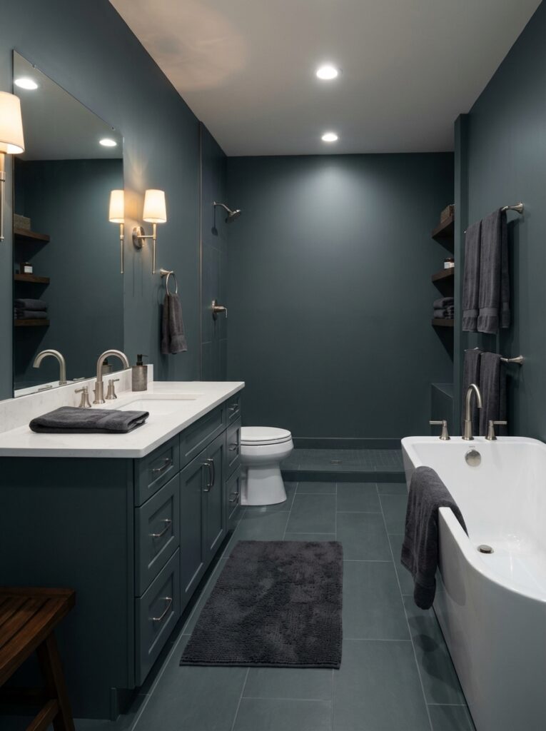
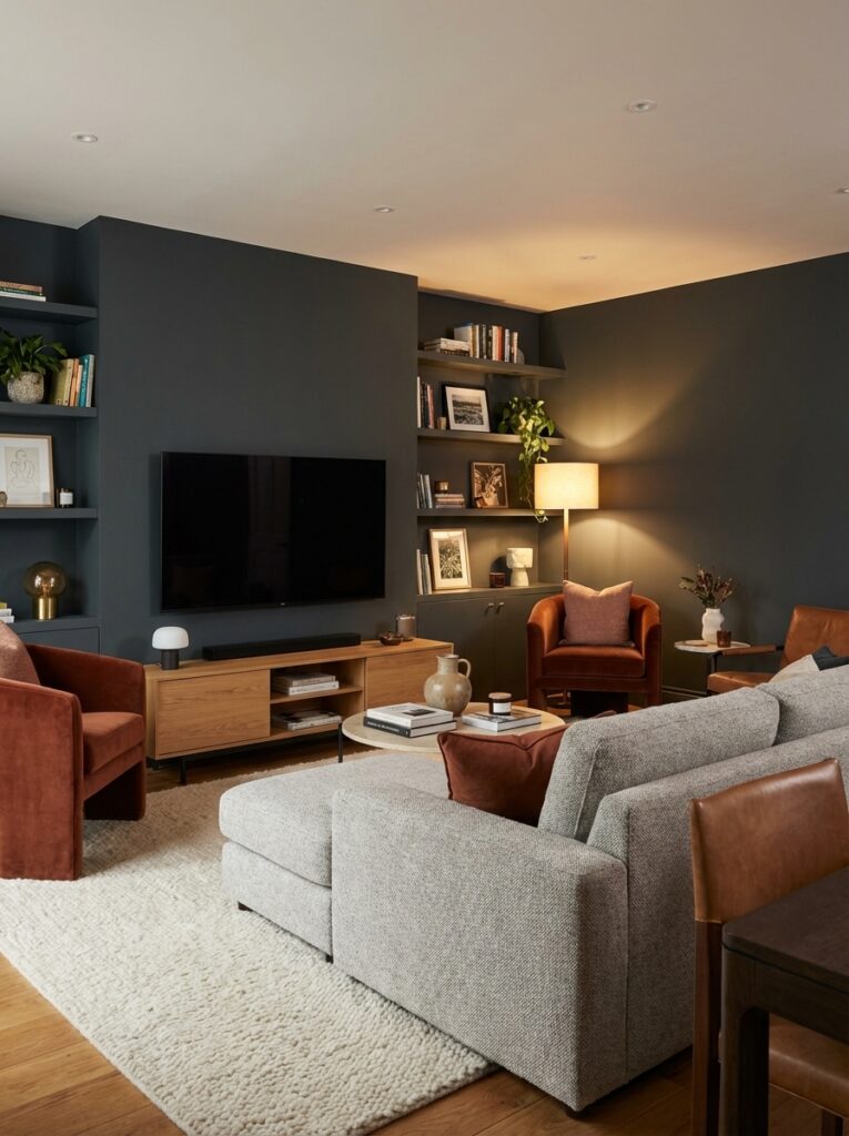
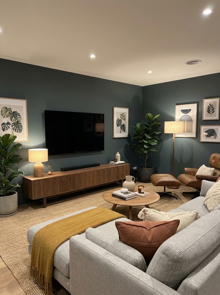
Best Rooms to Use Benjamin Moore Narragansett Green
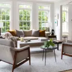
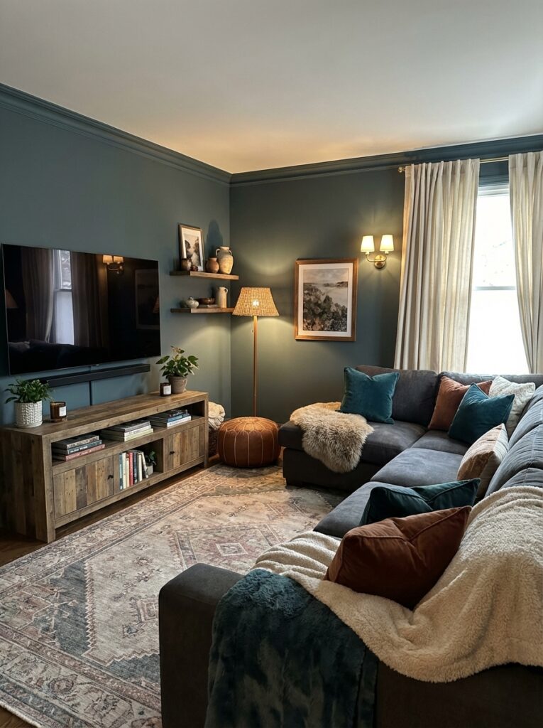
Living Room: Cozy & Sophisticated
This color turns a basic living room into a designer space.
Pair it with:
- Cream or white furniture
- Wood tones
- Brass accents
It creates a warm, upscale vibe.
Dining Room: Dramatic & Elegant
If you want that “wow” factor when guests walk in—this is it.
Add:
- Statement lighting
- Dark wood furniture
- Metallic accents
It feels rich and intimate.
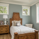
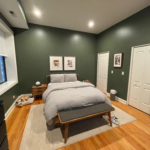
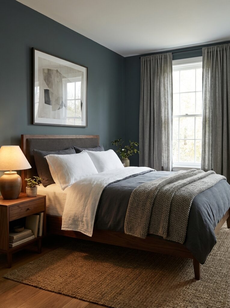
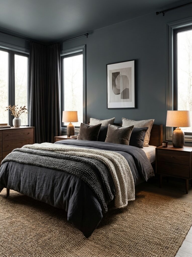
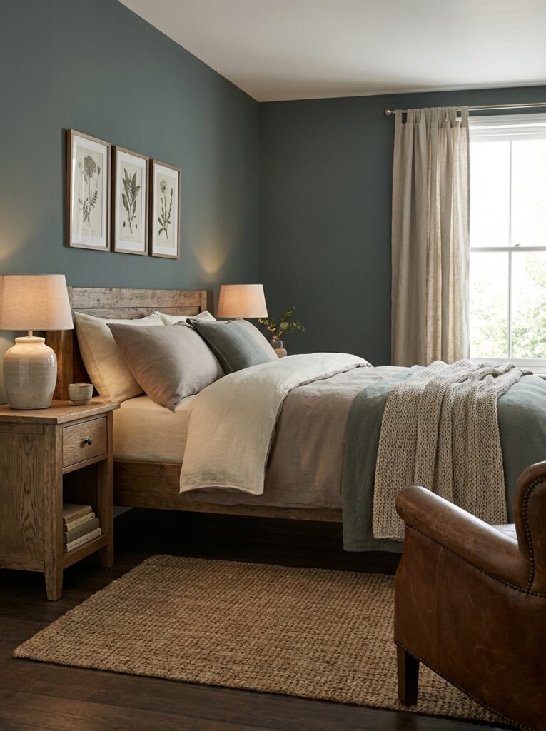
Bedroom: Moody & Relaxing
Perfect for a cozy, cocoon-like bedroom.
Use it with:
- Soft linens
- Warm lighting
- Minimal decor
It creates a calm, restful environment.
Accent Wall: Safe Way to Try It
Not ready to go all-in?
Use it on:
- One wall
- Built-ins
- Fireplace surround
You still get the drama without overwhelming the space.
Exterior: Bold Curb Appeal
It’s also a stunning exterior color.
Works beautifully with:
- White trim
- Natural stone
- Wood accents

Best Color Pairings for Narragansett Green
1. Crisp Whites
Top choices:
- Swiss Coffee
- Chantilly Lace
These create contrast and balance.
2. Warm Neutrals
Try:
- Beige
- Tan
- Soft taupe
They soften the boldness.
3. Natural Wood Tones
Wood is essential with this color.
Think:
- Oak
- Walnut
- Reclaimed wood
4. Brass & Gold Accents
Adds warmth and elegance.
5. Soft Blues & Grays
For a layered, tonal look.
Real-Life Examples (Relatable Scenarios)
Scenario 1: Boring Living Room Makeover
You’ve got plain white or gray walls.
Switching to Narragansett Green:
- Instantly adds depth
- Makes furniture stand out
- Feels custom and high-end
Scenario 2: Small Dining Room Upgrade
Instead of trying to make it feel bigger, you lean into coziness.
Result:
- Intimate atmosphere
- Stylish and bold look
- Perfect for entertaining
Scenario 3: Modern Bedroom Refresh
You want something different from beige or white.
Using Narragansett Green:
- Creates a cocoon effect
- Feels calming
- Looks expensive
Common Mistakes to Avoid
1. Using It in Very Dark Rooms Without Lighting
Because it’s already dark, it can feel heavy if there’s no lighting.
Fix it with:
- Layered lighting
- Lamps
- Warm bulbs
2. Not Balancing with Light Elements
Too much dark = overwhelming.
Balance with:
- White trim
- Light furniture
- Mirrors
3. Expecting It to Look the Same Everywhere
It shifts depending on lighting—don’t rely on online photos.
Always test samples.
4. Overusing It in Small Spaces
It works in small rooms—but only if styled correctly.
Expert Tips (Designer Secrets)
1. Use It for Color Drenching
Paint:
- Walls
- Trim
- Doors
All the same color for a dramatic, seamless look.
2. Add Contrast Through Decor
Use:
- Light rugs
- Neutral furniture
- Metallic finishes
3. Pair with Texture
Since it’s dark, texture is key:
- Velvet
- Linen
- Wood
4. Use Warm Lighting Only
Cool lighting can make it feel too cold or flat.
5. Try It on Cabinets
It’s stunning on:
- Kitchen cabinets
- Built-ins
- Bathroom vanities
How It Compares to Similar Colors
- Compared to navy → greener and softer
- Compared to dark green → more muted and sophisticated
- Compared to black → more depth and dimension
It sits right between green, blue, and charcoal.
Is Narragansett Green Right for You?
Choose this color if you:
- Love bold, moody interiors
- Want a high-end, designer look
- Prefer timeless over trendy
- Enjoy cozy, dramatic spaces
Avoid it if you:
- Want a bright, airy feel
- Have very little natural light
- Prefer light neutrals
Final Thoughts: Why Narragansett Green Is So Special
At the end of the day, Benjamin Moore Narragansett Green is not a “safe” color—and that’s exactly why people love it.
It’s:
- Deep and dramatic
- Rich and timeless
- Bold yet surprisingly versatile
If you’re ready to step away from basic neutrals and create a space with real personality, this color delivers in a big way.
FAQs About Benjamin Moore Narragansett Green
1. Is Narragansett Green green or blue?
It’s a mix of both, but often reads as a deep teal with blue undertones depending on lighting.
2. What is the LRV of Narragansett Green?
Its LRV is around 9, making it a very dark color that absorbs most light.
3. Does Narragansett Green work in small rooms?
Yes—but only with good lighting and lighter decor to balance it.
4. What colors go best with Narragansett Green?
Whites, warm neutrals, wood tones, brass, and soft blues all pair beautifully with it.
5. Is Narragansett Green a good exterior color?
Absolutely. It creates bold, elegant curb appeal when paired with white trim and natural materials.