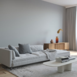
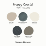
In the world of interior design, paint colors serve as the foundation upon which a room’s aesthetic is built. Among the myriad of options available, Benjamin Moore’s Seapearl stands out as a remarkably versatile choice. A soft, off-white shade, Seapearl is celebrated for its ability to transform spaces into bright, welcoming havens. But what truly sets off-whites apart is their inherent ability to blend classic elegance with contemporary versatility, making them the go-to choice for those seeking a universal appeal.
Overview of Seapearl by Benjamin Moore
Benjamin Moore’s Seapearl is a masterful blend of warm yellow and cool gray undertones, creating a sophisticated balance that is both captivating and calming. With a Light Reflectance Value (LRV) of 76, Seapearl achieves a perfect equilibrium; it is bright enough to illuminate a room without overwhelming other design elements, yet grounded enough to maintain a serene atmosphere.
Importance of Undertones in Off-White Paints
Undertones can make or break the feel of a space, and Seapearl’s nuanced hues play a significant role in its appeal. In natural light, Seapearl exudes a cozy ambiance, but its tone can subtly shift, showcasing either its warm or cool side depending on the lighting. This variability necessitates swatching the color in your own environment to discern its full impact and ensure it complements existing design elements.
Seapearl’s Best Uses
Living Rooms
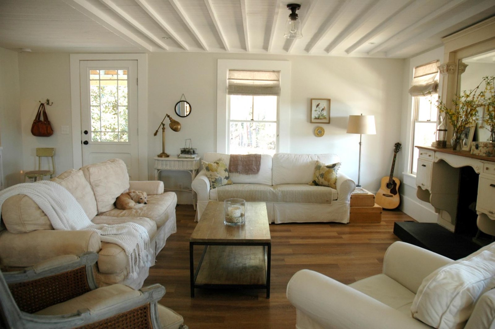
In living rooms, Seapearl acts as a neutral canvas, allowing furniture and decor to shine. Its versatility makes it an excellent backdrop for spaces that transition between day and evening gatherings.
Bedrooms
Seapearl’s soothing undertones create an ideal atmosphere for rest and relaxation. Its soft hues contribute to a tranquil bedroom environment conducive to sleep and reflection.

Pro Grade Paint Roller Kit, Brush & Roller for Professionals & Homeowners
Perfect for smooth finishes on your interior walls. Ideal for home improvement enthusiasts!
Buy Now on AmazonKitchens
In the kitchen, Seapearl infuses a sense of cleanliness and sophistication. It pairs well with various cabinetry finishes and can enhance both traditional and modern culinary spaces.
Bathrooms
Bathrooms benefit from Seapearl’s light-reflecting capabilities, creating an airy and refreshing space that feels both spa-like and serene.
Home Exteriors and Trim
On exteriors, Seapearl provides a classic, timeless look that withstands design trends. It also serves as a complementary trim color, accentuating architectural details with subtle grace.
Cabinets and Furniture
Seapearl’s adaptability extends to cabinetry and furniture, where its neutral tone highlights the craftsmanship of the pieces while blending seamlessly into various decor styles.
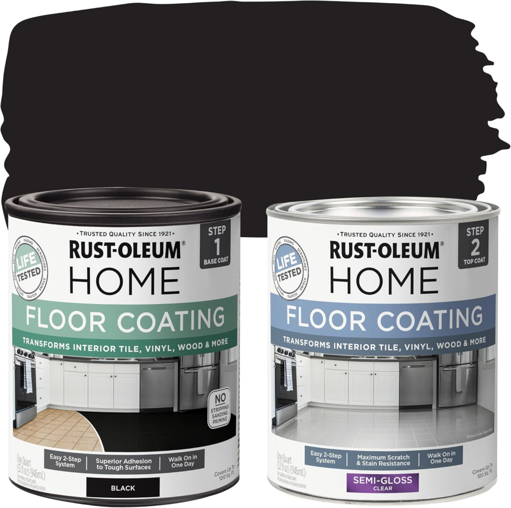
Rust-Oleum 367605 Home Interior Floor Coating Kit, Semi-Gloss Black
Ideal for updating outdated flooring at a fraction of the cost of replacement and adheres without stripping, sanding or priming.
Buy Now on AmazonWhole-House Color
Seapearl’s flexibility makes it suitable for use throughout an entire home, creating a cohesive and harmonious environment without sacrificing individuality in each space.
Similar Colors to Seapearl
Benjamin Moore Dove Wing
Dove Wing is slightly lighter and has more of a cream undertone compared to Seapearl. It offers a brighter option for those desiring a softer off-white.
Behr Weathered White
Weathered White shares Seapearl’s neutral stance but leans more towards an antique, aged appearance, providing an heirloom feel to interiors.
Sherwin Williams Grey Mist
Grey Mist carries more pronounced gray undertones, making it cooler than Seapearl but equally sophisticated for contemporary spaces.
Benjamin Moore Classic Gray
Classic Gray is a touch warmer than Seapearl, offering a hint of warmth that enriches cozy environments without skewing too far into beige territory.
Coordinating Colors with Seapearl
Cool Grays
Colors like Sleigh Bells and Stonington Gray harmonize with Seapearl to create a soothing, monochromatic palette with depth and interest.
Soft Greens
Arctic Shadows and Antique Pewter bring a refreshing contrast, enhancing Seapearl’s subtleties while echoing the calm of the outdoors.
Dark Blue-Grays
Knoxville Gray and Blue Spruce offer dramatic balance against Seapearl’s lightness, providing bold focal points within an overall serene schema.
Trim Colors
Choosing the right trim color is essential for a cohesive look. Bright whites like Benjamin Moore’s Simply White contrast beautifully with Seapearl, emphasizing architectural details. Alternatively, using Seapearl itself on trim in a semi-gloss finish creates a seamless, sophisticated aesthetic.
FAQs on Seapearl
What are the undertones of Seapearl?
Seapearl possesses a refined combination of warm yellow and cool gray undertones, offering an unparalleled balance that adapts gracefully to varying lighting conditions.
How does Seapearl compare to BM Classic Gray?
While similar, Seapearl is slightly cooler and more neutral compared to Classic Gray’s warmer disposition. Both offer serene foundations but can create subtly different aesthetics.
Difference between BM Dove Wing vs. Seapearl?
Dove Wing presents a lighter, creamier alternative to Seapearl’s balanced neutrality, offering a brighter choice for those looking for a gentle lift in their spaces.
Is Seapearl a good bedroom paint color?
Absolutely. Seapearl’s tranquility and soft undertones make it an ideal candidate for creating a relaxing, restful bedroom environment.
Conclusion
In conclusion, Benjamin Moore’s Seapearl stands as a testament to the power of subtlety and versatility in paint colors. Its gentle neutrality, balanced undertones, and ability to harmonize with a variety of other hues make it an exceptional choice for creating warm, inviting spaces. For those seeking to transform their homes into serene havens, a swatch of Seapearl is certainly worth exploring, promising to deliver an effortlessly stylish and welcoming ambiance.

