The hallway is the most paradoxical space in residential architecture. It is the artery of the home, the most frequently traveled path, yet it is often the most neglected in terms of design. In many modern homes and historic renovations alike, homeowners are plagued by the “Tunnel Effect”—a long, narrow, often windowless passage that feels more like a utility chute than a welcoming transition.
While knocking down walls to widen a footprint is rarely a structural or financial possibility, paint provides a solution that is both economical and transformative. But painting a narrow hallway is not as simple as slapping on a coat of “Bright White.” It requires a nuanced understanding of Light Reflectance Value (LRV), color temperature, and visual perception.
This guide will deconstruct the science of expanding space through color, offering a deep dive into the specific palettes, finishes, and optical strategies that can turn a claustrophobic corridor into a grand gallery.
Part I: The Physics of Space and Light
Before opening a paint can, we must understand the optical mechanics at play in a narrow space. The human eye perceives space based on how light interacts with surfaces. In a hallway, you are typically dealing with two long parallel planes (the walls) that converge in perspective. Your goal is to visually push these planes apart.
1. Understanding Light Reflectance Value (LRV)
Every paint color has an LRV, a number between 0 (absolute black, absorbing all light) and 100 (pure white, reflecting all light).

Pro Grade Paint Roller Kit, Brush & Roller for Professionals & Homeowners
Perfect for smooth finishes on your interior walls. Ideal for home improvement enthusiasts!
Buy Now on Amazon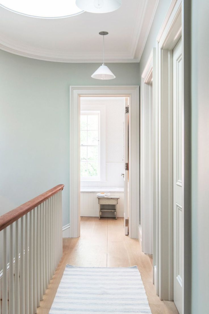
- The High LRV Strategy (70-100): In narrow hallways with some light source (even artificial), high LRV colors bounce photons back and forth between the walls. This blurs the definition of the corners. When corners are shadowed and distinct, the brain can easily calculate the small dimensions of the room. When corners are washed in reflected light, the spatial boundaries feel less rigid.
- The Low LRV Strategy (0-20): This is the counter-intuitive approach. In a hallway with zero natural light, high LRV paints can sometimes look flat and dingy because there is no light to reflect. In these instances, low LRV (dark) colors can actually “erase” the walls by absorbing the shadows. If you cannot see the corners because the whole room is a moody charcoal, the space feels infinite rather than small.
2. Cool vs. Warm: The “Receding” Rule
This is the Golden Rule of spatial manipulation.
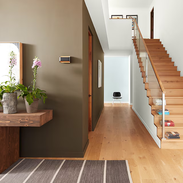
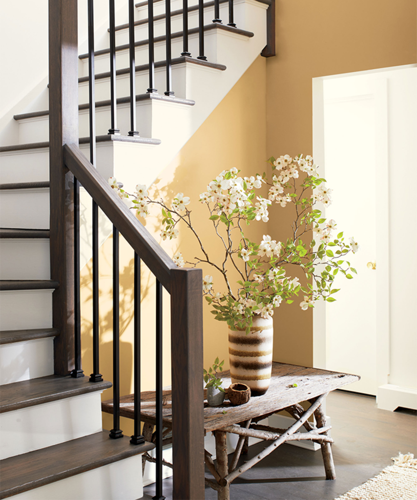
- Warm Colors (Reds, Oranges, Yellows): These are “advancing” colors. Their wavelengths are long, and the lens of the human eye adjusts in a way that makes them appear closer than they physically are. Painting a narrow hallway a warm terracotta will make the walls feel like they are closing in on you.
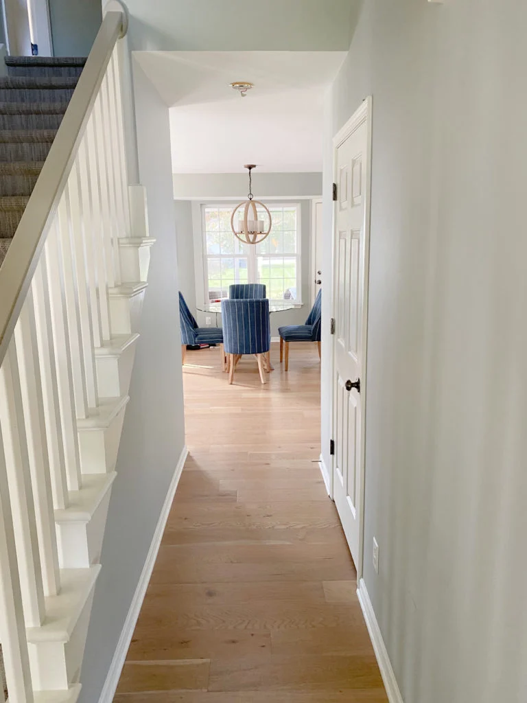
- Cool Colors (Blues, Greens, Violets): These are “receding” colors. They mimic the atmospheric scattering we see in nature (the sky, distant mountains). The eye focuses on them as if they are further away. A soft blue-grey wall will visually “step back” by several inches, widening the feel of the corridor.
Part II: The “Expander” Palette (Whites and Off-Whites)
The most common advice for small spaces is “paint it white.” However, in a hallway, the wrong white can be disastrous. A stark, sterile white (like a hospital corridor) highlights every shadow and imperfection. You need complex whites—colors that read as white but contain subtle undertones to add depth.
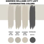
The “Greige” Solution
Greige (Grey + Beige) is the interior design workhorse for hallways. It bridges the gap between the receding nature of grey and the welcoming warmth of beige.
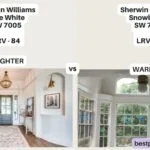
1. Sherwin Williams Agreeable Gray (SW 7029)

Rust-Oleum 367605 Home Interior Floor Coating Kit, Semi-Gloss Black
Ideal for updating outdated flooring at a fraction of the cost of replacement and adheres without stripping, sanding or priming.
Buy Now on Amazon- The Vibe: This is arguably the most popular paint color of the decade for a reason. It is the perfect “chameleon.”
- Why it works in Hallways: It has an LRV of 60, meaning it bounces significant light but has enough saturation to contrast with white trim. In a narrow hall, it softens the hard lines of the walls.
- Best For: Hallways with warm wood flooring. The slight beige undertone picks up the warmth of the oak or walnut floor, creating a seamless look.
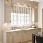
2. Benjamin Moore Pale Oak (OC-20)
- The Vibe: Elegant, soft, and slightly warmer than Agreeable Gray. It mimics the color of raw limestone.
- Why it works in Hallways: Pale Oak is sophisticated. If your hallway feels “cheap” or “boxy,” this color adds an instant sense of luxury. It reflects light beautifully but creates a soft, velvety texture visually.
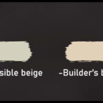
The “Complex” Whites
If you want true white, avoid “Ceiling White.” You need whites with a high LRV but specific undertones.
3. Benjamin Moore Chantilly Lace (OC-65)
- The Vibe: Crisp, clean, and essentially neutral. It has very little yellow or blue undertone.
- Why it works in Hallways: This is for the modern, minimalist hallway. If you have art to display, this is the gallery wall color. It maximizes light reflectance (LRV approx. 90), making a dim hallway feel significantly brighter.
- Warning: It requires excellent drywall finish. Because it is so bright, it will highlight bumps or uneven plaster.
4. Sherwin Williams Alabaster (SW 7008)
- The Vibe: A creamy, soft white. It feels like heavy cream or cotton.
- Why it works in Hallways: If your hallway leads to bedrooms, you may not want the starkness of Chantilly Lace. Alabaster provides a “glow” rather than a “shine.” It makes the transition to sleeping areas feel calm and gentle.
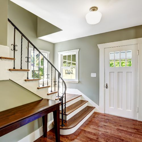
Part III: The “Atmospheric” Palette (Blues and Greens)
If you want personality without sacrificing the feeling of space, look to the colors of the horizon. These colors utilize the concept of “aerial perspective”—the artistic technique where distant objects are painted in pale blues to create depth.
5. Sherwin Williams Sea Salt (SW 6204)
- The Color: A complex hybrid of green and gray with a touch of blue.
- The Effect: This is the ultimate “spa” color. In a narrow hallway, it feels like a breath of fresh air. It is definitively a cool color, so it physically pushes the walls away from the viewer.
- Best Lighting: It looks best in hallways that get daylight from adjoining rooms. In strictly artificial yellow light, it can lean a bit too green.
6. Benjamin Moore Wickham Gray (HC-171)
- The Color: A pale blue-green gray. It is much cooler than the “Greiges” mentioned earlier.
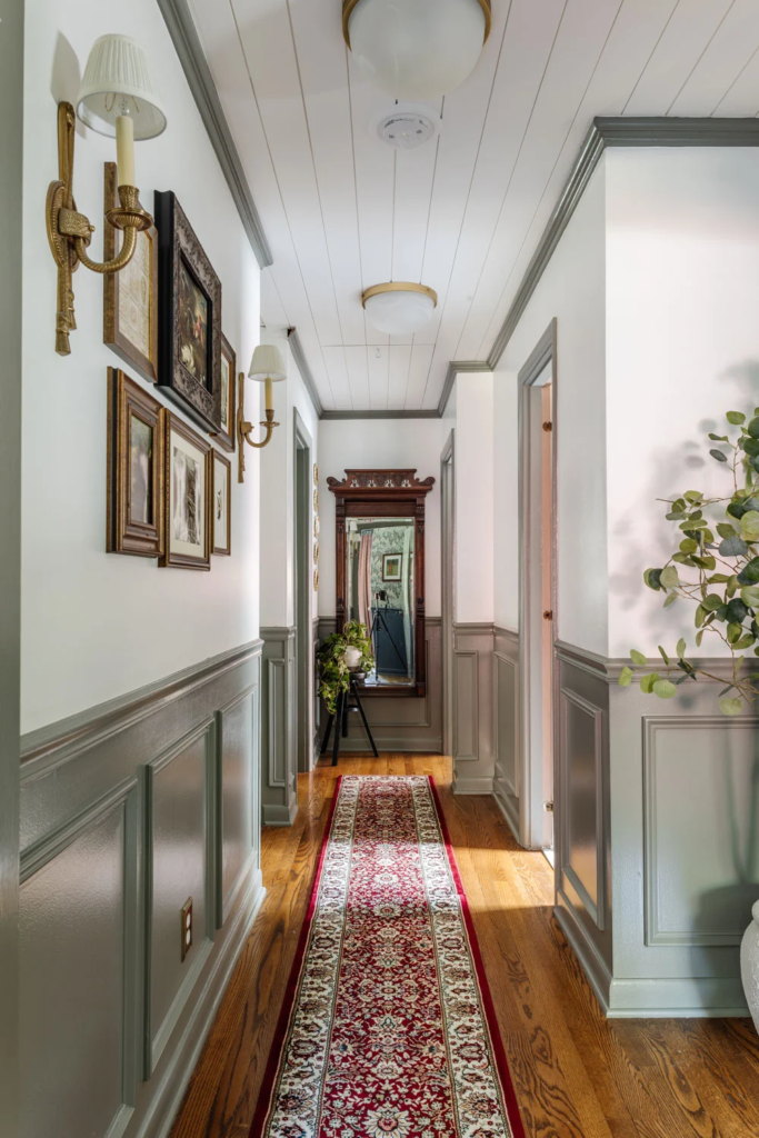
- The Effect: This color is masterful at tricking the eye. It is light enough to be airy but has enough blue pigment to feel vast. It is particularly effective in hallways with white wainscoting or beadboard.
7. Farrow & Ball Borrowed Light (No. 235)
- The Color: A pale, illuminated blue.
- The Effect: As the name suggests, it is designed to evoke the feeling of light where there is none. It is perfect for windowless corridors. It doesn’t look like “blue paint”; it looks like a shadow cast by a skylight.
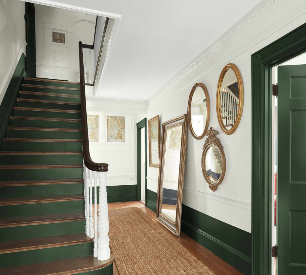
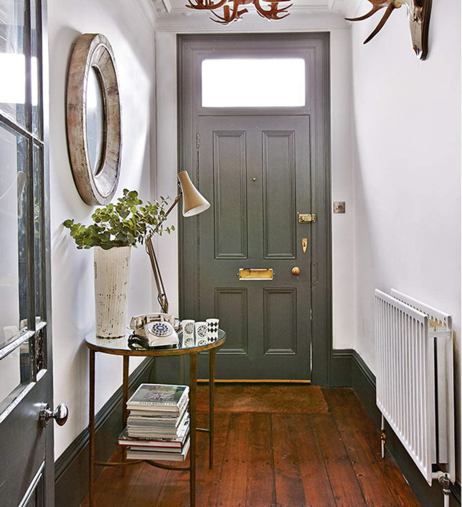
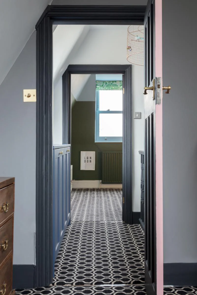
Part IV: The “Jewel Box” Effect (Dark & Moody)
There is a movement in design that rejects the idea that small spaces must be white. The “Jewel Box” theory suggests that since a narrow hallway will never look like a massive atrium, you should lean into the coziness and create drama.
This utilizes the “Compression and Release” architectural theory. Frank Lloyd Wright was famous for this: he would design low-ceilinged, narrow, dark entryways (compression) that opened up into soaring, bright living rooms (release). The contrast makes the living room feel twice as big.
8. Sherwin Williams Hale Navy (HC-154)
- The Color: A classic, deep maritime navy.
- Why it works: Dark colors blur edges. In a dimly lit hallway painted white, you see the grey shadows in the corners clearly. In a navy hallway, the shadows disappear into the paint. You lose the sense of where the wall ends.
- The Look: Pairs incredibly well with brass light fixtures and light wood floors.

9. Benjamin Moore Wrought Iron (2124-10)
- The Color: A soft, charcoal black. It isn’t a harsh “jet black,” but rather a very dark grey.
- Why it works: It acts as a void. It makes artwork pop intensely (the gallery effect). If you have a narrow hallway filled with family photos or art, a dark background recedes, pushing the art forward.
10. Sherwin Williams Pewter Green (SW 6208)
- The Color: A dark, earthy, mossy green.
- The Effect: It brings nature indoors. It feels grounded and organic rather than constricting.
Part V: Architectural Tricks & Finish Strategies
Selecting the color is only 50% of the battle. How you apply it and what finish you choose changes the physics of the space.
1. The Sheen Strategy
For narrow hallways, Satin or Eggshell is usually recommended over Flat/Matte.
- Reflectivity: Satin has a slight gloss. This allows light to bounce off the wall surface itself, not just the pigment. This micro-reflection helps light travel further down the “tunnel.”
- Durability: Hallways are high-traffic. Shoulders rub against walls; bags scrape them. Matte paint burnishes (gets shiny spots) when rubbed. Satin is scrubbable.
2. Color Drenching (The Monochromatic Look)
In a traditional home, you have colored walls and white trim. In a narrow hallway, that white trim creates distinct “racing stripes” along the floor and around doors. These stripes emphasize the length and narrowness of the hall.
- The Fix: Paint the baseboards, door frames, doors, and walls the exact same color.
- The Nuance: Use different sheens. Use Matte/Eggshell on the walls and Semi-Gloss on the trim.
- The Result: The visual “noise” of the contrasting trim is removed. The eye creates one continuous scan from floor to ceiling, making the walls feel taller and the hallway less cluttered.
3. The Ceiling Hack
Do not automatically paint the ceiling white.
- The “Lift”: If you paint the ceiling a slightly lighter shade of the wall color (e.g., wall is Agreeable Gray, ceiling is 50% Agreeable Gray + 50% White), it blurs the line where the wall meets the ceiling, making the ceiling feel higher.
- The “Tunnel Breaker”: If the hallway is extremely long and high (like a Victorian home), painting the ceiling a darker color can lower the visual height, which paradoxically makes the walls feel wider by correcting the aspect ratio.
4. The End-Wall Accent
If you have a very long, bowling-alley style hallway, paint the wall at the very end a darker, warmer color than the side walls.
- Why: Warm/Dark colors advance. This visually pulls the end wall closer to you, making the hallway feel shorter and less like a tunnel.
Part VI: Lighting and Decor Integration
Paint cannot do all the heavy lifting alone. It needs to partner with lighting and decor.
1. Lighting Temperature (Kelvin)
The color you choose will look completely different depending on your light bulbs.
- 2700K (Warm White): Will turn greys into brownish-taupes and whites into creams. Good for cozy, dark hallways.
- 3000K (Soft White): The standard “neutral.” Best for most Greiges.
- 4000K (Cool White): Mimics daylight. Crucial if you are using blues or stark whites (like Chantilly Lace). If you use 2700K bulbs with blue paint, the yellow light + blue paint = green walls.
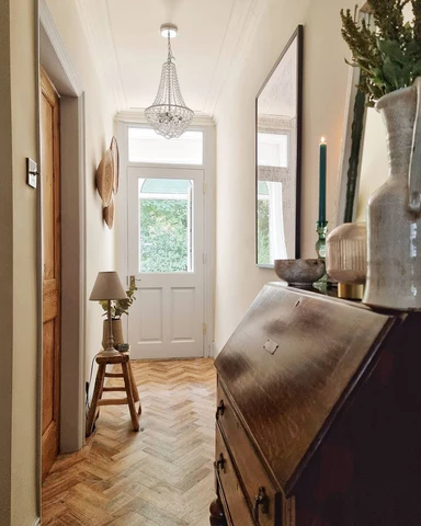
2. The Mirror Trick
Placement matters. Do not place mirrors on opposite walls facing each other (the infinity effect is disorienting).
- Placement: Place a large mirror on one side wall. It acts as a “window,” breaking the solid wall plane and doubling the visual width of that section.
3. Flooring Orientation
If you are redoing floors, run planks parallel to the longest wall to elongate, or diagonal (herringbone) to widen. Running planks perpendicular (like a ladder) can sometimes make the hallway feel choppy, like a series of hurdles.
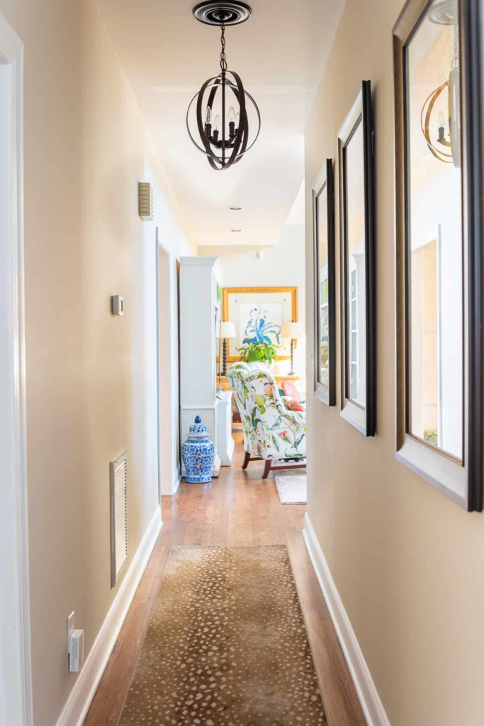
4. Rugs
Use runners to draw the eye.
- Horizontal Stripes: Widen the floor path.
- Vintage/Persian: Distract the eye with pattern so the brain focuses less on the tight walls.
Part VII: Summary Checklist for Your Project
When you are ready to paint your narrow hallway, follow this protocol to ensure success:
- Analyze the Light: Turn off all lights. Is it pitch black? (Go High LRV White or “Jewel Box” Dark). Is there ambient light from doors? (Go “Atmospheric” Blue/Green).
- Check the Undertones: Compare your swatch against a pure white piece of paper. Does the beige look pink? Does the grey look purple?
- Sample Properly: Do not paint a swatch in the middle of the wall. Paint it next to the trim. You need to see how the color interacts with your white baseboards and your floor color.
- The Box Test: Paint a large poster board. Move it to the darkest center part of the hallway and leave it for 24 hours. Check it in the morning, afternoon, and night (with artificial lights on).
By combining the physics of color with smart architectural styling, your narrow hallway can graduate from a cramped thoroughfare to a celebrated feature of your home’s design.