If you’re here because you’ve fallen in love with Sherwin-Williams Grays Harbor, you’re in very good company.
Sherwin-Williams Grays Harbor is one of those deep, moody blue-gray paint colors that instantly makes a space feel grounded, sophisticated, and a little bit dramatic—in the best possible way. It’s bold, it’s rich, and it absolutely has presence.
But here’s the big question I always get:
“What colors actually go with Grays Harbor without making the room feel too dark… or too cold… or just off?”
That’s exactly what we’re diving into today. We’re going to talk about undertones, contrast, trim, cabinets, exteriors, accent colors, and full room palettes—so by the end, you’ll feel confident pairing Grays Harbor anywhere in your home.

Pro Grade Paint Roller Kit, Brush & Roller for Professionals & Homeowners
Perfect for smooth finishes on your interior walls. Ideal for home improvement enthusiasts!
Buy Now on AmazonLet’s get into it.
First, Let’s Talk About Grays Harbor (Because Undertones Matter)
Before choosing coordinating colors, you need to understand what you’re working with.
Grays Harbor is a deep blue-gray with strong cool undertones. It leans navy, but it’s softer and smokier than a true navy. It also has a noticeable gray base, which keeps it from feeling overly bright or nautical.
In different lighting:

Rust-Oleum 367605 Home Interior Floor Coating Kit, Semi-Gloss Black
Ideal for updating outdated flooring at a fraction of the cost of replacement and adheres without stripping, sanding or priming.
Buy Now on Amazon- North-facing rooms: It can look cooler and moodier.
- South-facing rooms: It softens slightly and feels richer.
- Artificial lighting: Can emphasize its depth and blue tones.
This is not a light, airy paint color. It’s dramatic. So your coordinating colors need to either:
- Balance its depth
- Warm it up
- Enhance the mood
- Create intentional contrast
Now let’s walk through the best coordinating options.
Best White Trim Colors for Grays Harbor
Choosing the right white is everything. The wrong white can make Grays Harbor look too cold or too stark.
1. Pure, Clean White for Crisp Contrast
Sherwin-Williams Extra White
If you love a modern, high-contrast look, this is your go-to.
Extra White is bright, clean, and slightly cool. It makes Grays Harbor look sharper and more architectural. Think:
- Modern farmhouse
- Contemporary
- Clean-lined traditional
Use it on:
- Trim
- Doors
- Ceilings
- Built-ins
This combo feels polished and fresh.
2. Slightly Softer White
Sherwin-Williams Pure White
Pure White is one of my favorite pairing options because it’s soft without looking creamy.
It gently contrasts Grays Harbor without screaming, “Look at me!” This combination feels:
- Balanced
- Elegant
- Timeless
If you’re nervous about going too bright, Pure White is the safe and beautiful middle ground.
3. Creamy White for Warmth
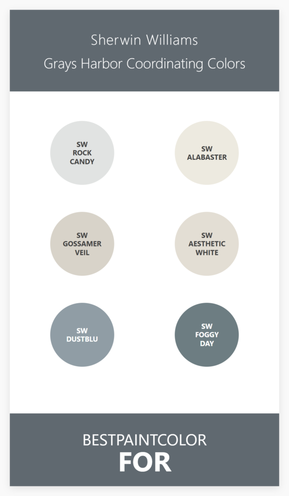
Sherwin-Williams Alabaster
If you want to soften the coolness of Grays Harbor, Alabaster is gorgeous.
It adds warmth and prevents the space from feeling too blue-heavy. This pairing works beautifully in:
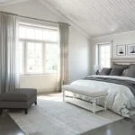
- Bedrooms
- Living rooms
- Traditional homes
- Spaces with warm wood floors
Alabaster + Grays Harbor = cozy sophistication.
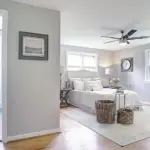
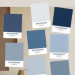
Light Neutral Wall Colors That Pair Beautifully
Maybe you want Grays Harbor as an accent wall, island, or cabinet color. What should go on the surrounding walls?
Here are some of my favorite lighter coordinating neutrals.
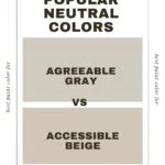
1. Greige That Bridges Warm and Cool
Sherwin-Williams Agreeable Gray
Agreeable Gray is a crowd favorite for a reason. It’s balanced—neither too warm nor too cool.
When paired with Grays Harbor:
- It prevents the room from feeling overly dark.
- It softens the blue undertones.
- It creates a cohesive, modern palette.
This is a fantastic whole-house combination.
2. Warm Greige for Contrast
Sherwin-Williams Accessible Beige
If your home leans warmer (wood floors, warm lighting, beige furnishings), Accessible Beige can ground Grays Harbor beautifully.
It warms the entire palette and keeps the deep blue-gray from feeling icy.
This is especially stunning in:
- Open-concept homes
- Kitchens with warm wood accents
- Transitional spaces
3. Light Gray With Subtle Coolness
Sherwin-Williams Repose Gray
Repose Gray works when you want a cooler, more cohesive look.
Pairing Repose Gray with Grays Harbor creates:
- A layered gray-blue palette
- Calm sophistication
- Subtle contrast
Perfect for:
- Bedrooms
- Offices
- Moody dining rooms
Darker Coordinating Colors (For Drama Lovers)
If you’re going moody, let’s really go moody.
1. Almost-Black Navy
Sherwin-Williams Naval
Naval is deeper and more saturated than Grays Harbor. Used together, they create depth and dimension.
Try:
- Grays Harbor walls
- Naval doors or built-ins
This pairing feels high-end and designer-approved.
2. Charcoal Contrast
Sherwin-Williams Peppercorn
Peppercorn adds bold charcoal contrast.
It works beautifully in:
- Industrial spaces
- Modern exteriors
- Accent furniture
Grays Harbor + Peppercorn = serious sophistication.
Coordinating Greens That Look Stunning
Blue-grays and greens are best friends.
1. Soft Sage
Sherwin-Williams Sea Salt
Sea Salt is soft, airy, and calming.
When paired with Grays Harbor:
- It lightens the mood.
- It keeps things coastal but not beachy.
- It adds subtle color variation.
This works beautifully in bathrooms and bedrooms.
2. Rich Earthy Green
Sherwin-Williams Evergreen Fog
Evergreen Fog adds an earthy, modern contrast.
This combination feels:
- Organic
- On-trend
- Sophisticated
If you love nature-inspired interiors, this is a winner.
Soft Accent Colors That Warm Things Up
Grays Harbor is cool-toned, so adding warmth creates balance.
1. Warm Taupe
Sherwin-Williams Taupe Tone
Taupe Tone brings warmth without overpowering.
It creates a balanced, grounded palette—especially in living spaces.
2. Muted Blush
Sherwin-Williams Intimate White
This soft blush neutral warms up the cool blue-gray beautifully.
Think:
- Bedrooms
- Accent chairs
- Powder rooms
It’s subtle but effective.
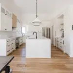
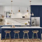
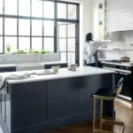
Kitchen Combinations With Grays Harbor
Let’s talk real-life application.
Grays Harbor Kitchen Island
Pair with:
- White perimeter cabinets (Pure White or Alabaster)
- Brass hardware
- White quartz countertops
This creates contrast without heaviness.
Grays Harbor Lower Cabinets
Use:
- Light walls (Agreeable Gray)
- Warm wood floors
- Matte black or brass fixtures
This combination feels timeless and rich.
Exterior Coordinating Colors
Grays Harbor is stunning outside.
Classic Exterior Combo
- Body: Grays Harbor
- Trim: Extra White
- Front Door: Naval
This look feels bold and classic.
Modern Exterior Combo
- Body: Grays Harbor
- Trim: Pure White
- Accents: Peppercorn
Add black windows and you’ve got serious curb appeal.
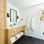
Flooring That Works With Grays Harbor
Let’s talk floors because they matter.
✔ Warm oak floors soften it
✔ Medium walnut makes it rich
✔ Light natural wood keeps it modern
✔ Gray tile enhances the mood
Avoid overly cool, icy gray floors—they can make the space feel too cold.
Hardware & Metals That Pair Well
Grays Harbor loves:
- Brass (adds warmth)
- Matte black (adds drama)
- Brushed nickel (keeps it cool and clean)
- Antique bronze (adds richness)
If your space feels too cool, brass is your best friend.
Whole-Home Coordinating Palette Example
Here’s a full-home concept:
- Main walls: Agreeable Gray
- Accent wall or office: Grays Harbor
- Trim: Pure White
- Cabinets: Grays Harbor
- Bedrooms: Sea Salt
- Exterior: Grays Harbor with Extra White trim
This creates a cohesive, layered look without repeating the exact same tone everywhere.
How to Know If Grays Harbor Is Right for You
Choose it if you:
✔ Love moody spaces
✔ Want something deeper than gray
✔ Prefer cool undertones
✔ Want drama without going black
Avoid it if:
✖ Your home has very little natural light
✖ You dislike cool undertones
✖ You want bright and airy everywhere
Final Thoughts: Creating a Balanced Palette
The secret to coordinating with Grays Harbor isn’t finding one perfect match.
It’s about balance.
Because it’s deep and cool, it thrives when paired with:
- Warm whites
- Balanced greiges
- Earthy greens
- Rich charcoals
- Warm metals
- Natural wood
When you mix depth with softness, warmth with coolness, and contrast with harmony—that’s when Grays Harbor truly shines.
And remember: always sample on your walls first. Lighting changes everything.
If you tell me where you’re planning to use Grays Harbor (kitchen, exterior, bedroom, cabinets?), I’d love to help you build a custom coordinating palette just for your space.