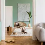
Japandi interior design has quickly become one of the most sought-after home aesthetics due to its calming color palette and harmonious blend of Japanese minimalism and Scandinavian coziness. It’s a design movement built on balance—quiet, earthy tones from Japan paired with warm, comfortable hues inspired by Nordic landscapes.
But the secret behind truly achieving authentic Japandi décor isn’t only in the furniture; it begins with the paint colors. The walls set the emotional temperature of a room. They decide whether a home feels soothing or chaotic, grounded or disconnected, minimalist or cold.
Sherwin-Williams and Behr both offer excellent color palettes that work beautifully for Japandi spaces. However, not every neutral or earthy shade qualifies. You need specific undertones, specific saturation levels, and a controlled warmth-to-cool ratio to capture the essence of Japandi.
This 3-part guide explores the best paint colors, why they work, where to use them, and how to pair them with Japandi-style materials and décor.
What Makes a Color “Japandi”?
Japandi color palettes are influenced by:

Pro Grade Paint Roller Kit, Brush & Roller for Professionals & Homeowners
Perfect for smooth finishes on your interior walls. Ideal for home improvement enthusiasts!
Buy Now on Amazon1. Organic Natural Elements
Think:
- Natural wood tones
- Clay
- Sand
- Charcoal
- Stone
- Raw linen
The colors are pulled from nature, never artificial or hyper-saturated.
2. Soft Minimalism
Japandi avoids:
- Bright whites
- Stark contrasts
- Pure blacks
- Overly warm beiges
- High-chroma colors
Everything is muted, restrained, and timeless.

Rust-Oleum 367605 Home Interior Floor Coating Kit, Semi-Gloss Black
Ideal for updating outdated flooring at a fraction of the cost of replacement and adheres without stripping, sanding or priming.
Buy Now on Amazon3. Warm Meets Cool Harmony
Japan tends toward warm neutrals; Scandinavia toward cool neutrals. Japandi sits exactly in the middle—with colors that feel:
- Warm, but not yellow
- Cool, but not blue
- Earthy, but not brown
- Grey, but not steely
Think of colors like warm greiges, clay tones, soft taupes, earthy whites, and natural stone hues.
The Key Color Categories in Japandi Design
Before exploring Sherwin-Williams and Behr colors, it helps to understand the six essential color families used in Japandi interiors:
1. Soft Off-Whites
Not bright white. Not cold white. Soft, chalky, warm whites.
2. Greiges & Warm Neutrals
A balance of grey (Scandi) and beige (Japan).
3. Muted Earth Tones
Clay, terracotta, stone, mushroom, moss.
4. Smoky Pastels
Dusky greens, muted blues, stone pinks.
5. Natural Dark Accents
Charcoal, ink, espresso—never pure black.
6. Warm Wood-Complement Colors
Anything designed to highlight natural oak, ash, walnut, sugi, or hinoki wood.
Now let’s dive into Sherwin-Williams and Behr, focusing on exactly which colors deliver true Japandi harmony.
SECTION A — SHERWIN-WILLIAMS COLORS FOR JAPANDI INTERIORS
Below are the most Japandi-appropriate Sherwin-Williams paint colors, grouped by usage, undertone, and mood.

1. Best Sherwin-Williams Whites for Japandi Spaces
● SW 7102 White Flour
A perfectly soft, warm-white without yellowing.
Japandi interiors need whites that feel calm but not clinical; this is one of the most balanced warm whites from SW.
Where it works: bedrooms, living rooms, open spaces, hallways.

● SW 9540 Timber Beam
A Japanese-inspired chalky white with beige-clay undertones.
Feels handmade and organic—excellent with natural wood.
Where it works: entryways, kitchens, dining rooms.
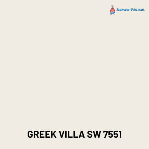
● SW 7551 Greek Villa
A warm yet not yellow creamy white.
Excellent for Scandinavian-leaning Japandi rooms.
Where it works: living rooms with light oak furniture.
Why These Whites Work:
Japandi does not use stark white; it uses creamy, diffused, earthy whites that soften the environment and highlight wood grains.

2. Best Sherwin-Williams Greiges for Japandi Interiors
● SW 9173 Shiitake
A perfect mushroom-taupe neutral.
This is possibly the most “Japandi” color from Sherwin-Williams because it mirrors natural clay and stone.
Works with: rattan, bamboo, OSB, ashwood furniture.
● SW 7037 Balanced Beige
Warm yet modern.
A foundational color in many Japandi kitchens and living rooms.
Pairs with: warm woods, matte black accents, stone textures.
● SW 7642 Pavestone
A deeper greige with a grounding, stone-like quality.
Adds depth without feeling heavy.
Great for: feature walls, cabinets, interior doors.

3. Best Sherwin-Williams Earth-Tone Neutrals
● SW 9120 Malabar
A soft sandy neutral with clay undertones.
This color feels handmade and earthy—ideal for spaces inspired by Japanese tea rooms.
● SW 7531 Canvas Tan
Simple, relaxed, and perfectly aligned with Scandi-cozy aesthetics.
Pairs with linen textiles and light beech or pine.
● SW 9109 Natural Linen
Organic, grounded, and warm.
Perfect for Japandi bedrooms and reading corners.

4. Best Sherwin-Williams Muted Greens & Blues (Japandi Pastels)
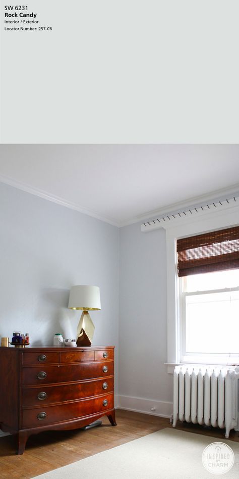
● SW 9654 Rock Candy
A cool pastel grey-blue, extremely subtle.
Adds Scandinavian calmness while still fitting Japanese simplicity.
● SW 6171 Chatroom
A muted sage-greige with earthy depth.
Green is a core Japandi color due to its connection with nature.
Works with: plants, tatami textures, natural stone.
● SW 9131 Jade Dragon
A smoky green that feels peaceful and grounded.
Ideal for bathrooms, kitchens, study rooms.

5. Best Sherwin-Williams Dark Accents for Japandi
● SW 6991 Black Magic
Not a pure black—soft, charcoal-like.
Perfect for window frames, trims, minimalistic shelves.
● SW 7048 Urbane Bronze
Dark brown-grey with a natural stone undertone.
This is THE Japandi accent color.
Works for: bathroom vanities, doors, bed backdrops.
● SW 7069 Iron Ore
A top choice for Japandi kitchens—deep, grounding, modern.
Pairs with white oak and brass hardware.
SECTION B — BEHR COLORS FOR JAPANDI INTERIORS
Behr has an equally strong range of muted, earthy neutrals that align beautifully with Japandi design principles.

1. Best Behr Whites for Japandi Spaces
● Behr Ultra Pure White (but diluted / paired properly)
When softened with warm décor or paired with greige trims, it can still fit Japandi, but use carefully.
● Behr Swiss Coffee (12% LRV variation recommended)
Creamy, soft, calm, not yellow.
A classic Japandi-approved white.
● Behr Cameo White
A chalky, warm, traditional Japanese-inspired white.
Works well with bamboo, rattan, and natural oak.
2. Best Behr Greiges & Neutrals
● Behr Natural Gray
A neutral grey with warmth—great for Scandi-leaning Japandi homes.
● Behr Wheat Bread
A legendary warm neutral.
Not too brown, not too grey—exactly what Japandi requires.
● Behr Almond Wisp
Light greige with creamy undertones.
Pairs beautifully with linen curtains, cotton rugs, and warm wood flooring.

3. Best Behr Earth-Tone Colors
● Behr Mushroom Bisque
One of the most authentically “mushroom-clay” toned colors.
Matches Japanese interior clay walls.
● Behr Aged Beige
A calm, earthy neutral.
Perfect for living rooms and hallways.
● Behr Toasty Gray
Despite its name, it’s a warm greige that feels organic.
4. Best Behr Muted Greens & Blues
● Behr Nature’s Gift
An extremely Japandi green with a dusty quality.
Works for bedrooms, mudrooms, kitchens.
● Behr Grey Mist
A soft grey-green that feels like morning fog.
Pairs with stone décor, pampas grass, raw wood.
● Behr Tranquil Gray
Blue-grey with a muted, almost smoky undertone.

5. Best Behr Dark Japandi Accents
● Behr Cracked Pepper
A perfect charcoal black.
Not harsh, not glossy—very Japandi.
● Behr Carbon Copy
Soft black with deep warm undertones.
Excellent for cabinets and interior doors.
● Behr Midnight Blue
A deep navy-charcoal hybrid.
Works for accent walls and joinery.
Why Sherwin-Williams & Behr Both Work for Japandi
Both brands offer:
- Soft, muted, earth-inspired neutrals
- Warm, minimalist whites
- Natural greens, stone blues, clay taupes
- Soft warm blacks
- Greige and taupe families suitable for Japanese + Scandinavian interiors
The key is choosing shades that feel natural, raw, and calming—not trendy or overly colorful.
Now that we’ve covered the foundational theory and explored the best Japandi-friendly colors from Sherwin-Williams and Behr, it’s time to look at how to apply these colors room-by-room. Japandi style is about balance, purpose, and serenity. Every room has a different emotional goal—and the paint colors you choose should reflect that intention.
Each section below explains:
- The purpose of the room in Japandi philosophy
- The best colors from Sherwin-Williams & Behr
- How to combine them with wood tones, décor, lighting, and textures
- Sample color palettes for different moods (calm, warm, dramatic, ultra-minimal)
Let’s begin.
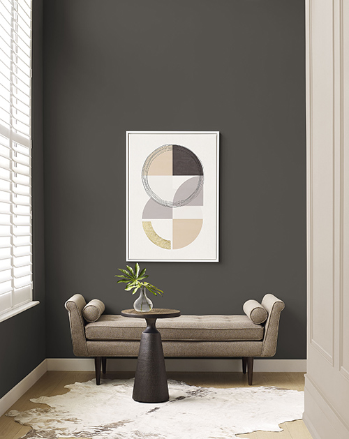
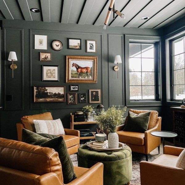
Japandi Living Room Colors
The living room is the heart of Japandi interiors. It needs to feel open, breathable, warm, and grounded—all at the same time. Paint colors here should create calmness without stripping the space of personality.
1. Best Sherwin-Williams Colors for a Japandi Living Room
Here are the strongest candidates:
● SW 9173 Shiitake
The most recommended greige for living rooms because it matches tatami-inspired tones and Scandinavian warm neutrals.
Pairs with: white oak flooring, linen sofas, slatted wood panels.
● SW 7037 Balanced Beige
A warm, medium-depth neutral ideal for rooms with high natural light.
Works with: minimalist shelving, neutral fabrics, cane furniture.
● SW 7551 Greek Villa
A light, soft white that doesn’t feel sterile.
Perfect for: small living rooms, or Scandinavian-leaning Japandi homes.
● SW 7642 Pavestone
Deeper and moodier, for those who love minimalist sophistication.
Best for: accent walls behind TV panels, reading corners, or low-light interiors.
2. Best Behr Colors for a Japandi Living Room
● Behr Wheat Bread
A universally flattering greige that feels cozy yet modern.
Pairs beautifully with Scandinavian textures.
● Behr Almond Wisp
Soft, light greige with balanced undertones.
Perfect for families that want a breathable, airy space.
● Behr Mushroom Bisque
Earthy, warm, and grounding—ideal for Japanese-style low furniture.
● Behr Swiss Coffee
If you prefer a lighter palette, Swiss Coffee is one of the best creamy whites for Japandi.

Japandi Living Room Color Palettes
Calm + Minimalistic Palette
- SW Greek Villa or Behr Swiss Coffee
- SW Shiitake
- Natural oak + linen textures
- Black matte accents
Warm + Cozy Palette
- Behr Wheat Bread
- SW Malabar
- Behr Mushroom Bisque
- Walnut and cane furniture
Modern + Sophisticated Palette
- SW Pavestone
- SW Urbane Bronze
- Behr Cracked Pepper (accents)
- Brushed brass details
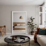
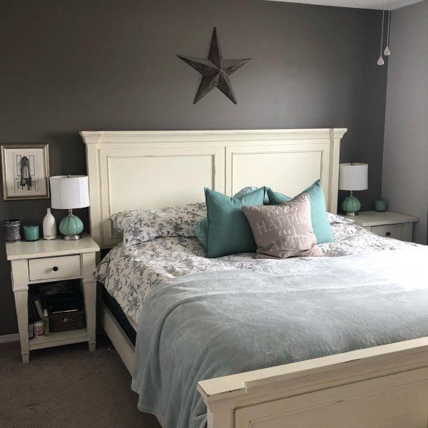
Japandi Bedroom Colors
The bedroom is the most sacred space in Japandi design.
It should evoke peace, softness, and emotional quiet.
Avoid bright whites, high-contrast combinations, or any color that feels “busy.”
1. Best Sherwin-Williams Bedroom Colors
● SW 9109 Natural Linen
One of the calmest Japandi neutrals—perfect for serene bedrooms.
Works with: soft bedding, tatami mats, light wood.
● SW 7650 Ellie Gray
A cool-toned muted grey that feels like early morning fog.
Pairs beautifully with Scandinavian décor.
● SW 9131 Jade Dragon
A smokey, soft green that feels like nature.
Ideal for clients who want a Zen-inspired bedroom.
● SW 9540 Timber Beam
An earthy, chalky white that creates a spa-like bedroom environment.
2. Best Behr Bedroom Colors
● Behr Tranquil Gray
A muted cool grey-blue, perfect for deep rest.
Pairs with minimal artwork and neutral bedding.
● Behr Nature’s Gift
Calming green with a dusty undertone—ideal for plant lovers.
● Behr Aged Beige
Warm and peaceful, perfect for Japandi organic minimalism.
● Behr Grey Mist
A subtle sage-grey blend for a dreamy atmosphere.

Japandi Bedroom Color Palettes
Ultra-Calm Zen Palette
- SW Natural Linen
- Behr Grey Mist
- Beige linen bedding
- Wabi-sabi accessories
Nature-Inspired Palette
- SW Jade Dragon
- Behr Nature’s Gift
- Maple wood furniture
Minimal Wood + White Palette
- SW Timber Beam
- SW Greek Villa
- White oak bed frame, soft drapes
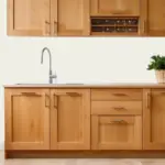
Japandi Kitchen Colors
Japandi kitchens should feel efficient, simple, and clutter-free. The palette must coordinate with wood tones, cabinets, and countertop colors.
1. Best Sherwin-Williams Kitchen Colors
● SW 7069 Iron Ore
Ideal for lower cabinets or kitchen islands.
Sophisticated but still natural.
● SW 7102 White Flour
Perfect for upper cabinets or open-plan kitchens.
● SW 6171 Chatroom
Muted green-greige that complements stone countertops.
● SW 7531 Canvas Tan
Excellent for Scandinavian-style light wood kitchens.
2. Best Behr Kitchen Colors
● Behr Cracked Pepper
A calm charcoal—great for cabinetry or accents.
● Behr Natural Gray
For kitchens with stainless steel or stone tiles.
● Behr Toasty Gray
A warm greige that feels inviting for family meals.
● Behr Cameo White
Simple, clean, and minimalistic for upper cabinets.
Japandi Kitchen Palettes
Light + Airy Scandinavian-Japandi
- SW White Flour
- Behr Cameo White
- Light ash wood cabinets
Earthy + Warm Japanese Style
- SW Chatroom
- Behr Toasty Gray
- Warm walnut cabinets
Modern Japandi (Dark Accents)
- SW Iron Ore
- Behr Cracked Pepper
- Natural stone backsplash
Japandi Bathroom Colors
Bathrooms in Japandi style focus on spas, stillness, and authenticity.
They should feel like an onsen blend with Scandinavian spa energy.
1. Best Sherwin-Williams Bathroom Colors
● SW 9131 Jade Dragon
A top pick for bathrooms because green symbolizes purification.
● SW 9654 Rock Candy
Light grey-blue, resembling cold water in Japanese gardens.
● SW 7037 Balanced Beige
Works beautifully in small bathrooms.
● SW 7647 Crushed Ice
A soft grey that complements stone tiles.
2. Best Behr Bathroom Colors
● Behr Tranquil Gray
Fresh but muted—excellent for small bathrooms.
● Behr Aged Beige
Warmer, spa-like mood.
● Behr Smoky White
Soft, warm white that avoids sterility.
● Behr Glacier Bay
Muted blue—calming and clean.
Japandi Bathroom Palettes
Spa Retreat Palette
- SW Jade Dragon
- Behr Smoky White
- Bamboo accessories
Zen Stone Palette
- SW Rock Candy
- SW Crushed Ice
- Stone tiles and black fixtures
Warm Japan-Tea Palette
- Behr Aged Beige
- SW Balanced Beige
- Walnut cabinetry
Japandi Dining Room Colors
The dining room is where Japandi’s philosophy of “intentional living” shines.
Colors should feel grounded, social, and harmonious.
1. Best Sherwin-Williams Colors for Dining Rooms
● SW 9120 Malabar
Warm, earthy, and perfect for family gatherings.
● SW 9540 Timber Beam
Soft enough for daily use; sophisticated enough for hosting.
● SW 7036 Accessible Beige
Not overly warm, not overly cool—beautiful balance.
2. Best Behr Colors for Dining Rooms
● Behr Wheat Bread
One of the most flexible Japandi colors—great with all wood tones.
● Behr Almond Wisp
Airy and welcoming.
● Behr Toasty Gray
Adds subtle richness and depth.
Japandi Dining Room Palettes
Warm + Organic Palette
- SW Malabar
- Behr Toasty Gray
- Black accents + foliage
Minimal + Contemporary Palette
- SW Timber Beam
- Behr Almond Wisp
- Light wood dining table
Modern Japandi Dark Palette
- SW Accessible Beige
- Behr Cracked Pepper (accent wall)
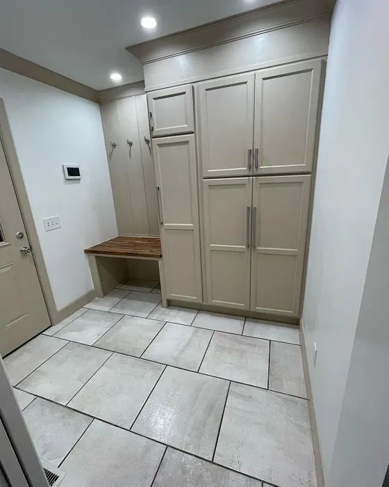
Japandi Entryway & Hallway Colors
Entryways set the tone for the entire home. In Japandi style, the entry must feel grounding and slow-paced.
Best Sherwin-Williams Colors
- SW 7531 Canvas Tan
- SW Pavestone
- SW Shiitake
Best Behr Colors
- Behr Swiss Coffee
- Behr Aged Beige
- Behr Mushroom Bisque
Tips for Entryways
- Use darker colors to create a cozy transition
- Keep décor minimal—wood hooks, low benches
- Add plants for natural energy
Japandi Office or Study Colors
Japandi workspaces should be calm but also help focus.
This means soft muted tones—not bright colors.
Best Sherwin-Williams Office Colors
- SW Rock Candy
- SW Ellie Gray
- SW Jade Dragon
Best Behr Office Colors
- Behr Grey Mist
- Behr Tranquil Gray
- Behr Nature’s Gift
Japandi Office Palette Options
Focused Calm
- SW Ellie Gray
- Light birch desk
Nature Inspiration
- Behr Nature’s Gift
- Bamboo shelving
Minimal Productivity
- SW Rock Candy
- Black accents
Whole-Home Japandi Color Strategy
Designing a home in Japandi style isn’t about choosing random pretty neutrals. It’s about consistency, flow, and emotional harmony. Every room should feel connected to the next—light transitions, gentle variations, and a grounded color base.
Below are the most effective full-home strategies.
1. Choose One Dominant Neutral as Your Backbone Color
This should be a color that appears in:
- Hallways
- Shared spaces
- Trim
- Open-concept areas
- Walls connecting multiple rooms
The backbone color keeps everything cohesive.
Best Japandi Backbone Colors (Sherwin-Williams):
- SW 9173 Shiitake — most versatile warm greige
- SW 7551 Greek Villa — creamy off-white for minimal homes
- SW 7036 Accessible Beige — warm, soft, comforting
- SW 7541 Grecian Ivory — warm beige with light green hue
Best Japandi Backbone Colors (Behr):
- Behr Wheat Bread
- Behr Swiss Coffee
- Behr Almond Wisp
- Behr Toasty Gray
Choose one from these lists and use it generously.
2. Add Supporting Colors for Depth and Movement
These should be used in:
- Bedrooms
- Kitchen islands
- Accent walls
- Bathrooms
- Entryways
- Built-ins or shelves
These tones add emotional variation while keeping the palette coherent.
Sherwin-Williams Supporting Colors:
- SW Malabar
- SW Ellie Gray
- SW Jade Dragon
- SW Rock Candy
- SW Iron Ore (limited use)
Behr Supporting Colors:
- Behr Nature’s Gift
- Behr Grey Mist
- Behr Cracked Pepper (for depth)
- Behr Aged Beige
- Behr Mushroom Bisque
Use only 3–5 supporting colors to avoid visual clutter.
3. Add One Deep Accent Color (Optional But Powerful)
Japandi style rarely uses bold colors—but deeper muted tones offer grounding energy.
Best Deep Japandi Accents (Sherwin-Williams):
- SW Iron Ore
- SW Urbane Bronze
- SW Porpoise
Best Deep Japandi Accents (Behr):
- Behr Cracked Pepper
- Behr Carbon Copy
Use deep colors sparingly:
- Entryway feature wall
- Kitchen island
- Study behind shelving
- Bedroom behind headboard
Even 5–10% of the space is enough.
Wood + Paint Pairing Guide (Essential for Japandi Style)
Japandi design relies heavily on wood. Without the right balance, even the perfect paint color will fall flat. Below is a complete wood-paint pairing guide.
Light Woods (Ash, Pine, Scandinavian Oak)
These woods feel airy, Scandinavian, and organic.
Best Sherwin-Williams Pairings:
- SW Greek Villa
- SW Shiitake
- SW Natural Linen
- SW Canvas Tan
Best Behr Pairings:
- Behr Swiss Coffee
- Behr Almond Wisp
- Behr Grey Mist
Design Mood: bright, airy, minimalist, modern Japanese.
Medium Woods (Maple, Honey Oak, Natural Birch)
Medium-tone woods add warmth and depth.
Best Sherwin-Williams Pairings:
- SW 7036 Accessible Beige
- SW 7541 Grecian Ivory
- SW 9120 Malabar
Best Behr Pairings:
- Behr Wheat Bread
- Behr Aged Beige
- Behr Mushroom Bisque
Design Mood: warm, cozy, family-oriented Japandi.
Dark Woods (Walnut, Ebony, Wenge)
Dark woods add structure and sophistication.
Best Sherwin-Williams Pairings:
- SW Crushed Ice
- SW Ellie Gray
- SW Pavestone
- SW Rock Candy
Best Behr Pairings:
- Behr Tranquil Gray
- Behr Cracked Pepper
- Behr Natural Gray
Design Mood: luxury Japandi, modern Zen spa vibes.
Lighting Effects on Japandi Paint Colors
Lighting is more important in Japandi design than in many other styles, because the palette is subtle and can easily shift with lighting temperature.
Below is a clear breakdown of how different lighting types affect color.
North-Facing Light
Cool and shadowy → makes colors look slightly blue.
Best choices:
- Warm greiges (SW Shiitake, Behr Wheat Bread)
- Beige with warm undertones
- Muted greens
Avoid:
- Cool greys
- Stark whites
South-Facing Light
Warm and bright → makes colors appear lighter and warmer.
Best choices:
- Cool greys (Rock Candy, Ellie Gray)
- Soft whites
- Sage greens
Avoid:
- Ultra-warm beiges (may look yellow)
East-Facing Light
Warm in the morning, cool by afternoon.
Best choices:
- Balanced neutrals
- Light greiges
- Warm whites
Great for bedrooms and kitchens.
West-Facing Light
Cool early, very warm sunset light later.
Best choices:
- Warm neutrals
- Warm greens
- Clay-toned tans
Avoid:
- Bright whites (can turn orange at sunset)
Artificial Lighting Guide
Warm LED (2700K–3000K)
Softens cool colors
Makes warm colors feel cozier
Best for bedrooms and living rooms
Neutral LED (3500K–4000K)
Ideal for kitchens and offices
Shows colors more accurately
Works well with greens and greiges
Cool LED (5000K+)
Avoid for Japandi
Makes rooms feel sterile
Kills organic warmth
Whole-Home Japandi Color Maps (Sherwin-Williams Version)
Below are ready-to-use blueprints showing exactly where each color should go.
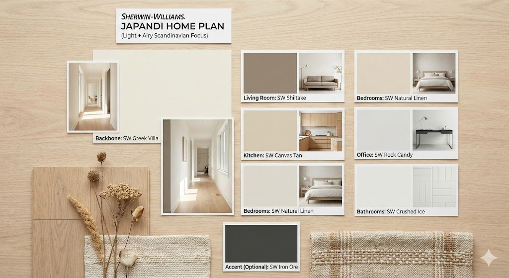
Sherwin-Williams Japandi Home Plan (Light + Airy Scandinavian Focus)
- Backbone: SW Greek Villa
- Living Room: SW Shiitake
- Kitchen: SW Canvas Tan
- Bedrooms: SW Natural Linen
- Office: SW Rock Candy
- Bathrooms: SW Crushed Ice
- Accent (Optional): SW Iron Ore
Mood: minimal, bright, organic.
Sherwin-Williams Japandi Home Plan (Warm + Grounded Japanese Focus)
- Backbone: SW Accessible Beige
- Entryway: SW Pavestone
- Living Room: SW Malabar
- Kitchen: SW Chatroom
- Bedrooms: SW Jade Dragon
- Bathrooms: SW Rock Candy
- Accent: SW Urbane Bronze
Mood: calming, earthy, modern.
Whole-Home Japandi Color Maps (Behr Version)
Behr Japandi Home Plan (Soft + Minimal)
- Backbone: Behr Swiss Coffee
- Living Room: Behr Wheat Bread
- Bedrooms: Behr Grey Mist
- Kitchen: Behr Natural Gray
- Bathrooms: Behr Tranquil Gray
- Accent: Behr Cracked Pepper
Mood: clean, calm, spa-inspired.
Behr Japandi Home Plan (Warm + Organic)
- Backbone: Behr Almond Wisp
- Living Room: Behr Mushroom Bisque
- Kitchen: Behr Toasty Gray
- Bedrooms: Behr Aged Beige
- Office: Behr Nature’s Gift
- Accent: Behr Carbon Copy
Mood: natural, cozy, authentic.
Final Japandi Color Combinations (Cross-Brand Pairings)
If you use both Sherwin-Williams and Behr in the same home, here are palettes that blend perfectly.
Combo 1 — Warm Organic Minimalism
- SW Shiitake
- Behr Wheat Bread
- SW Malabar
- Behr Mushroom Bisque
Perfect for homes with medium wood tones.
Combo 2 — Light, Scandinavian Japandi
- SW Greek Villa
- Behr Swiss Coffee
- SW Crushed Ice
- Behr Grey Mist
Best for small homes or apartments.
Combo 3 — Modern Dark Japandi
- SW Iron Ore
- SW Ellie Gray
- Behr Cracked Pepper
- Behr Natural Gray
For dramatic Japandi lovers.
Combo 4 — Nature-Inspired Zen
- SW Jade Dragon
- Behr Nature’s Gift
- SW Grecian Ivory
- Behr Almond Wisp
A beautiful botanical-inspired palette.
Japandi Styling Tips to Match Your Paint Colors
Paint is only half the story—Japandi styling needs specific material choices to complete the aesthetic.
Use Natural Materials
- Linen
- Wool
- Organic cotton
- Japanese paper
- Ceramic
- Clay
- Cane
- Bamboo
These materials support muted color palettes.
Keep the Room Silently Balanced
Japandi uses the rule of:
30% wood + 30% soft textiles + 20% neutrals + 10% black accents + 10% nature
Choose Low, Horizontal Furniture
Inspired by Japanese interiors, use:
- Low beds
- Low sofas
- Low coffee tables
This enhances calmness.
Avoid Over-Decorating
Japandi is intentional.
Every item should have a purpose.
Choose 1 or 2 pieces of decor—not 10.
Conclusion: Why Japandi Colors Matter So Much
Japandi design is successful not because of furniture or art but because of how colors build emotional harmony. The right paint palette instantly transforms your home into a place of peace, balance, and natural beauty.
Sherwin-Williams and Behr both offer exceptional Japandi-friendly colors—from warm greiges like SW Shiitake and Behr Wheat Bread to calm greens like SW Jade Dragon and Behr Nature’s Gift, all the way to dramatic darks like SW Iron Ore and Behr Cracked Pepper.
Use the 3-part strategy:
- Choose one backbone color
- Add supporting hues
- Add a deep grounding accent (optional)
And combine it with lighting choices, natural wood tones, and authentic textures.
By following this complete guide, you can create a cohesive, serene, timeless Japandi home—whether you’re painting one room or your entire house.