
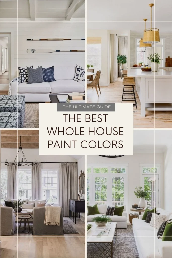
Choosing the perfect paint color for a single room is hard enough. But when you’re trying to find the right paint colors for your entire house, the challenge gets ten times bigger — especially if you want your home to feel cohesive, calm, and beautifully designed.
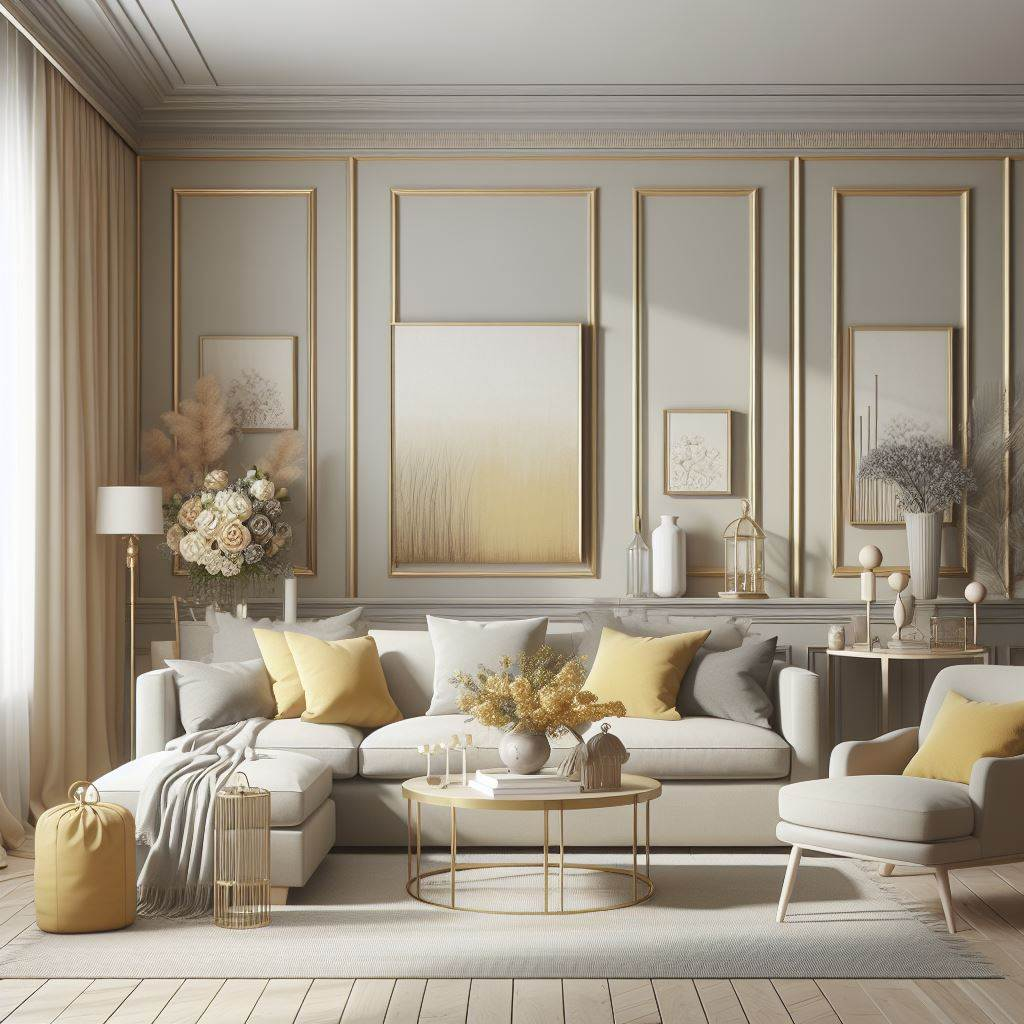
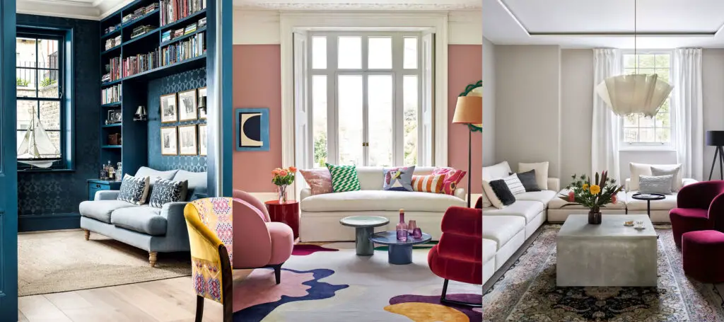
If you’ve ever walked through a home and felt instantly at peace without knowing why, chances are the color palette played a big part in that feeling. A whole-house color scheme doesn’t mean every room needs to be the exact same shade — but it does mean that all your colors should flow together like a well-composed symphony.
In this post, we’ll break down everything you need to know about choosing 10 versatile and stunning paint colors that work harmoniously across an entire home. From cozy neutrals to designer-favorite whites, from how lighting affects color to how to pair shades like a pro — this guide will walk you through it all.
Let’s get started with the basics.
🎨 Understanding Whole-House Color Palettes
What is a Whole-House Color Palette?
Think of your home like a novel — every room is a chapter, but they all need to feel like part of the same story. A whole-house color palette is a curated set of paint colors that work well together and create a sense of flow from one room to the next.

Pro Grade Paint Roller Kit, Brush & Roller for Professionals & Homeowners
Perfect for smooth finishes on your interior walls. Ideal for home improvement enthusiasts!
Buy Now on AmazonInstead of painting each room based on individual preferences (like bright yellow in the kitchen, teal in the office, red in the dining room), you select a cohesive range of tones — typically anchored by a few core neutrals and complimented by carefully chosen accents.
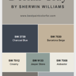
Also Read: 10 Whole House Color Schemes by Sherwin Williams
This approach doesn’t just look better — it feels better. It makes your space feel calm, intentional, and professionally designed.

Why Go With a Unified Color Scheme?
Here’s what a well-chosen color palette can do for your home:

Rust-Oleum 367605 Home Interior Floor Coating Kit, Semi-Gloss Black
Ideal for updating outdated flooring at a fraction of the cost of replacement and adheres without stripping, sanding or priming.
Buy Now on Amazon- ✅ Creates Visual Harmony – Rooms don’t feel disjointed or chaotic.
- ✅ Boosts Perceived Space – A cohesive color flow makes small homes feel larger.
- ✅ Increases Resale Value – Buyers prefer a calm, consistent backdrop.
- ✅ Simplifies Decorating – You can mix and match furniture and décor easily.
- ✅ Reduces Overwhelm – Fewer decisions, more confidence.
A well-designed palette is one of the most affordable ways to make your home feel like it’s had a designer’s touch — even if you’re DIY-ing everything.
Common Mistakes to Avoid
Before we dive into color picks, let’s talk about pitfalls:
- ❌ Using Too Many Bold Colors: They can clash and create visual fatigue.
- ❌ Ignoring Undertones: Cool vs. warm undertones matter more than you think.
- ❌ Choosing Colors in Isolation: Colors need context — test them in your actual space!
- ❌ Overlooking Lighting: Natural light, artificial light, and direction all affect how a color looks.
🧩 How to Choose a Whole-House Color Palette
Choosing colors for your entire home isn’t just about picking your favorite shade from a swatch. It’s about balance, light, and livability. Here’s a step-by-step breakdown.
Must Read: Sherwin Williams Peppercorn Color Palette
Step 1: Start With a Base Color
Your base color is the backbone of your whole palette — it’s the one that sets the tone (literally) for the rest of your home.
🧱 Most popular base options:
- Greige (gray + beige)
- Warm whites
- Soft taupes
- Light grays

You’ll use your base color in your most open and connected spaces: living rooms, hallways, open-plan areas, and entryways.
💡 Pro tip: Pick a base color that looks good in both natural and artificial light. It should be flexible enough to work in any room.
Step 2: Add Complementary and Accent Colors
Now that you have a strong neutral base, add one or two complementary shades and a few accents for personality.
Use the 60-30-10 rule:
- 60% base neutral
- 30% complementary colors (kitchen, bedrooms, baths)
- 10% bold accent shades (feature walls, powder rooms, cabinets)
🎯 Choose complementary colors that share a similar temperature (warm or cool) with your base shade.
Step 3: Factor in Lighting and Exposure
Lighting can make or break a paint color. Here’s how it affects what you see:
🌞 North-facing rooms: Light is cooler → colors can look grayer.
🌤️ South-facing rooms: Warm light → colors feel richer.
🌅 East-facing rooms: Warm morning light → good for warm tones.
🌃 West-facing rooms: Cool in morning, warm in evening → test colors in both times!
🧪 Always swatch colors on at least two walls and check them at different times of day.
Step 4: Test Before You Paint
We can’t stress this enough: don’t trust the swatch alone. What looks like a soft beige on a tiny chip can turn full-blown yellow once it’s on your wall.
🖼️ Try these testing methods:
- Use large peel-and-stick samples (like Samplize)
- Paint a 24×24 inch test patch
- Observe the patch during daylight, evening, and artificial light
- Test near trim, floor, and existing furniture
🏠 10 Best Paint Colors for Your Whole House (2025 Edition)
Now that we’ve covered the theory, it’s time for the good stuff — the colors.
These 10 tried-and-true shades are loved by designers, adored by homeowners, and praised by real estate pros for their versatility and impact.
Each one offers something unique, but all can work beautifully across an entire home.
1. Sherwin-Williams Alabaster (SW 7008)
Why we love it:
Alabaster is a creamy off-white with just enough warmth to keep things cozy — not stark or cold like hospital white.
- LRV: 82 → Reflects tons of light
- Undertones: Subtle yellow-beige warmth
- Best for: Living rooms, hallways, trim, ceilings
💡 Pairs beautifully with deep greens, charcoal gray, and warm woods.

2. Benjamin Moore Revere Pewter (HC-172)
Why it works:
A beloved greige that adapts beautifully in different lighting. Neither too gray nor too beige — the Goldilocks of paint colors.
- LRV: 55.5 → Mid-range brightness
- Undertones: Warm green/greige
- Best for: Open-plan spaces, dining rooms, bedrooms
🖌️ Looks especially beautiful against white trim or navy blue accents.

3. Behr Swiss Coffee (12)
Why it’s popular:
Swiss Coffee is a soft, creamy white with a hint of warmth that makes any space feel inviting.
- Undertones: Slightly yellow, very subtle
- Best for: Kitchens, ceilings, entire walls
- Great with: Black accents, brass hardware
🏠 Many designers use this as a go-to whole-home white for its livable, warm feel.

4. Farrow & Ball Cornforth White
Why it stands out:
Despite its name, this isn’t a white — it’s a pale gray with warm undertones that shifts with the light in magical ways.
- Mood: Calm, neutral, sophisticated
- Great for: Modern homes, minimalist spaces
- Pairs with: Warm taupe, darker grays, sage greens
✨ Looks luxurious without being flashy.

5. Benjamin Moore Classic Gray (OC-23)
A gentle favorite:
Classic Gray is a soft, warm gray that almost reads as off-white in bright light — incredibly versatile and calming.
- Undertones: Warm taupe
- Best for: Bedrooms, offices, bathrooms
💫 Use it in rooms where you want serenity without sterility.

The ultimate crowd-pleaser:
6. Sherwin-Williams Agreeable Gray (SW 7029)
If you want a “can’t-go-wrong” paint color, this is it. Agreeable Gray is the most recommended neutral by interior designers for a reason.
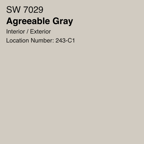
- LRV: 60 → Bright enough for most rooms
- Undertones: Warm greige with a touch of beige
- Works in: Every room — literally
💬 Why it’s amazing: It plays well with both cool and warm tones, making it easy to layer in furniture, artwork, or accent walls without clashing.
🖤 Looks sharp with black accents and cozy with warm wood finishes.
7. Clare Paint Timeless
A modern neutral for modern homes:
Timeless by Clare Paint is a designer-curated off-white that gives your home a clean, warm canvas without looking boring.

- Eco-friendly & Low-VOC: Great for families and sensitive spaces
- Finish: Velvety smooth with great coverage
- Undertones: Just the right balance of warm and cool
🌿 Bonus: Clare’s website helps you order samples that actually look like real paint, not printed swatches.

8. Valspar Oyster Pearl
The budget-friendly beauty:
This warm neutral reads like a creamy beige with subtle gray undertones. It’s often overlooked — but once people discover it, they fall in love.

- Best for: Older homes, transitional interiors, budget remodels
- Why it works: It brings warmth and elegance without overpowering a space
- Pairs well with: Earthy greens, navy, and rich browns
💡 A smart pick for rental properties or house flippers.

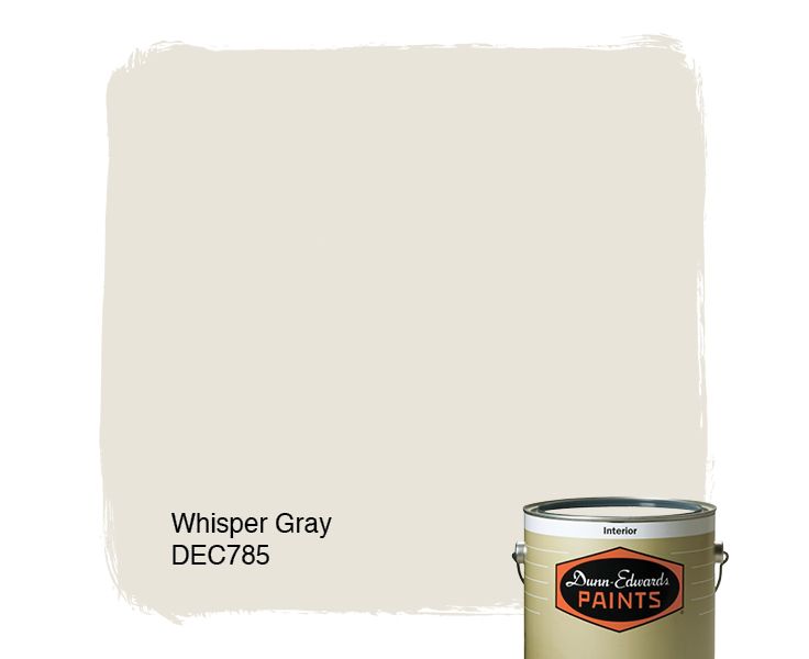
9. Dunn-Edwards Whisper
Soft and serene:
Whisper is a dreamy off-white that brings softness and a feeling of light to every room it touches.
- Undertones: Slight gray/violet
- Best used in: Bedrooms, bathrooms, and south-facing rooms
🛁 Want a spa-like feel in your bath or a light, airy vibe in the bedroom? Whisper does it all.
10. Benjamin Moore White Dove (OC-17)
The holy grail of white paint:
No list of whole-house paint colors is complete without White Dove. It’s crisp but never cold — a warm white that works everywhere.
- LRV: 85.38 → Super bright and reflective
- Perfect for: Walls, ceilings, trim, cabinets
- Pairs with: Literally anything
💎 This is the go-to color for interior designers who want a white that flatters every surface, from plaster to drywall to woodwork.
🛋️ Room-by-Room Color Strategy
Even when using a unified palette, you’ll want to adjust the way you use colors depending on the room. Here’s how to nail it:
Living Room & Family Room
- Use your base neutral as the wall color
- Add warmth with wood tones, rugs, and textiles
- Accent walls optional — go deeper in tone, not bolder in hue
🎨 Top picks: Agreeable Gray, Alabaster, Classic Gray
Kitchen & Dining Room
- White or off-white walls give a clean backdrop for cabinets and tile
- Consider painting your kitchen island a contrasting color
- Dining rooms love mood: think warm grays or soft taupes
🍽 Try: White Dove on walls, Navy or deep green for cabinets or island
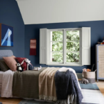
Bedrooms
- Bedrooms benefit from muted, soft, and relaxing hues
- Consider layering tone-on-tone bedding and furniture for depth
- Accent walls behind headboards can work well
🛏️ Go for: Whisper, Revere Pewter, or Classic Gray
Bathrooms
- Light colors help reflect natural light and enlarge small spaces
- For a spa feel, go with blue-grays or green-grays
- Paint ceilings the same color for a seamless look
🛁 Perfect picks: Cornforth White, Whisper, Swiss Coffee
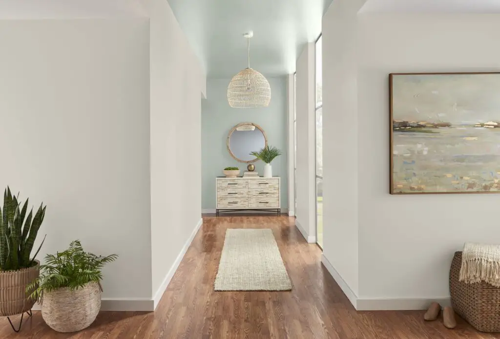
Entryways & Hallways
- This is where your base color shines — make it bright and welcoming
- Add personality with a bold front door or statement light fixture
- Hallways love light neutrals that carry the flow
🚪 Suggestions: Alabaster, Timeless, or Oyster Pearl
Must Read: Best Bathroom Paint Colors
🎯 Pro Tips for a Cohesive Look
Using Trim and Ceiling Colors to Your Advantage
A huge part of whole-house cohesion comes from consistency in trim, doors, and ceilings.
- Best trim whites: White Dove, Simply White, Chantilly Lace
- Flat finish for ceilings, semi-gloss or satin for trim
- Keep trim the same color throughout for a designer-like polish
Tying Rooms Together With Shared Elements
Even if each room uses a slightly different shade, it all works together when you:
- Repeat the same white trim and door color
- Use coordinated flooring or rugs
- Repeat a signature color in pillows, curtains, or art
🖼️ Example: Use Revere Pewter in the living room, Classic Gray in the bedroom, and link them with the same navy accent pillows.
Accent Walls – Yes or No?
Accent walls can be stunning — if done right.
✅ Do:
- Use them in bedrooms or dining rooms
- Pick a deeper version of your wall color (not a whole new bold hue)
- Anchor them with large furniture or art
❌ Don’t:
- Overuse them
- Pick random contrast colors
- Do one in every room — it kills the flow
Paint Finish Guide by Room
Here’s the finish breakdown that designers and painters swear by:
| Room | Wall Finish | Trim/Ceiling |
|---|---|---|
| Living Room | Eggshell | Semi-gloss (trim), Flat (ceiling) |
| Kitchen | Satin or Semi-gloss | Semi-gloss |
| Bathroom | Satin or Pearl | Semi-gloss |
| Bedroom | Eggshell or Matte | Semi-gloss (trim), Flat (ceiling) |
| Hallways | Eggshell | Semi-gloss |
📸 Real-Life Examples and Mood Boards
Let’s put theory into practice. Here are a few curated palettes with real-world inspiration.
🏡 Modern Farmhouse Feel
Palette:
- Walls: Alabaster
- Trim: White Dove
- Accent: Sherwin-Williams Iron Ore (for doors and shiplap)
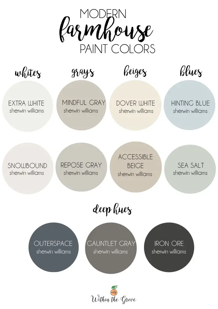
Mood: Cozy, warm, and welcoming — rustic yet polished.
🏙️ Urban Minimalist Condo
Palette:
- Walls: Classic Gray
- Trim: Chantilly Lace
- Accent: Black window frames or shelving
Mood: Sleek, modern, neutral — a blank canvas for art and furniture.
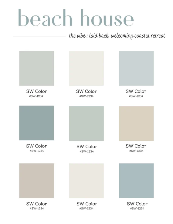
🌊 Coastal Retreat Vibe
Palette:
- Walls: Whisper
- Accent: Sea Salt by Sherwin-Williams
- Trim: Simply White
Mood: Relaxing, breezy, perfect for beach towns or airy interiors.
🔁 What If You Have Different Flooring in Each Room?
This is a common challenge, especially in older homes or during phased renovations. You might have hardwood in the living room, tile in the kitchen, and carpet in the bedrooms. Can you still use a whole-house color palette?
Absolutely — here’s how:
✅ Stick to a Consistent Undertone
No matter how different your floors look, they likely lean toward warm (yellow/red) or cool (blue/gray). Your paint should match that undertone.
- Warm oak floors? Try creamy beiges or warm grays like Agreeable Gray.
- Cool gray tile? Go with soft cool neutrals like Classic Gray or Cornforth White.
✅ Use Transitional Spaces Smartly
- Hallways or stairwells can act as buffer zones using your base color to tie two different rooms together.
- Rugs and furniture in shared colors help bridge the visual gap.
✅ Anchor the Rooms With Shared Decor
Even with flooring changes, using the same trim color, ceiling paint, or drapery tone throughout keeps the home unified.
📦 Whole-House Paint Planning Checklist
Before you break out the roller and painter’s tape, let’s plan like a pro. Here’s what you need to prepare:
🎯 1. Define Your Core Palette
- Choose 1 base neutral
- Pick 1-2 complementary hues
- Select up to 2 accent colors
🖌️ 2. Calculate How Much Paint You Need
- One gallon covers about 350–400 sq. ft.
- Account for two coats per surface
- Don’t forget ceilings, trim, doors, and closets
🧰 3. Gather Your Tools
- Paint roller and tray
- Angled brush for trim
- Painter’s tape
- Drop cloths
- Sandpaper (for smoothing rough patches)
- Caulk for filling gaps in trim or baseboards
💰 4. Budget Breakdown
| Item | Estimated Cost |
|---|---|
| Paint (walls) | $35–$70/gallon |
| Paint (trim/doors) | $40–$80/gallon |
| Supplies/tools | $50–$150 |
| Labor (optional) | $2–$6/sq. ft. |
💡 Bonus Tip: Many paint stores offer discounts when buying 5+ gallons — ask!
🙋♀️ Frequently Asked Questions
Q: Can I still use bold colors in a whole-house scheme?
Yes, but use them strategically. Think of them as accessories — not the whole outfit. Bold hues work well in powder rooms, laundry rooms, or as cabinet colors.
Q: What’s the best paint color for resale value?
Neutral and warm colors appeal to the broadest audience. Top resale favorites include:
- Agreeable Gray
- Alabaster
- Classic Gray
- White Dove
(Related: How to Choose Paint Colors That Boost Resale Value)
Q: How often should I repaint interior walls?
Typically every 5–7 years, or sooner in high-traffic areas. For resale, fresh paint gives an instant refresh.
Q: What’s the difference between warm and cool neutrals?
- Warm neutrals have undertones of red, orange, or yellow — they feel cozy and welcoming.
- Cool neutrals have undertones of blue or gray — they feel crisp and modern.
Q: Should trim be the same color throughout the house?
Yes, especially in a whole-house color palette. It creates visual continuity and simplifies your color plan.
📚 Bonus: Color Psychology Insights
Ever wonder why you feel relaxed in one room and energized in another? Color is influencing you more than you think.
🔵 Blues and Blue-Greens
- Calming, serene, peaceful
- Great for bedrooms, bathrooms
🟢 Greens
- Balancing, earthy, fresh
- Good for kitchens, sunrooms, and home offices
🟤 Warm Neutrals (Beige, Taupe, Greige)
- Comforting, welcoming
- Ideal for shared family spaces and entryways
⚪ White and Off-White
- Clean, open, pure
- Makes small spaces feel bigger
- Encourages creativity in offices and studios
🌍 Eco-Friendly Paint Options (2025 Guide)
Looking for a safer, healthier way to paint your home? Here are your best bets:
🟢 Low-VOC and Zero-VOC Paint Brands
- Clare Paint – Chic, low-tox, designer-curated colors
- Benjamin Moore Natura – Zero-VOC and asthma/allergy-friendly
- Sherwin-Williams Harmony – Formaldehyde-reducing technology
- ECOS Paints – Completely non-toxic, ideal for nurseries
🌿 Why Go Green?
- Better indoor air quality
- Safer for kids and pets
- No strong odors or off-gassing
💡 Pro tip: Check labels — “Low-VOC” can still mean up to 50g/L. Look for paints with 5g/L or less.
🧠 Final Thoughts: Choosing the Right Paint Colors
Picking a whole-house color palette isn’t about sticking to one boring shade — it’s about finding colors that reflect your personality while creating harmony across your space.
From soft whites like White Dove, to designer-favorite greiges like Revere Pewter, and cozy neutrals like Agreeable Gray, the options are endless — but when done right, the result is magical.
A unified color palette doesn’t just look good. It makes your home feel intentional, inviting, and peaceful — whether you’re hosting guests, relaxing after work, or getting ready to sell.
So take your time. Test your samples. Walk through your space during morning and evening. Use color as the quiet foundation that holds your entire home together.
💬 We’d Love to Hear From You!
What’s your favorite whole-house paint color?
Have you used any of these in your own home — or are you about to try one? Leave a comment below and let’s chat!
📌 If you found this post helpful, don’t forget to save it on Pinterest or share it with a friend planning a home makeover.
And if you’re exploring more home design tips, don’t miss:


