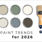
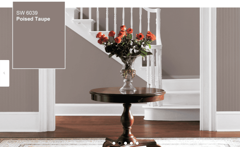
Let’s talk about neutrals for a moment.
Not the boring kind.
Not the “I picked this because I was scared to choose anything else” kind.
But the kind of neutral that actually does something for your space.
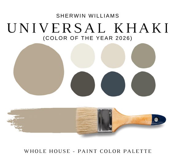
That’s where Sherwin-Williams Universal Khaki (SW 6150) comes in.
At first glance, it might seem simple. Almost understated. But spend a little time with it, and you’ll realize this color has layers. Depth. Personality. It doesn’t shout for attention — it earns it quietly.

Pro Grade Paint Roller Kit, Brush & Roller for Professionals & Homeowners
Perfect for smooth finishes on your interior walls. Ideal for home improvement enthusiasts!
Buy Now on AmazonAnd that’s exactly why Sherwin-Williams named it Color of the Year 2026.
This isn’t just another beige.
This is a color that makes rooms feel grounded. Calm. Intentional. Like someone really thought things through.
So let’s slow down and walk through it together — what Universal Khaki really is, how it behaves in real homes, and whether it’s the right choice for your space.
What Universal Khaki Actually Looks Like (In Real Life)
The word “khaki” can be misleading.

Rust-Oleum 367605 Home Interior Floor Coating Kit, Semi-Gloss Black
Ideal for updating outdated flooring at a fraction of the cost of replacement and adheres without stripping, sanding or priming.
Buy Now on AmazonIf you’re picturing stiff uniforms or dull, lifeless tan walls — forget that image completely.
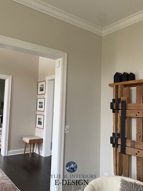
Universal Khaki is warm, earthy, and surprisingly refined.
It lives somewhere between beige and soft brown, but it never feels heavy or muddy. It’s a mid-tone neutral that knows how to stay in its lane. Not too light. Not too dark. Just… balanced.
It has warmth, yes.
But it also has restraint.
And that balance is what makes it work in so many different spaces.
Why Designers Are Falling for Universal Khaki
Here’s the thing.
Design trends come and go fast. One year it’s cool grays. The next year it’s dramatic moody walls. Then suddenly everyone wants white again.
Universal Khaki feels different.
It doesn’t chase trends.
It doesn’t beg for attention.
It sits quietly in the background and lets everything else shine — your furniture, your art, your textures, your life.
That’s exactly why designers love it.
It’s dependable.
It’s flexible.
And it doesn’t age poorly.

Understanding the Undertones (This Part Matters)
Let’s get a little technical — but not boring.
Universal Khaki has warm yellow undertones, which give it that cozy, welcoming feel. But here’s the twist: there’s also a soft olive-green influence hiding underneath.
You might not notice it right away.
But your eyes do.
That subtle green note is what keeps the color from looking flat or overly golden. It gives Universal Khaki a natural, earthy quality — like clay, sand, or sun-warmed stone.
And yes, lighting changes everything.
- In bright natural light, it feels warmer and more golden
- In softer or north-facing light, it leans more neutral and grounded
- In low light, it deepens and becomes cozy and enveloping
That’s not a flaw.
That’s depth.
Light Reflectance Value: Why the Room Feels the Way It Does
Universal Khaki has an LRV of around 40, which puts it right in that sweet spot.
It reflects enough light to keep rooms feeling open.
But it absorbs enough light to feel rich and comforting.
This is why it works so well in living rooms, bedrooms, and spaces where you want to relax.
It doesn’t bounce light aggressively.
It holds it gently.
Why Sherwin-Williams Chose It as Color of the Year 2026
This choice wasn’t about drama.
It was about how people actually want to live.
Homes today aren’t just showpieces. They’re offices. Retreats. Safe spaces. Gathering places. And people are craving colors that feel stable and reassuring — not overwhelming.
Universal Khaki represents:
- Comfort without boredom
- Warmth without heaviness
- Style without trend-chasing
It’s a color that feels familiar in the best way. Like something you’ve always liked but never had a name for.
Where Universal Khaki Truly Shines
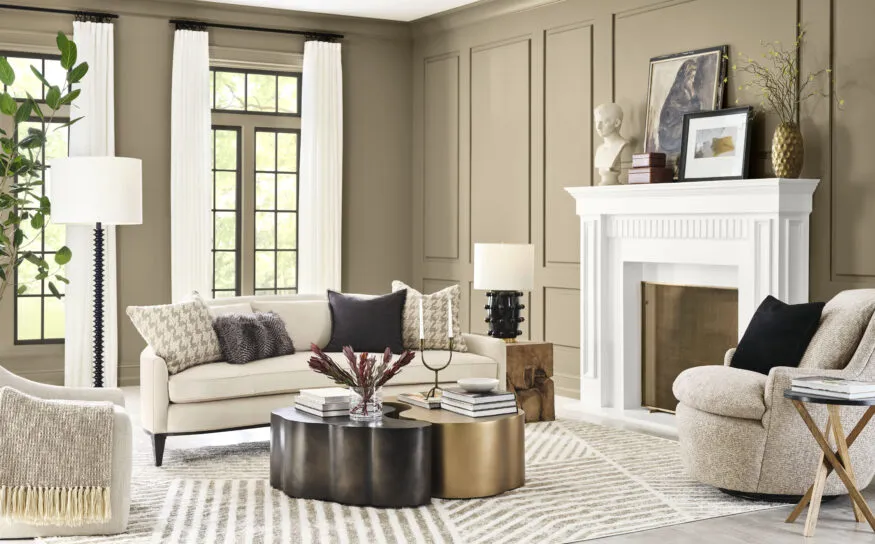
Living Rooms
This is where Universal Khaki feels most at home.
It creates a backdrop that feels warm and welcoming without stealing attention. Sofas look better against it. Wood tones glow. Artwork stands out.
And best of all?
It doesn’t get tiring.
You can live with this color every day — and still love it years from now.
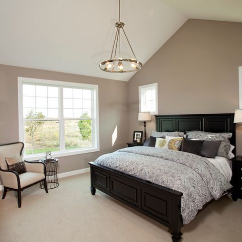
Bedrooms
If you want your bedroom to feel calm, grounded, and restful, Universal Khaki is a beautiful choice.
It pairs effortlessly with soft whites, warm linens, layered bedding, and natural textures. The result feels peaceful. Grown-up. Thoughtful.
Not cold.
Not stark.
Not trendy.
Just comfortable.
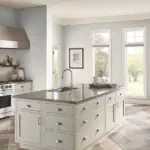
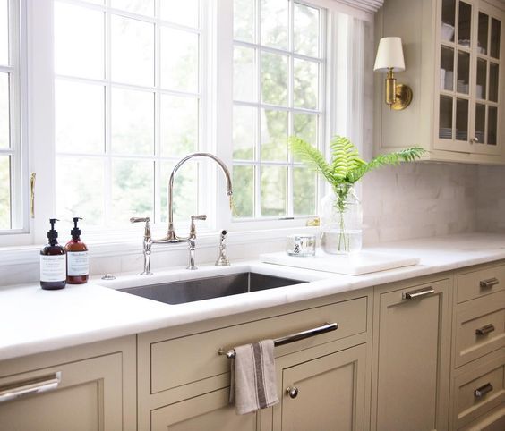
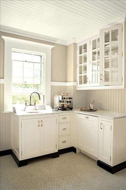
Kitchens and Cabinets
This is where Universal Khaki surprises people.
On cabinets, islands, or built-ins, it feels elevated and intentional. Especially when paired with brass hardware, wood accents, or stone countertops.
It’s neutral — but it’s not forgettable.
Accent Walls and Built-Ins
If you’re not ready to commit to an entire room, Universal Khaki works beautifully as an accent.
It adds depth without drama.
Character without chaos.
Perfect for shelves, fireplaces, or statement walls that still feel timeless.
Exterior Use
Yes, it works outside too.
On exteriors, Universal Khaki feels classic and grounded. It pairs beautifully with brick, stone, darker trims, and natural landscaping.
It doesn’t scream “look at me.”
It quietly elevates the entire home.
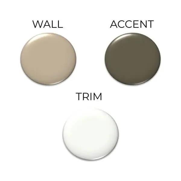
Color Pairings That Just Work
This is where Universal Khaki really earns its name.
With Whites
Warm whites are your best friend here.
Think creamy, soft whites — not icy or blue-leaning ones. The contrast feels clean without being harsh.
With Earth Tones
Olive greens. Soft browns. Muted blues. Warm terracottas.
These combinations feel natural and cohesive, like they were always meant to be together.
With Bold Accents
Want drama?
Universal Khaki can handle it.
Deep navy. Charcoal. Even rich reds or dark greens. It holds its ground while letting those colors shine.
The Pros (Why People Love It)
- Warm and inviting without being boring
- Works in many styles — modern, traditional, transitional
- Pairs beautifully with wood, metal, and stone
- Timeless, not trendy
- Easy to live with long-term
The Cons (Let’s Be Honest)
No color is perfect.
- In very dark rooms, it can feel heavier
- It doesn’t work well with icy, cool whites
- If you want a bold, dramatic statement color, this isn’t it
But if you want something that feels thoughtful, calm, and timeless — those “cons” might not matter at all.
How to Make Universal Khaki Look Its Best
Here’s the secret.
Don’t rush it.
Sample it.
Watch it in morning light.
See how it looks at night.
Pair it with texture. Natural materials. Warm finishes.
And trust your instincts.
If it makes your space feel calmer, warmer, and more you — then it’s doing its job.
Final Thoughts
Universal Khaki (SW 6150) isn’t trying to impress anyone.
And that’s exactly why it works.
It’s the kind of color that grows on you. The kind that makes a room feel settled. Finished. Like it belongs.
If you’re tired of chasing trends.
If you want a neutral that feels intentional, not safe.
If you want your home to feel warm, grounded, and timeless…
Universal Khaki might just be the color you didn’t know you were looking for.