Imagine the serenity of ocean waves, the richness of sea glass, and the calm of a forest lake… captured in paint colors that instantly transform your home. Blue-green hues balance cool and warm tones in a way few other shades can — they’re simultaneously soothing, refreshing, and endlessly versatile.
Today we’re diving deep into the best blue-green paint colors from two of the most loved paint brands in the world:
- 🌊 Sherwin-Williams — known for timeless, layered, designer-approved palettes
- 🌿 Behr — known for trend-forward, lively hues that play beautifully with light
We’ll explore the colors, how they feel in different rooms, how to pair them with design styles, and how to choose the right hue for your vibe.
Let’s dive in!

Why Blue-Green Colors Are Magical
Before we begin the color list, let’s talk about why these hues are so powerful:

Pro Grade Paint Roller Kit, Brush & Roller for Professionals & Homeowners
Perfect for smooth finishes on your interior walls. Ideal for home improvement enthusiasts!
Buy Now on Amazon🌟 Blue-Green = Balance
Blue brings:
- Calm
- Spaciousness
- Coolness
Green brings:
- Nature
- Warmth
- Comfort
So a blue-green shade often:
✅ Feels relaxing
✅ Works in large and small spaces
✅ Plays well with neutrals and wood tones
✅ Adds character without overwhelming
Whether you want a coastal look, a modern vibe, or a classic feel, blue-green hues can do it.

Rust-Oleum 367605 Home Interior Floor Coating Kit, Semi-Gloss Black
Ideal for updating outdated flooring at a fraction of the cost of replacement and adheres without stripping, sanding or priming.
Buy Now on AmazonHow to Use Blue-Green Colors
Blue-greens work beautifully in:
- Living rooms & family rooms
- Bedrooms & bathrooms
- Kitchens
- Accent walls
- Cabinets & islands
- Entryways & foyers
- Trim or millwork (for a subtle pop)
They pair wonderfully with:
✨ Whites and warm neutrals
✨ Natural wood elements
✨ Brass or bronze hardware
✨ Textured textiles (like linen and woven baskets)
Okay — now for the good stuff.
BEST BLUE-GREEN COLORS FROM SHERWIN-WILLIAMS
Sherwin-Williams has such a rich range of blue-greens — from soft sea glass to deep moody hues.
Here are the top picks designers keep coming back to:
🩵 1. Rainwashed (SW 6211)
This is arguably one of the most loved blue-greens of the last decade.
Why designers adore it:
✔ A soft, sea-glass vibe
✔ Works in small and large rooms
✔ Super calming — great for bedrooms & bathrooms
Feels like: Back-to-nature freshness meets spa tranquility.
Pair it with:
🤍 Creamy whites
🌾 Natural wood
✨ Soft linen
Perfect for: Primary bedrooms, bathrooms, guest rooms, coastal living rooms.
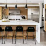
🌿 2. Sea Salt (SW 6204)
This color is dreamy and ethereal — like a soft mist by the shore.
What makes it special:
✔ Slightly more green than Rainwashed
✔ Breathable and light
✔ Doesn’t go pastel
Feels like: Sea breeze + mossy driftwood.
Pair it with:
🤎 Beige or greige neutrals
🪵 Light oak finishes
🧼 White subway tile
Ideal for: Kitchens, bathrooms, whole walls in calming spaces.
🍃 3. Clary Sage (SW 6178)
A muted blue-green that leans earthy.
Why it’s great:
✔ Gentle, natural sophistication
✔ Works in traditional and modern spaces
✔ Less “beach” and more “garden”
Feels like: A herb garden on a calm morning.
Pair it with:
🟫 Warm beiges
🪵 Aged wood
🟡 Brass accents
Great for: Cabinets, accent walls, and cozy living spaces.
🌙 4. Evergreen Fog (SW 9130)
This one is deeper and moodier — perfect when you want drama but still calm.
What it brings:
✔ Cloudy blue + gray + green undertones
✔ Elegant but grounded
✔ Works beautifully with large furniture
Feels like: Forest canopy after rain.
Pair it with:
🩶 Darker trim (like Urbane Bronze)
🤍 Soft whites
🪵 Charcoal or walnut wood
Use it in: Dining rooms, libraries, media rooms, bedrooms.
💙 5. Quietude (SW 6212)
A softer, quieter counterpart to Rainwashed.
Why it stands out:
✔ Understated elegance
✔ Softer — less vibrant
✔ Feels serene without faded look
Feels like: Early morning light on calm water.
Pair it with:
🤎 Warm neutrals
🤍 Creamy whites
🌿 Green foliage accents
Best for: Bedrooms, living rooms, calm reading nooks.
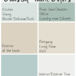
📌 Sherwin-Williams Quick Blue-Green Color List
| Color Name | Feel | Best Use |
|---|---|---|
| Rainwashed | Breezy & spa-like | Bathrooms, bedrooms |
| Sea Salt | Ethereal calm | Kitchens, whole rooms |
| Clary Sage | Earthy & soft | Cabinets, accent walls |
| Evergreen Fog | Moody refinement | Formal rooms, offices |
| Quietude | Gentle tranquility | Lounges, nurseries |
BEST BLUE-GREEN COLORS FROM BEHR
Behr has been stepping up with wonderful blue-green hues that feel fresh, modern, and incredibly livable.
Here are Behr’s best blue-greens that people love:
🌊 1. Beach Glass (Behr MQ3-21)
Behr’s answer to soft sea glass.
What makes it special:
✔ Soft, washed-out vibe
✔ Highly adaptable
✔ Great with neutral palettes
Feels like: Walking on sunlit sand with a breeze off the water.
Pair with:
🤍 Crisp whites
🪵 Driftwood textures
🌿 Plants & woven baskets
Use in: Entryways, kitchens, bathrooms.
🐚 2. Aqua Sky (Behr M440-2)
A dreamy, cloud-light blue-green that’s refreshing without being overwhelming.
Why it works:
✔ Airy and bright
✔ Adds subtle personality
✔ Beautiful in north light
Feels like: A clear summer sky touching the sea.
Pair with:
🤎 Soft taupes
⚪ Classic whites
🟡 Light gold or brass accents
Perfect for: Nurseries, guest rooms, baths.
🌴 3. Island Spa (Behr M470-3)
A balanced teal-leaning shade — richer than Beach Glass but still gentle.
What it brings:
✔ Cool but calm
✔ Works beautifully on cabinets
✔ A hint of sophistication
Feels like: A secluded tropical ocean cove.
Pair with:
🔥 Warm woods
🌾 Jute rugs
⚪ Clean whites
Ideal for: Kitchens, built-ins, accent walls.
🪵 4. Jacuzzi (Behr M470-4)
Richer and more saturated — perfect if you want presence without intensity.
What makes it stand out:
✔ Balanced depth without heaviness
✔ Saturated but serene
✔ Great for feature walls
Feels like: A luxurious spa retreat.
Pair with:
⚪ Crisp white trim
🪵 Dark wood
🟡 Brushed gold accents
Best for: Living rooms, home offices, dining rooms.
💧 5. Blue Agave (Behr P440-1)
A soft, slightly earthy mix.
Why people love it:
✔ Warm blue-green undertones
✔ Soft when light hits it
✔ Works in multiple orientations
Feels like: A glass of agave-colored seaside calm.
Pair with:
🤍 Warm whites
🤎 Greige tones
🌿 Indoor plants
Great in: Bedrooms, hallways, bathrooms.
📌 Behr Quick Blue-Green Color List
| Color | Feel | Best Use |
|---|---|---|
| Beach Glass | Soft sea breeze | Whole rooms |
| Aqua Sky | Airy & light | Baths, nurseries |
| Island Spa | Balanced serenity | Cabinets, accents |
| Jacuzzi | Spa-like rich | Living spaces |
| Blue Agave | Soft earthy | Bedrooms & halls |
How to Choose Between Sherwin-Williams and Behr Blue-Greens
Both brands have incredible blue-greens — but here’s how to choose:
🎨 Sherwin-Williams
👉 More timeless & designer-approved palettes
👉 Slightly deeper, layered colors
👉 Great for whole homes
🧑🎨 Behr
👉 Trend-forward and fresh
👉 Fantastic value
👉 Great for bold rooms and feature walls
Choose SW if you want classic and layered colors that grow with your home.
Choose Behr if you want fresh, lively hues that pop without overpowering.
Color Pairing Guides (Match Made in Heaven)
Here’s how to pair blue-greens with other elements:
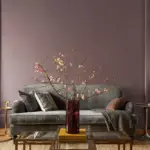
🛋️ Living Room Pairings
- Walls: Rainwashed (SW)
- Trim: Pure White (SW)
- Sofa: Warm beige
- Accents: Brass + wood
🍽️ Dining Room Pairings
- Feature Wall: Evergreen Fog (SW)
- Trim: Alabaster (SW)
- Furniture: Dark wood
- Lighting: Matte black or bronze
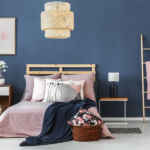
🛏️ Bedroom Pairings
- Walls: Island Spa (Behr)
- Trim: Off-white
- Bedding: Stone gray or linen
- Textures: Rattan + jute
🛁 Bathroom Pairings
- Walls: Aqua Sky (Behr)
- Vanity: Clary Sage (SW) or Pure White
- Tile: White subway or marble
- Fixtures: Brushed gold
Accent Ideas With Blue-Greens
Blue-greens aren’t just wall colors — they can become:
✨ Cabinet hues (kitchens, bathrooms)
✨ Island colors
✨ Built-in millwork
✨ Entryway statements
✨ Accent trims or ceiling colors
Use them sparingly for impact, or boldly for immersive spaces!
Common Mistakes With Blue-Green Paint
❌ 1. Choosing without samples
Always paint swatches — lighting changes everything.
❌ 2. Ignoring undertones
Some lean green, others blue — trust undertones under real light.
❌ 3. Using too much saturation
Balance with neutrals so the space feels calm.
Tips for Perfect Results
✔ Test samples on multiple walls
✔ View at different times of day
✔ Pair with lighting – warm bulbs bring out warmth, cool bulbs enhance blues
✔ Include wood tones and soft fabrics to soften edges
Final Thoughts
Blue-green colors are some of the most enchanting choices you can make for your home. They:
🌊 Evoke nature
🌿 Calm the mind
🛋️ Work with countless styles
🖌️ Make rooms feel both airy and grounded
From Sherwin-Williams’ timeless classics like Rainwashed and Evergreen Fog to Behr’s fresh sensations like Beach Glass and Jacuzzi, you have a rich palette to choose from.
Your home shouldn’t just look good — it should feel good.
And a well-chosen blue-green color palette? That’s the kind of joy you feel the moment you step inside.