Choosing the right paint color can feel like a daunting task. We’ve all been there—excitedly picking a color, painting a wall, and then realizing it doesn’t look quite right. But don’t worry! It’s just paint, and the best part? You can always change it.
In this ultimate guide, we’ll go through everything you need to know about selecting the perfect paint color. Whether you’re painting a single room or revamping your entire home, these pro tips will help you make confident decisions like a design pro!

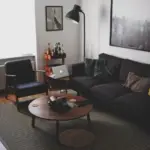
1. Start with Your Decor, Not the Paint
One of the biggest mistakes people make is choosing a paint color first. Instead, focus on your existing decor—your furniture, rugs, artwork, and accessories. It’s much easier to find a paint color that complements your decor than trying to match furniture to a wall color later.
How to Make This Work:
- Pick a statement piece in your home (like a couch, painting, or rug) and pull colors from it.
- Look at the undertones of your furniture and decor to find colors that harmonize well.
- Use neutral walls as a versatile backdrop for bolder decor choices.
2. Find Inspiration from Your Favorite Pieces
Every great design starts with inspiration. Whether it’s a Pinterest board, a magazine, or a fabric swatch, let something spark your creativity.
Pro Tip:
- If you love the look of a specific interior design style, research common colors associated with it. (Example: Scandinavian interiors favor whites, greys, and muted pastels.)
- Use paint color visualizer tools from brands like Sherwin-Williams and Benjamin Moore to see how a color would look in a space.

3. Stick with Neutrals for a Timeless Look
While bold colors can be exciting, neutral wall colors offer the most flexibility and longevity. They allow you to swap out accessories and furniture without worrying about clashing colors.

Pro Grade Paint Roller Kit, Brush & Roller for Professionals & Homeowners
Perfect for smooth finishes on your interior walls. Ideal for home improvement enthusiasts!
Buy Now on AmazonWhy Neutrals Work:
✔ Enhance your decor by making furniture and accents stand out. ✔ Provide flexibility—change up your decor without repainting. ✔ Create a cohesive flow from room to room. ✔ Medium-toned neutrals hide scuffs and dirt better than ultra-light shades.
Popular neutral paint colors include:
- Warm Neutrals: Beige, greige, and warm whites.
- Cool Neutrals: Light gray, taupe, and off-white.
- Earthy Tones: Muted greens, browns, and warm grays.

4. Understanding Undertones: Warm vs. Cool Colors
Paint colors are more than what they seem! Every color has an undertone that leans either warm or cool, and this can dramatically affect how it looks in your space.
How to Identify Undertones:
- Warm Colors: Have hints of yellow, red, or orange (e.g., creamy whites, warm grays, and beiges).
- Cool Colors: Contain blue, green, or gray undertones (e.g., icy whites, slate grays, and seafoam greens).
Pro Tip: Always compare colors against a pure white background to see their true undertones!

Rust-Oleum 367605 Home Interior Floor Coating Kit, Semi-Gloss Black
Ideal for updating outdated flooring at a fraction of the cost of replacement and adheres without stripping, sanding or priming.
Buy Now on Amazon5. Always Test Paint Colors at Home
Lighting changes everything! A color that looks perfect in the store might look completely different on your walls at home.
How to Test Paint Colors:
- Get large paint swatches or sample pots from the store.
- Paint a poster board instead of directly on the wall (easier to move around!).
- Observe how it looks in different lighting conditions (morning, afternoon, and evening).
- Compare it against your furniture, flooring, and decor.
Lighting & Paint Colors:
- South-facing rooms: Bright natural light can wash out lighter colors; use slightly deeper tones.
- North-facing rooms: Cool light can make colors look dull—consider warmer tones.
- East & West-facing rooms: Light changes throughout the day—test your colors at different times!
6. Choosing the Right Paint Finish
Paint isn’t just about color—it’s also about sheen and durability. The right finish can make a big difference in how the color looks and how easy it is to clean.
Paint Finish Guide:
- Gloss: Very shiny, easy to clean—best for trim, cabinets, and doors.
- Semi-gloss: Less shine, still wipeable—ideal for kitchens and bathrooms.
- Satin: Smooth with a soft sheen—great for high-traffic areas like hallways.
- Eggshell: Low-sheen but durable—perfect for living rooms and bedrooms.
- Flat/Matte: No shine, great for hiding imperfections—best for ceilings and low-traffic rooms.
7. Plan a Cohesive Whole-Home Color Scheme
Instead of picking different colors for every room, create a flowing color palette for your entire home. This makes the space feel intentional and balanced.
How to Create a Home Color Scheme:
- Pick 3–5 core colors (e.g., a primary neutral, a secondary shade, and a few accents).
- Use different shades and intensities of the same color for variety.
- Repeat colors in different proportions across rooms (e.g., a navy blue island in the kitchen and navy accents in the living room).
8. How to Read Paint Swatches Like a Pro
Those long strips of paint samples at the store? They’re not just random colors—they follow a scientific system!
Decoding a Paint Swatch:
- Each strip represents a single color family.
- Colors at the top are lighter versions (more white mixed in).
- Colors at the bottom are darker versions (more pigment).
- Cool vs. Warm: Swatches are usually grouped by temperature—stick to one temperature for cohesion.
9. Choosing the Right White Paint
White walls are timeless, but choosing the wrong white can make your space feel too cold or too yellow.
Tips for Picking the Right White:
✔ If your home has cool tones (blues, grays, crisp blacks), choose a cool white. ✔ If your home has warm tones (beiges, browns, golds), pick a warm white. ✔ Try sample pots and compare against your decor and lighting.
Some popular whites:
- Cool Whites: Sherwin-Williams Pure White, Benjamin Moore Chantilly Lace.
- Warm Whites: Sherwin-Williams Alabaster, Benjamin Moore White Dove.
Final Thoughts: Bring It All Together!
Choosing the right paint color doesn’t have to be overwhelming. By starting with your decor, understanding undertones, testing in natural light, and picking the right finish, you’ll create a home that feels beautifully put together.
Key Takeaways:
✅ Always start with your furniture and decor, not the paint. ✅ Test your color in various lighting conditions before committing. ✅ Stick to neutral walls for flexibility, and add color with accents. ✅ Choose a whole-home color palette for a cohesive look. ✅ Pick the right paint finish to match durability needs.
With these expert tips, you’re ready to pick the perfect paint colors and transform your home like a pro! 🎨✨