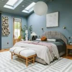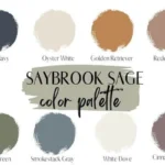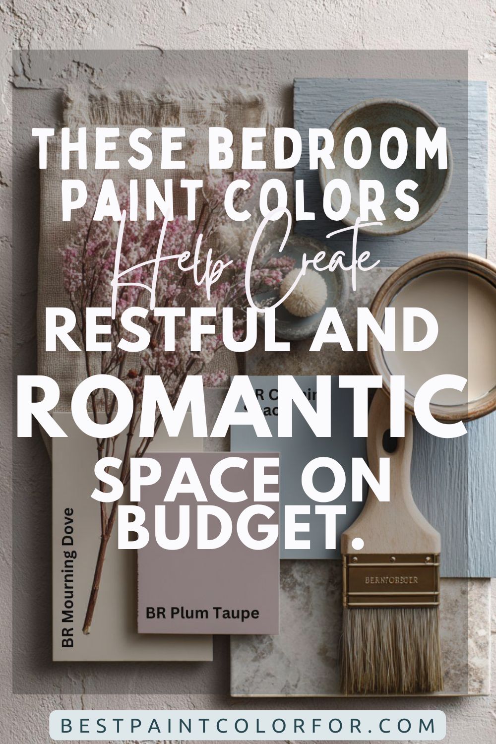
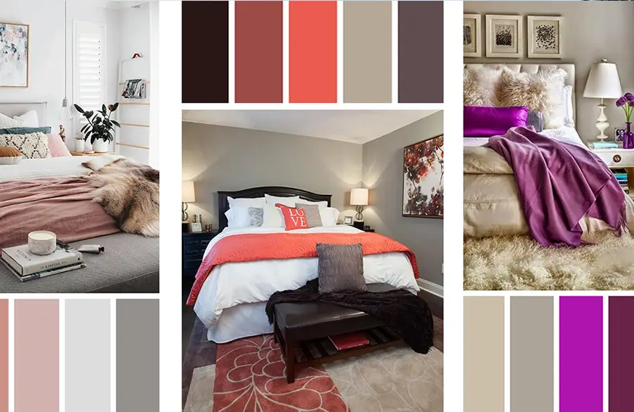
Color sets the emotional tone of a space, especially in a bedroom where relaxation, rest, and romance are key. Choosing the right color palette can dramatically affect your mood, your sleep quality, and even how much time you want to spend in your bedroom. The perfect combination? A palette of pale blue and soft pink tones using Behr’s “Mourning Dove,” “Plum Taupe,” and “Calming Space.” This trio creates an aesthetic that’s both soothing and deeply romantic without feeling overly sweet or juvenile.
In this post, we’ll dive deep into how these colors work together, how to use them effectively, and how to balance aesthetics with function. We’ll also explore materials, lighting, art, and personal touches that help bring your dream bedroom to life.
The Psychology of Bedroom Colors
How Colors Impact Mood and Sleep
- Pale Blue: Known for its ability to soothe the mind, reduce blood pressure, and slow down heart rate, pale blue is ideal for winding down at the end of the day.
- Soft Pink: Symbolizing love and nurturing, pink evokes warmth, gentleness, and emotional well-being. It also works wonderfully as an accent color to soften sharp lines or harsh lighting.
- Taupe/Mauve: These earth-based tones bring emotional grounding and sophistication. They add depth to light pastels and keep the overall palette feeling mature.
Why These Colors Work Well Together
- Balance of Warm and Cool: Blue cools while pink and taupe warm the space.
- Subdued Saturation: The muted tones make them easy to layer without overwhelming the senses.
- Visual Flow: These tones naturally guide the eye, creating a peaceful rhythm throughout the room.
Meet the Colors
Behr Mourning Dove
A soft, pale blue with subtle gray undertones, Mourning Dove exudes peaceful calmness. It performs well under different lighting conditions and complements both warm and cool decor. It’s versatile enough to be used for entire walls, yet soft enough to recede gently into the background, letting other elements shine.
Behr Plum Taupe
Rich, yet muted, Plum Taupe sits between a dusty mauve and a mocha taupe. It brings unexpected charm and visual stability to a room, offering a sophisticated contrast when paired with pastels. This color is perfect for feature walls, built-in storage units, or headboard backdrops.

Behr Calming Space
True to its name, Calming Space is a soft pink with earthy undertones, making it ideal for adult bedrooms. It avoids the “bubblegum” effect by toning down the vibrancy and adding a touch of groundedness. Ideal for bedding, upholstery, or painted decor pieces.

Pro Grade Paint Roller Kit, Brush & Roller for Professionals & Homeowners
Perfect for smooth finishes on your interior walls. Ideal for home improvement enthusiasts!
Buy Now on Amazon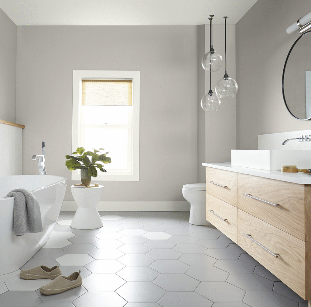
How to Use This Palette in a Bedroom?
Walls
- Option 1: Paint all walls in Mourning Dove for a unified, open feel.
- Option 2: Create a feature wall in Plum Taupe behind the bed or in a reading nook.
- Option 3: Use Calming Space in panels, trims, or behind shelves to create depth and visual interest.
Ceiling and Trims
- Ceiling: Stick to crisp white or a very pale version of Mourning Dove to enhance vertical space.
- Trim: Try Calming Space for an elegant twist on traditional white baseboards.
- Crown Molding: A glossy finish in Plum Taupe can bring unexpected character.
Furniture
- Whitewashed or Scandinavian-style furniture keeps the room light.
- Deep wood tones can add classic charm—especially when balanced with soft textiles.
- Painted pieces: Consider a Plum Taupe dresser or nightstand for a custom look.
Soft Textures & Layered Fabrics
Bedding
- Base Layer: Crisp white sheets or light blue linen sets.
- Accent Pillows: A mix of velvet, faux fur, and cotton in blush pink and taupe.
- Throws: Chunky knit blankets in mauve or textured weaves in soft taupe.
Curtains
- Light Filtering: Use sheer white or dove gray to diffuse light.
- Full Blackout: Choose lined curtains in Calming Space or a floral blend of all three tones.
- Hardware: Use brushed brass or matte black rods to match other metallic accents.
Rugs
- Neutral Anchor: A plush taupe rug adds warmth underfoot.
- Patterned Statement: Go for a pale vintage-inspired rug with faint pink and blue details.
- Layering: Consider layering a soft blue round rug atop a larger neutral base.
Lighting for Romance and Rest
- Ambient: Install a dimmable ceiling fixture with warm white bulbs (2700K).
- Task: Bedside lamps with soft pink or matte white shades.
- Accent: LED strip lighting under furniture or behind headboards for a dreamy effect.
- Candles: Flameless LED candles in mauve holders for added charm and safety.
Art, Decor & Personal Touches
Wall Art
- Large canvases in watercolor or abstract styles using blush and dove hues.
- Black and white photography in gold, bronze, or wooden frames.
- DIY art panels painted in each of the palette’s shades for a personalized gallery wall.
Plants & Greenery
- Add natural contrast and air purification with green plants.
- Snake plants, ferns, and small fiddle leaf figs work well.
- Use pastel ceramic pots or natural woven baskets for styling.
Decor Accents
- Mirrors with antique brass or rose gold frames to reflect light.
- Decorative trays in plum or blush to organize jewelry.
- Books, candles, or ceramics in coordinating hues to tie the room together.
Storage & Organization with Style
- Multi-functional furniture: storage ottomans or under-bed drawers.
- Use fabric baskets in linen or blush tones for stylish storage.
- Custom closet organizers painted in Mourning Dove or Plum Taupe.
Common Mistakes to Avoid
- Too Much Pink: Use pink sparingly to avoid a juvenile look.
- Clashing Undertones: Test swatches in natural and artificial light before committing.
- Neglecting Texture: Flat surfaces can make even perfect colors look dull—mix in textures like knits, velvets, and woven materials.
- Inconsistent Palette: Keep metals, woods, and fabrics aligned with the main color story.
Tips for Small Bedrooms
- Use vertical space with floating shelves.
- Choose multi-purpose furniture in light tones.
- Stick to Mourning Dove on walls to make the room feel more expansive.
- Use mirrors opposite windows to bounce natural light.
FAQs
Can this palette work for a couple’s bedroom?
Absolutely. Mourning Dove brings tranquility, while Plum Taupe offers grounding depth. Calming Space softens the edges. The overall palette feels sophisticated and balanced for both partners.
Will it feel too cold in winter?
Not with layered textiles like velvet curtains, wool throws, and cozy lighting. Add seasonal accessories in rich neutrals to keep it feeling warm.
How do I transition this palette into other rooms?
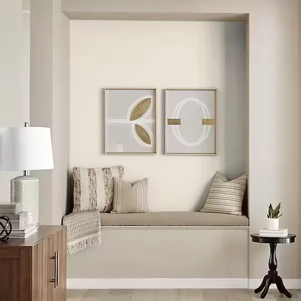
Carry the undertones into adjacent spaces. For example, use Plum Taupe in the living room’s accent pillows or Mourning Dove in bathroom walls.
What flooring goes best with this palette?
- White oak or pale maple hardwood.
- Soft gray or stonewashed laminate.
- Neutral-toned carpets in sand, cream, or dusty rose.
Conclusion: The Dreamy Bedroom You Deserve
Choosing a color palette is more than a design choice—it’s a lifestyle decision that impacts your everyday mood and well-being. With Behr’s Mourning Dove, Plum Taupe, and Calming Space, you create not just a bedroom, but a sanctuary.

Rust-Oleum 367605 Home Interior Floor Coating Kit, Semi-Gloss Black
Ideal for updating outdated flooring at a fraction of the cost of replacement and adheres without stripping, sanding or priming.
Buy Now on AmazonThis dreamy palette invites softness, serenity, and subtle sophistication. Whether you’re curling up with a book, sharing a moment with a loved one, or catching restful sleep, your bedroom becomes a personal retreat.
Start experimenting with swatches, mood boards, and sample fabrics. Then layer in textures, lighting, and décor that reflect your style. The result? A space that looks like a dream—and feels even better.
Ready to create your perfect bedroom? Share your favorite combinations or ask questions in the comments below. Let your restful and romantic space begin!