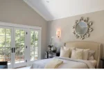
One of the most frequently asked questions about our home revolves around paint colors. Selecting interior paint shades can be an overwhelming process, especially when trying to achieve a cohesive and timeless aesthetic. In this post, I’ll take you on a tour of our home, sharing the cottage-inspired paint colors we’ve carefully chosen for each space. Whether you’re searching for the perfect neutral or a subtle pop of color, I hope this guide helps you in your paint selection journey.
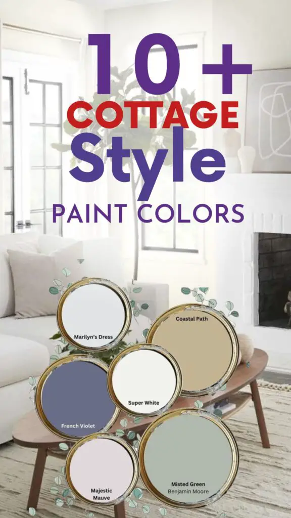
Why We Chose Neutral Cottage Paint Colors
I have always been drawn to simple, neutral colors in home design. These shades create a calming and welcoming atmosphere while allowing other elements—like reclaimed wood, vintage décor, and natural textures—to shine. Most of the colors we chose for our home are soft whites, greiges, and muted tones that perfectly complement the cottage aesthetic I envisioned.
Whole House Paint Colors
While I’ve shared our home’s paint colors before, we recently refinished our floors, prompting some changes to our interior. I wanted to provide an updated list of all the shades we’ve used to create a warm and inviting cottage-inspired space.
Exterior Paint Colors
When we purchased our home 10 years ago, it was already painted in a beautiful gray. We loved it so much that we had it color-matched and lightened by 50% for the shutters. We also painted the interior of our front door the same shade to maintain a cohesive look.
Currently, I don’t have the exact name of this gray, but since our home will need a fresh coat of paint soon, I’m excited to share both the process and the new color choice with you when the time comes!

Pro Grade Paint Roller Kit, Brush & Roller for Professionals & Homeowners
Perfect for smooth finishes on your interior walls. Ideal for home improvement enthusiasts!
Buy Now on AmazonEntryway Paint Colors
The walls in our entryway are painted a simple flat white that we purchased off the shelf from our local hardware store. The interior of the front door, as mentioned earlier, is the same color-matched gray as our home’s exterior.
For the trim in this space, we chose Stingray by Benjamin Moore, lightened by 50%. This warm greige is one of my favorite colors, and as you’ll see throughout this post, we’ve used it in multiple areas of our home to tie everything together.
Living Room & Dining Room Paint Colors
Both our living room and dining room walls are painted in the same flat white from our local True Value hardware store. The trim in these rooms continues with the lightened Stingray by Benjamin Moore, creating a soft and warm contrast that enhances the charm of the space.
We also painted the built-in shelving around our fireplace Stingray at full strength, and I absolutely love how it adds a cozy depth to the room.
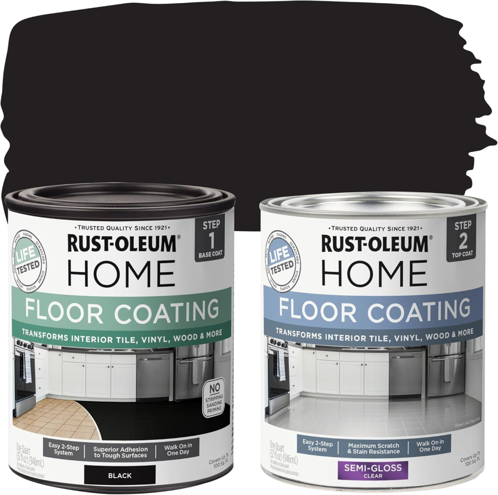
Rust-Oleum 367605 Home Interior Floor Coating Kit, Semi-Gloss Black
Ideal for updating outdated flooring at a fraction of the cost of replacement and adheres without stripping, sanding or priming.
Buy Now on AmazonSunroom Paint Colors
For our sunroom, we used the same flat white paint from True Value on the walls. However, for the trim, we opted for Stone Hearth by Benjamin Moore, another beautiful greige shade that pairs beautifully with the natural light flooding this space.
Our vintage-inspired rug and newly built-in features make this one of my favorite rooms in the house!
Kitchen Paint Colors
In the kitchen, we used Swiss Coffee by Benjamin Moore for the walls, paired with Revere Pewter by Benjamin Moore for the trim. This combination complements the wood beams and stone wall beautifully, adding warmth and character to the space.
Our kitchen cupboards were already painted when we moved in, and unfortunately, I don’t know the exact shade of white used. However, they are a crisp and clean white that blends seamlessly with the rest of the room.
Mudroom Paint Colors
The back entryway and mudroom area feature a combination of basic white trim paint and Revere Pewter by Benjamin Moore on the lower portion of the walls. This greige shade adds just the right amount of contrast and warmth to this hardworking space.
Bedroom Paint Colors
Boys’ Room
For our boys’ bedroom, we used a plain white satin finish from True Value on the walls, with Compelling by True Value, a beautiful shade of blue, as an accent. This color adds a playful yet classic touch to the space.
Master Bedroom
Our master bedroom is nearly complete, and I am so excited to share the final look soon!
For the walls, we used the same flat white paint from our local hardware store, while the trim is Stingray by Benjamin Moore, lightened by 50%.
Before this update, the bedroom was painted Halo by Benjamin Moore with a basic white trim. While I loved Halo, I feel like the new color scheme better complements our reclaimed wood beams and overall cottage aesthetic.
Future Paint Plans
There are still a few areas of our home that I plan to repaint soon, including the nursery and main bathroom. As soon as these spaces are finished, I’ll update this post with the exact paint colors used!
Summary of Our Cottage Paint Colors
Here’s a quick reference list of the colors we’ve used throughout our home:
- Flat White Paint – True Value (used in most rooms)
- Stingray (Lightened by 50%) – Benjamin Moore (trim in entryway, living room, dining room, and master bedroom)
- Stingray (Full Strength) – Benjamin Moore (built-ins around fireplace)
- Stone Hearth – Benjamin Moore (sunroom trim)
- Revere Pewter – Benjamin Moore (kitchen trim, lower portion of mudroom walls)
- Swiss Coffee – Benjamin Moore (kitchen walls)
- Compelling – True Value (boys’ room accent color)
- Plain White Satin Finish – True Value (boys’ room)
- Halo – Benjamin Moore (previous master bedroom color)
Final Thoughts: Creating a Cohesive Cottage Aesthetic
As you can see, I love using soft neutrals, especially white and greige tones, to create a cohesive and timeless cottage-inspired home. These colors provide a beautiful backdrop for layering textures, vintage décor, and natural materials.
Are you in the process of selecting paint colors for your home? Do you prefer neutrals, or do you love incorporating bold hues? Let me know in the comments—I’d love to hear about your favorite shades and what inspires your home’s color palette!

