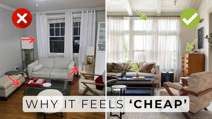
Let’s be real…
You can have the nicest furniture, the cutest decor, and still walk into your home thinking, “Why does this feel… off?”
Here’s the thing—paint color can either elevate your space instantly… or quietly ruin the entire vibe.
And the worst part? Most of these mistakes are super common. Like, everyone makes them at some point.
If you’ve ever painted a room and thought,
“Wait… why does this look so different from the sample?”
—yeah, you’re not alone.

Pro Grade Paint Roller Kit, Brush & Roller for Professionals & Homeowners
Perfect for smooth finishes on your interior walls. Ideal for home improvement enthusiasts!
Buy Now on AmazonThe good news? Once you know what to look for, fixing it is surprisingly easy.
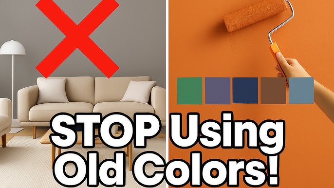
Let’s break down the 10 paint color mistakes that make your home look cheap—and exactly how to avoid them.

1. The “Wrong White” Problem (Yes, It’s a Thing)
This is the mistake everyone makes.
You walk into the store, pick a “nice white,” and boom—done, right?

Rust-Oleum 367605 Home Interior Floor Coating Kit, Semi-Gloss Black
Ideal for updating outdated flooring at a fraction of the cost of replacement and adheres without stripping, sanding or priming.
Buy Now on AmazonNope.
Here’s the thing… not all whites are created equal.
Some are:
- Too yellow
- Too blue
- Too gray
- Too stark
And suddenly your room looks either:
- Cold and hospital-like
- Or weirdly dingy
If you’ve ever felt like your white walls look “dirty” or “off”… this is why.
How to Fix It:
- Pay attention to undertones (warm vs cool)
- Test on multiple walls (lighting changes everything)
- Look at it morning AND night
Pro Tip:
Soft whites like warm whites tend to feel more expensive and inviting than stark, bright whites.
✨ “The right white feels effortless. The wrong white feels awkward.”
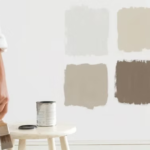
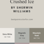
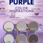
2. Ignoring Undertones (Big Mistake)
Most people don’t realize this, but…
Every paint color has an undertone.
That “perfect beige”?
It might secretly be:
- Pink
- Green
- Yellow
And once it’s on your walls… surprise.
I’ve seen this go wrong so many times.
Why It Makes Your Home Look Cheap:
Clashing undertones = visual chaos.
It makes your space feel unintentional.
How to Fix It:
- Compare colors side-by-side
- Hold samples next to your flooring and furniture
- Stick to one undertone family (warm OR cool)
Trust me… this one change alone can upgrade your entire home.
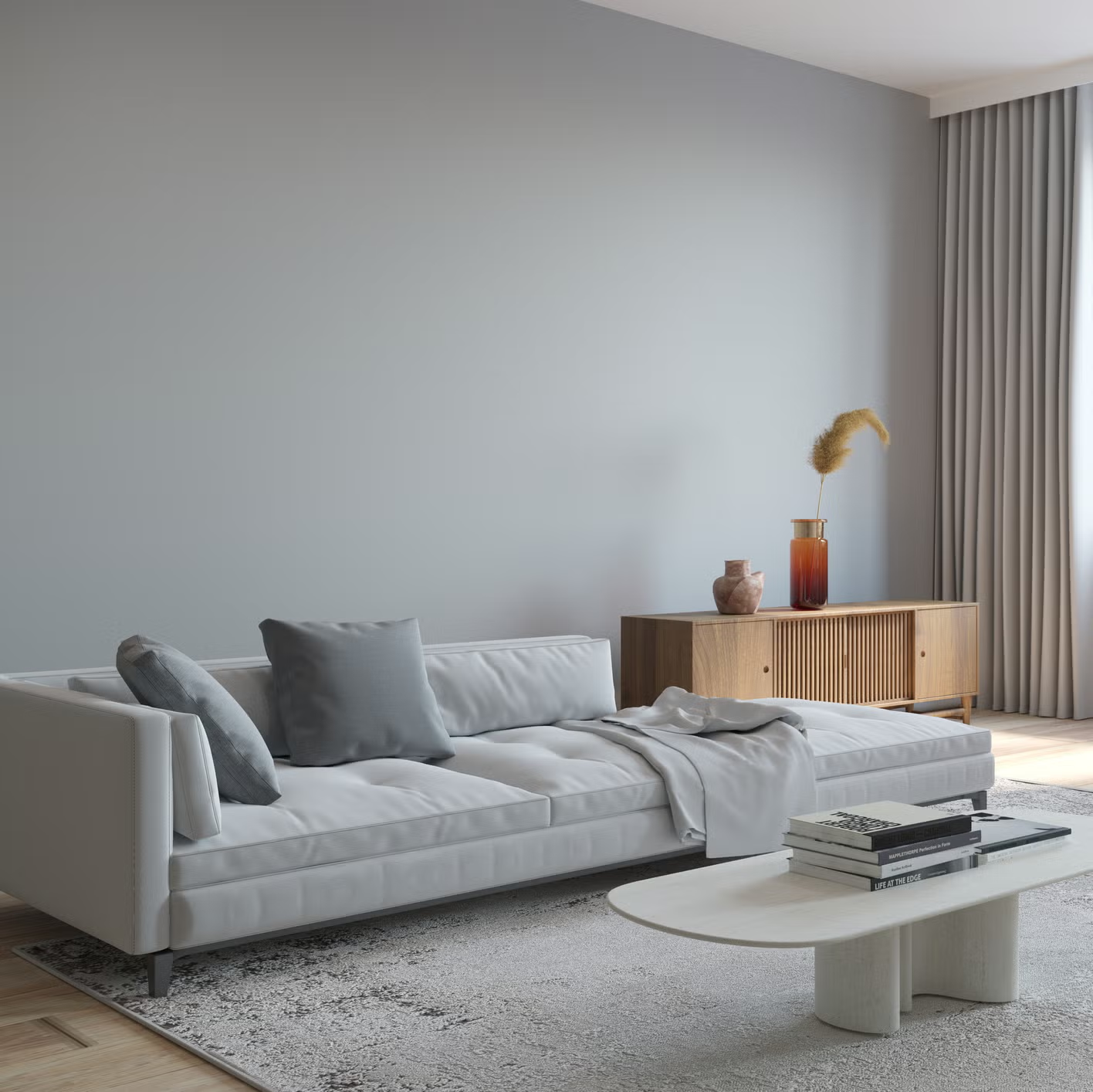
3. Going Too Dark Without Enough Light
Dark paint can look insanely luxurious…
But only when it’s done right.
Otherwise?
It feels like a cave.
The Problem:
You saw a moody dark green or charcoal online…
…but your room doesn’t have the same lighting.
So instead of cozy, you get gloomy.
How to Fix It:
- Use dark colors in well-lit rooms
- Balance with:
- Light furniture
- Mirrors
- Natural textures
Pro Tip:
If your room lacks natural light, try a medium tone instead of a deep one.
✨ “Dark doesn’t equal luxury—balance does.”
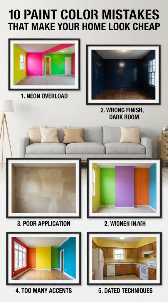
4. Using Flat Paint Everywhere
Let’s be honest…
Flat paint sounds like a safe choice. No shine, no fuss.
But here’s the truth:
Flat paint can make your walls look dull and lifeless.
Why It Feels Cheap:
It absorbs light instead of reflecting it.
So your space loses depth and dimension.
What to Do Instead:
Use different finishes strategically:
- Eggshell or satin → walls
- Semi-gloss → trim & doors
- Matte (selectively) → bedrooms or ceilings
You’ll love this…
Just changing the finish (not even the color) can make your room look more high-end.
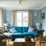
5. Matching Everything Too Perfectly
This one might surprise you.
A lot of people think matching everything = good design.
But actually?
Too much matching feels flat and boring.
Example:
- Beige walls
- Beige sofa
- Beige rug
Everything blends… and not in a good way.
How to Fix It:
- Add contrast
- Mix tones within the same color family
- Layer textures
✨ “A beautiful room isn’t perfectly matched—it’s thoughtfully mixed.”
6. Skipping Sample Testing (Big Regret Later)
Let me guess…
You picked a color from a tiny swatch and painted the whole room?
Yeah… we’ve all been there.
The Problem:
Paint looks COMPLETELY different when:
- It’s on a large wall
- The lighting changes
- It’s next to your furniture
What to Do Instead:
Always test samples:
- Paint large swatches (not tiny patches)
- Check in:
- Morning light
- Evening light
- Artificial light
Trust me… this step saves you time, money, and frustration.
7. Choosing Trendy Colors Without Thinking Long-Term
Trends are fun. We all love them.
But here’s the thing…
Not every trendy color works in real life.
That super bold color you saw on Instagram?
It might feel overwhelming after a week.
Why It Looks Cheap:
It can feel impulsive instead of intentional.
Smarter Approach:
- Use trendy colors in:
- Accent walls
- Decor pieces
- Keep main walls more timeless
Pro Tip:
Classic neutrals with subtle personality always feel more expensive.
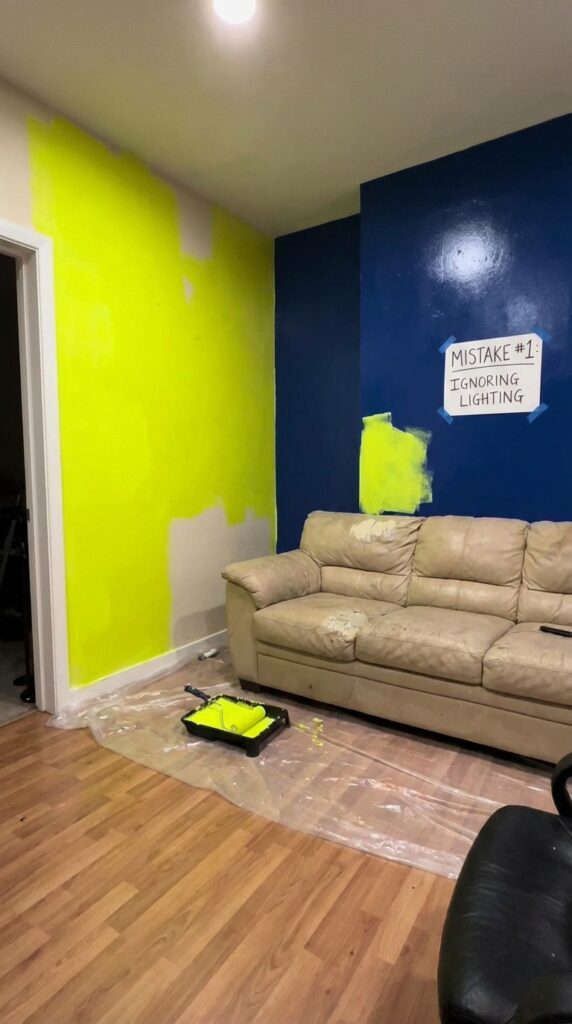
8. Forgetting About Lighting (This Changes EVERYTHING)
If there’s one thing you remember from this article, let it be this:
Lighting changes everything.
Seriously.
The Same Paint Can Look:
- Warm in one room
- Cool in another
- Completely different at night
Why This Matters:
Ignoring lighting = unpredictable results.
What to Do:
- North-facing rooms → warmer tones
- South-facing rooms → cooler tones work well
- Always test in your actual space
✨ “Don’t trust the store lighting. Trust your home.”
9. Painting Ceilings Basic White Without Thinking
Here’s something most people never question:
Ceilings don’t have to be plain white.
And sometimes… they shouldn’t be.
Why It Can Feel Cheap:
Bright white ceilings can feel disconnected from the rest of the room.
Better Options:
- Soft white that matches your wall tone
- Slightly lighter version of your wall color
- Even subtle color for a cozy feel
You’ll love this…
A well-painted ceiling can make your room feel taller and more designed.

10. Ignoring Trim and Details
Walls get all the attention…
But trim, doors, and baseboards?
They matter just as much.
The Problem:
- Yellowing trim
- Wrong shade of white
- No contrast
It makes the whole room feel unfinished.
How to Fix It:
- Use clean, crisp trim colors
- Create contrast with walls
- Keep it fresh and well-maintained
✨ “Details are what separate ‘nice’ from ‘wow.’”
BONUS: 5 More Mistakes Most People Don’t Even Realize
Because honestly… 10 isn’t enough 😄
11. Overusing Gray Everywhere
Gray had its moment.
And it’s still great—but overusing it?
Feels cold and outdated.
Fix:
Mix in warmth:
- Greige tones
- Warm woods
- Soft beiges
12. Ignoring Flow Between Rooms
Ever walked from one room to another and thought…
“Wait, what just happened?”
That’s a flow problem.
Fix:
- Choose a cohesive color palette
- Keep undertones consistent
13. Using Super Bright Colors in Large Areas
Bold colors can be fun…
But too much?
Overwhelming.
Fix:
Use bold colors in smaller doses:
- Accent walls
- Furniture
- Decor
14. Not Considering Your Furniture
Here’s the thing…
Your paint color doesn’t exist alone.
It has to work with:
- Your couch
- Your floors
- Your decor
Fix:
Always choose paint after considering your main pieces.
15. Rushing the Decision
This is probably the biggest mistake of all.
You want to finish quickly… so you pick fast.
But paint is one of the most visible elements in your home.
Fix:
Take your time. Seriously.
✨ “A well-chosen color feels right every single day.”
PRO TIPS THAT MAKE YOUR HOME LOOK EXPENSIVE (WITHOUT SPENDING MUCH)
Let’s level up your space real quick:
✔ Stick to a Cohesive Palette
Pick 3–5 colors and repeat them throughout your home.
✔ Use Contrast Intentionally
Light walls + dark accents = instant depth.
✔ Layer Neutrals
Not all neutrals are boring—layering them creates richness.
✔ Pay Attention to Finish
A subtle sheen can elevate everything.
✔ Think About Mood
Ask yourself:
- Do I want cozy?
- Airy?
- Dramatic?
Then choose accordingly.
FINAL THOUGHTS
Here’s the thing…
Your home doesn’t look cheap because of your furniture or decor.
Most of the time?
It’s the paint choices quietly working against you.
But now you know better.
You know about:
- Undertones
- Lighting
- Balance
- Texture
- Flow
And honestly? That’s what separates a random space from a beautifully designed one.
You don’t need a huge budget.
You just need the right decisions.
✨ “Good paint choices don’t scream for attention—they just make everything feel right.”
So… which mistake have you been making without realizing it?
And more importantly—
Which one are you fixing first?
👉 Save this before you paint—you’ll thank yourself later.