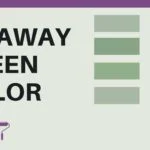
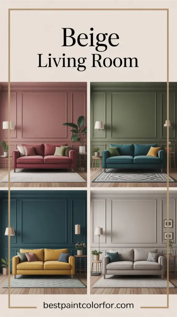
I’m gonna share with you four living room color ideas with the paint color beige that everyone should know. Often, the color beige gets a bad rap — but for all the wrong reasons — and I’m gonna show you how to get it right. And it starts with the undertones that you have in your room. I help people like you all over North America, and you can check it out with my online shop in the description section down below.
So without further ado, let’s get this show started.
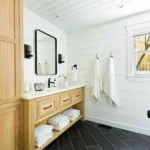
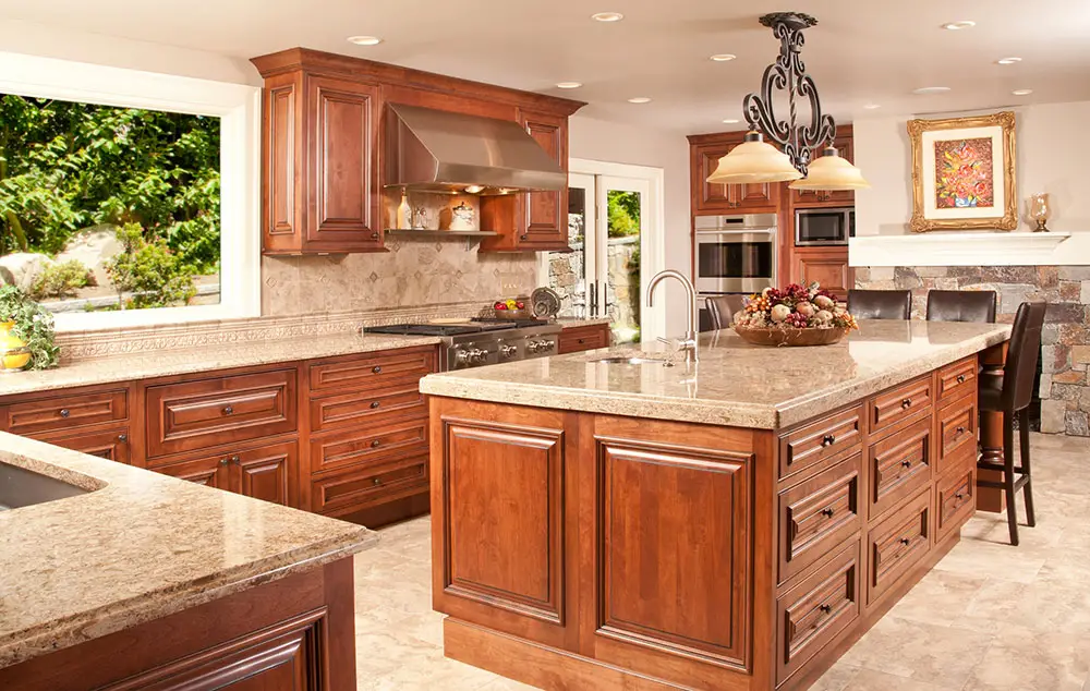
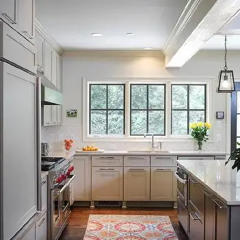
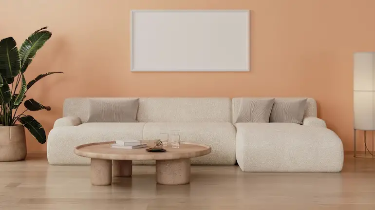
For all of you out there who have a home that was built between 2005 and 2010, chances are your home falls in the Tuscan trend.
What’s the Tuscan Trend?
The Tuscan trend is basically:
– you have dark furniture
– or you have dark wood like cherry wood
– or you have orange or gold or bronze
– or maybe even terracotta bricks within your home
So if you want to lighten it up, then you might want to try out Manchester Tan or Feather Down by Benjamin Moore.

Pro Grade Paint Roller Kit, Brush & Roller for Professionals & Homeowners
Perfect for smooth finishes on your interior walls. Ideal for home improvement enthusiasts!
Buy Now on Amazon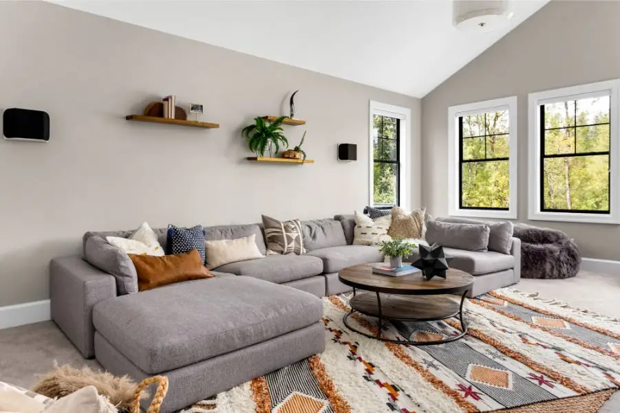
Let’s Take a Closer Look
This is Manchester Tan by Benjamin Moore. It’s got a little bit of green-beige undertone. I want to show you a couple of quick colors that would go really well with Manchester Tan.
Let’s start off with this — let’s say you have a little bit of gold in your living room. When you compare it together, you’ll notice the green undertone does a really good job of working with this gold.
Another thing that I want to show you — let’s say that you have red cherry wood cabinets like this one. When you compare it with Manchester Tan, these are two complementary colors that work really well together.
Or let’s say that you have a little bit of red-orange, like this. Red-orange is a little bit earthy, but when you compare it with Manchester Tan and the green-beige undertone, they work beautifully.

Rust-Oleum 367605 Home Interior Floor Coating Kit, Semi-Gloss Black
Ideal for updating outdated flooring at a fraction of the cost of replacement and adheres without stripping, sanding or priming.
Buy Now on AmazonLet’s just say that Manchester Tan is a little bit too dark for you — a good idea that I would recommend would be maybe Feather Down by Benjamin Moore. When you compare these two colors together, you’ll notice it’s a lot lighter than Manchester Tan, and it will do the job just as well.
As you can see, Manchester Tan and Feather Down by Benjamin Moore do a really good job transitioning from the Tuscan trend to the current color of today.
If you have any questions, feel free to put them in the comment section down below.
Wheatsheaf by Benjamin Moore
Wheatsheaf by Benjamin Moore is a yellow beige, and when it’s paired correctly with the undertone that you have in your home, it will look beautiful.
Now, if you google this online, chances are you’re going to see some red cherry cabinets that are paired with Wheatsheaf — please don’t do this. It will not look good.
Instead, do this — this is Wheatsheaf by Benjamin Moore. It’s a yellow-beige. It’s not screaming yellow; it’s just got that nice soft touch.
Now I’m going to give you a couple of quick examples of some colors that will work really well with Wheatsheaf.
Let’s say that you have birch wood hardwood flooring or maybe birch wood cabinets — when you compare this with Wheatsheaf, it goes beautifully together.
Now another thing that you want to keep in mind — let’s say that you have a lot of yellows in your living room. You want to keep your yellows clean, and you’ll notice when you compare this with Wheatsheaf, it goes fantastic.
Also, you want contrast when you’re working with Wheatsheaf. A really good color would be a teal blue-green, just like this.
This is a classic example of how to make a yellow-beige like Wheatsheaf feel trendy, warm, and balanced in the home.
By the way, if you’re new to this channel and you haven’t subscribed, you might want to consider it. I give you valuable information just like this.
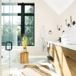
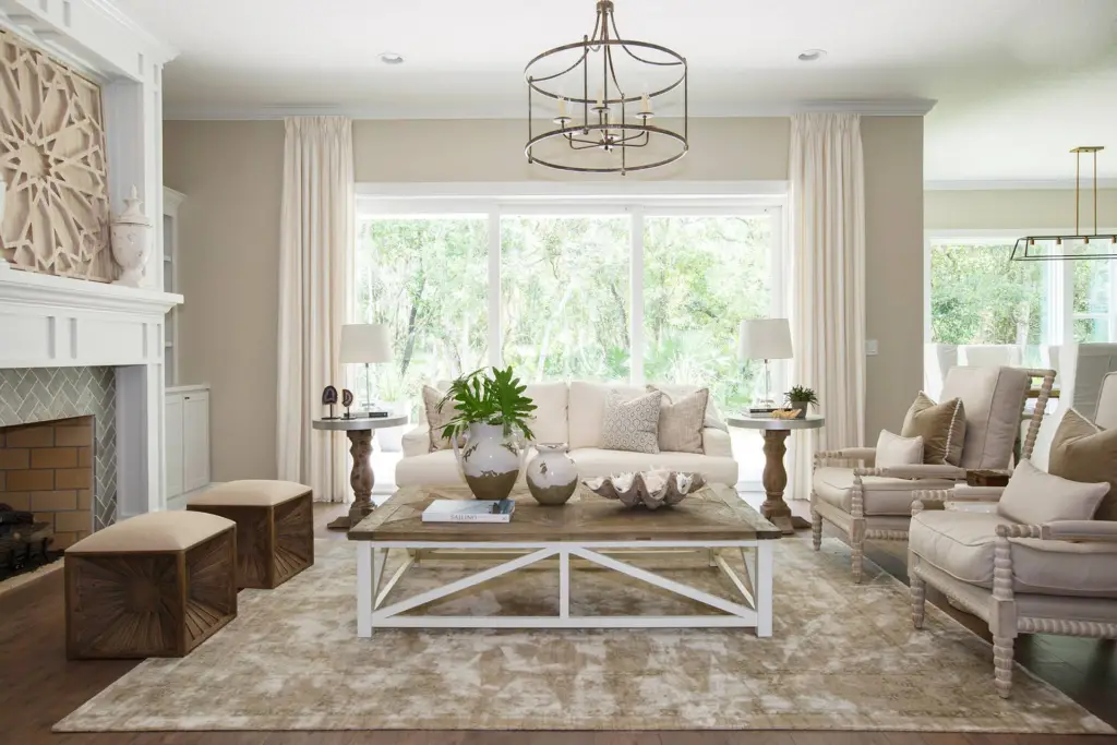
Granite Beige by Benjamin Moore
If you want a paint color that’s going to give your home some sophistication, then you might want to try Grant Beige, assuming that you have the right color undertone and the fixed elements to make this happen.
So I’m going to show you a couple of examples of how to work with both cool and warm undertones with Grant Beige.
Watch this — this is Grant Beige by Benjamin Moore. It’s a green-beige, and I want to show you a couple of colors that will work really well.
So let’s say that you have hardwood floors and it’s a brown color like this one. Now when you compare it with Grant Beige, you’ll notice how they pair beautifully.
Now there are two other colors that I want to show you. So let’s say that you have blue-green fabrics — maybe it’s your curtains, just like this one. When you compare it with Grant Beige, notice how they complement each other really well.
Another color that I want to show you is this one — it’s a red. Let’s say this is in your rugs or maybe you have an accent or a picture in your living room that looks like this, and when you compare it together, it really works.
As you can see, Grant Beige is versatile — it can work with both cool and warm undertones, as long as you have the right fixed elements and the right items to make it happen.
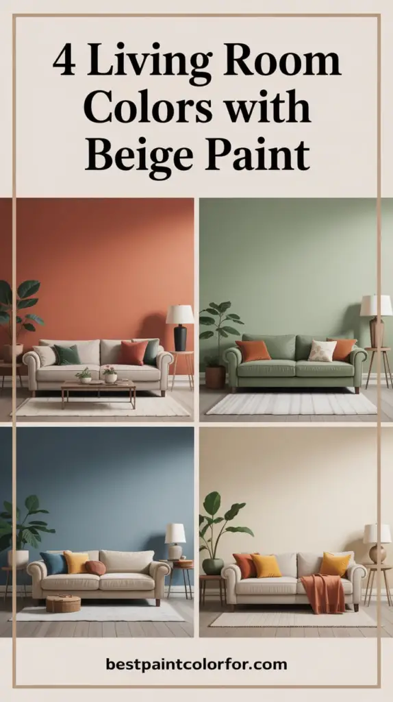
1. Beige + Deep Navy Blue: Classic Meets Bold
Why It Works: The softness of beige pairs beautifully with the richness of deep navy, creating a high-contrast, high-style effect. This combo brings a touch of elegance and depth without overwhelming the space.
Try This Combo:
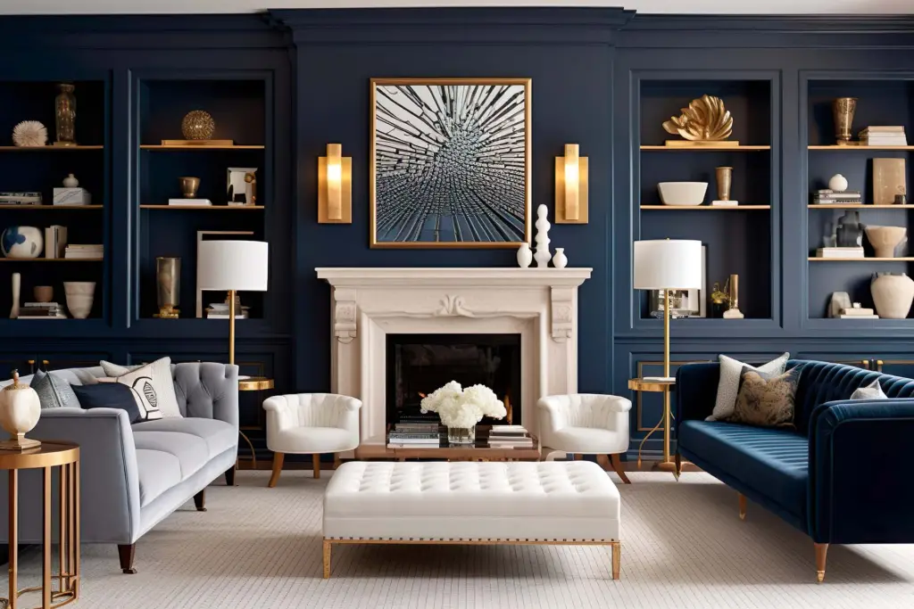
- Walls: Accessible Beige (Sherwin-Williams)
- Accent Color: Naval (Sherwin-Williams 6244) — a stunning navy that adds drama and dimension.
Design Tip: Paint one feature wall in navy or add navy-colored velvet throw pillows, a dark blue rug, or art pieces for a sophisticated and cozy vibe.
2. Beige + Warm Terracotta: Earthy & Inviting
Why It Works: Terracotta tones bring in natural warmth and earthy charm, making your living room feel inviting and grounded. When combined with beige, the result is a balanced, cozy environment with boho or southwestern flair.
Try This Combo:
- Walls: Edgecomb Gray (Benjamin Moore) — a soft beige with warm undertones.
- Accent Color: Cavern Clay (Sherwin-Williams 7701) — a rich, earthy terracotta that brings in warmth and personality.
Design Tip: Use terracotta on accent chairs, ceramics, throw blankets, or even as a feature wall for an organic-modern look.
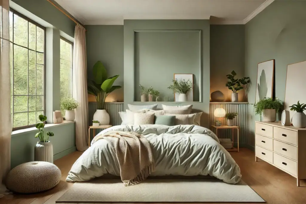
3. Beige + Sage Green: Fresh and Serene
Why It Works: Sage green is calm, understated, and brings a breath of fresh air into your living room. It complements beige without overpowering it, making the space feel light, natural, and peaceful.
Try This Combo:
- Walls: Natural Linen (Sherwin-Williams 9109) — a soft, creamy beige.
- Accent Color: Clary Sage (Sherwin-Williams 6178) — a muted green that’s both relaxing and stylish.
Design Tip: Use sage green in window treatments, side chairs, or cabinetry. Add a few leafy houseplants to enhance the natural feel.
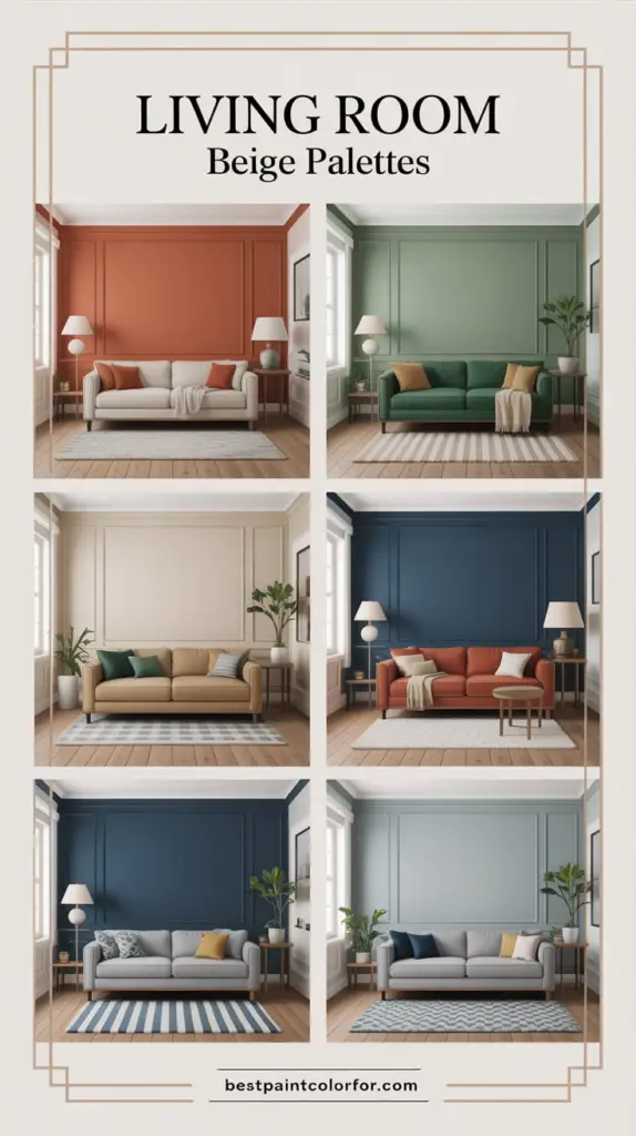
4. Beige + Charcoal Gray: Chic and Contemporary
Why It Works: Charcoal gray gives beige a sleek, modern edge. It’s a great option for those who want a more minimal or industrial look without going full monochrome.
Try This Combo:
- Walls: Balboa Mist (Benjamin Moore OC-27) — a warm beige with subtle gray undertones.
- Accent Color: Peppercorn (Sherwin-Williams 7674) — a bold, dark gray that creates depth and drama.
Design Tip: Use charcoal gray on built-ins, fireplace surrounds, or in geometric area rugs to add texture and style.
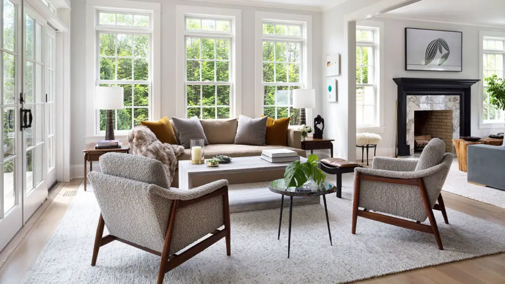
Final Thoughts
Remember, it’s not the paint color that goes first — it starts with the interior decor that you have in your living room.
You want to build your color palette, and then you want to hone in on what undertones that you have in your living room.
So if you need help finding the perfect colors for your living room and you want it professionally done, then you might want to check out the description link down below. I show you how I can do it without ever stepping foot in your home.