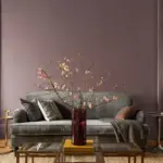
Looking for some best cream paint colors to enjoy that perfect neutral scene in your home? Well, that’s what I’ve brought to you today, the best neutral paint color that will be perfect for your space, no matter what!
We all love this netural paint – cream and that’s what I’ve always loved. The best thing I love about cream paint colors is that you never have to re-paint to change your accent color scheme.
Imagine a gentle whisper of color that blankets your walls, wrapping you in its embrace like a soft, warm hug. Cream paint colors, with their delicate balance of white and subtle undertones, create a symphony of softness that soothes the senses.
From the velvety Ivory Lace to the cozy Warm Almond, each shade brings a unique character to your space.
These colors possess the magical ability to amplify natural light, making even the smallest of rooms feel open and inviting.

Pro Grade Paint Roller Kit, Brush & Roller for Professionals & Homeowners
Perfect for smooth finishes on your interior walls. Ideal for home improvement enthusiasts!
Buy Now on AmazonWhether you’re seeking a calming refuge or an inviting gathering spot, cream paints are your ticket to a world of understated elegance.
- Key takeaways
- What is cream paint color? – The Definition
- Why might you choose cream paint colors – the reason?
- How can you find the right cream paint color shade?
- The Colors that go well with cream paint colors
- What is the best cream paint color?
- Best Cream Paint Color for walls
- Best Cream Paint color for exterior of a house
- Best Cream paint color for Kitchen Cabinets
- Best Cream paint color for Exterior Trims
- Table for the Most Popular Cream Paint Colors for your home
- The best Cream Paint Colors
- The bottom line
Key takeaways
- Cream paint colors are perfect for creating a neutral and cozy atmosphere in your home.
- Creams have a soft mix of white and gentle undertones that soothe and comfort.
- Cream shades amplify natural light, making rooms feel open and inviting.
- Cream colors work well with various decor styles and never go out of fashion.
- Light Reflective Value (LRV) helps us understand how bright or dark colors are.
- Cream shades are like a canvas, embracing daylight and reflecting it gently.
- Cream walls can change their appearance based on surrounding colors and lighting.
- Choosing the right cream shade involves comparing swatches and observing them in different lighting conditions.
- Cream colors can be used for walls, exterior trims, kitchen cabinets, and more.
- Cream shades are versatile, timeless, and can reflect your unique style and comfort.
What is cream paint color? – The Definition
Describing cream can be as tricky as catching sunlight – it’s like a soft whisper of yellow that makes you think of pastels. Picture it as a kind of off-white with a touch of yellow underneath, giving off a feeling of calm and warmth, almost like a friendly smile.
- Light Reflective Values (LRV).
Now, let’s talk about something called Light Reflective Values (LRV).
This is like a scale that tells us how bright or dark colors are.

Rust-Oleum 367605 Home Interior Floor Coating Kit, Semi-Gloss Black
Ideal for updating outdated flooring at a fraction of the cost of replacement and adheres without stripping, sanding or priming.
Buy Now on Amazon- When LRV goes higher than 82, it’s like a bright white.
- Between 73 and 82, we’re in the land of off-whites.
- Go lower than 73, and it’s quite different from plain white.
This LRV scale helps us see colors in a new way.

Why might you choose cream paint colors – the reason?
Well, think of it as a mix of light and depth – not as bright as pure white, but not as strong as really bright colors either.
Cream creates a cozy feeling that lasts over time. It’s like a canvas that lets in daylight and reflects it gently. Imagine this canvas embracing you in its warmth and charm, like a dance between light and subtleness.
Imagine your room with walls that feel like they’re holding your dreams. Cream-colored walls work well with all kinds of decor styles and they never go out of style. They’re like a timeless hug for your home that will stay beautiful for years.
How can you find the right cream paint color shade?
- Start with a paint strip and move from the brightest to the deeper shades.
- You’ll notice hints of brown, yellow, or even a touch of pink.
- Put it next to something really white, like a paper, and you’ll see these hints even better.
- It’s like characters stepping into the spotlight!
As you explore the world of cream paint colors, remember it’s like a kaleidoscope of choices.
Each choice reveals a new beauty and brings inspiration that’s all your own. So, as you pick your cream, remember that there’s a story waiting to be told and a canvas eager for your creative touch.
The Colors that go well with cream paint colors
Unlocking the secrets of cream’s companionship with other colors is like discovering the perfect duet – versatile and harmonious.
Cream’s neutral nature lets it dance with almost any color. It waltzes gracefully alongside soft shades like light tans and grays for an understated elegance. On the other hand, when paired with bold or darker accents, cream holds its own, proving its adaptability.
When selecting companions, consider the undertones of your cream paint. Harmony lies in coordinating or complementing these subtle tones. A symphony of hues awaits, waiting to be explored.
What is the best cream paint color?
Defining the ultimate cream paint depends on your space’s personality and lighting conditions. Crafting this masterpiece involves a series of steps:
- Gather paper swatches.
- Place them around the room.
- Choose 3-5 swatches for samples.
- Paint multiple walls, observe day and night, lights on and off.
- Select the color that resonates.
These steps ensure that your cream is more than just a shade – it’s a dynamic expression of your space’s soul.
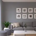
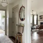
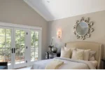
Best Cream Paint Color for walls
Cream walls possess a magical quality, reflecting not only light but also the hues around them. This trait stems from their high Light Reflective Value (LRV). Imagine a cream wall near a bold red rug – it might catch a blush of pink.
To avoid such surprises, swatching cream in your space is crucial. The sun’s brightness also plays a role – opt for a cream with lower LRV and richer hues if your home basks in sunlight.
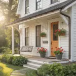
Best Cream Paint color for exterior of a house
When it comes to selecting the ideal cream paint color for the outside of your house, there’s a delicate art to it – one that harmonizes undertones and embraces natural light.
Picture this: your home’s outer attire, whether it’s siding, brick, or stone, becomes a canvas waiting for the right shade of cream. The key lies in finding undertones that either match or beautifully complement the existing color scheme. Think of it as selecting the perfect partner for a graceful dance.
Now, let’s talk about the sun’s role in this visual symphony. Bright sunlight can transform whites and off-whites into ghostly apparitions, losing their charm. So, if your home basks in abundant sunshine, consider a cream shade with a lower Light Reflective Value (LRV). This not only preserves the creamy elegance but also adds a touch of richer color to keep your home’s exterior looking inviting and warm.
In the world of exterior aesthetics, the perfect cream paint becomes more than just a hue – it’s a reflection of your home’s personality, a seamless blend of style and sunlight that welcomes you with open arms.
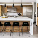
Best Cream paint color for Kitchen Cabinets
Choosing a cream for kitchen cabinets involves a delicate dance with existing features – countertops, flooring, and backsplash. If white elements are present, a careful comparison with paint samples is wise. The goal: a cohesive ensemble that feels like a symphony of flavors in your culinary haven.
Best Cream paint color for Exterior Trims
Trimming cream’s glory is a two-fold decision. Picture this: cream on cream, a soft embrace that creates depth. Opt for a semi-gloss trim to contrast the flat or eggshell walls, all in the same creamy shade.
Alternatively, a stark white trim adds drama. Avoid warm tones that might clash. Think of clean whites like Extra White or Ultra White – they make cream walls pop with contrast and clarity. The choice is yours: an intimate whisper or a bold statement, both elevating cream’s timeless charm.
In the realm of design, cream proves to be more than just a color – it’s an invitation to create an exquisite masterpiece that reflects your style, vision, and the unique essence of your space.
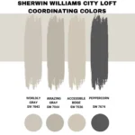
Table for the Most Popular Cream Paint Colors for your home
Exploring the world of cream paint colors is like stepping into a realm of timeless elegance. These shades possess a unique charm that transcends trends, making them a beloved choice for various spaces in your home.
Below is a table highlighting some of the most popular cream paint colors, their Light Reflective Values (LRV), undertones, suitability for different areas of the house, and the colors they harmonize well with:
| Paint Color | LRV | Undertones | Suitability | Goes Well With |
| Sherwin Williams Creamy | 81 | Warm yellow, tan | Living room, bedroom | Soft grays, earthy browns |
| Benjamin Moore Cloud White | 85 | Warm neutral, yellow | Kitchen, bathroom | Blues, greens, light pinks |
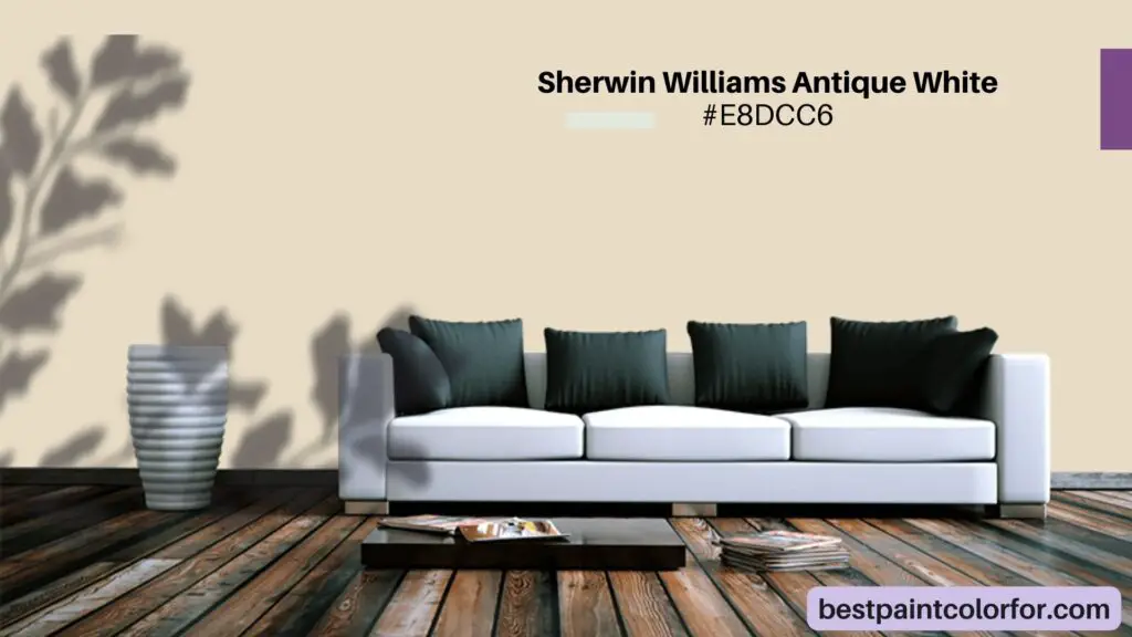
| Sherwin Williams Antique White | 72 | Yellow, beige, orange | Dining room, hallway | Rich reds, warm golds |
| Sherwin Williams Dover White | 83 | Golden yellow | Kitchen, bedroom | Navy blue, forest green |
| Benjamin Moore Swiss Coffee | 81 | Gray, yellow, green | Entryway, study | Deep blues, muted greens |
The table above showcases some of the most sought-after cream paint colors, each possessing its distinct personality. Light Reflective Value (LRV) reveals how much light bounces back from a color, affecting its brightness. Undertones play a significant role in determining the warmth or coolness of a shade.
Notably, these cream colors are versatile and adaptable, finding their homes in various spaces.
- Sherwin Williams Creamy with its warm yellow undertones brings a cozy touch to living rooms and bedrooms, while Benjamin Moore Cloud White’s warm neutral base shines in kitchens and bathrooms.
- Sherwin Williams Antique White adds sophistication to dining rooms and hallways with its yellow and beige undertones, complemented by rich reds and golds.
- Sherwin Williams Dover White, with its golden touch, finds its place in kitchens and bedrooms, playing well with navy blues and forest greens.
- Lastly, Benjamin Moore Swiss Coffee’s gray and green tones lend elegance to entryways and studies, harmonizing beautifully with deep blues and muted greens.
Incorporating these cream paint colors into your design journey invites you to embrace their versatility, creating spaces that reflect your unique style and comfort.
The best Cream Paint Colors
Exploring the world of cream paint colors is akin to unraveling the enigmatic allure of an art masterpiece. These hues, poised between softness and warmth, have the power to transform any space into a canvas of elegance. Below, you’ll discover an extensive collection of popular cream paint shades, each bestowed with its own unique character. From the lighter tones that whisper of sunlit mornings to the deeper hues that evoke cozy evenings, this palette offers a symphony of choices to captivate your senses.
Lighter Cream Paint Colors: A Radiant Dawn
In this symphony of color, the lighter cream tones dance with warmth and grace. Let’s spotlight a few stars from this ensemble:
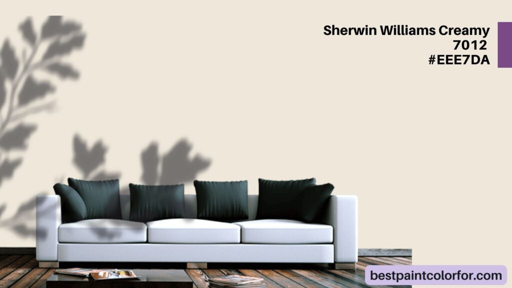
Sherwin Williams Creamy
With an LRV of 81, Creamy embodies a soft, gentle yellow. It resides in the realm of off-whites but exudes a creamy radiance that warms the soul. Suitable for living rooms and bedrooms, Creamy harmonizes well with soft grays and earthy browns.
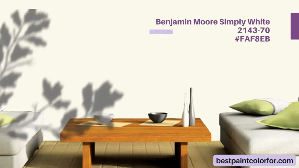
Benjamin Moore Simply White
Boasting an LRV of 91.7, Simply White is a testament to refined elegance. With delicate undertones of yellow and a touch of green, it’s the perfect choice for kitchens and bathrooms, embracing blues, greens, and light pinks as its companions.
Sherwin Williams Antique White
A touch of history graces this shade with an LRV of 72. Its undertones of yellow, beige, and orange lend a sense of vintage charm. Dining rooms and hallways find their partner in Antique White, complemented by rich reds and warm golds.
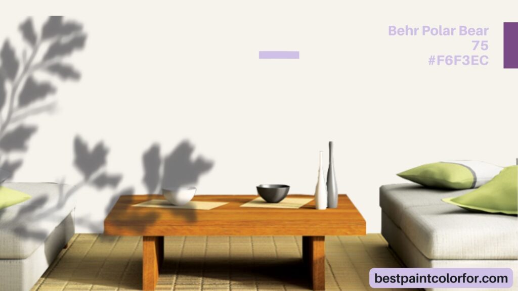
Behr Polar Bear
A radiant LRV of 90 characterizes Polar Bear, an embodiment of warmth with subtle pink undertones. Ideal for spaces craving a clean yet inviting aura, Polar Bear pairs harmoniously with warm accents.
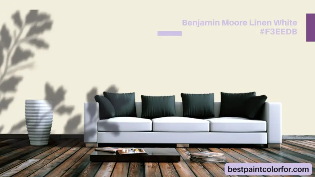
Benjamin Moore Linen White
With an LRV of 80.94, Linen White offers a gentle embrace of warmth. Its undertones, leaning towards yellow, create an atmosphere of soft elegance. An excellent choice for versatile application, it’s practically white, reflecting a luminous charm.
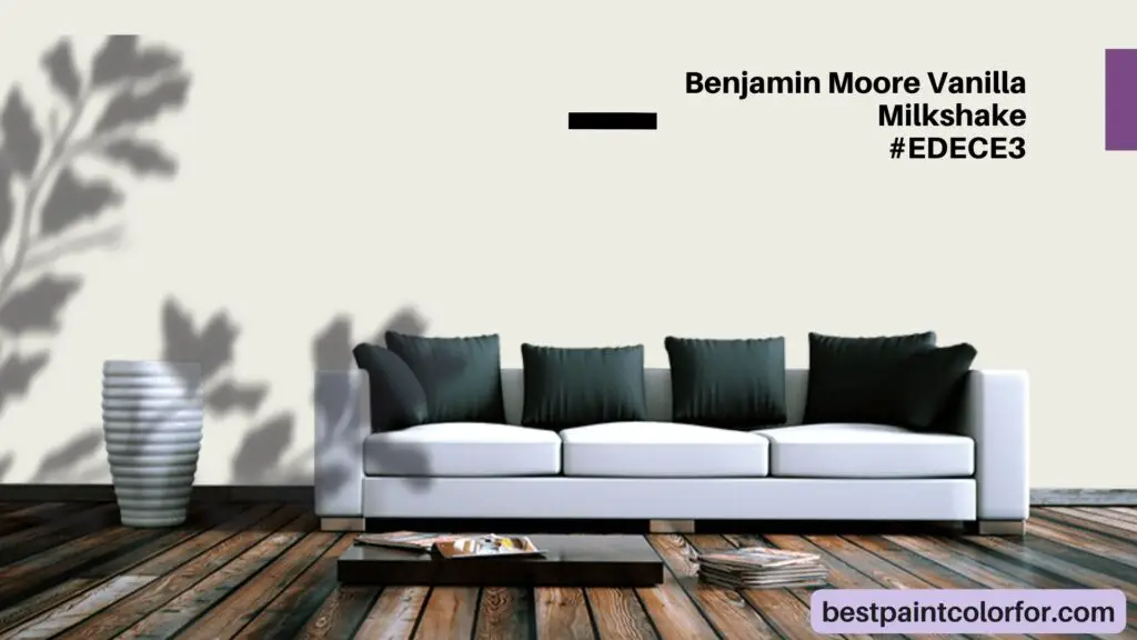
Benjamin Moore Vanilla Milkshake
With an LRV of 80.97, Vanilla Milkshake captivates as a soft greige with beige and cream undertones. This neutral gem illuminates spaces with light, warmth, and a touch of subtlety.
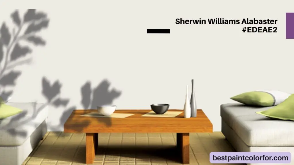
Sherwin Williams Alabaster
Embodying the perfect balance, Alabaster boasts an LRV of 82. Its warm beige undertones create a timeless charm that bridges the realms of warmth and coolness, inviting universal appeal.
Deeper Cream Paint Colors: A Cozy Embrace
The deeper cream shades exude a sense of coziness, inviting you to wrap yourself in their depths:
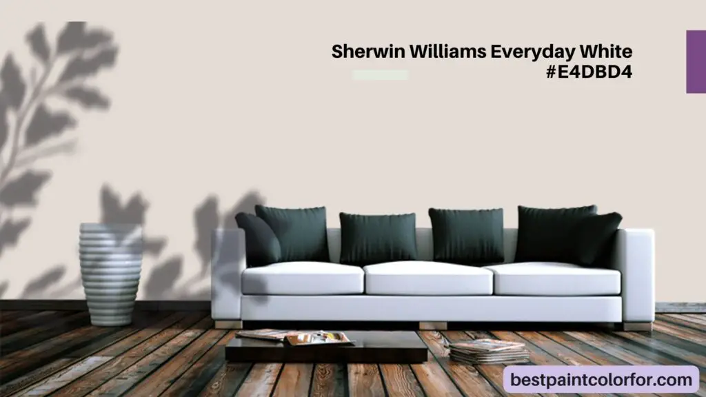
Sherwin Williams Everyday White
Hovering just beyond the off-white threshold, Everyday White, with an LRV of 72, emanates true creaminess. Its undertones of beige and blush infuse rooms with a warm, inviting atmosphere.
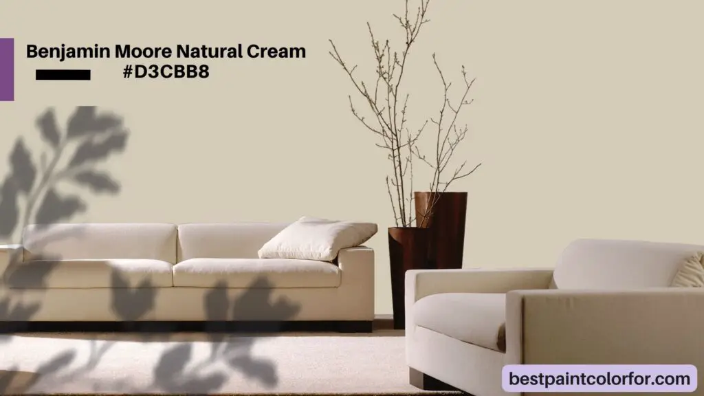
Benjamin Moore Natural Cream
With an LRV of 64.78, Natural Cream is a mid-toned greige, leaning into beige with warm yellow and gray undertones. Its depth and richness make it a perfect choice for adding dimension to darker rooms.
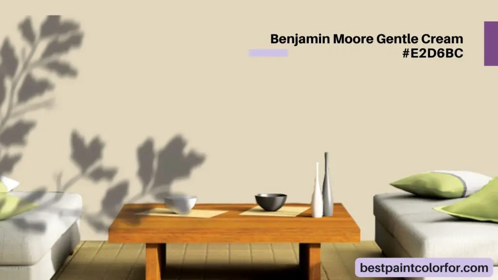
Benjamin Moore Gentle Cream
Boasting an LRV of 71.32, Gentle Cream brings a touch of tan with a hint of orange warmth. Its depth adds character to spaces while maintaining a sense of coziness.
Sherwin Williams Antique White
At an LRV of 72, Antique White, ironically, isn’t quite a white. Its depth and undertones of yellow, beige, and orange create a warm, timeless appeal that thrives even in brighter settings.
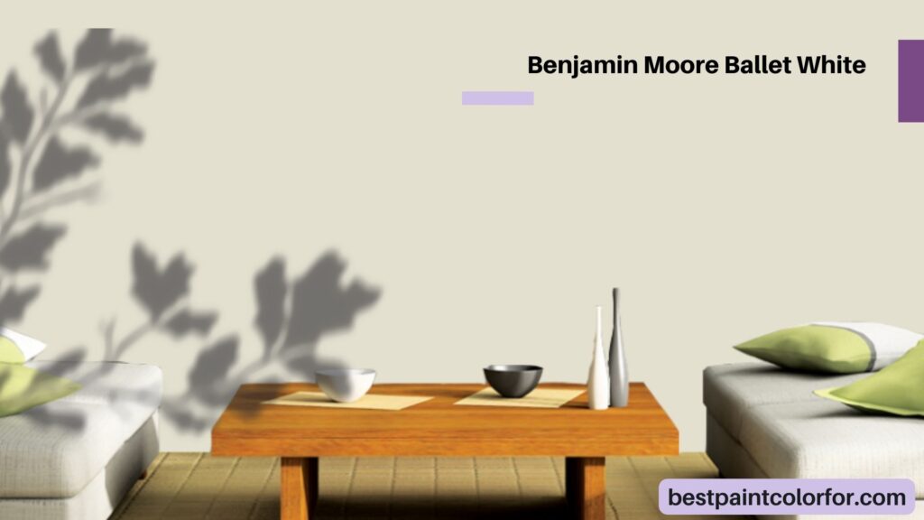
Benjamin Moore Ballet White
With an LRV of 71.97, Ballet White is a muted cream with graceful gray undertones. Its subtle beige essence radiates a sense of calm and tranquility.
This palette of cream shades beckons you to embrace the interplay of light and depth, to discover the perfect harmony that resonates with your space and your soul. Each color has its own story to tell, waiting to transform your walls into a canvas of warmth and elegance.
The bottom line
In the enchanting world of home design, cream paint colors emerge as the unsung heroes, offering a symphony of softness and warmth that gracefully embraces any space. Picture this: your walls adorned in the gentle embrace of cream hues, like a soft whisper of color that blankets you in a serene, welcoming ambiance.
These colors, with their delicate dance of light and depth, possess an uncanny ability to amplify natural light, transforming even the smallest corners into inviting havens. Imagine, too, their versatility—harmoniously waltzing with various decor styles, forever in vogue, a timeless hug for your home’s soul.
As you explore the palette of cream shades, envision a canvas eager for your touch—a canvas that holds stories waiting to be told. With each brushstroke of color, you craft a tale of comfort, style, and creativity. Your space becomes a masterpiece, not confined by trends, but painted with the hues of your personality.
It’s an invitation to embrace cream’s soothing elegance, a chance to harmonize with light and depth, and a journey into the artistry of home design. In the end, your home is a canvas, and cream paint colors are your medium, waiting for you to create a symphony of elegance that resonates with your heart and soul