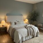
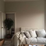
Have you ever found yourself in the situation where you decided to paint your room gray, expecting a chic and neutral atmosphere, only to be surprised when it looks more blue than intended?
The frustration of spending time selecting the perfect color, purchasing the paint, dedicating a day to painting, and then realizing the color doesn’t match your vision can be disheartening.
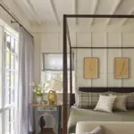
The allure of gray lies in its versatility and neutrality, making it a popular choice for various spaces.
However, the shift from gray to blue can happen, and understanding the reasons behind this unexpected transformation is crucial.
In today’s discussion, we’ll explore in detail why your gray paint might appear blue and offer comprehensive solutions to address this issue.

Pro Grade Paint Roller Kit, Brush & Roller for Professionals & Homeowners
Perfect for smooth finishes on your interior walls. Ideal for home improvement enthusiasts!
Buy Now on Amazon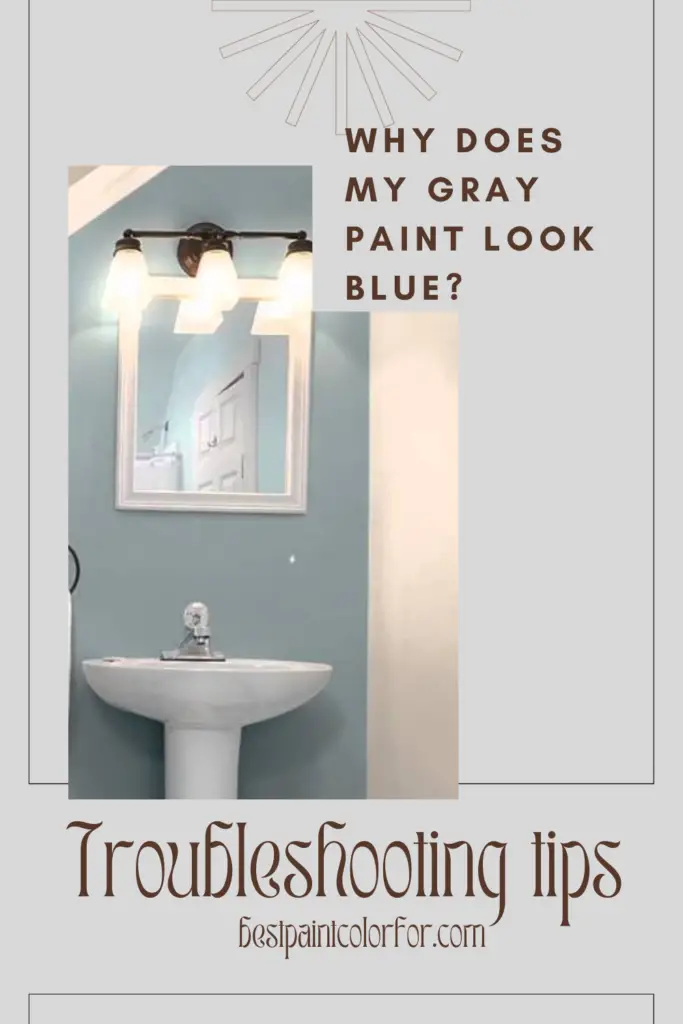
1. The Influence of Natural Light:
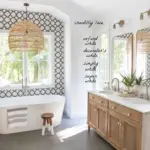
One of the primary factors affecting the perception of gray as blue is the direction your room’s windows face. The orientation of windows determines the quality and temperature of light that enters your space. North-facing rooms, for example, receive cool-toned light, which can accentuate the cool blue undertones in gray walls.
🔧 Solution
- To counteract the cool lighting, consider opting for a gray shade with warmer tones. This can balance the color, providing a more neutral and pleasing appearance. Testing different shades in your specific lighting conditions is essential to finding the right balance.
2. Accent Colors and Their Impact:
Colors are not isolated; they interact with their surroundings. The choice of accent colors paired with your gray walls can significantly influence how the gray appears. Just as a white paint color might appear neutral until placed next to a different color, the same principle applies to gray.
Solution: Be mindful of the colors you introduce into the space. Surprisingly, incorporating blue accent colors can sometimes diminish the perception of blue in your gray walls. This technique works well when the gray has a subtle bluish hint. However, be cautious with warm accent colors, as they may enhance the cool blue tones.
3. The Role of Lighting:
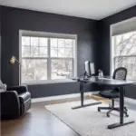
Lighting, both natural and artificial, plays a vital role in color perception. Cool-toned light bulbs, commonly found in many LED lights, can cast a blue glow on your walls, intensifying the bluish appearance.

Rust-Oleum 367605 Home Interior Floor Coating Kit, Semi-Gloss Black
Ideal for updating outdated flooring at a fraction of the cost of replacement and adheres without stripping, sanding or priming.
Buy Now on AmazonSolution: Consider switching to daylight bulbs with warmer tones. This simple change can have a significant impact, especially during the evening when artificial lighting is prevalent. It creates a more balanced and natural look, reducing the dominance of blue undertones.
4. The Importance of Color Testing:
One common pitfall in the painting process is not testing the chosen color in your actual living space. Relying solely on a small swatch from the store or seeking recommendations without practical testing can lead to unexpected and disappointing outcomes.
Solution: Swatching colors on your wall is crucial to ensure they harmonize with your surroundings, both during the day and at night. The advent of removable peel-and-stick paint samples makes this process convenient and efficient. Before committing to a color, take the time to see how it interacts with your unique lighting conditions.
📝 Key takeaways
- Gray paint may look blue due to factors like window direction, accent colors, and lightbulbs.
- Natural light from north-facing windows can enhance cool blue tones.
- Accent colors play a role; blue accents may reduce the perception of blue.
- Cool-toned light bulbs, like LEDs, can intensify the bluish appearance.
- Testing paint colors in your space is crucial to avoid unexpected outcomes.
- Choosing a warmer-toned gray can counteract a baby blue hue.
- Caution: Warm accent colors may enhance cool blue tones.
- Switching to warmer-toned light bulbs can create a more balanced look.
- Explore different color palettes to find the right balance.
- Seeking guidance can help address specific concerns about gray paint.
Why does my gray paint look blue?
Several key factors contribute to the bluish tint in your gray walls:
- The orientation of your room’s windows
- The choice of accent colors paired with the gray
- The type of lightbulbs used
- Failure to test the chosen color
The Solution
In the quest to make your gray walls appear less blue, a few strategies can be employed:
1. Opt for a Warm-Toned Gray:
If your gray paint seems to be skewing towards baby blue and that’s not the desired effect, consider selecting a warmer-toned gray. This choice can counteract the cool undertones, providing a more balanced and neutral appearance.
2. Choose Complementary Accent Colors:
The interplay of colors is a fascinating aspect of design. Surprisingly, incorporating blue accent colors into your decor can sometimes make your walls appear less blue. This technique works effectively when your gray has a subtle bluish hint.
⚠️Caution:
While blue accents can help, avoid introducing warm accent colors, as they may enhance the cool blue tones. If you have cherry or golden oak floors or cabinets, sticking to a warm gray is advisable to avoid an unwanted blue appearance.
3. Adjust Lighting with Different Bulbs:
The type of light bulbs used in your space contributes significantly to the overall ambiance. If you’ve noticed a blue tint in your gray walls, especially during the evening, it might be attributed to cool-toned light bulbs.
✅Action:
Swap out your cool-toned light bulbs for ones with a warmer, golden color. This adjustment can make a noticeable difference, especially when the lights are on at night. It contributes to a warmer and more inviting atmosphere.
In conclusion, understanding why your gray paint looks blue and taking proactive steps to address this issue can transform your living space into the harmonious and aesthetically pleasing environment you envisioned. By considering factors such as natural light, accent colors, lighting choices, and the importance of practical color testing, you can navigate the nuances of color perception and create a space that truly reflects your style and preferences.
The Conclusion
Feel free to explore different color palettes, experiment with accent colors, and embrace the transformative power of lighting to achieve the perfect balance in your gray-painted haven.
If you have any further questions or seek more guidance on the world of gray paint, don’t hesitate to reach out.
Happy painting!