Considering the adoption of Behr Blank Canvas for your living space? Let’s delve into the characteristics of this color, exploring its undertones, and determining if it aligns seamlessly with your home.
Behr recently unveiled Blank Canvas as their designated color of the year for 2023, a choice that caught my attention.
Notwithstanding any negativity towards this color, it exudes a pleasant, inviting, and warm white hue.
In a milieu where trends lean towards more vibrant pigments adorning walls, Blank Canvas stands out as a commendable choice.
Let’s examine the attributes that contribute to Blank Canvas’s popularity and its recognition as an award-winning color.

Pro Grade Paint Roller Kit, Brush & Roller for Professionals & Homeowners
Perfect for smooth finishes on your interior walls. Ideal for home improvement enthusiasts!
Buy Now on Amazon- Behr Blank Canvas Paint Color Overview
- What Are The Undertones Of Blank Canvas?
- Understanding the Warmth
- Does Blank Canvas Look Yellow?
- Is Blank Canvas Warm Or Cool?
- Light Reflectance Value (LRV)
- RGB Colors
- Hex Code
- Undertones
- Best Uses
- Similar Colors
- Coordinating Colors
- Secondary Colors
- Trim Colors
- How Does Blank Canvas Compare To Swiss Coffee?
- Lighter Option Than Blank Canvas
- Darker Alternative To Blank Canvas
- Behr Blank Canvas Color Palette
- Blank Canvas Coordinating Hues
- Behr Blank Canvas In Home Interiors
- Behr Blank Canvas Vs Behr Polar Bear (75)
- Behr Blank Canvas Vs Benjamin Moore White Dove (Oc-17)
- Behr Blank Canvas Vs Sherwin Williams Pure White (Sw 7005)
- Blank Canvas Pros u0026 Cons
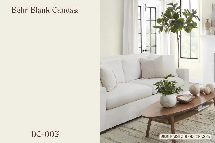
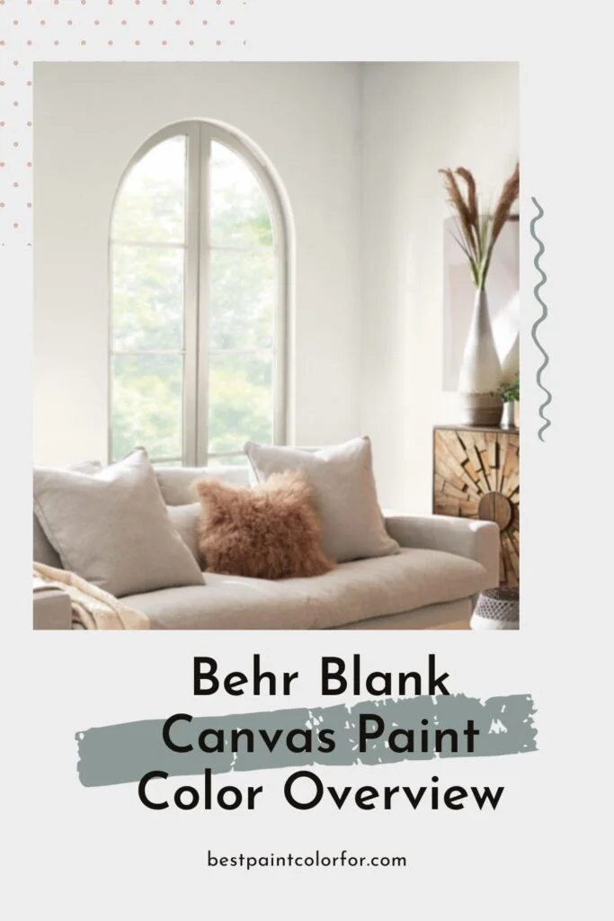
Behr Blank Canvas Paint Color Overview
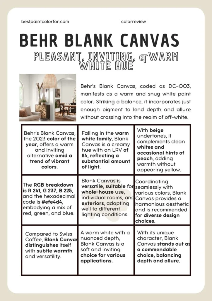
Behr’s Blank Canvas, coded as DC-003, manifests as a warm and snug white paint color. Striking a balance, it incorporates just enough pigment to lend depth and allure without crossing into the realm of off-white.
- Color Family
- Blank Canvas finds its place in the warm white color family.
📝 Note:
- Blank Canvas reveals itself as a creamy white imbued with a natural essence. Its subtle and versatile nature allows it to seamlessly complement items in the “natural” color spectrum, such as shoes, clothing, or home decor.
The Light Reflectance Value (LRV), a measure on a scale of 0 to 100 indicating how much light a color reflects, positions Blank Canvas at 84.
This places it on the mid-to-dark range of white paint colors, edging towards off-white while maintaining its unique character.
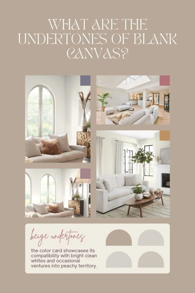
What Are The Undertones Of Blank Canvas?
Describing Blank Canvas as having beige undertones, the color card showcases its compatibility with bright clean whites and occasional ventures into peachy territory.

Rust-Oleum 367605 Home Interior Floor Coating Kit, Semi-Gloss Black
Ideal for updating outdated flooring at a fraction of the cost of replacement and adheres without stripping, sanding or priming.
Buy Now on Amazon📝 Key takeaways
- While not a stark, bright white, Blank Canvas avoids a yellow appearance, occasionally revealing a subtle touch of peach in certain lighting conditions.
Categorized as a warm white, it stands out as more neutral than extremely creamy options, yet distinctly creamy when compared to the crispest whites.
Understanding the Warmth
Comparing white paints often involves discerning their warmth or coolness. Blank Canvas is unequivocally a warm white, offering a neutral alternative to exceptionally creamy options and showcasing its creamy nature when placed alongside the coolest whites.
In the realm of light reflection, Blank Canvas plays in the mid-to-dark spectrum, making it an intriguing choice for those seeking a nuanced and versatile white for various applications.
Does Blank Canvas Look Yellow?
Blank Canvas, being a creamy white, DOES NOT exhibit a clean, bright white appearance. While it doesn’t specifically appear yellow, it’s essential to note that, in certain lighting conditions, Blank Canvas may portray a subtle touch of peach.
The creaminess of this white shade distinguishes it from brighter, cooler whites, offering a warmer and more nuanced aesthetic.
Therefore, depending on the lighting and surroundings, Blank Canvas might present a hint of peach rather than a pure yellow tone.
source / https://settingforfour.com/
Is Blank Canvas Warm Or Cool?
Blank Canvas is unequivocally a warm white. In the realm of white paints, distinguishing warmth or coolness is often facilitated by comparing shades with one another.
In this context, Blank Canvas stands out as a warm white, aligning itself more with neutral tones than extremely creamy options.
When placed next to the whitest or coolest whites, Blank Canvas unmistakably exudes a creamy warmth.
Therefore, if you’re seeking a warm and inviting ambiance in your space, Blank Canvas could be an excellent choice.
Light Reflectance Value (LRV)
With an LRV of 84, Blank Canvas reflects a substantial amount of light. On the scale from 0 to 100, where 0 is pure black and 100 is pure white, this places the color on the lighter end. Generally, colors with an LRV between 72-82 are categorized as off-white, while those exceeding 82 are considered white. Despite being white, Blank Canvas possesses a nuanced depth that distinguishes it from many other white paint colors.
RGB Colors
The RGB breakdown for Blank Canvas is as follows: R 241, G 237, B 225. This numeric representation encapsulates the mix of red, green, and blue in the color composition.
Hex Code
The hexadecimal code for Blank Canvas is #efe4d4.
Undertones
Blank Canvas reveals creamy neutral undertones, exhibiting a neutral base with subtle hints of yellow, brown, and gray. Its overall temperament leans towards warmth.
It is imperative to swatch colors on your walls to ensure their aesthetic appeal in different lighting conditions before committing to a choice.
Best Uses
This neutral color, possessing just the right amount of pigment, serves as an excellent choice for wall colors.
While it excels as a whole-house paint color, it also proves versatile for individual rooms, cabinets, or even the exterior of a house. Notably, exterior appearances may appear whiter due to the sun’s brightening effect.
In dimly lit spaces, Blank Canvas takes on a creamier and more off-white appearance.
Similar Colors
Some colors akin to Blank Canvas include Behr Palais White, Behr Crystal Cut, Behr Ostrich, Benjamin Moore White Down, Benjamin Moore Pearly Gates, Sherwin Williams Panda White, Sherwin Williams White Gold, Sherwin Williams Summer White, and Valspar Quail Egg.
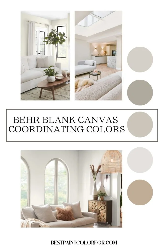
Coordinating Colors
Being exceptionally neutral, Blank Canvas harmonizes well with most color schemes. However, it is advisable to avoid red-based hues (red, orange, or purple) as they may accentuate the yellow tones. The Behr color palette for 2023 complements Blank Canvas seamlessly.
Secondary Colors
- Neutral: Perfect Taupe, Spanish Sand, Gratifying Gray, Vintage Pewter, Pure Earth.
- Pastel: Half Sea Fog, Hybrid.
- Bold: Vine Leaf, Midnight Blue, Cracked Pepper, Spiced Mustard, Vermilion, Aubergine, Conifer Green, Sophisticated Teal.
Trim Colors
For a cohesive look, employing Blank Canvas for both walls and trim is recommended. A flat or eggshell finish on the walls, coupled with a semi-gloss finish on the trim, imparts a soft and contemporary aesthetic. Alternatively, for high contrast, opting for an extra white or a crisp white trim is viable, though it may slightly alter the appearance of Blank Canvas walls.
In summary, Blank Canvas by Behr, with its warm white allure and versatile attributes, proves to be a compelling choice for various applications within your home.
How Does Blank Canvas Compare To Swiss Coffee?
Initially, I must confess that I harbored some skepticism about Blank Canvas when considering its proximity to Swiss Coffee – Behr’s longstanding classic.
On paper, the resemblance between the two is striking, almost to the point where the differences are imperceptible.
In terms of RGB values, Swiss Coffee boasts R: 241 G: 237 B: 224, while Blank Canvas stands at R: 241 G: 237 B: 225.
Yes, you read that right – merely a one-digit difference.
This led me to ponder whether Behr was attempting to replicate and market their most popular white as a new color.
However, I decided to delve deeper by examining the color chips, and I can affirmatively state that there is indeed a subtle but discernible distinction between these two shades – a distinction that I found quite refreshing.
To illustrate the disparity, I conducted a variety of comparisons.
- The first set showcases swatches of Swiss Coffee and Blank Canvas over a marbled tile, emphasizing the nuanced divergence.
- The images captured provide a glimpse of how Blank Canvas, with its extra hint of blue, leans slightly more towards neutrality when juxtaposed with Swiss Coffee.
- While the initial photo may be the most illustrative of the difference, I was inspired to go above and beyond, presenting additional visual aids for a comprehensive understanding.
- In the subsequent comparison, both color cards are held up against a white background, serving to accentuate the subtleties in their tones.
- As an added layer of clarity, I included a depiction of the Swiss Coffee color card with Blank Canvas swatched over it.
- I trust that these visuals contribute to a clearer appreciation of the minute yet impactful distinctions between Blank Canvas and Swiss Coffee.
- It’s essential to note that if your walls are currently adorned in Swiss Coffee, I would advise against repainting them in Blank Canvas.
- While I remain not entirely convinced that the dissimilarity is prominently evident once applied, embarking on such a repainting venture might prove to be an unwarranted expenditure.
Lighter Option Than Blank Canvas
Apart from Whipped Cream, which deviates significantly from Blank Canvas, these whites all fall within the same Light Reflectance Value (LRV) range.
For a lighter substitute to Blank Canvas, consider Behr WHISPER WHITE. While maintaining the same tonal quality, it offers a slightly lighter shade.
Darker Alternative To Blank Canvas
To explore a darker alternative to Blank Canvas, experiment with Behr QUARRIED LIMESTONE. Positioned on the color strip, it becomes apparent that this shade closely resembles Blank Canvas but tends towards an off-white hue.
Behr Blank Canvas Color Palette
Behr provides a recommended color palette to complement Blank Canvas, featuring a range of versatile neutrals.
This palette includes Gratifying Gray, Vintage Pewter, Vine Leaf, Midnight Blue, and Cracked Pepper, all harmonizing with Blank Canvas for a cohesive and stylish look.
Blank Canvas Coordinating Hues
Vintage Pewter
Embrace the timeless appeal of Vintage Pewter, a greige paint color that beautifully complements the warmth of Blank Canvas.
Gratifying Gray
Gratifying Gray, a warm gray with silvery undertones, pairs harmoniously with Blank Canvas, creating an elegant combination.
Vine Leaf
For those desiring a bold, dark green, Vine Leaf is a captivating choice. Its rich emerald tone complements the luxurious warmth of Blank Canvas. If Vine Leaf feels too bold, alternatives like Sherwin Williams PEWTER GREEN or ROSEMARY might be preferable.
Midnight Blue
Create a classic aesthetic by combining the deep navy of Midnight Blue with the creamy white of Blank Canvas. This traditional pairing is particularly suitable for Victorian restorations.
Cracked Pepper
For a Modern Farmhouse color scheme, Blank Canvas and Cracked Pepper form an ideal duo, blending modern style with classic warmth.
Complementary Color For Blank Canvas
The official complementary color for Blank Canvas, found directly across the color wheel, is a powdery violet-blue. Behr Vaguely Violet is a remarkably close match.
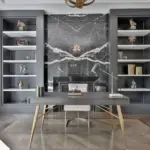
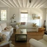
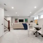
Behr Blank Canvas In Home Interiors
Finding real-life photos of Behr Blank Canvas can be a bit challenging. Here’s a compilation featuring rooms with Blank Canvas alternatives and some I assembled with an actual Blank Canvas backdrop.
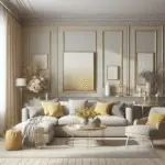
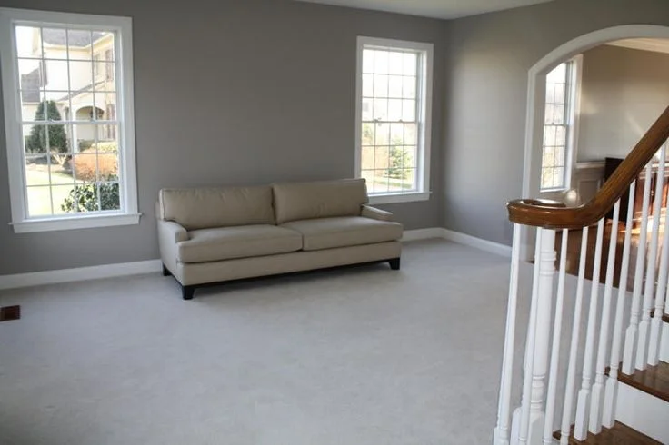
Behr Blank Canvas On Living Room Walls:
Witness Blank Canvas in an all-white living room, showcasing a neutral ambiance with occasional hints of a peachy undertone.
source / https://behr.com/
Blank Canvas In A Dining Room:
In lower light, such as this dining room, Blank Canvas takes on a more off-white appearance.
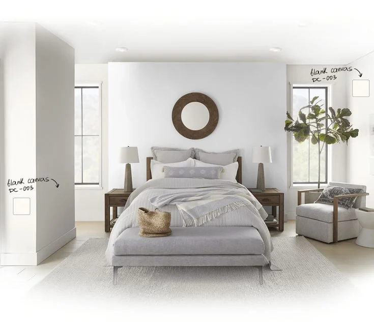
Behr Blank Canvas Inspired Bedroom:
Although this bedroom features Benjamin Moore Swiss Coffee, it gives a sense of how Blank Canvas would appear in softer light, perhaps with a slightly more beige touch.
source / https://howtodecorate.com/
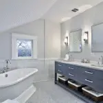
Blank Canvas In A Bathroom:
The bathroom, painted in SW Alabaster (similar to Behr Blank Canvas but darker), demonstrates how Blank Canvas can embody a crisp white look.
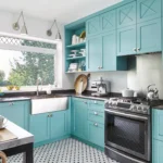
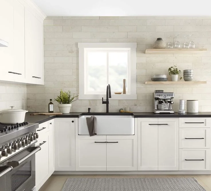
Behr Blank Canvas On Kitchen Cabinets:
Visualize Blank Canvas in an all-white kitchen setting, providing a bright and clean aesthetic.
Blank Canvas On Your Exterior:
While we await more Blank Canvas photos, here are exterior shots inspired by Blank Canvas. One depicts a similar shade to Alabaster on a front porch, and another showcases Benjamin Moore Swiss Coffee, resembling Blank Canvas with a more beige tone.
Behr Blank Canvas Vs Behr Polar Bear (75)
Polar Bear stands out as one of Behr’s more sought-after whites, presenting itself as a lighter counterpart to Blank Canvas. Despite the similarity, Polar Bear leans slightly cooler, maintaining its status as a soft white.
Behr Blank Canvas Vs Benjamin Moore White Dove (Oc-17)
While White Dove shares a warm creamy tone with Blank Canvas, it veers towards a cooler, grayer spectrum, enhancing its overall neutrality. Multiple photos were taken to capture the nuanced contrast, with the best representation provided below.
Behr Blank Canvas Vs Sherwin Williams Pure White (Sw 7005)
Pure White by Sherwin Williams, although a soft white, exudes a truer white essence compared to Blank Canvas. The difference becomes evident in the juxtaposition of swatches.

Blank Canvas Pros & Cons
In brief, here’s a summary:
Pros
- A soft white that complements a wide array of colors.
- Strikes a balance between lightness and color, making it suitable for entire home use.
- Ideal for exterior applications.
- Serves as a noteworthy alternative to the immensely popular Sherwin Williams Alabaster.
Cons
- Not a stark, pure white.
- The subtle peachy undertone might be a decisive factor.
- Its classic nature could potentially be perceived as a bit mundane.