Are you on a quest for the perfect gray paint color to enhance the aesthetics of your home? Look no further!
Let’s delve into the world of Sherwin Williams Grayish, exploring its unique undertones, coordinating colors, and trim pairings to determine if it’s the ideal choice for your living space.
Gray paint colors have become incredibly popular, with a myriad of shades beyond the infamous “50 shades of gray.” One such contender is Sherwin Williams Grayish – a paint color that may not dominate the popularity charts, but its distinct undertones make it a compelling choice for the right setting.
- Sherwin Williams Grayish: At a Glance
- Is Grayish a Good Natural or Neutral Color?
- Undertones:
- Best Uses:
- Similar Colors:
- Coordinating Colors:
- Trim Colors:
- Grayish FAQs:
- Why Do Some Grays Look Purple, and Others Appear Browner?
- Will Grayish Look Purple or Have Cool Undertones?
- What Color is Close to Grayish Without the Purple Undertones?
- Color Schemes for Grayish:
- Examples of Success with Grayish:
- Warmer Gray Would Work Better:
- Grayish in Small Bathroom:
- Grayish in Natural Light:
- Grayish in the Basement:
Sherwin Williams Grayish: At a Glance
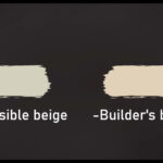
When scouring the best gray paints by Sherwin Williams, familiar names like Accessible Beige (a greige color), Agreeable Gray, Silver Strand, and Repose Gray often take the spotlight. Amidst these choices, there’s one color that might not grab all the attention but is certainly worth considering.
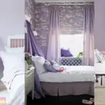
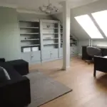
Grayish SW 6001 by Sherwin Williams has found its place in two different bathrooms and our entire basement, areas that don’t receive much natural light.

Pro Grade Paint Roller Kit, Brush & Roller for Professionals & Homeowners
Perfect for smooth finishes on your interior walls. Ideal for home improvement enthusiasts!
Buy Now on AmazonGrayish is a color that requires thoughtful consideration due to its ability to present varied appearances in different spaces. What sets it apart is its departure from the typical gray seen on many walls.
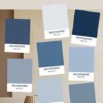
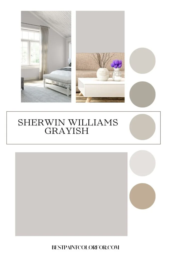
- Color Family: Grayish belongs to the gray color family.
- Light Reflectance Value (LRV): With an LRV of 60, it approaches mid-toned gray, steering clear of being overly light.
- RGB Colors: R:207 G:202 B:199, reflecting the color mix to create this unique shade.
- Hex Code: #cfcac7
Examining the hex codes of paints provides an interesting insight into surrounding colors. While the left side leans towards purple, the underlying main color exudes warmth. It’s a captivating blend where warm meets cool, offering a modern and distinct character to the color
Is Grayish a Good Natural or Neutral Color?
Our spaces painted in Grayish bring us immense satisfaction as it strikes a balance between being light and adding depth or richness to the color palette.
However, some individuals find Grayish leaning too much towards purple or blue. Given our inclination towards cool colors, we appreciate and have incorporated this color in various places.

Rust-Oleum 367605 Home Interior Floor Coating Kit, Semi-Gloss Black
Ideal for updating outdated flooring at a fraction of the cost of replacement and adheres without stripping, sanding or priming.
Buy Now on Amazon
Undertones:
Grayish boasts pronounced purple undertones, providing a cool gray appearance with subtle hints of pink or red, distinguishing it from more popular greige choices. The color tends to exude a cooler vibe, particularly in rooms with north-facing windows or limited natural light. However, a well-lit southern-facing window can infuse warm, yellow-toned light, mitigating the coolness and purple undertones.
Best Uses:
This color finds its ideal canvas in smaller rooms, shining in bedrooms, guestrooms, or bathrooms. Bright rooms with ample natural light tend to showcase Grayish in a lighter and warmer manner, minimizing the purple undertones. It harmonizes seamlessly with stone and brown accents, creating a delightful contrast against darker floors or finishes. Additionally, it emerges as an excellent choice for exterior applications, exuding warmth and inviting charm when bathed in sunlight.
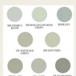
Similar Colors:
- SW Individual White
- SW Destiny
- SW Mercurial
- Benjamin Moore Cement Gray
- Behr Offshore
- Essential Gray SW 6002
- Proper Gray SW 6003
- Mink SW 6004
- Folkstone SW 6005
- Manor House SW 7505
Coordinating Colors:
- Grayish effortlessly pairs with blue, cool white, or dark brown. Some notable recommendations include:
- Blues: SW Halcyon Green, SW Moody Blue, SW Interesting Aqua, SW Stormcloud, SW Indigo Batik
- Whites: SW Snowfall, SW Individual White, SW Essential Gray, SW Extra White
- Browns: SW Browse Brown, SW Chinchilla, SW Black Fox
Trim Colors:
The undertones of Grayish harmonize best with a clean, crisp white trim. Optimal choices include:
Bright White Trim Colors: Benjamin Moore Simply White, Sherwin Williams Extra White, Behr Ultra Pure White
Grayish FAQs:
- Undertones: Grayish exhibits purple and slight pink undertones, particularly in cooler light.
- Warm or Cool: This is a cooler gray paint color; however, in warm natural light, it appears extremely neutral.
- Pink or Purple Appearance: Grayish may look pink under warm-toned natural lighting and can read as purple in rooms with minimal natural light or during nighttime with overhead lights on.
- Comparisons:
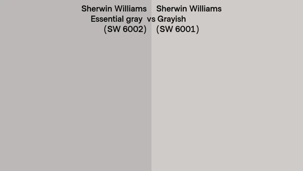
- Agreeable Gray vs. Grayish: While both share an LRV of 60, Agreeable Gray leans warm, whereas Grayish boasts cool undertones.
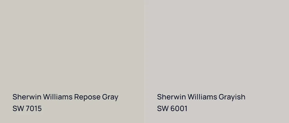
Repose Gray vs. Grayish: Grayish is slightly lighter than Repose Gray but stands out with blue/purple undertones, offering a cooler tonality compared to Repose Gray’s neutral appeal.
Why Do Some Grays Look Purple, and Others Appear Browner?
The warmth or coolness of any gray paint depends on the mixtures of colors and lighting conditions. Undertones and lighting play a significant role, emphasizing the importance of testing paints in specific lighting situations. Your personal color perception further influences the undertones you observe.
Need help testing paints? Read our full review on using large peel-and-stick paint samples for assistance in choosing colors.
Will Grayish Look Purple or Have Cool Undertones?
Grayish undeniably exhibits purple undertones, appealing to those who favor cool colors. To fully gauge how it will appear in your space, thorough testing using tools like Samplize or painting samples on the wall is recommended.
What Color is Close to Grayish Without the Purple Undertones?
Some individuals have found success with Alpaca as a nice color devoid of purple undertones.
Color Schemes for Grayish:
According to the Sherwin Williams website, Alaea, Snowfall, and Roman Column are excellent coordinating colors with Grayish SW 6001. However, this neutral and light color blends seamlessly with various color schemes. In our large bathroom, natural slate stone paired with Grayish walls and darker accents showcase the versatility of this paint.
Examples of Success with Grayish:
Grayish achieves a pleasing aesthetic in our small bathroom with blue-gray painted cabinets and wood shelves. In the basement, its light and neutral tone complements the large space, providing a perfect backdrop for the walls.
[Image: Behr Charcoal Blue painted cabinet with SW Grayish walls and silver mirror]
Warmer Gray Would Work Better:
In the larger bathroom, a warmer gray like Agreeable Gray might have been a more fitting choice. However, utilizing leftover paint and desiring a distinct gray for the bathroom led us to choose Grayish. The color works well, but a slightly warmer undertone could have complemented the slate tile.
Grayish in Small Bathroom:
Grayish’s lightness doesn’t seem to diminish the space in our small bathroom. Adding more color to the cabinets creates a delightful contrast, keeping the walls light and airy in this neutral paint color.
Grayish in Natural Light:
Warmer tile walls might not blend as seamlessly with Grayish. The color appears different with the light fixture on, showcasing the impact of lighting on its appearance.
Grayish in the Basement:
In our basement, original oak molding alongside white painted trim complements Grayish, creating a clean and appealing look. The color pairs well with white cabinets and brightens up the space.
In conclusion, Sherwin Williams Grayish emerges as a distinctive choice for those seeking a cool-toned gray with character. Explore its nuances, consider its best applications, and embark on your painting journey with confidence.