Choosing Sherwin Williams Accessible Beige as the color for your room is a significant decision when it comes to painting your home.
Opting for a neutral color like Accessible Beige can be a wise choice, especially if you’re feeling a bit apprehensive about the process.
The advantage of sticking to neutrals for your main wall colors is that it provides a blank canvas, allowing you to experiment with accent colors for furniture and seasonal decor.
It’s a design approach that offers versatility and the opportunity for creative expression.
Here’s a breakdown of considerations and insights related to Accessible Beige and its coordinating colors:

Pro Grade Paint Roller Kit, Brush & Roller for Professionals & Homeowners
Perfect for smooth finishes on your interior walls. Ideal for home improvement enthusiasts!
Buy Now on Amazon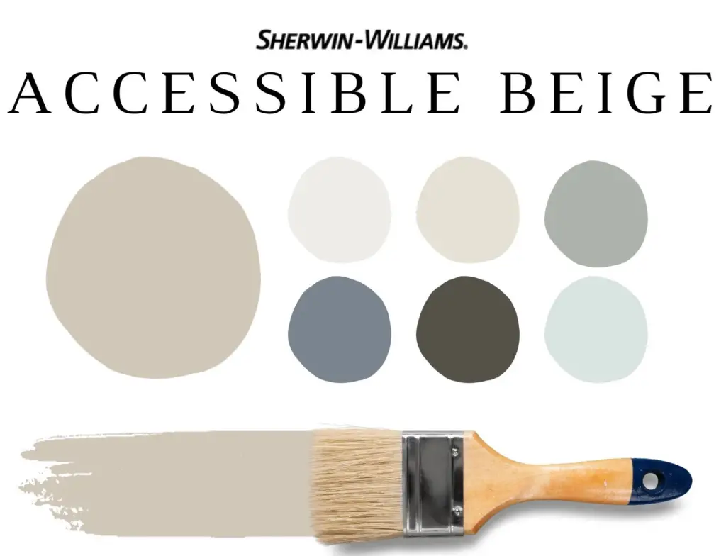
How to Select Your Accent Colors
When deciding on accent colors, there are key considerations:
Neutral or Bold:
Determine whether you prefer a neutral color scheme or if you want to introduce pops of color.
Color Families:
If opting for neutrals, consider shades of gray, beige, and white. For bold pops of color, decide between cool tones like blues or warm tones like golds.
Permanent Elements:
Take into account permanent elements in your home, such as trim color, flooring, and kitchen cabinets. Choose colors that complement these tones.

Rust-Oleum 367605 Home Interior Floor Coating Kit, Semi-Gloss Black
Ideal for updating outdated flooring at a fraction of the cost of replacement and adheres without stripping, sanding or priming.
Buy Now on AmazonLighting:
Consider the lighting in your home; natural light can affect how colors appear. Test colors in both daytime and nighttime to ensure they meet your preferences.
How to Use Accent Colors
Accent colors can be incorporated in various ways, including painting accent walls, furniture, curtains, rugs, pillows, lamps, and home decor.
How to Shop for Accent Colors
When shopping for accent pieces, carry a paint sample or swatch of Accessible Beige. This handy hack allows you to compare and coordinate colors quickly while shopping.
About Accessible Beige
Accessible Beige is a popular beige color that has stood the test of time. Despite the trend towards warm tones, Accessible Beige remains relevant, offering a depth and richness that sets it apart from average builder beige. It is characterized as a warm tan-beige with gray undertones, devoid of pink undertones.
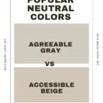
Agreeable Gray vs. Accessible Beige
Accessible Beige and Agreeable Gray are closely related paint colors. While both fall under the greige category, Accessible Beige is warmer and more yellow, whereas Agreeable Gray tends to skew more pink.
Coordinating Colors for Accessible Beige
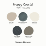
For coordinating neutrals, consider creamy whites or deep shades of brown. Accessible Beige pairs well with colors like Tony Taupe, Aesthetic White, Balanced Beige, Van Dyke Brown, and Urbane Bronze.
Complementary Colors and Trim
If you want to introduce color, pastels like Sea Salt, Pink Shadow, Cadet, and Topsail complement Accessible Beige. For trim, stick to a creamy white like SW Alabaster or even warm white for a harmonious look.
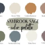
Accessible Beige Color Palette
Unlock the potential of Accessible Beige in your home by exploring our exclusive paint color palette. This pre-made palette offers the perfect trim color and six accent colors, striking a balance between neutrals and bold hues for an instantly harmonious space.
Before making your final decision, delve into our comprehensive breakdown of beige vs. tan to gain a deeper understanding of these popular neutrals and make a well-informed choice for your wall color.