Hey there; paint color expert, and e-design consultant.
Today, we’re looking at Sherwin-Williams Greek Villa.
As you know, Greek Villa is a white paint color, but it’s not a true white paint color.
Every paint color has an LRV number, which is on a scale of zero (black) to 100 (white).
In the paint world, we only go up to 94. We don’t have whites above that; they’re more, let’s call them, technical whites.

Pro Grade Paint Roller Kit, Brush & Roller for Professionals & Homeowners
Perfect for smooth finishes on your interior walls. Ideal for home improvement enthusiasts!
Buy Now on AmazonThis guy comes in at 84, so that’s 10 points underneath the whitest white. And what is the whitest white?
This right here, this is Behr, I believe it’s Behr Ultra White, Ultra Pure White, yeah.
So super white shows you the softness of Greek Villa.
That’s what that lower LRV gives you.

Rust-Oleum 367605 Home Interior Floor Coating Kit, Semi-Gloss Black
Ideal for updating outdated flooring at a fraction of the cost of replacement and adheres without stripping, sanding or priming.
Buy Now on AmazonPremium Download
Get the Pro Color Palette for Free
- Help you Visualize
- Help you Plan
- Make most out of it
Be sure about LRV Value
What you really need to know about this number here is it’s a percentage from 0 to 100, and the higher the number is, the more light it reflects, which means the lighter the color will appear.
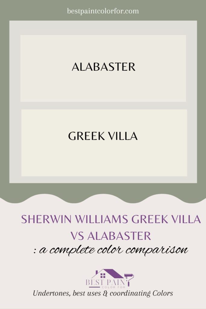
Sherwin Williams Greek Villa
Is there a flawless white paint hue out there?
Well, nope, not really.
I wish there was a universal white paint that worked like magic in every home and room.
White paint is quite a finicky character. It plays off everything – your lights, your furniture, even those trees outside.
If there’s a forest view, greenish hints might sneak in.
Choosing white paint is like navigating a labyrinth.
Here’s my strategy: kick off with a popular white shade. It’s a solid beginning. Then, you can decide if you want a cozier or cooler white, or maybe one with fewer yellow undertones.
Sherwin Williams Greek Villa is a strong contender in this quest.
What color is Sherwin Williams Greek Villa?
Sherwin Williams Greek Villa: The Creamy Farmhouse White
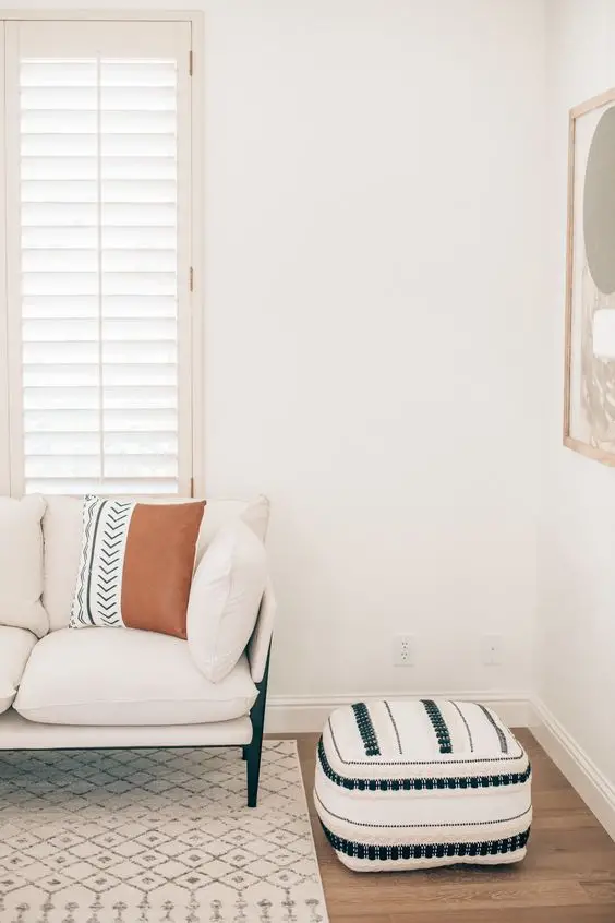
Greek Villa, from Sherwin Williams, is a color with hue between white and off-white. It’s the farmhouse white you’ve been eyeing. This isn’t your stark white. Greek Villa boasts a creamy, gentle white with a hint of warmth in its undertones.
Credit: wtfab
What color is Sherwin Williams Alabaster?
Alabaster, our chosen paint, isn’t your blindingly bright white. With a Light Reflectance Value (LRV) of 82, it’s got depth and creaminess woven in.
But wait, there’s more! Alabaster isn’t just any white; it carries a subtle touch of gray undertones, adding to its unique character.
Also Read: 65 colors to pair with terra cotta (Best Collection!)
Source: Lavenia Shah
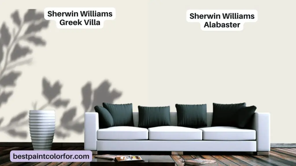
What’s the difference in colors of Greek Villa Vs Alabaster Apart?
Looking at Greek Villa vs. Alabaster, there’s some common ground:
Both are creamy, off-white favorites in the world of interior decor.
But now, let’s dive into what makes them unique:
💡Pro tip:
Greek Villa leans towards a warm beige cream vibe, while Alabaster sports a touch of grayish cream sophistication.In the subtle world of shades, Greek Villa takes the lightness crown with an LRV of 84, just edging out Alabaster at 82.
Here’s the nitty-gritty:
Greek Villa:
LRV: 84
RGB: R:240 G:236 B:226
Undertones: Hints of yellow and beige.
Alabaster:
LRV: 82
RGB: R: 237 G: 234 B: 224
Undertones: It’s got warm, beige-toned undertones to jazz up your space.
What are some undertones?
Greek Villa brings the warmth with hints of yellow and beige, while Alabaster leans into cooler gray tones.
But which one’s whiter?
Both Greek Villa and Alabaster flirt with creamy off-white, but Greek Villa tiptoes closer to white, being a tad lighter and brighter.
Why Greek Villa is the best of white colors?
It’ll work in a lot of situations, especially if you want a warm White specifically.
It’s also in a sweet spot where you could use it as a very light wall color, and it’s light enough that you could justify using it on your trims and your doors, and especially on cabinets, maybe even ceilings if you wanted to, although I am a touch hesitant on that one because for some reason, I tend to gravitate towards either really clean stark white ceilings or I pick something bold.
Places to use Greek Villa paint color
You either go deliberately white or deliberately not white. The one situation where I would see Greek Villa being a good choice on the ceiling is when you have it on the walls already and you’re just continuing it all the way up.
This is common practice for rooms that have those slanted or those vaulted ceilings, for example, when you don’t have a room with a clear concise flat ceiling panel above, and all the surfaces just sort of meld together. In those cases, you can keep that consistency by continuing that same wall color all the way up and around the room.
Will Greek Villa act like white?
Yes, as long as you don’t have other white around. So if you have white subway tile, hard no on Greek Villa. It needs to be the whitest white in the space.
Now we’re going to do some comparison because comparison is the best way to pick white paint colors, because they are a bit of a bugger with undertones.
I want to show you Sherwin-Williams Whitest White, which is High Reflective White. Its LRV, I believe it’s 93. It’s running right up here with Ultra Pure White.
Now you can see that shift between Sherwin-Williams White is White and the softness there, right?
Benjamin Moore colors
Now, I also want to show you a few Benjamin Moore colors, because whites are so tricky. I’d rather show you more options rather than less. You can see those shifts.
So Greek Villa is a warm white, but if we compare it to a warm white like Cloud White, we can see how much softness is in there.
I like that.
If you have a lot of rich warm colors, Greek Villa is probably going to be a little flat for them.
Something like Cloud White or say Sherwin-Williams Alabaster is probably going to be better.
Benjamin Moore White Dove
Benjamin Moore White Dove is a little bit less warm than Cloud White, but it’s still warmer than Greek Villa. So again, we’ve got warmth, but it’s not that creamy Sherwin-Williams Pure White.
So when I’m picking a white for a project, I usually start at Pure White and work out from there to see what works. Pure White is a fantastic color.
So for me, I believe they both have the same LRV.
So if I’m choosing between these two whites, Pure White and Greek Villa, I’m almost always going to go for Pure White because I trust it a little bit more.
Greek Villa has a little bit of warmth to it, Pure White does too, a little bit stronger. The one thing I worry about with Greek Villa is whether it could grab a little wink of green.
I wouldn’t say there’s an obvious green in there, but of the two, it’s more likely, and that’s a risk with some of these warm whites.
I would just watch for if you have a lot of green landscaping outside, this is probably going to be a safer bet than Greek Villa.
I wouldn’t worry about the green, just be aware of it just in case it pops up.
If we go to the other end of white, which is the cool end, so this has a comparable LRV, but rather than being warm, it’s cool, and I feel that really helps us see the warmth in there and how maybe it could flash that little bit yellow-green, give an encouragement.
Again, I wouldn’t worry about it, be aware of it. So where would I be aware of it?
Say you have products in your home that have purple and pink undertones, that’s where I’d watch it the most.
Alabaster
One more comparison, Alabaster. This is similar to Benjamin Moore Cloud White that we looked at.
Again, this is a beautiful warm white, softer, almost a little bit more gray in it in comparison, right? But still some warmth there.
So there you have it, that’s Greek Villa.
Greek Villa Vs Alabaster
Alabaster comes to mind, West Highland White’s pretty cool, Snowbound, but Greek Villa is one that checks so many boxes as a paint color.
First of all, you have the name which is evocative of that beautiful white marble that I got to see in Athens. James, just stop it, okay?
It’s over, the honeymoon’s done, okay?
One thing that I really like about how Sherwin-Williams organizes their colors on their website is they give you a lot of information right at your fingertips.
Pair Greek Villa with other colors
While you could just stick with one paint color in Greek Villa, it’s cool to have a few other options if you want to add some complexity.
The first color to look at is the white pairing, which is a simple one to me.
It’s White Snow, and I like it because it’s one of the few white paint colors that has a slight contrast to Greek Villa because it is a bit cleaner and brighter.
It also has a bit less warmth to it, which will help it pop off a little bit more, just a nice minimal white to go with Greek Villa.
Lime Wash with Greek Villa
The light color pairing is Limewash, which is named after a very popular faux finish these days. This color is not going to give you a limewash look on your walls, but it does have a really soft suede-like coloration to it that combines a bit of brown and a bit of beige and a decent dose of gray.
There is a noticeable jump in depth here, so for the rooms that you want some noticeable color but you don’t necessarily want something that might clash, I really like Limewash for that purpose.
It’s not necessarily the most obvious choice either because you would think you would double down on that Greek Villa warmth with your light color.
Limewash still maintains a certain level of sophistication because of that grayed-out quality to it. The mid-tone color introduces just that, some color.
Fresh Eucalyptus
Fresh Eucalyptus has a very clear teal to it, although it’s not too far of a jump from Limewash in its neutral quality.
This color has a slightly muted touch but has that kind of bluish color to help bridge the gap a bit from the previous color to our final color pairing, which I’ll get to in a second.
Oftentimes nowadays, you’ll see a lot of houses flooding their space with warm white, and then you have little pops of color here and there as an accent.
Fresh Eucalyptus can be that accent for something a little more soft and understated, and as you increase its usage in your house, maybe you put it on the walls in your bathroom or as a fun little vanity color, it’ll just add some character to an otherwise understated color palette
So if you do have a lot of those muted grays already and you want just a little bit of color here and there without making a massive statement, this is kind of a good color to do that with.
Sherwin Williams Alabaster – Why it’s perfect?
To many people, you may look at alabaster and think, okay, nothing too wild or crazy over here, it kind of just looks white but kind of doesn’t, and to me that’s too many kindas.
Okay, I like things that are definitive.
The tough part about working with subtle paint colors like alabaster is they’re not really clearly anything like a big bold red or a deep beautiful blue, off-whites can be tricky, so don’t hate yourself too much if you’re struggling because a lot of us do.
So before you get tricked, let’s talk about what alabaster is at its core.
LRV Value of Alabaster
The first thing I like to do is check out its LRV or its light reflectance value. This will determine how much light the color reflects, and this also tells you how light it will appear on a percentage scale from 0 to 100.
So an 82 LRV is pretty light, in fact, anything over 80 to me I tend to categorize it as an off-white or a white paint color, which is what alabaster is.
These types of colors can have any number of undertones, but typically you can broadly define them as being warmer or cooler, and I would say that alabaster leans warmer but not by a massive margin.
Why Alabaster is popular?
I think one of the reasons why it’s so popular is because of its real strong sense of balance.
It’s really a bit creamy and beige-y but it doesn’t feel overly yellow.
It has a touch of gray in it to help soften it and desaturate it which allows it to really blend in seamlessly to many different spaces and when you’re going with a neutral paint color on your walls, especially blending in is normally a good thing.
You don’t want them to pull focus from the super hilarious portrait your dad painted of you and your fiancé in Mexico.
True story.
Alabaster is one of those awesome neutral canvas colors that allows your accessories to become the stars of the show. I
will say it tends to be on the lighter side of wall colors.
Once you start to get to the 80 mark and above on the LRV scale, you do run the risk of your paint color feeling a bit washed out and kind of bland during those periods of peak lighting.
Another thing with really bright white paints is they tend to look a bit, I don’t know, dingy and unattractive in the corners of rooms specifically because of how shadows can behave.
Alabaster is sort of on the cusp but shouldn’t cause you too many problems on that front because it’s not high reflective white or anything like that.
It’s soft and subtle, bright but not too bright.
Alabaster as an Exterior color for the trims
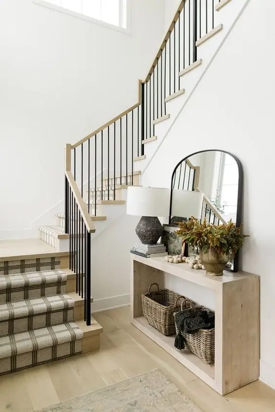
As an exterior color, I think it’s an incredible choice as a secondary or a trim color on your home. You could technically get away with it as a main body color although it will appear pretty bright.
I think it’s a perfect combination of undertones for the outside because the cool sunlight will neutralize the warm undertones giving it a very clean streamlined look.
Coordinating Colors with Alabaster
We’re gonna give you an off-white, a light, a medium, and a dark color that I have chosen to go alongside alabaster in any capacity you see fit. The truth is though there are so many different colors that you can use with alabaster because of how versatile and flexible it is but here are the four that I picked.
City Loft
For the light color, we have City Loft which is a 70 LRV greige which is a combination of gray and beige although it’s a touch more gray than beige.
What’s interesting about it is it also has a little bit of red in the undertones coming in giving it a taupey or a brown feeling as well and it really doesn’t have much of the creaminess that’s found in alabaster.
The two colors together are different enough in depth so that you can distinctly see a difference between the two, and while you still have that 13 light reflectance jump from one to the other, it’s a noticeable difference.
But I would say it’s more subtle, all things considered. That emphasis on brown compared to beige is what helps these two colors co-exist separately. They behave with one another, but they’re also distinctive and special.
If you had something like pacer white, which is similar to city loft but has more yellow, then that subtle pairing to alabaster would get even subtler.
Broccoflower
But I’m not always one for subtleties, which is why my mid-tone color is extremely vibrant and pretty dark. To be fair, it’s broccoflower, which is a paint color that is just as fun as its name. It has a bit of an avocado flair but also brings in quite a bit of warmth in its undertones.
Definitely feels closer to the yellow side of green versus a bluish green like teal or turquoise. This is definitely the accent color of the bunch, but you don’t need to use it in an accent format. This doesn’t need to be your 10 color in your 60-30-10 split, but it will be the one that everyone will be looking at. So whichever surface you put it on, it’s definitely going to draw the eye.
Our dark color pairing that we’re going with is technically more saturated because of how much colorant is in it, but it’s going to be secondary to that green we just talked about. It’s a super deep taupe gray with a dash of green as well, and it’s called thunder gray, the color named after a sound I still can’t wrap my head around. That, me and my pea-sized brain.
So by far the darkest color with an LRV of nine, we’re in the single digits here. And this will probably read as a near-black color next to something light like alabaster, but it won’t seem quite as dark next to a bunch of your matte black table and chair legs. Those are real black, this one is kind of black. There are darker paint colors that exist, but I didn’t necessarily want to pick something too dark because of how light we were starting with using alabaster.
Thunder Grey
I like thunder grey because it is a nice combination of everything. It takes that touch of gray in alabaster and magnifies the crap out of it. You have a bit of brown from city loft and then a dash of the green from broncoflower visible in the undertones, finishing up with our off-white paint color choice. I know it’s a cop-out, but I really like doubling down with alabaster here. Why try and find another awesome off-white when you already are starting with one? I love alabaster as a trim color even if you’re using it on the walls.
The final verdict
So, if you wanted something just a bit cleaner and starker, you could perhaps go for pure white, which is not as bright as you can go, but it’s one that I like to use alongside alabaster for something that’s a tad less warm. If you have a couple of minutes, we talked about it in this video right over here. It’s a great color on cabinets too.
Conclusion
In the end, the Greek Villa vs. Alabaster debate isn’t just about paint; it’s about crafting the ambiance of your space. The decision hinges on your unique style, lighting conditions, and personal preferences.
So, armed with swatches and a newfound understanding, you’re now ready to embark on your painting adventure and create the perfect backdrop for your home’s story.
Also Read: Sage Green Vs Olive Green – Let’s pick the best color