Exploring a light gray paint with warm undertones?
Let’s discuss Sherwin Williams Drift of Mist and its potential fit for your home.
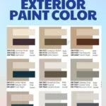
Picking the right paint color can be challenging, especially when the goal is a neutral shade.
Drift of Mist falls between greige and off-white, offering a hint of color for a comfortable feel on your walls.
This color exudes warmth without any yellow undertones, owing to its predominantly green undertones.

Pro Grade Paint Roller Kit, Brush & Roller for Professionals & Homeowners
Perfect for smooth finishes on your interior walls. Ideal for home improvement enthusiasts!
Buy Now on AmazonIf you’re into the current trend of decorating with greens, Drift of Mist could be an excellent neutral choice for you.
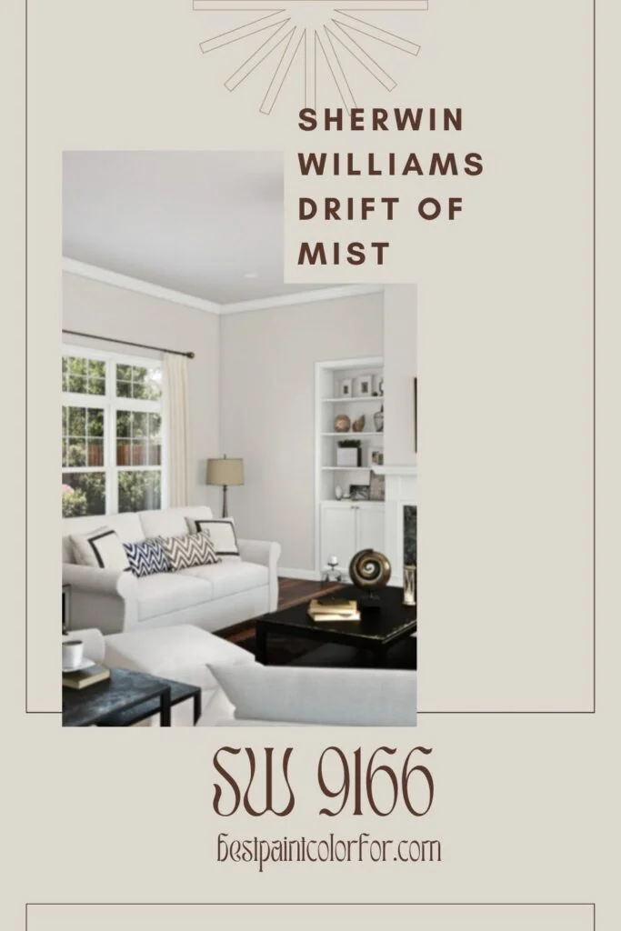
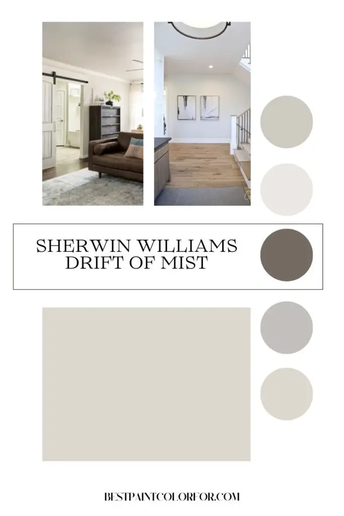
Sherwin Williams Drift of Mist SW 9166
Color Family
Drift of Mist falls into the gray color family.
Light Reflectance Value
With a Light Reflective Value (LRV) of 69, this color possesses a considerable depth, placing it in the mid-toned category.
Keep in mind that in very bright rooms, the color may appear slightly washed out compared to darker rooms.

Rust-Oleum 367605 Home Interior Floor Coating Kit, Semi-Gloss Black
Ideal for updating outdated flooring at a fraction of the cost of replacement and adheres without stripping, sanding or priming.
Buy Now on AmazonRGB Colors
R:220 G:216 B:208
Describing the color mix to create the shade, the RGB values are on a scale of 0 to 255 for each color.
Hex Code
#dcd8d0
Undertones
This warm, neutral-toned light greige color can sometimes exhibit a greenish tint, especially in certain lighting conditions, like when cool north-facing light interacts with its golden hue.
Swatching colors on your wall is crucial to ensure they look good day and night in your actual space before making a commitment. For convenient swatching, consider removable peel & stick paint samples.
Best Uses
While some categorize Drift of Mist as an off-white paint color, it may appear a bit dark for that purpose. Consider it more of a mid-toned greige. Regardless, it is a highly neutral color suitable for various spaces.
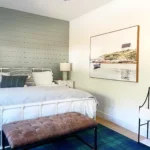
It works well in super bright rooms, offering enough depth to retain color even when washed out. Additionally, it complements bedrooms, dining rooms, or living rooms with less intense light, presenting a more medium-toned greige appearance.
Similar Colors
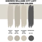
Sherwin Williams City Loft, Sherwin Williams Windfresh White, Sherwin Williams Sunbleached, Behr Silver Drop, Benjamin Moore Light Pewter, and Valspar Barest Hush are similar colors.
Coordinating Colors
Drift of Mist pairs well with:
- Warm grays
- Dusty aqua
- Warm blacks, considering its green undertones.
This color harmonizes with green paint colors and other golden or warm hues.
Warm Grays:
Sherwin Williams Gray Clouds:
Sherwin Williams Gray Clouds is a warm gray with subtle undertones that make it a versatile choice for various spaces.
Its warm tones create a cozy and inviting atmosphere, making it suitable for both contemporary and traditional settings.
The color has a neutral quality, allowing for easy coordination with other hues in your decor. The pros of Gray Clouds include its adaptability and ability to pair well with various accent colors.
Considerations may include testing it in different lighting conditions to ensure it aligns with your desired aesthetic.

Sherwin Williams Gossamer Veil:
Gossamer Veil is a warm gray with added depth and warmth, making it an excellent choice for those who want a bit more richness in their color palette.
This color is slightly darker than some other warm grays, providing a sense of coziness without being too overpowering.
Gossamer Veil is versatile, working well in both well-lit and dimly lit spaces. Consider this option if you want a warm gray with character that doesn’t get washed out easily in bright rooms.

Sherwin Williams Grizzle Gray:
Sherwin Williams Grizzle Gray is a warm gray with distinct undertones that lean towards the greige spectrum.
This color exudes a modern and sophisticated vibe, making it suitable for contemporary interiors. Its versatility allows it to pair seamlessly with a range of accent colors.
The unique feature of Grizzle Gray lies in its ability to bring a touch of warmth to a space without compromising on a clean and minimalist aesthetic. Pros include its adaptability, but it’s essential to consider the undertones and test it in your specific lighting conditions.
Dusty Aquas:
Sherwin Williams Oyster Bay:
Sherwin Williams Oyster Bay is a dusty aqua with a muted and calming presence. This color is well-suited for spaces where you want to introduce a hint of color without it being too vibrant.
Oyster Bay’s subtlety makes it an excellent choice for bedrooms, bathrooms, or living rooms. Its unique feature lies in the delicate balance between blue and green undertones, creating a serene and soothing atmosphere. Pros include its versatility and compatibility with various design styles.
Considerations may involve testing it in different lighting to gauge its true appearance.
Sherwin Williams Aqua Sphere:
Sherwin Williams Aqua Sphere is a dusty aqua that brings a refreshing and tranquil feel to any space. This color is ideal for creating a beach-inspired or coastal aesthetic.
Aqua Sphere’s unique feature is its ability to evoke a sense of relaxation, making it suitable for bedrooms or bathrooms.
Pros include its calming effect and adaptability, while considerations may involve assessing its compatibility with other colors in your design scheme.
Sherwin Williams Watery:
Sherwin Williams Watery is a dusty aqua with a hint of vibrancy, making it an excellent choice for those seeking a lively yet subdued color.
This shade works well in spaces where you want to infuse energy without being too bold. Watery’s unique feature is its balanced tonality, creating a versatile backdrop for various decor styles.
Pros include its ability to add character without overwhelming a room. Considerations may involve testing it in different lighting conditions to ensure it aligns with your vision.
Sherwin Williams Halcyon Green:
Sherwin Williams Halcyon Green is a dusty aqua with green undertones, adding a touch of nature to your interior. This color is well-suited for spaces where you want to bring the outdoors in.
Halcyon Green’s unique feature lies in its association with natural elements, creating a serene and organic ambiance.
Pros include its ability to connect indoor spaces with the outdoors. Considerations may involve assessing its compatibility with other colors in your design scheme and testing it in various lighting conditions.
Warm Blacks:
Sherwin Williams Caviar:
Sherwin Williams Caviar is a warm black with rich undertones, providing a sophisticated and luxurious feel.
This color is ideal for creating a bold and dramatic focal point in your space, such as an accent wall or cabinetry. Caviar’s unique feature is its warmth, making it a softer alternative to cooler black tones. Pros include its ability to add depth and elegance to a room.
Considerations may involve ensuring proper lighting to prevent the color from appearing too heavy or overpowering.
Sherwin Williams Tricorn Black:
Sherwin Williams Tricorn Black is a warm black with a classic and timeless appeal. This color is versatile, suitable for both traditional and contemporary interiors.
Tricorn Black’s unique feature lies in its ability to create a sense of sophistication without being overly dramatic.
Pros include its adaptability and compatibility with various design styles. Considerations may involve testing it in different lighting conditions to ensure it achieves the desired effect without appearing too stark.
Sherwin Williams Black Magic:
Sherwin Williams Black Magic is a warm black with deep undertones, adding a sense of mystery and elegance to your space.
This color is well-suited for creating a bold statement, particularly in spaces where you want to emphasize architectural features or furnishings. Black Magic’s unique feature is its richness, providing a luxurious backdrop for other elements in the room.
Pros include its ability to create a high-impact, stylish look. Considerations may involve balancing it with lighter elements to avoid a too-dark overall appearance.
Trim Colors:
To maintain a clean and polished look, pair Drift of Mist with crisp bright white trim colors:
Benjamin Moore Simply White:
Benjamin Moore Simply White is a crisp and clean white that complements Drift of Mist, creating a timeless and elegant contrast.
This trim color is versatile and suitable for various design styles, adding a fresh and bright touch to the overall aesthetic.
Pros include its ability to enhance the clean look of Drift of Mist. Considerations may involve ensuring proper lighting to showcase the true brilliance of Simply White.
Sherwin Williams Extra White:
Sherwin Williams Extra White is a bright and pure white trim color that pairs seamlessly with Drift of Mist. This combination creates a contemporary and polished appearance, enhancing the overall sophistication of the space.
Pros include its ability to provide a sharp contrast while maintaining a cohesive look. Considerations may involve ensuring proper lighting to showcase the crispness of Extra White.
Behr Ultra Pure White:
Behr Ultra Pure White is a pristine and bright white trim color that complements Drift of Mist, contributing to a clean and modern aesthetic.
This trim color is versatile, working well with various color palettes and design styles. Pros include its ability to enhance the overall freshness of Drift of Mist. Considerations may involve testing it in different lighting conditions to ensure a consistent and bright appearance.
Pairing Drift of Mist with these crisp bright white trim colors ensures a cohesive and sophisticated look, maintaining a sense of cleanliness and elegance in your space.
FAQs about Drift of Mist
Is Drift of Mist more grey or beige?
Drift of Mist is categorized as a greige paint color, leaning towards warm gray rather than beige. Its appearance tends to exhibit more gray tones in north-facing light and warmer hues in southern light.
Does Drift of Mist complement Agreeable Gray?
Drift of Mist is notably lighter and brighter than Agreeable Gray. However, it is not recommended to pair these colors together as their undertones clash. Opting for colors with greater contrast rather than attempting to blend two greiges is advisable.
Gossamer Veil vs Drift of Mist
Gossamer Veil boasts additional depth, being slightly darker and warmer than Drift of Mist. If you desire a bright room with a touch of color that is less prone to being washed out, Gossamer Veil is a preferable choice compared to Drift of Mist.
It’s worth noting that Drift of Mist carries subtle purple undertones. In spaces with north-facing orientation or cool lighting, there’s a possibility of the color appearing somewhat purple on the walls.