Choosing the perfect paint color is already tricky—but when you’re dealing with a north-facing room, things get a whole lot more complicated. That beautiful greige you saw online? It might suddenly look cold, flat, or even slightly blue once it’s on your walls.
If you’ve ever painted a room and thought, “Why does this look nothing like the sample?”—you’re not alone.
North-facing rooms are notorious for cool, indirect light, which can completely change how colors appear. And when it comes to greige (that perfect blend of gray and beige), the wrong undertone can turn your cozy dream into a dull, lifeless space.
This guide will walk you through exactly how to choose the right Behr greige for north-facing rooms, step by step—so you get a warm, inviting, and balanced look every time.
Why North-Facing Rooms Are So Challenging
Before choosing a color, you need to understand what you’re working with.

Pro Grade Paint Roller Kit, Brush & Roller for Professionals & Homeowners
Perfect for smooth finishes on your interior walls. Ideal for home improvement enthusiasts!
Buy Now on AmazonNorth-facing rooms receive:
- Cool, indirect sunlight
- Minimal warm tones
- Consistent but slightly dim lighting throughout the day
This means:
- Colors appear cooler and darker than expected
- Warm undertones get muted
- Cool undertones become more pronounced
So if you pick a greige with even a slight blue or green undertone—it will amplify dramatically.
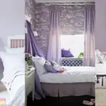
What Makes Greige So Popular (and Tricky)
Greige sits between gray and beige, making it:

Rust-Oleum 367605 Home Interior Floor Coating Kit, Semi-Gloss Black
Ideal for updating outdated flooring at a fraction of the cost of replacement and adheres without stripping, sanding or priming.
Buy Now on Amazon- Versatile
- Neutral
- Modern yet cozy
But here’s the catch:
Not all greiges are created equal.
Some lean:
- Warm (yellow, beige, taupe undertones)
- Cool (blue, green, violet undertones)
In north-facing rooms, this difference becomes critical.
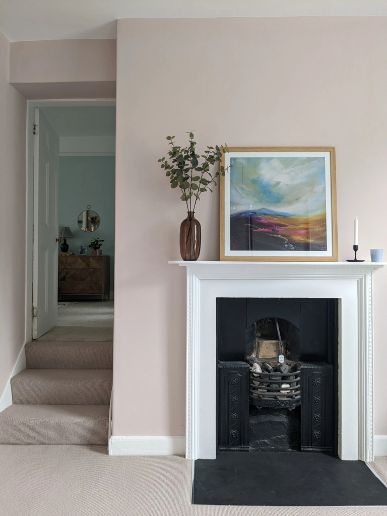
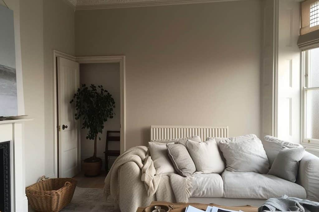
Rule #1: Always Choose Warm-Leaning Greige
This is the golden rule.
In a north-facing room:
- Cool greige = cold, dull, lifeless walls
- Warm greige = balanced, soft, inviting space
Look for greiges with:
- Beige undertones
- Taupe warmth
- Slight creamy softness
Avoid:
- Blue-based grays
- Green undertones
- Stark or icy greiges
Understanding Undertones (The Secret Most People Miss)
Undertones are everything.
Even if two colors look identical on a swatch, they can behave completely differently on your wall.
Common Greige Undertones
1. Beige/Yellow (Best for North Rooms)
- Adds warmth
- Prevents dullness
- Feels cozy and welcoming
2. Taupe (Also Excellent)
- Balanced warmth
- Slight depth
- Works in both modern and traditional spaces
3. Green (Risky)
- Can turn muddy or swampy in north light
4. Blue/Violet (Avoid)
- Becomes icy and uninviting
Best Behr Greige Types for North-Facing Rooms
Let’s break this into categories so you can choose based on your style.
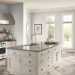
1. Light Warm Greige (Best for Small or Dark Rooms)
These colors reflect light and keep the space from feeling heavy.
Why they work:
- Brighten dim spaces
- Add subtle warmth
- Make rooms feel larger
Look for:
- Soft creamy undertones
- No harsh gray dominance
Perfect for:
- Bedrooms
- Small living rooms
- Apartments
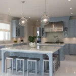
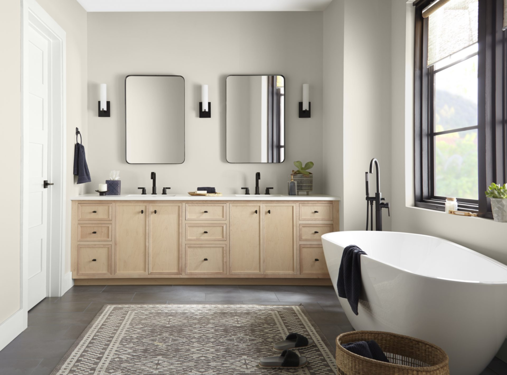
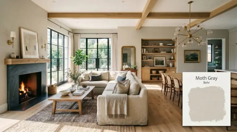
2. Mid-Tone Greige (Most Versatile Choice)
If you want a balanced, designer look—this is your sweet spot.
Why they work:
- Enough depth to feel modern
- Enough warmth to fight cool lighting
- Works with most furniture styles
Perfect for:
- Living rooms
- Dining areas
- Open floor plans
3. Deep Greige (For Moody, Cozy Spaces)
Yes, you can go dark in a north-facing room—if you do it right.
Why they work:
- Create a cozy, cocoon effect
- Add richness and depth
- Pair beautifully with warm lighting
But be careful:
- Must have strong warm undertones
- Use with good artificial lighting
The Importance of LRV (Light Reflectance Value)
LRV tells you how much light a color reflects.
- High LRV (60–80) → brighter, more reflective
- Medium LRV (40–60) → balanced
- Low LRV (20–40) → darker, moodier
For North-Facing Rooms:
- Stick to LRV 50–70 for most spaces
- Go higher if the room is small or dark
- Go lower only if you want a dramatic look
Testing Paint the Right Way (Most People Skip This)
Never trust a paint chip alone.
Here’s how to test properly:
Step 1: Get Large Samples
Buy sample pots instead of relying on tiny swatches.
Step 2: Paint Multiple Walls
North light changes depending on angles—test at least 2–3 walls.
Step 3: Observe Throughout the Day
Check the color:
- Morning
- Afternoon
- Evening (with artificial light)
Step 4: Compare Side by Side
Put 2–3 greiges next to each other—you’ll instantly see undertone differences.
How Artificial Lighting Changes Everything
North-facing rooms rely heavily on artificial light.
Best Lighting Choices:
- Warm white bulbs (2700K–3000K)
- Soft ambient lighting
- Layered lighting (lamps + ceiling)
Avoid:
- Cool white or daylight bulbs (4000K+)
- Harsh overhead lighting
Warm lighting will:
- Enhance beige undertones
- Reduce gray dullness
- Make the space feel inviting
Coordinating Colors That Work with Greige
Once you choose your greige, you need to build around it.
Best Pairings:
1. Warm Whites
- Creamy trims
- Soft off-white ceilings
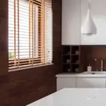
2. Natural Wood
- Oak, walnut, or light wood tones
- Adds warmth and texture
3. Earthy Accents
- Terracotta
- Olive green
- Muted rust tones
4. Soft Textiles
- Linen
- Wool
- Neutral fabrics
Common Mistakes to Avoid
Let’s save you from expensive repainting.
Mistake #1: Choosing a Cool Greige
Looks modern in store → looks cold at home
Mistake #2: Ignoring Undertones
That “neutral gray” probably isn’t neutral
Mistake #3: Not Testing Properly
Lighting changes everything
Mistake #4: Going Too Dark Without Lighting
Leads to a cave-like feel
Mistake #5: Using Cool Lighting
Makes everything worse instantly
Real-Life Scenario: Fixing a North-Facing Room
Imagine this:
You pick a trendy greige online.
You paint your living room.
And suddenly…
- The walls look gray-blue
- The room feels colder
- Your furniture looks off
What went wrong?
The undertone didn’t match the lighting.
The Fix:
- Switch to a warm greige
- Add warm lighting
- Introduce wood and textiles
Result?
A completely transformed space—without changing everything.
Pro Tips Designers Swear By
Here are some insider tricks:
1. Always Go Slightly Warmer Than You Think
What looks “too warm” on a swatch often looks perfect on the wall.
2. Use Contrast
Pair greige walls with warmer decor to balance the space.
3. Consider Finish
- Matte → soft and modern
- Eggshell → subtle sheen, easy to clean
- Satin → more reflective, slightly brighter
4. Don’t Forget the Ceiling
A warm off-white ceiling can make a huge difference.
When Greige Might Not Be the Best Choice
Let’s be honest—greige isn’t always the answer.
If your north-facing room is:
- Extremely dark
- Very small
- Lacking natural light entirely
You might consider:
- Warm whites
- Soft beige tones
- Light creamy neutrals
These can sometimes perform better than greige.
Final Thoughts: Getting It Right the First Time
Choosing the right greige for a north-facing room isn’t about luck—it’s about understanding how light and undertones interact.
If you remember just a few things, make it these:
- Always choose warm-leaning greige
- Test colors in your actual space
- Use warm lighting to your advantage
- Pay attention to undertones (they matter more than you think)
Done right, greige can turn even the coolest, dimmest room into a calm, inviting, and beautifully balanced space.
Done wrong… well, you’ve probably seen those results already.