On the hunt for the best warm white paint? Let’s check out Sherwin Williams Snowbound vs Pure White to see which one suits your style!
White paint is a big deal. It’s like a magic wand for your room, making it look fresh and ready for a magazine cover.
But, here’s the trick – you want a white that feels cozy, not icy. Cold whites can make your space seem chilly and too clean, but warm whites, they’re like a warm hug for your walls.
And when it comes to the most popular ones, Sherwin Williams Snowbound and Pure White are the shining stars in this category.
I really like both Snowbound and Pure White! They’re not too creamy or too bright; they’re just right. But what sets them apart, and which one should you go for?

Pro Grade Paint Roller Kit, Brush & Roller for Professionals & Homeowners
Perfect for smooth finishes on your interior walls. Ideal for home improvement enthusiasts!
Buy Now on AmazonYou’ll find the words “Sherwin Williams Snowbound vs Pure White” in bold letters, with pictures on each side – a cozy Snowbound cabin on the left and some white steps leading to the ocean in Santorini on the right.
After reading this, you’ll know which one suits you best!
The big difference between Pure White and Snowbound is that Snowbound is a tad warmer and leans a bit closer to red.
- What makes Snowbound and Pure White similar?
- Difference between Pure White Vs Sherwin Williams Snowbound
- Sherwin Williams Snowbound:
- Sherwin Williams Pure White:
- Which one is whiter, Snowbound or Pure White?
- How do you choose between these two colors?
- Should you use Snowbound and Pure White together?
- Undertones: Warm Whites
- LRV (Light Reflectance Value): A Slight Difference
- Snowbound vs. Pure White vs. Alabaster: A Comparison
- Can You Pair Snowbound with Pure White?
- Choosing Trim Colors for Pure White and Snowbound
- Cabinets: Snowbound vs. Pure White
- Snowbound vs. Pure White on Cabinets: Notable Similarities
- Exterior: Snowbound vs. Pure White
- Snowbound vs. Pure White on Exteriors: Differences and Recommendations
- Snowbound Vs Pure White Walls
- Snowbound vs. Pure White on Walls: The Verdict
- Pure White or Snowbound on Woodwork?
- When to Choose Snowbound or Pure White?
- Frequently Asked Questions
Also Read: SW Alabaster vs BM White Dove: Best Comparison

Rust-Oleum 367605 Home Interior Floor Coating Kit, Semi-Gloss Black
Ideal for updating outdated flooring at a fraction of the cost of replacement and adheres without stripping, sanding or priming.
Buy Now on Amazon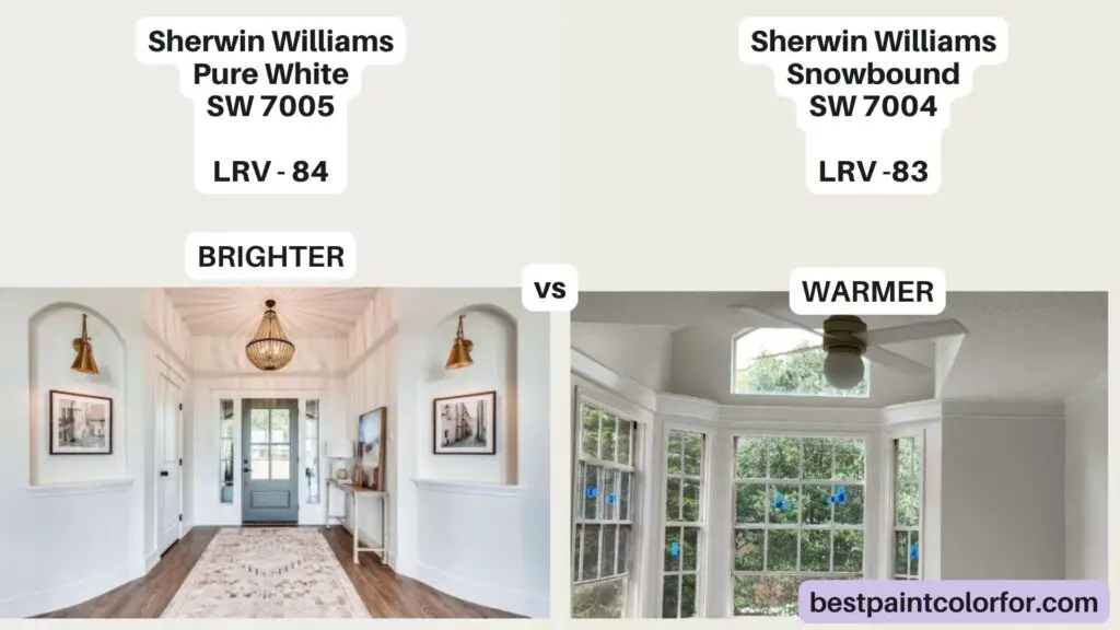
What makes Snowbound and Pure White similar?
Snowbound and Pure White are both warm white paint colors. They’re pretty much alike, and to spot the differences, you’d need to look at them side by side.
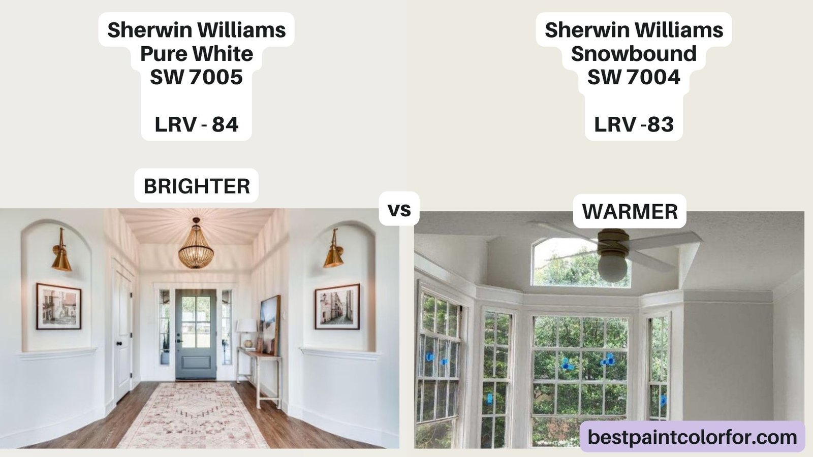
- Their LRVs are 83 and 84, which means they’re very close in how dark or light they are.
- Both are warm-toned, which means they make your room feel cozy, not cold or harsh.
Difference between Pure White Vs Sherwin Williams Snowbound
So, what sets Snowbound and Pure White apart? The key difference lies in the undertones. Snowbound has a warmer touch and leans slightly toward red, while Pure White carries a hint of yellow undertones.
Before we get into the nitty-gritty, take a look at some visuals. Both Snowbound and Pure White are beautifully true whites, and at first glance, they appear quite similar. For instance, Snowbound graces a vaulted open plan living room, while Pure White shines on the walls of a staircase.
However, the lighting in these spaces differs – Snowbound in artificial light and Pure White in natural light. The point here is that both shades appear predominantly white.
Now, let’s dive into what sets them apart.
Sherwin Williams Snowbound:
Snowbound has warm, creamy undertones that might have a touch of taupe (a soft pinkish-beige).
Sherwin Williams Pure White:
Pure White has a slight hint of yellow in its undertones. It’s not really yellow but more of a soft creamy tone, which prevents it from feeling cold.
Which one is whiter, Snowbound or Pure White?
Pure White has a slightly higher LRV at 84, which means it’s just a tiny bit lighter and whiter than Snowbound. But remember, neither of them is as pure white as SW Extra White!
How do you choose between these two colors?
If your room gets lots of warm, golden sunlight (like a southern-facing room), it can make any color appear more yellow. So, Pure White might look quite yellow in this case. Snowbound is a better option.
On the flip side, north-facing rooms have cooler, bluish light. This can make Snowbound seem a tad taupe, pink, or purple. In cooler rooms, stick with Pure White.
It’s super important to test these colors on your wall to make sure they look good in your space both during the day and at night.
Should you use Snowbound and Pure White together?
Don’t pair Snowbound and Pure White because they’re so similar. It’ll look like a mismatch. Instead, go for colors with a more significant difference in LRV, around 10 or more, for a nice contrast.
Also Read: Sherwin Williams Alabaster vs Pure White: A Great Comparison
Undertones: Warm Whites
Both Snowbound and Pure White belong to the warm white family. Pure White’s yellow undertones give it a touch of gray, making it neutral and not overly yellow. It’s slightly creamy and gray compared to a bright, clean white like Benjamin Moore’s Chantilly Lace. Snowbound, on the other hand, has pink undertones, though it doesn’t look pink. In certain lighting, next to an extra clean white like SW Extra White, Snowbound might appear a tad muted and hint at pink.
Take a closer look, and you’ll spot it – like in a picture where Snowbound walls meet Extra White trim, and suddenly Snowbound appears somewhat pinkish beside the crisp Extra White.
But don’t be alarmed! Snowbound isn’t predominantly pink; it just has a subtle undertone. In contrast, Pure White’s undertone is more toward yellow but not excessively so.
LRV (Light Reflectance Value): A Slight Difference
LRV measures how much light a color reflects, ranging from 0 (pure black) to 100 (pure white). Snowbound has an LRV of 83, while Pure White has an LRV of 84. The difference is minimal, and both colors look quite similar on the wall.
Snowbound vs. Pure White vs. Alabaster: A Comparison
To demonstrate just how similar Snowbound and Pure White are, let’s introduce Sherwin Williams Alabaster, a creamier shade. Alabaster has more yellow-beige undertones than either Pure White or Snowbound.
Can You Pair Snowbound with Pure White?
I would advise against combining Snowbound and Pure White in a space. They are very similar, and the lack of contrast between them, especially when used on trim, can make the difference nearly imperceptible. If you’re planning to use either for the walls, consider using the same color for trim but in a different sheen, providing contrast without worrying about clashing whites.
Choosing Trim Colors for Pure White and Snowbound
If you want to use different whites for walls and trim, Pure White can be paired with most lighter whites for trim, although you should avoid cool whites to prevent a yellowish appearance. Snowbound is more particular about trim choices due to its subtle pink undertones. Benjamin Moore Simply White or Valspar’s version of Swiss Coffee could work well with both Pure White and Snowbound.
Snowbound vs. Pure White on Trim: Both Great Choices
Both Snowbound and Pure White are excellent options for trim with almost any wall color. Snowbound is a go-to choice for trim, providing a perfect balance between creamy colors like Alabaster and bright whites like Chantilly Lace. Pure White is also a great pick and can work effectively, but I have a soft spot for Snowbound.
Cabinets: Snowbound vs. Pure White
Choosing the right white for kitchen cabinets is a significant decision since refinishing cabinets can be costly and time-consuming. Let’s examine how Snowbound and Pure White fare on cabinets.
Snowbound on Cabinets
Snowbound looks lovely on kitchen cabinets. In most kitchen settings, it appears very white and doesn’t strongly exhibit its undertones. The slight pink undertone in Snowbound might be subtly noticeable when placed next to very bright, clean whites.
In some cases, lighting can accentuate the undertone. For example, Snowbound cabinets beside SW Extra White trim can make the pink undertone more apparent. However, the pink undertone is usually quite subtle, and most people won’t perceive it.
Pure White on Cabinets
Pure White is a fantastic choice for kitchen cabinets if you want a pure, bright white. This shade works well on cabinets and doesn’t exhibit strong undertones. It creates a clean and classic look that complements various kitchen styles.
In some kitchen settings with Pure White cabinets, you’ll notice its bright, white appearance without distinct undertones.
Snowbound vs. Pure White on Cabinets: Notable Similarities
Before writing this article, Snowbound and Pure White seemed quite similar to me. However, cabinets may be the space where we observe the most noticeable difference between the two.
Both Snowbound and Pure White are soft whites, and both perform wonderfully on cabinets. Snowbound leans slightly warmer due to its pink undertones, but in most kitchen settings, this warmth is not strongly apparent.
Snowbound may reveal a whiff of pink next to the cabinets painted in bright white, and once you notice it, you can’t unsee it. However, your guests and even your Instagram followers are unlikely to pick up on the subtle undertone.
Exterior: Snowbound vs. Pure White
Now, let’s take a look at how Snowbound and Pure White appear on exterior surfaces. When used outdoors, paint colors can look brighter and their undertones more apparent.
Snowbound on Exterior
Snowbound used on an exterior does not appear pink; it maintains a warm, creamy appearance. It might look a touch warmer and creamier outside compared to indoor lighting, but it doesn’t have a pronounced pink hue.
Outside, Snowbound retains its white essence, even when applied to surfaces like painted brick. It doesn’t take on a pinkish tone, and in the snowy countryside, it remains a clean and warm white.
Pure White on Exterior
Pure White is an excellent choice for exterior applications, especially if you desire a bright and pure white look. It complements exteriors nicely and maintains a true white appearance with a touch of gray, preventing it from looking washed out.
Here are a couple of examples where Pure White shines on exteriors, creating a clean and classic appeal.
Snowbound vs. Pure White on Exteriors: Differences and Recommendations
Both Snowbound and Pure White work well for exterior applications, but they have distinct qualities. Snowbound appears warmer, making it an excellent choice for a modern farmhouse aesthetic. In contrast, Pure White stands out as a pure, clean white and is ideal for a crisp, black and white exterior look.
Ultimately, your choice between Snowbound and Pure White depends on your specific needs and style preferences. Both are fantastic whites, and you can’t go wrong with either.
Snowbound Vs Pure White Walls
Let’s dive into the debate of Snowbound vs. Pure White on your walls! Both these Sherwin Williams white paint colors have their own unique characteristics. Using the same color for both walls and trim can simplify your decision, eliminating concerns about undertones. So, how do Snowbound and Pure White fare as wall colors?
How Does Snowbound Look as a Wall Color?
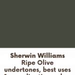
In the Rock Creek Farmhouse, Snowbound graces the ceilings, walls, and trim, and the result is fabulous. This application of Snowbound appears beautifully white and not pink, particularly because there are no other whites in the space to compare it to. Snowbound takes on a soft, pretty appearance when used on walls. In another example, Snowbound works seamlessly as a wall color in a bedroom, looking quite white, especially when paired with a contrasting feature wall in Sherwin Williams Ripe Olive.
How Does Pure White Look as a Wall Color?
Pure White, as showcased in Angela’s home, also delivers an impressive result when used on interior walls. In one instance, Pure White shares the living room wall with Sherwin Williams Urbane Bronze for a stunning contrast. The result is clean and delectable. However, there is a slight pinkish cast in one photo due to shadows, which is a reminder that white is reflective and can pick up surrounding colors.
Snowbound vs. Pure White on Walls: The Verdict
When used as both wall and trim colors, both Snowbound and Pure White appear very white. The choice between them comes down to personal preference, as they can be used interchangeably. Pure White might appear slightly brighter than Snowbound, but the difference is subtle.
Pure White or Snowbound on Woodwork?
Both Snowbound and Pure White can be used on wood features like shiplap, board and batten, or geometric walls. Snowbound may appear a bit creamier in certain situations, but cropping the photo could make it look white again. Pure White can also have a creamy appearance, but it’s quite similar to Snowbound, making the choice between them a matter of personal preference.
When to Choose Snowbound or Pure White?
In summary:
Pure White and Snowbound can both look true white or creamy, depending on the environment and other colors.
- Snowbound is slightly softer than Pure White.
- Pure White is a better choice for cabinets.
- Both will look their whitest as the only white in the room.
- Pure White is an easier white to choose a contrasting trim color for.
- If you dislike pink undertones, choose Pure White. If you dislike yellowy creams, choose Snowbound.
- If you’re undecided between a bright white and a cream, both Snowbound and Pure White are great options.
- Pure White is the more popular color, but Snowbound offers a unique and original touch.
So, after exploring the characteristics of both paints, the choice between Snowbound and Pure White ultimately depends on your specific preferences and how they fit into your design vision.
Cabinets might be the area where you notice the most difference, but for walls, they can both deliver a fantastic white backdrop.
Happy painting!
Frequently Asked Questions
What is the difference between SW Pure White and Snowbound?
The main difference between Sherwin Williams Pure White and Snowbound is their undertones. Snowbound has warm, creamy undertones that might have a touch of taupe (a soft pinkish-beige), while Pure White has a slight hint of yellow in its undertones. Pure White is slightly lighter and whiter than Snowbound.
Is Sherwin Williams Snowbound too white?
Snowbound is a warm white paint color, not overly bright or stark. It’s a good choice if you want a white that feels cozy and inviting in your space.
What undertone is Sherwin Williams Snowbound?
Snowbound has creamy, beige undertones with a hint of taupe (pink), making it a warm white paint color.
Does SW Snowbound look yellow?
Snowbound doesn’t look yellow, but it has warm undertones that can give it a creamy, inviting feel. It won’t appear stark or cold in your room.