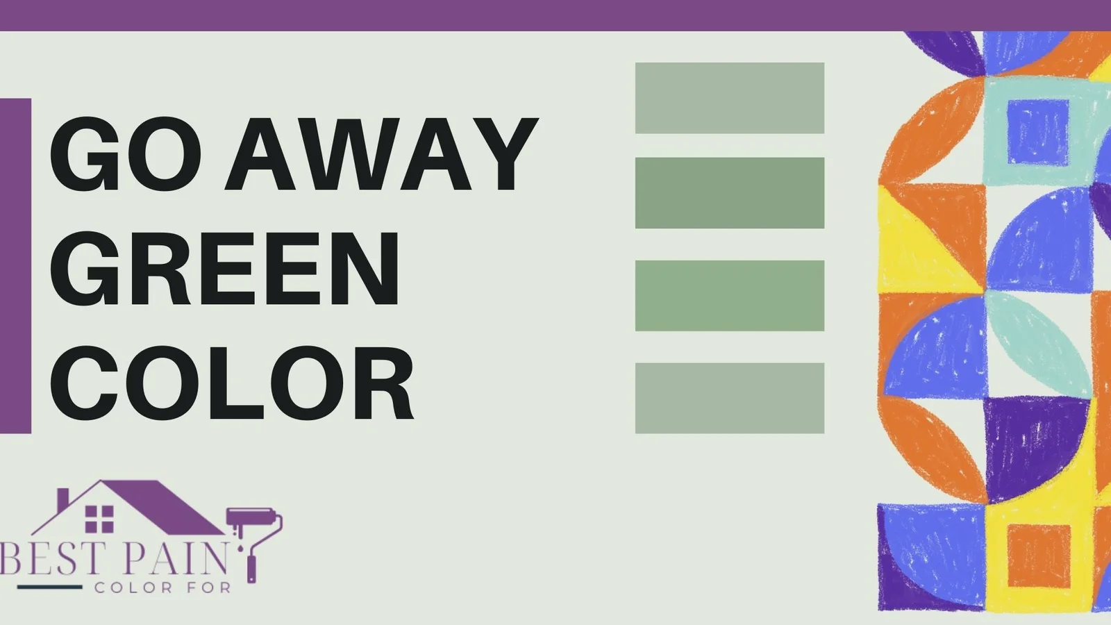
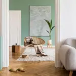
Have you ever visited a theme park and wondered why you don’t notice certain boring-looking buildings? Well, theme parks like Disney use a special kind of green color called ‘go away green.’
This color helps hide uninteresting stuff, like maintenance areas, so that you can enjoy the fun parts of the park without being distracted.
Imagine if all the maintenance buildings and behind-the-scenes things were painted in a color that blends with the trees and plants.
That way, when you look around the park, your eyes don’t focus on those plain buildings. Instead, they focus on the exciting rides and attractions.
This idea is why they call it ‘go away green’ – because these buildings seem to ‘go away’ and become almost invisible among the greenery. So next time you’re at a theme park, see if you can spot any ‘go away green’!

Pro Grade Paint Roller Kit, Brush & Roller for Professionals & Homeowners
Perfect for smooth finishes on your interior walls. Ideal for home improvement enthusiasts!
Buy Now on Amazon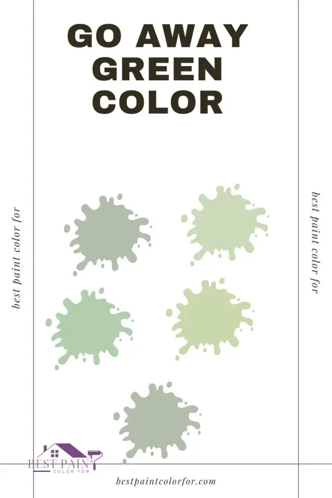
Why do they use the “go away green” color?
Well, think about when you visit a theme park like Disney. They want you to feel like you’re in a magical world, like in a fairy tale. But guess what? Theme parks are real places with real stuff that’s not so magical.
Imagine things like:
- Trash cans (not the most exciting)
- Places where they’re building new things (can look messy)
- The not-so-nice parts of buildings
- Boring offices where people work
- Doors and tunnels for staff
- Cameras watching for safety
- Boxes for stuff like electricity
So, to make these things less noticeable and keep the magic alive, they use a special green color. This color helps them blend in with trees and plants. That way, when you look around, you see the fun stuff and not the not-so-fun stuff. It’s like a way to make the not-so-magical things “go away.” Cool, right?
These special paint colors are used to paint things so they can hide in the background and be hard to notice.
Rust-Oleum 367605 Home Interior Floor Coating Kit, Semi-Gloss Black
Ideal for updating outdated flooring at a fraction of the cost of replacement and adheres without stripping, sanding or priming.
Buy Now on AmazonNow, they’re not like magical cloaks that make things truly invisible. However, when there are so many wonderful and interesting things to look at, objects painted with these colors really do seem to vanish.
Now, let’s focus on a color called “Go Away Green” and think about whether it could be useful on your property!
The Disney “Go Away Green” Paint Color
Have you heard about “Go Away Green”? It’s a kind of plain green color made to hide among trees and plants. The cool thing is, it’s meant to be so sneaky that you won’t even notice it next to all the beautiful things around it.

The Special Code for “Go Away Green”
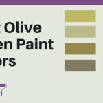
There’s no single secret code for “Go Away Green.” Actually, they use a few different gray-green shades! Here’s the trick: you can look at similar colors below, choose one that works well with your place, and find its special code!
Colors like “Go Away Green”
Sadly, Disney doesn’t sell their paint to us. But don’t worry, there are similar colors out there:
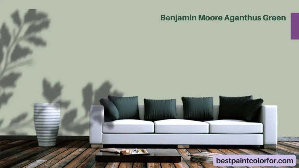
Benjamin Moore Aganthus Green
Aganthus Green from Benjamin Moore is a calming and nature-inspired color that resembles the lush greenery found in gardens. It brings a sense of tranquility and freshness to spaces, making it a great choice for creating a serene atmosphere.
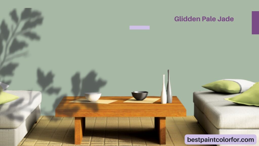
Glidden Pale Jade
Pale Jade by Glidden is a soft and delicate hue reminiscent of the pale green shades found in precious gemstones. This color brings a touch of elegance and subtlety to rooms, evoking a sense of quiet sophistication.
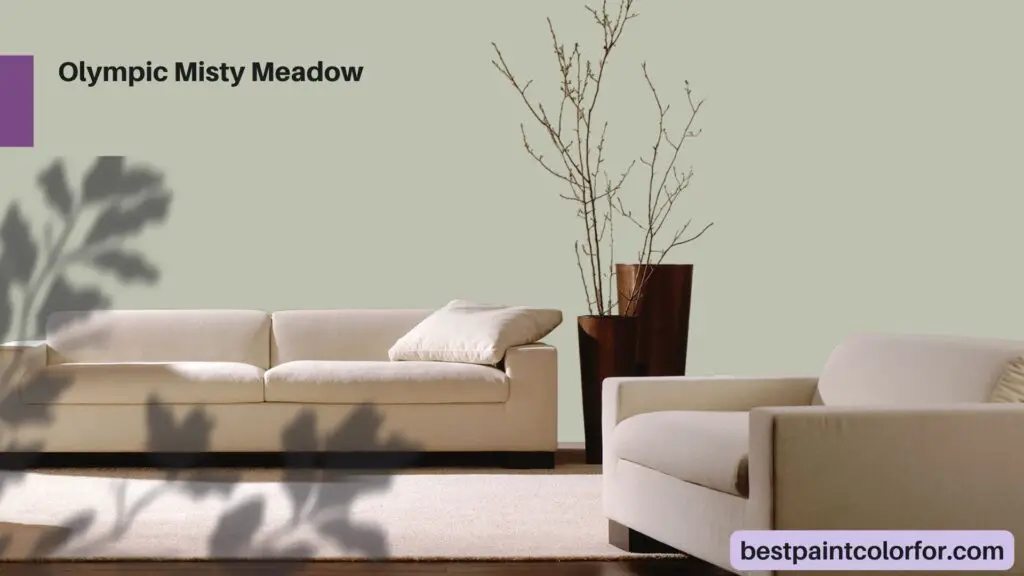
Olympic Misty Meadow
Olympic’s Misty Meadow captures the essence of a mist-covered meadow in the early morning. This color carries a hint of mystery and nostalgia, making it ideal for spaces where you want to create an ambiance of gentle reflection.
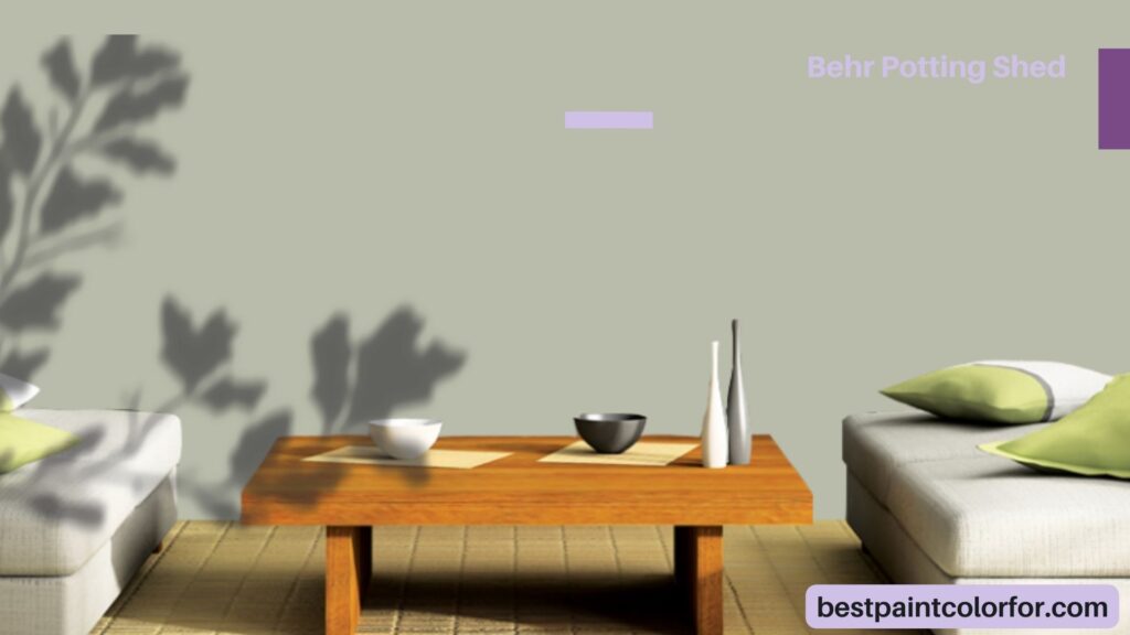
Behr Potting Shed
Behr’s Potting Shed offers the cozy and rustic feeling of a well-loved garden shed. This earthy color brings warmth and comfort to interiors, invoking a sense of nostalgia and the great outdoors.
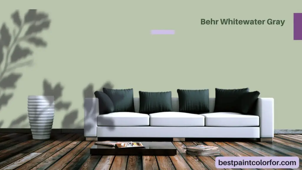
Behr Whitewater Gray
Whitewater Gray from Behr is a versatile and modern neutral that adds a touch of sophistication to any room. Its soft gray undertones create a serene backdrop for various decor styles and color schemes.
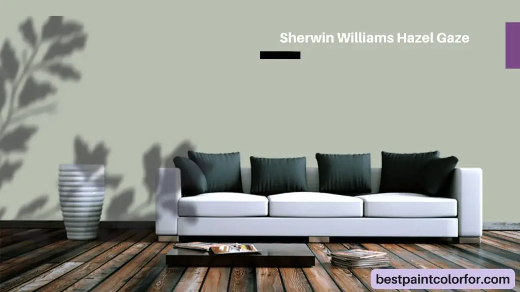
Sherwin Williams Hazel Gaze
Hazel Gaze by Sherwin Williams is a rich and inviting shade that conjures images of autumn leaves and warm spices. This color adds depth and a welcoming atmosphere to spaces, making it a popular choice for cozy living areas.
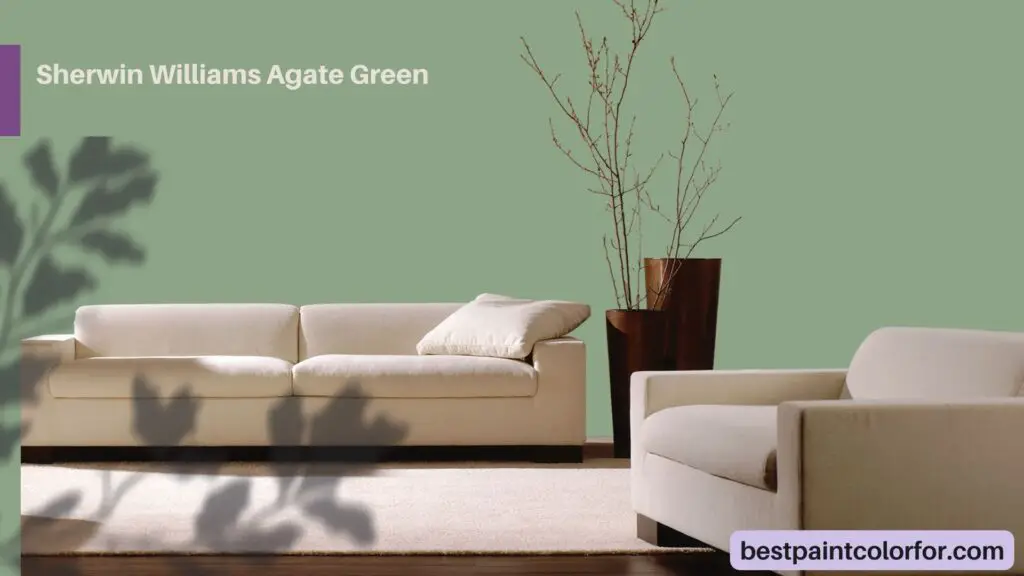
Sherwin Williams Agate Green
Agate Green from Sherwin Williams is a deep and jewel-like color reminiscent of polished agate gemstones. It exudes a sense of luxury and opulence, making it a bold choice for creating a striking focal point.
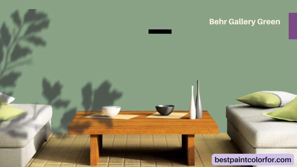
Behr Gallery Green
Gallery Green by Behr is a sophisticated and timeless color inspired by classic art galleries. It offers a deep, muted green that adds depth and character to walls, evoking a sense of heritage and refinement.
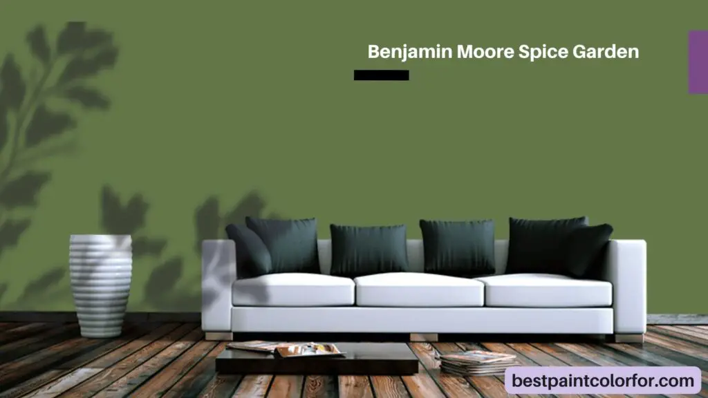
Benjamin Moore Spice Garden
Spice Garden from Benjamin Moore is a warm and inviting hue that reflects the vibrant colors of a well-tended garden. This color brings energy and positivity to interiors, making it an excellent choice for spaces where you want to uplift the mood.
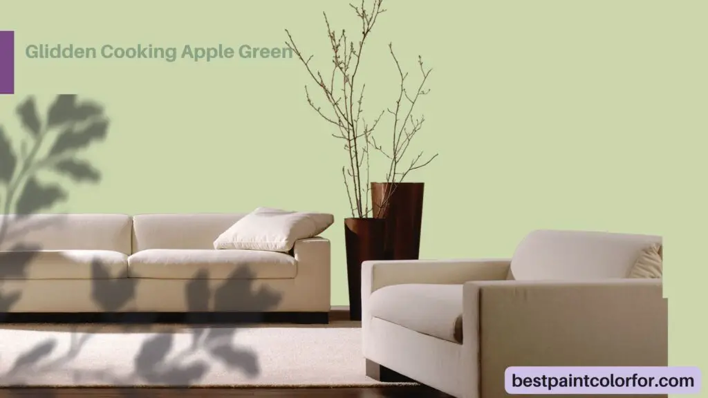
Glidden Cooking Apple Green
Cooking Apple Green by Glidden is a fresh and lively color reminiscent of the vibrant green of cooking apples. It infuses spaces with a sense of vitality and youthfulness, making it a great option for creating cheerful and vibrant atmospheres.
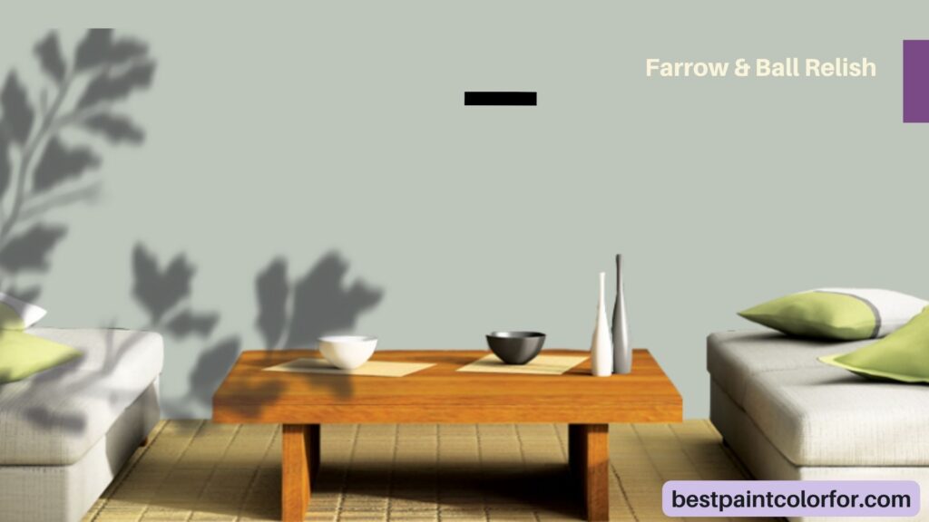
Farrow & Ball Relish
Relish by Farrow & Ball is a rich and deep green that evokes a sense of indulgence and luxury. This color adds drama and sophistication to interiors, creating a captivating backdrop for elegant decor.
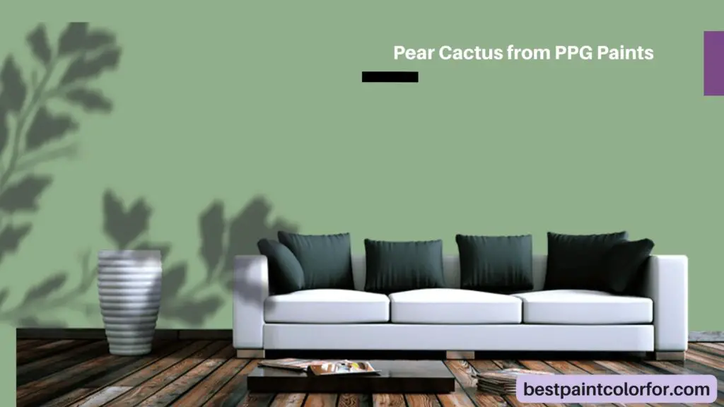
Pear Cactus from PPG Paints
Pear Cactus by PPG Paints is a unique and refreshing color inspired by the soothing green of cacti. It brings a touch of the outdoors inside, creating a calming and natural ambiance that’s perfect for relaxation.
Just remember, the trick is to pick a color that can blend into your surroundings. So, choose one that’s a bit more green or gray, depending on what’s around you!
The bottom line
The world of theme parks, like Disney, holds a fascinating secret – a color called ‘go away green’ that’s used to make unsightly buildings vanish from view. These unobtrusive structures, like maintenance areas and plain offices, are given a special green coat that lets them blend into the lush surroundings of trees and plants.
The magic lies in the fact that this color makes these less exciting parts seem to disappear, allowing our eyes to focus on the thrilling rides and attractions instead. This enchanting concept showcases the effort to maintain the allure of a magical world even in the presence of everyday realities.
And while this special green isn’t exactly an invisibility cloak, its ability to make the mundane ‘go away’ is a testament to the clever design strategies employed in these parks.
So, next time you’re enjoying the wonder of a theme park, keep an eye out for the sneaky ‘go away green’ that’s working its enchantment all around you.
And who knows, you might even consider using a similar idea – just like the various shades of green mentioned – to blend in with your surroundings and create your own touch of magic in your space.
Further Read:
Also Read: The Best Black-Green paint colors

