Looking for the perfect neutral paint color for your home? Let’s talk about Benjamin Moore Wind’s Breath and whether it might be the right choice for your space.
If you’re stuck choosing between whites, creams, grays, and beiges, Wind’s Breath is a fantastic option to consider. This soft, neutral paint color strikes a perfect balance—it’s not too warm, not too cool, just an easy, welcoming shade with a slight warm undertone. In certain lighting, it truly shines.
Wind’s Breath provides a neutral look without feeling too stark or cold. It pairs nicely with a variety of colors and complements almost any décor style, making it an incredibly versatile choice for any room.
Let’s take a closer look at what makes Wind’s Breath such a unique and appealing paint color.
Understanding Benjamin Moore Wind’s Breath
What Is Wind’s Breath?
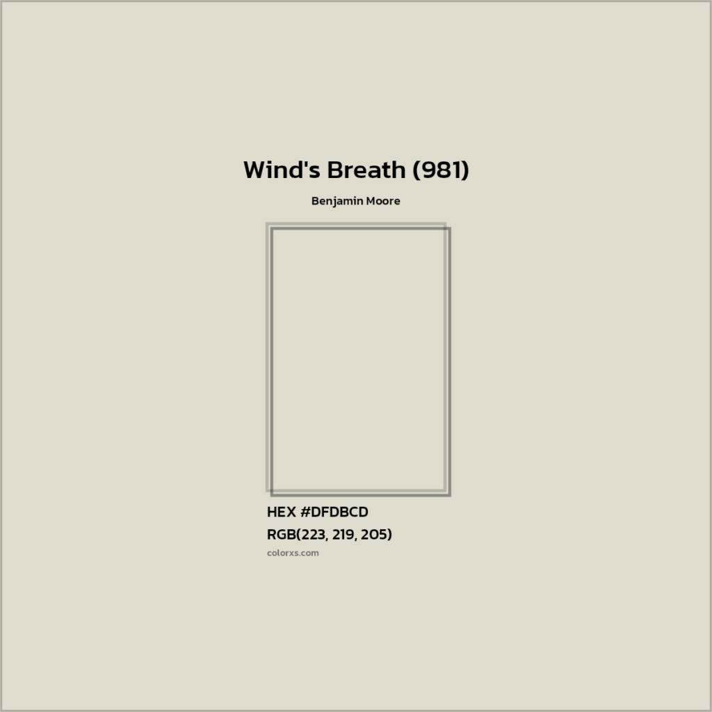
Benjamin Moore Wind’s Breath (OC-24) is a chameleon neutral color that balances taupe, gray, and cream tones. It feels both relaxed and timeless, making it an excellent option for modern and classic interiors alike.

Pro Grade Paint Roller Kit, Brush & Roller for Professionals & Homeowners
Perfect for smooth finishes on your interior walls. Ideal for home improvement enthusiasts!
Buy Now on AmazonColor Family
Wind’s Breath belongs to the white color family, but its warm taupe and gray undertones make it a sophisticated off-white shade rather than a stark white.
Light Reflectance Value (LRV)
Wind’s Breath has an LRV of 70. This means it reflects a good amount of light but isn’t overly bright. On a scale of 0 (pure black) to 100 (pure white), 70 is considered light and airy, though in dim lighting, it can appear slightly muted.
RGB and Hex Code
- RGB Values: R: 223, G: 219, B: 205
- Hex Code: #dfdbcd
These values indicate a soft, neutral shade with a mix of warm and cool tones, making it adaptable to various lighting conditions.
Undertones of Wind’s Breath
Wind’s Breath is an almost perfect balance of taupe, beige, gray, and cream. Depending on the lighting, it may take on different hues:

Rust-Oleum 367605 Home Interior Floor Coating Kit, Semi-Gloss Black
Ideal for updating outdated flooring at a fraction of the cost of replacement and adheres without stripping, sanding or priming.
Buy Now on Amazon- In bright, south-facing rooms: It leans toward a soft off-white or creamy taupe. If there’s an abundance of natural light, it may appear lighter and even slightly washed out.
- In darker, north-facing rooms: It can take on stronger gray tones and may even look a bit dull or dingy.
- Under artificial lighting: The type of bulbs you use will impact its appearance. Warm bulbs emphasize the beige tones, while cool bulbs highlight the gray undertones.
Pro Tip:
Always test Wind’s Breath in your home before committing! Use peel-and-stick samples to see how it looks during different times of the day.
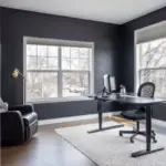
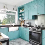
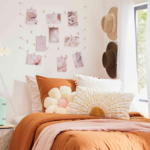
Best Uses for Wind’s Breath
Wind’s Breath is neutral enough to work as a whole-house paint color. However, keep in mind that it may appear dull in darker spaces. Here are some ideal places to use it:
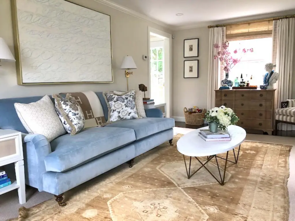
Living Rooms
The soft warmth of Wind’s Breath creates an inviting atmosphere in living spaces. It pairs beautifully with cozy textiles, warm wood tones, and modern or traditional furniture styles.

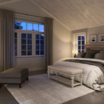
Bedrooms
For a serene and restful space, Wind’s Breath is an excellent choice. It works well with both light and dark accent colors, allowing for a variety of bedding and décor options.
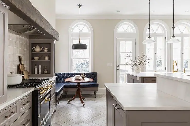
Kitchens
This color provides a clean yet warm backdrop for kitchens. It looks stunning with white or wood cabinetry and can complement both stainless steel and matte black hardware.
Bathrooms
In bathrooms, Wind’s Breath offers a spa-like feel, especially when paired with soft blues or greens. Be mindful of lighting conditions to prevent it from appearing too dull.

Home Exteriors
While Wind’s Breath is a fantastic interior color, it may not be the best choice for exterior walls, as it can look washed out in direct sunlight.
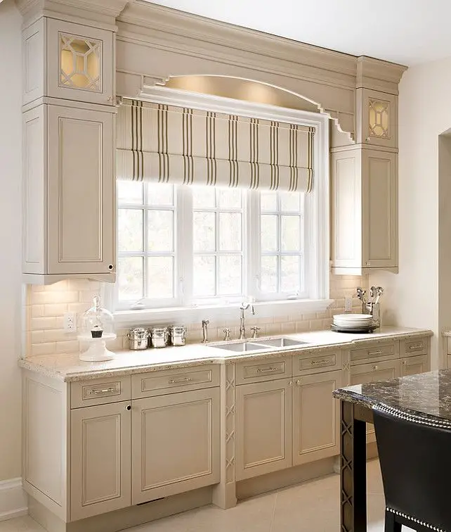
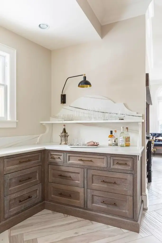
Cabinets and Interior Doors
For a subtle, elegant look, Wind’s Breath is a beautiful option for cabinets and interior doors, offering a softer alternative to pure white.
Similar Colors to Wind’s Breath
If you love Wind’s Breath but want to explore other options, consider these similar shades:
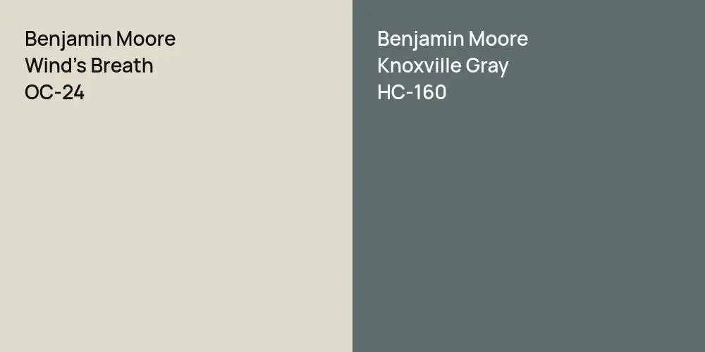
- Benjamin Moore Edgecomb Gray – Slightly darker and more greige.
- Behr Light Granite – A soft, warm neutral with similar depth.
- Sherwin Williams Oat Milk – A creamy beige-gray alternative.
- Benjamin Moore Olympic Mountains – A bit cooler in tone.
- Sherwin Williams Natural Choice – A warm off-white with neutral undertones.
Coordinating Colors for Wind’s Breath
Wind’s Breath is a versatile color that pairs well with a variety of coordinating hues.
Crisp, Bright Whites
For a clean and fresh contrast, try pairing it with:
- Benjamin Moore Chantilly Lace
- Benjamin Moore Ice Mist
- Benjamin Moore Snow White
- Benjamin Moore Distant Gray
- Benjamin Moore Wedding Veil
Deep Neutrals
For a bold and dramatic look, pair Wind’s Breath with:
- Silhouette
- Midsummer Night
- Stone Brown
- Iron Mountain
- Topeka Taupe
Warm Greiges and Soft Browns
These colors create a cohesive, earthy palette:
- Rockport Gray
- Herbal Escape
- Jockey Hollow Gray
- Indian River
- River Reflections
Bonus Tip:
Avoid pairing Wind’s Breath with soft whites, as this can make both colors look dingy instead of crisp.
Trim Colors for Wind’s Breath
For a polished and sophisticated finish, Wind’s Breath pairs best with bright, crisp whites for trim. Recommended choices include:
- Benjamin Moore Simply White
- Sherwin Williams Extra White
- Behr Ultra Pure White
FAQs
Is Wind’s Breath a warm or cool color?
Wind’s Breath is a warm neutral. However, its balanced mix of taupe, beige, gray, and cream allows it to adapt to different lighting conditions.
Is Wind’s Breath a good exterior paint color?
Wind’s Breath is best suited for interiors. Outdoors, it can appear too light and washed out under direct sunlight.
Does Wind’s Breath look pink?
Not usually, but in some lighting conditions, its taupe undertones may pull a faint pink or purple hue.
How does Wind’s Breath compare to Edgecomb Gray?
Edgecomb Gray is slightly darker with more pronounced beige undertones, whereas Wind’s Breath leans creamier.
What’s the Sherwin Williams equivalent of Wind’s Breath?
There’s no exact match, but Oat Milk, Natural Choice, Oyster White, and White Duck are close alternatives.
Conclusion
Wind’s Breath is an exceptional choice for anyone looking for a sophisticated and versatile neutral. Its warm yet balanced undertones make it a great option for a variety of spaces, from living rooms to kitchens to bedrooms. With the right coordinating colors and trim, it can create a harmonious and inviting atmosphere in any home.