If you want your home to feel like a luxury interior designer designed it, there’s one color family you can’t ignore in 2026:
👉 Benjamin Moore sage greens
These shades are not just trendy—they’re timeless, calming, and quietly luxurious.
What makes Benjamin Moore stand out?
- Rich, complex undertones
- Smooth, premium finish
- Designer-approved palettes
And most importantly, their sage greens lean into soft gray-green tones, which create a sophisticated, expensive look instead of a bright or overpowering green.

Pro Grade Paint Roller Kit, Brush & Roller for Professionals & Homeowners
Perfect for smooth finishes on your interior walls. Ideal for home improvement enthusiasts!
Buy Now on Amazon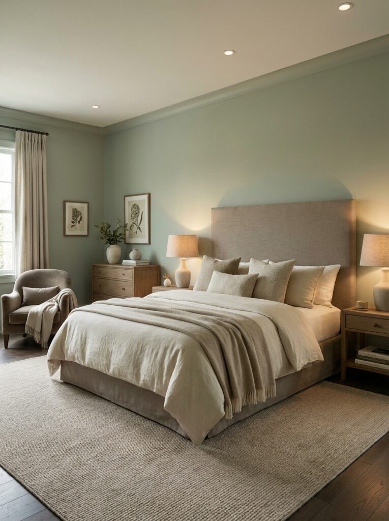
Why Sage Green Feels “Expensive”
Let’s be honest—not all green paints look high-end.
The secret behind luxury interiors?
👉 Muted, layered colors—not bright ones
Sage green works because:

Rust-Oleum 367605 Home Interior Floor Coating Kit, Semi-Gloss Black
Ideal for updating outdated flooring at a fraction of the cost of replacement and adheres without stripping, sanding or priming.
Buy Now on Amazon- It mimics nature (stone, moss, eucalyptus)
- It has gray undertones → looks refined
- It pairs beautifully with wood, marble, and brass
In fact, designers in 2026 are favoring gray-green tones because they feel calm, grounded, and adaptable in different lighting.
10 Best Benjamin Moore Sage Green Paint Colors
Let’s break down the most loved shades—and exactly how to use them.
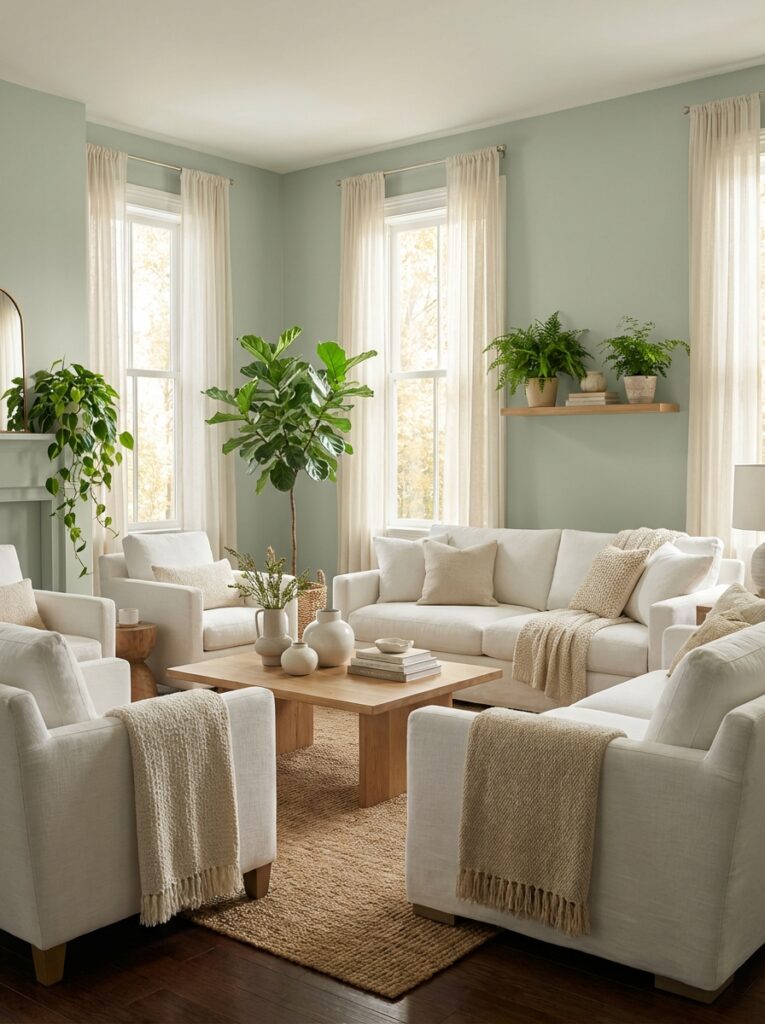
1. October Mist (1495) — The Ultimate Designer Sage
- Soft silvery sage
- Balanced gray-green
This was a Color of the Year, and it still dominates modern interiors.
👉 Why it feels expensive:
It changes subtly with light—sometimes gray, sometimes green—creating depth.
👉 Best for:
- Living rooms
- Whole-house color
- Open spaces
2. Saybrook Sage (HC-114) — Classic & Timeless
- True mid-tone sage
- Slight warmth
👉 Why designers love it:
It’s traditional but never outdated.
👉 Real use:
- Kitchen cabinets
- Dining rooms
💬 Real homeowner insight:
“Great lighter shade of sage”
3. Sage Wisdom (CSP-775) — Soft & Serene
- Muted sage
- Calm, relaxing tone
👉 Perfect for:
- Bedrooms
- Meditation spaces
This shade creates that spa-like luxury feel.
4. Gloucester Sage (HC-100) — Rich & Historic
- Deeper sage tone
- Slight olive depth
👉 Best for:
- Accent walls
- Exterior siding
This color has a heritage, upscale vibe often used in classic homes.
5. Silver Sage (506) — Light & Elegant
- Pale gray-green
- Very soft
👉 Perfect for:
- Small rooms
- Bathrooms
It reflects light beautifully, making spaces feel airy and refined.
6. Soft Fern (2144-40) — Fresh Yet Subtle
- Light green with gray softness
👉 Best for:
- Nurseries
- Bedrooms
It’s gentle and uplifting without feeling childish.
7. Oil Cloth (CSP-760) — Designer Secret Shade
- Deep muted sage
- Slightly moody
👉 Best for:
- Offices
- Accent walls
This is one of those colors designers use when they want something unique but still neutral.
8. Louisburg Green (HC-113) — Earthy & Warm
- Classic sage
- Slight yellow undertone
👉 Best for:
- Living rooms
- Traditional homes
This one leans warmer, making it feel cozy and inviting.
9. Wind Chime (AF-465) — Soft Neutral Sage
- Gray-heavy sage
- Extremely versatile
👉 Best for:
- Whole house
- Hallways
It works almost like a green neutral, blending into any palette.
10. Thornton Sage (464) — Balanced & Natural
- Medium sage tone
- Earthy undertone
👉 Best for:
- Kitchens
- Feature walls
It brings that organic, grounded feel designers love.
How to Use Sage Green for a Luxury Look
This is where most people go wrong—they pick a nice color but don’t style it right.
1. Pair with Warm Neutrals
Think:
- Cream
- Beige
- Soft white
Avoid harsh, cool whites—they kill the cozy effect.
2. Add Natural Materials
Sage looks expensive when paired with:
- Wood
- Linen
- Stone
- Marble
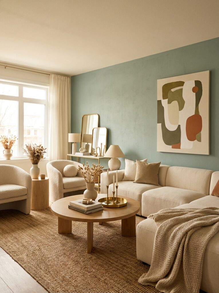
3. Use Brass or Gold Accents
This instantly elevates the look:
- Light fixtures
- Cabinet handles
- Mirrors
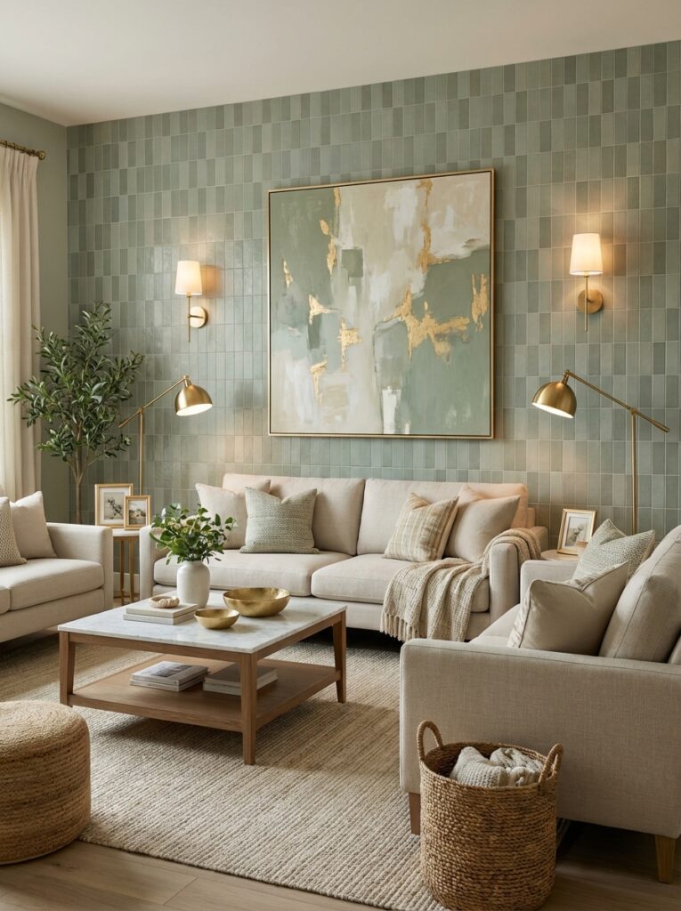
4. Layer Different Greens
Designers often combine:
- Light sage walls
- Dark green furniture
- Plants
This creates depth and richness.
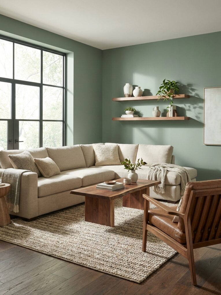
Best Rooms for Benjamin Moore Sage Green
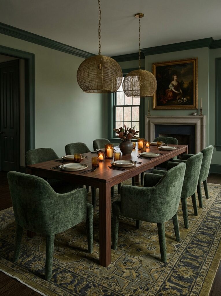
Living Room
- October Mist
- Louisburg Green
👉 Creates a calm, welcoming space
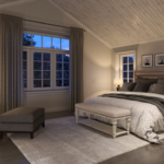
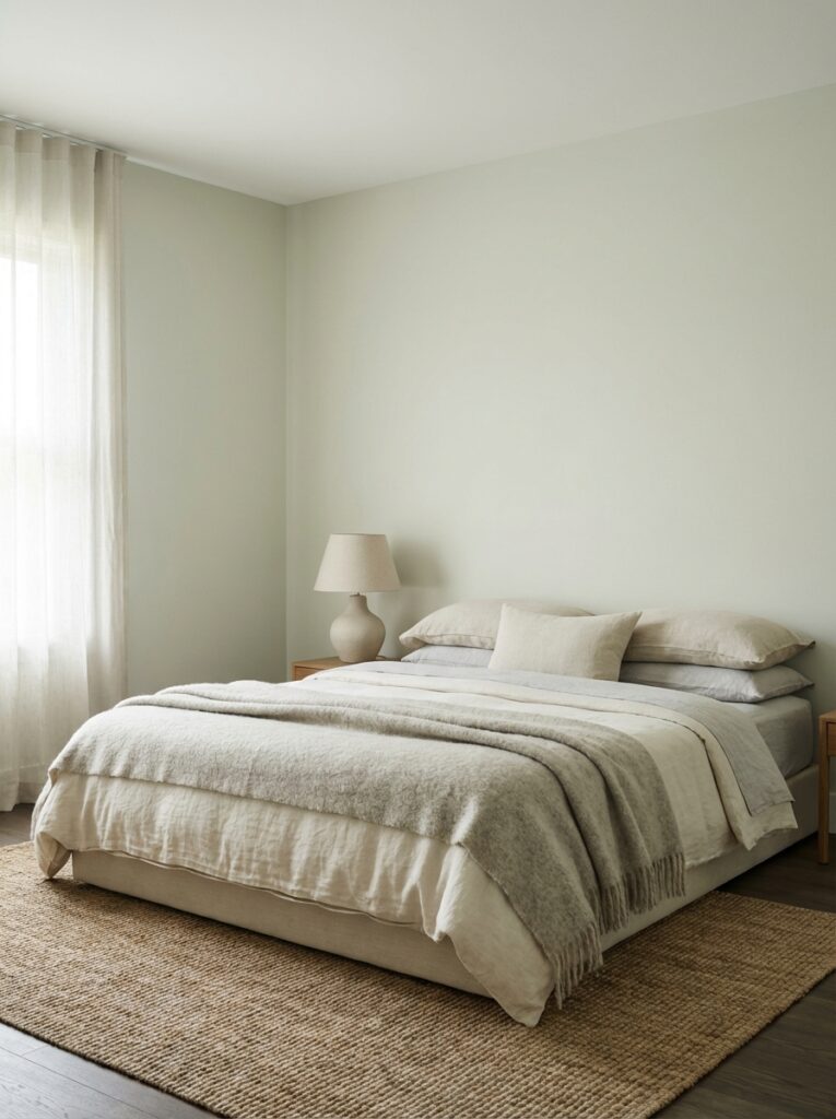
Bedroom
- Sage Wisdom
- Soft Fern
👉 Promotes relaxation and better sleep
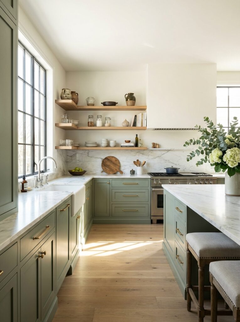
Kitchen
- Saybrook Sage
- Thornton Sage
👉 Pinterest-perfect cabinets
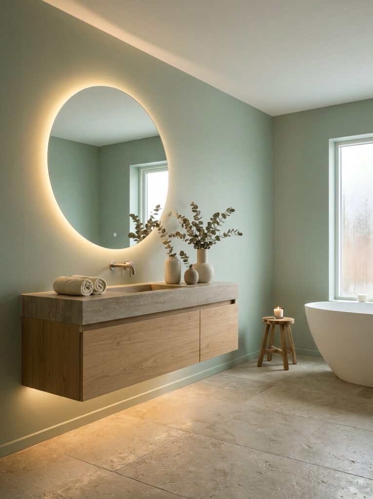
Bathroom
- Silver Sage
- Wind Chime
👉 Spa-like, clean, luxurious feel
Common Mistakes to Avoid
❌ Choosing Too Bright Green
Sage should always feel muted.
❌ Ignoring Lighting
North-facing rooms can make sage look blue or gray.
❌ Using Cool Gray with Sage
This creates a dull, lifeless palette.
👉 Instead:
Pair with warm neutrals.
2026 Design Trend Insight
Sage green is evolving.
Designers are shifting toward:
- Warmer sage tones
- Earthier greens
- Layered neutral palettes
Cool blue-based sages are slowly fading, while rich, grounded tones feel more luxurious.
Final Thoughts
If your goal is a home that feels:
- Calm
- Elegant
- Effortlessly expensive
Benjamin Moore sage greens are one of the best choices you can make.
👉 Safe picks:
- October Mist (modern luxury)
- Saybrook Sage (classic elegance)
👉 Bold designer picks:
- Oil Cloth
- Gloucester Sage
Sage green isn’t just a color—it’s a mood.
And when used correctly, it can completely transform your space into something that feels high-end, peaceful, and timeless.