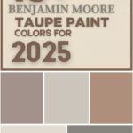
In a refreshing twist, Sherwin Williams has abandoned its traditional single “Color of the Year” for 2025, opting instead for a 9-color capsule collection designed to inspire creativity and cohesion in home design. This innovative approach reflects evolving consumer desires for flexibility and longevity in interior spaces. The palette—six warm neutrals and three vibrant hues—balances versatility with personality, offering a toolkit for both minimalist and maximalist aesthetics.
This shift acknowledges a growing trend: homeowners crave curated choices that simplify decision-making without sacrificing individuality. By grounding the collection in brown-toned neutrals and pairing them with cool, statement-making colors, Sherwin Williams bridges the gap between timeless elegance and contemporary flair. Let’s dissect this capsule and explore how to harness its potential in any space.

Chapter 1: Decoding the 2025 Color Capsule
The Neutrals: Warmth Meets Sophistication
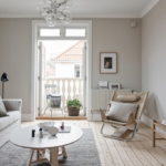
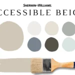
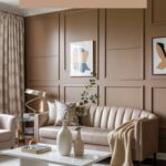
The six neutrals—White Snow, Sunbleached, Malabar, Bosc Pear, Grounded, and Clove—are unified by brown undertones, a deliberate choice that replaces the coldness of gray with organic warmth. This creates a welcoming foundation, especially in open-concept homes where seamless transitions between rooms are key.
- Light Neutrals:
White Snow (SW 9541) is a crisp, clean white that avoids sterility thanks to subtle taupe undertones, making it ideal for ceilings and trim. Sunbleached (SW 9585) leans into beige, evoking sun-washed linen. Both shades amplify natural light, perfect for small spaces or north-facing rooms. - Medium Neutrals:
Malabar (SW 9110) introduces golden undertones, reminiscent of desert sands, while Bosc Pear (SW 6390) blends muted terracotta and ochre. These mid-tones add depth to feature walls or cabinetry without overwhelming. - Dark Neutrals:
Grounded (SW 6089) is a cocoa-inspired brown with a whisper of brick red, ideal for grounding open shelving or built-ins. Clove (SW 9605), the darkest shade, offers a near-black richness with neutral versatility, pairing effortlessly with metals and textiles.
Why Brown Undertones?
Brown’s resurgence reflects a cultural shift toward nature-inspired interiors. Unlike gray, which can feel clinical, brown evokes earthiness and comfort. It also harmonizes with both warm (wood tones) and cool (metals, glass) materials, making it a chameleon-like base.
The Accent Colors: Bold yet Balanced
The three accent hues—Chartreuse (SW 0073), Mauve Finery (SW 6282), and Rain Cloud (SW 9639)—are carefully chosen to inject energy without clashing.

Pro Grade Paint Roller Kit, Brush & Roller for Professionals & Homeowners
Perfect for smooth finishes on your interior walls. Ideal for home improvement enthusiasts!
Buy Now on Amazon- Chartreuse (SW 0073):
This vibrant yellow-green is the capsule’s showstopper. Historically linked to mid-century modern design, it revitalizes neutral backdrops. Pair it with Clove for high contrast or Sunbleached for a sunlit vibe. Use sparingly—think throw pillows or a front door—to avoid visual fatigue. - Mauve Finery (SW 6282):
A dusky purple-pink, this hue channels vintage glamour without saccharine sweetness. It softens modern spaces when applied to accent walls or upholstery. Complement it with Malabar for warmth or White Snow for freshness. - Rain Cloud (SW 9639):
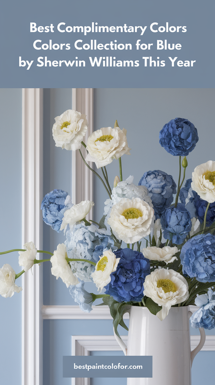
This moody blue-gray straddles the line between neutral and color. Use it in home offices for focus, or in bedrooms paired with Grounded for a cocoon-like effect. Its versatility allows it to stand alone or support bolder accents like Chartreuse.
Color Theory in Action:
The capsule’s cool accents (green, purple, blue) contrast elegantly with warm neutrals, creating dynamic yet harmonious spaces. This balance adheres to the 60-30-10 rule: 60% dominant neutrals, 30% secondary tones, 10% accents.

Chapter 2: The Strategic Advantage of a Color Capsule
Simplifying Design Decisions
Choosing a cohesive palette from scratch can paralyze even seasoned designers. The capsule eliminates guesswork by providing pre-tested combinations. For example:
- Sunbleached walls + Mauve Finery armchair + Rain Cloud curtains.
- Clove kitchen island + Bosc Pear bar stools + Chartreuse pendant lights.
Real-World Application:
In a 2024 survey, 68% of homeowners cited “decision fatigue” as their top renovation challenge. Pre-curated palettes reduce stress and costly mistakes, ensuring that every element—from wall color to decor—feels intentional.
Longevity Over Trends
While marketed as the “2025” collection, these colors resist obsolescence. Brown-based neutrals have anchored interiors for decades (recall the 1970s earth tones or 1990s taupe), while the accents nod to enduring styles:

Rust-Oleum 367605 Home Interior Floor Coating Kit, Semi-Gloss Black
Ideal for updating outdated flooring at a fraction of the cost of replacement and adheres without stripping, sanding or priming.
Buy Now on Amazon- Chartreuse: Mid-century modern revival.
- Mauve Finery: Grandmillennial charm.
- Rain Cloud: Coastal and industrial fusion.
Expert Insight:
“This capsule isn’t about fleeting trends—it’s about creating a narrative,” says interior designer Maria Cortez. “The neutrals whisper, and the colors shout, but they all speak the same language.”
Chapter 3: Transformative Applications for Every Space
Walls: From Subtle to Statement
- Full Room Paint:
Opt for White Snow in sun-deprived rooms to maximize light. In contrast, Clove envelops dining rooms or libraries in sophistication. For a balanced look, pair Malabar walls with white trim. - Accent Walls:
Rain Cloud shines behind beds or fireplaces, adding depth without gloom. Chartreuse energizes home gyms or playrooms. Use Sherwin Williams’ peel-and-stick tiles (3.50–3.50–4 each) for temporary drama.
Pro Tip:
Test colors at different times of day. Bosc Pear may glow amber at sunset but appear muted at noon.
Furniture & Cabinetry: Unexpected Pop
- Kitchens:
Paint lower cabinets Grounded and uppers White Snow for contrast. Add Chartreuse knobs for whimsy. - Built-Ins:
Highlight shelves with Mauve Finery interiors against Sunbleached exteriors.
Case Study:
A Brooklyn loft transformed its open kitchen by painting an island Clove and bar stools Bosc Pear. The result? A cohesive flow into the adjacent living area’s Malabar sofa and Rain Cloud rug.
Decor: Low-Commitment High Impact
- Textiles:
Layer Mauve Finery velvet cushions on a Grounded sofa. Drape Chartreuse throws over neutral armchairs. - Artwork:
Frame botanical prints with Rain Cloud mats for subtle cohesion.
Budget Hack:
Swap accent colors seasonally—Chartreuse for spring, Mauve Finery for winter—without repainting.
Chapter 4: Room-by-Room Guidance
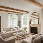
Living Rooms: Harmony in High-Traffic Areas
Anchor the space with Sunbleached walls and a Grounded leather sofa. Add Mauve Finery curtains and Chartreuse ceramic vases. For eclectic flair, hang a Rain Cloud gallery wall.
Lighting Tip:
Use warm-toned bulbs to enhance brown undertones, avoiding harsh cool LEDs.
Bedrooms: Serenity Meets Personality
Pair White Snow walls with Clove bed frames for contrast. Introduce Mauve Finery bedding and Malabar nightstands. In children’s rooms, a Chartreuse accent wall fosters creativity.
Psychological Impact:
Studies show blue-gray tones like Rain Cloud reduce stress, making them ideal for primary bedrooms.
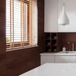
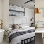
Kitchens & Bathrooms: Functional Elegance
- Kitchens:
Bosc Pear lower cabinets + White Snow uppers + brass hardware. Add Chartreuse tea towels. - Bathrooms:
Rain Cloud vanity + Sunbleached tiles. Accessorize with Mauve Finery towels.
Material Pairings:
Combine Clove with matte black fixtures for modernity, or Malabar with terracotta for rustic charm.
Chapter 5: Beyond Paint—Holistic Integration
Sustainable Synergy
Sherwin Williams’ Emerald® line offers low-VOC options, aligning the capsule with eco-conscious trends. Grounded and Clove’s depth reduces the need for frequent repaints, minimizing waste.
DIY Projects for Renters
- Removable Wallpaper:
Use Chartreuse geometric patterns on a feature wall. - Furniture Makeovers:
Refresh thrifted dressers with Mauve Finery paint.
Renter-Friendly Tip:
Command Strips and peel-and-stick tiles make customization damage-free.
Conclusion: Crafting Your Legacy Space
Sherwin Williams’ 2025 Color Capsule transcends trends, offering a blueprint for spaces that evolve with you. Whether through a Clove-accented reading nook or a Chartreuse front door, this palette invites creativity without chaos. By embracing its structured flexibility, you craft a home that’s both timeless and distinctly yours—a testament to the power of intentional design.
Final Checklist:
- Start with a neutral base.
- Layer accents gradually.
- Test samples in your unique lighting.
- Embrace imperfection—design is a journey.