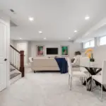
Absolutely — contrast trim is one of the easiest ways to make a room feel intentional, sophisticated, and designed. When the trim color pops against the wall color — whether soft and subtle or bold and dramatic — it elevates the whole space.
Let’s break down everything you need to know to choose the best paint colors for contrast trims — in a way that’s practical, human-friendly, and feels like having a design conversation with a friend.

🎨 What Is “Contrast Trim” Anyway?
Contrast trim simply means your trim (baseboards, doors, window casings, crown molding) is a different color than your walls — and that difference is noticeable.
There are three main types of contrast:
- Strong contrast — big difference (e.g., deep charcoal trim with light walls)
- Moderate contrast — subtle but visible (e.g., warm white trim with a soft neutral wall)
- Soft contrast — barely there but still defined (e.g., creamy off-white trim with warmer walls)
All three can be beautiful — but the effect is very different.

Pro Grade Paint Roller Kit, Brush & Roller for Professionals & Homeowners
Perfect for smooth finishes on your interior walls. Ideal for home improvement enthusiasts!
Buy Now on Amazon🖌 Why Use Contrast Trim?
Contrast trim:
- Defines architectural details
- Provides depth and dimension
- Frames the walls like art
- Makes spaces feel intentional and polished
- Helps ceilings feel more connected to the design
So if you want your room to feel designed, contrast trim is one of the quickest ways to get there.
🏆 Best Trim Colors for Contrast (Categorized)
Below are the most popular and effective trim colors — organized by the type of contrast they create.
⚪ 1. Classic Crisp White (Strong & Fresh)
Classic white trim never goes out of style — especially when paired with the right wall colors.

Rust-Oleum 367605 Home Interior Floor Coating Kit, Semi-Gloss Black
Ideal for updating outdated flooring at a fraction of the cost of replacement and adheres without stripping, sanding or priming.
Buy Now on AmazonBest Crisp White Trim Colors
- Sherwin‑Williams Extra White — Cleanest, brightest white
- Sherwin‑Williams Pure White — Soft but still crisp
- Benjamin Moore Chantilly Lace — Bright and true white
Why they work:
These whites provide high contrast with almost every wall color — especially neutrals, blues, greens, and grays. They make trim lines sharp and architectural.
Best paired with:
- Light walls
- Mid-tone neutrals
- Soft blues/greens
- Muted grays
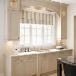
⚪ 2. Warm Whites & Creams (Soft Contrast)
If stark white feels too “hospital” or too bright, warm whites offer a softer version of contrast.
Warm White Favorites
- Sherwin‑Williams Alabaster — Warm, cozy cream
- Sherwin‑Williams Creamy — Soft ivory tone
- Benjamin Moore White Dove — Soft, comforting white
Why they work:
Warm whites are gentle — they still contrast the wall, but with a softer, warmer effect that’s perfect in cozy spaces or rooms with warm wood and textiles.
Best paired with:
- Warm neutrals
- Greige tones
- Earthy greens
- Spa-like palettes
⚫ 3. Deep Charcoal & Black (Bold Contrast)
Want your trim to pop? Dark trim creates drama and architectural flair.
Bold Dark Trim Colors
- Sherwin‑Williams Tricorn Black — True black, striking
- Sherwin‑Williams Iron Ore — Deep charcoal with richness
- Benjamin Moore Black Beauty — Elegant deep black
Why they work:
Dark trim creates the highest contrast. It gives rooms definition and a modern architectural feel — especially in homes with tall ceilings, light walls, or minimal decor.
Best paired with:
- Bright white or light neutral walls
- Soft pastels
- Cool gray walls
- Black hardware and accents
🔵 4. Dark Gray & Blue-Gray Trims (Modern & Stylish)
If you want contrast without a stark black, deep gray or charcoal-blue trims are stunning.
Great Gray/Blue-Gray Trims
- Sherwin‑Williams Grays Harbor — Moody blue-gray
- Sherwin‑Williams Dorian Gray — Warm, deep gray
- Benjamin Moore Kendall Charcoal — Elegant, rich gray
Why they work:
Deep grays or blue-grays offer contrast with softness. They’re less intense than black but richer than mid-tone colors.
Best paired with:
- Neutral-based walls
- Muted blues/greens
- Warm wood tones
- Natural textiles
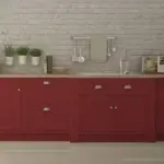
🟤 5. Warm Contrast Tones (Earthy & Cozy)
Not all contrast has to be cool or modern. Some of the most beautiful contrast trims are warm, earthy tones that still feel intentional.
Earthy Trim Options
- Sherwin‑Williams Urbane Bronze — Moody bronze with warmth
- Sherwin‑Williams Peppercorn — Deep charcoal with warm undertones
Why they work:
These tones feel sophisticated and cozy without the starkness of true black. They pair beautifully with warm neutrals and textured decor.
Best paired with:
- Greige walls
- Warm beige and taupe
- Wooden furniture
🧠 Choosing the Right Contrast Level
Now we get to the fun part — actually choosing the contrast based on your space.
Here’s how to think about it:
🌞 1. Light, Sunny Rooms
If you have lots of natural light:
- High contrast works beautifully
- White or bold dark trims will look intentional and crisp
Example:
- Walls: light gray
- Trim: crisp white or charcoal
→ Clean, modern, elevated
🕯️ 2. Dark or North-Facing Rooms
North light tends to feel cooler and softer.
In these rooms:
- Choose warmer trim or mid-contrast hues
- Avoid stark white that can look icy
Example:
- Walls: warm greige
- Trim: warm cream
→ Balanced, cozy
🏙️ 3. Small Bedrooms
Small spaces can benefit from soft or moderate contrast.
- Crisp white can make a room feel larger
- Gentle contrast keeps lines clean without cutting the space visually
Example:
- Walls: soft blue
- Trim: pure white
→ Fresh and airy
🏡 4. Open Concept Spaces
When your walls flow into multiple areas:
- Pick a trim color that can work across rooms
- Consistency matters more than bold contrast in this case
Example:
- Trim: Pure white throughout
- Walls: different calming neutrals
→ Cohesive and intentional
🧰 Practical Tips for Painting Trim
Contrast is fantastic — but trim demands a little extra care:
✍️ Use Semi-Gloss or Gloss Finish
Trim looks cleaner and more intentional in a sheen that reflects light slightly.
🖌️ Don’t Forget Doors & Cabinets
If you’re using contrast trim, sometimes extending that color onto interior doors or cabinets creates harmony.
🧼 Prep Matters
Trim shows imperfections more than walls — sanding and priming pays off.
📌 Smart Contrast Pairings to Try
Here are some tested pairings that always look intentional:
🎨 Crisp Contrast (High Impact)
- Walls: Light gray
- Trim: Extra White
→ Clean, modern, calm
🎨 Warm + Soft (Gentle Contrast)
- Walls: Greige
- Trim: Alabaster
→ Cozy, inviting
🎨 Drama & Depth
- Walls: Creamy neutral
- Trim: Iron Ore
→ Bold, architectural
🎨 Modern Calm
- Walls: Soft blue
- Trim: Pure White
→ Airy and fresh
🎨 Earthy Sophistication
- Walls: Warm taupe
- Trim: Urbane Bronze
→ Rich, textured, luxurious
🧠 Quick Rules to Remember
✔ High contrast makes details pop
✔ Soft contrast keeps spaces cozy
✔ Warm trims tame cool walls
✔ Dark trim anchors light walls
✔ Consistency in trim color = intentional design
🌟 Final Thoughts
Contrast trim isn’t about trends.
It’s about design clarity.
It’s about framing your space — like a picture — so everything feels polished and purposeful.
Whether you go bold with charcoal and crisp whites, soft with warm neutrals, or elegant with deep blues and grays, the right trim color can elevate your bedroom, living room, or entire home.
If you want, tell me:
✔ The room you’re painting
✔ Your wall color
✔ Your lighting conditions
…and I’ll recommend the perfect contrast trim color (and even specific paint codes) tailored to your space.
Let’s make your home look intentional and beautiful. 🎨✨