When it comes to giving your home a makeover, few updates have as much impact as a fresh coat of exterior paint. The right color doesn’t just refresh tired siding—it can completely transform curb appeal, boost resale value, and even make your house feel more “you.”
But here’s the catch: with thousands of shades out there, choosing the perfect exterior paint color can feel overwhelming. That’s why we’re looking to the three giants of the paint world—Behr, Sherwin Williams, and Benjamin Moore. Each brand offers a carefully curated lineup of timeless neutrals, trendy darks, and inviting hues that work beautifully outdoors.
In this guide, we’ll walk through 20+ of the very best exterior house paint colors—organized by color families—so you can picture how they’ll look on your own home.
Premium Download
Get the Pro Color Palette for Free
- Help you Visualize
- Help you Plan
- Make most out of it
2. Things to Consider Before Choosing Exterior Paint
Before we dive into swatches and color names, let’s slow down for a second. Picking a paint chip at the store isn’t enough—you need to think about how that color will look in real life. Here are a few key things to consider:

Pro Grade Paint Roller Kit, Brush & Roller for Professionals & Homeowners
Perfect for smooth finishes on your interior walls. Ideal for home improvement enthusiasts!
Buy Now on Amazon🌞 Sunlight, Shade, and Climate Effects
Paint can look drastically different depending on the weather. A soft gray might appear almost white in full sun but take on a moody tone on cloudy days. If you live in a hot climate, lighter shades help keep your home cooler, while darker tones may fade faster under harsh UV rays.
🏘 HOA Rules, Neighborhood Styles, and Resale Value
Love that bold navy? Great—but if your HOA only allows “earth tones,” you may need to rethink. Similarly, if every house on your street is beige, going jet black might stand out a little too much. Consider your neighborhood vibe and potential resale value when making your pick.
🎨 Warm vs. Cool Undertones in Exterior Paint
Every paint color has undertones—those subtle hints of yellow, blue, or green that show up in certain lighting. For example, Sherwin Williams Alabaster looks like a soft, warm white, while Benjamin Moore’s Chantilly Lace is a crisp, cool white. Understanding undertones helps you avoid surprises once the paint is on your siding.
🏡 The Role of Front Doors, Trim, and Roof Color
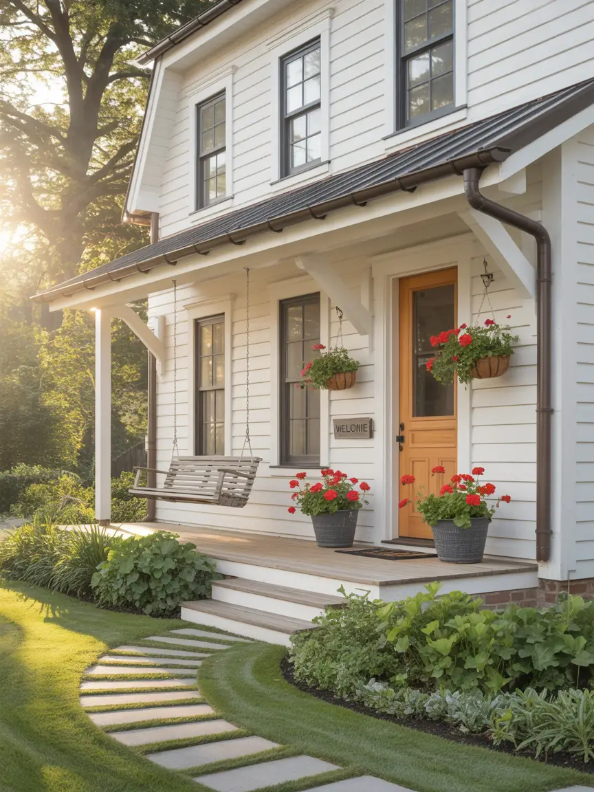
Your exterior isn’t just one big color. The trim, shutters, front door, and even your roof play a role in how your paint will read. A gray house with white trim feels classic, while the same gray paired with black trim feels bold and modern. Always test colors against existing elements before committing.

Rust-Oleum 367605 Home Interior Floor Coating Kit, Semi-Gloss Black
Ideal for updating outdated flooring at a fraction of the cost of replacement and adheres without stripping, sanding or priming.
Buy Now on Amazon3. Timeless Neutrals That Always Work
Neutrals are the backbone of exterior design. They never go out of style, appeal to a wide range of buyers, and provide a clean backdrop for landscaping or bold front door colors. If you’re not sure where to start, these three timeless neutrals are foolproof:
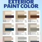
Behr – Ultra Pure White (White 52)
One of the cleanest whites on the market, Ultra Pure White is a classic choice for homeowners who want a crisp, bright exterior. It works beautifully on modern farmhouses, Cape Cods, and traditional homes alike. Pair it with black shutters for a timeless look, or with wood accents for a warm, rustic vibe.
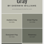
Sherwin Williams – Alabaster (SW 7008)
Alabaster is one of Sherwin Williams’ most popular whites, and for good reason. It’s soft and creamy without looking yellow, making it a warm white that feels welcoming. Perfect for exteriors where stark white might look too harsh. It shines on stucco homes, brick exteriors, and even siding with lots of texture.
Benjamin Moore – White Dove (OC-17)
If there’s one neutral exterior color that designers swear by, it’s White Dove. This versatile shade strikes the ideal balance: not too cool, not too warm. It looks elegant with stone foundations and makes trim and windows pop without overpowering other details.
4. Soft Grays for Modern Appeal
Gray has become the new neutral for exteriors, and for good reason. It feels sleek, timeless, and works across architectural styles—from Craftsman to contemporary homes. What makes gray so versatile is its ability to shift with undertones: some grays lean warm and cozy, while others feel cool and crisp.
Here are three soft gray exterior paints from Behr, Sherwin Williams, and Benjamin Moore that designers consistently recommend:
Behr – Silver Drop (790C-2)
Silver Drop is a soft, light gray with a barely-there beige undertone. It almost reads as a warm off-white, making it an excellent option for homeowners who want a light, airy feel without going stark white. On sunny days, it glows bright; in the shade, it picks up a subtle, calming depth. Pair it with white trim for a clean look, or add black shutters for extra contrast.
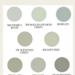
Sherwin Williams – Repose Gray (SW 7015)
One of the most popular grays in the Sherwin Williams collection, Repose Gray is a balanced, medium-light gray with a slight warmth. It’s modern but not cold—making it an ideal choice for siding. This color works especially well if you have natural stone or brick accents, since it blends seamlessly with both warm and cool tones.
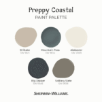
Benjamin Moore – Stonington Gray (HC-170)
Stonington Gray is a cooler gray with subtle blue undertones, giving it a crisp, coastal vibe. It’s perfect for Cape Cods, beach houses, and homes that want to feel fresh and breezy. On exteriors with a lot of greenery, Stonington Gray creates a beautiful contrast, letting landscaping shine.
Designer Tip: Soft grays can sometimes look “flat” if not paired with the right trim. Adding a contrasting white or even a bold black front door can give gray exteriors the pop they need.
5. Bold Dark Colors That Stand Out
Gone are the days when dark exteriors felt gloomy. Today, they’re dramatic, modern, and undeniably chic. If you’ve ever scrolled through Pinterest and stopped on a house that looked like it belonged in a design magazine—it was probably painted a bold dark shade.
The beauty of going dark is how it makes trim, landscaping, and architectural details pop. Plus, darker paints tend to hide dirt and wear better than light colors.
Behr – Cracked Pepper (PPU18-01)
Cracked Pepper is a soft, charcoal black that feels sophisticated but not too harsh. It’s perfect for homeowners who want a moody look without committing to jet black. Paired with warm wood accents—like cedar garage doors or natural stone—it feels rich and inviting.
Sherwin Williams – Tricorn Black (SW 6258)
If you want a true, deep black exterior, Tricorn Black is the industry favorite. Designers love it for its neutral undertones, meaning it won’t look blue or brown—it’s just… black. Bold, timeless, and guaranteed to make your home stand out on the block.
Benjamin Moore – Hale Navy (HC-154)
Okay, not quite black—but Hale Navy is a dark, saturated navy that has practically become legendary in design circles. It works beautifully on traditional homes and coastal properties, offering drama without feeling stark. Against white trim, it’s downright dreamy.
Designer Tip: If you go dark, balance it with lighter trim or accents. A black house with black trim might feel heavy—but black siding with crisp white trim and natural wood details? Perfection.
6. Earthy and Natural Tones
With homeowners seeking connection to nature, earthy colors are having a major moment. Think warm greens, muted taupes, and clay-inspired browns. These shades make your home feel grounded and organic, blending beautifully with outdoor surroundings.
Behr – Mountain Sage (N350-4)
Mountain Sage is a soft, muted green that immediately feels cozy and inviting. It’s a fantastic choice for cabins, craftsman-style homes, or any property surrounded by trees. Pair it with cream trim and stonework for a timeless look.
Sherwin Williams – Dried Thyme (SW 6186)
This muted, gray-green tone is earthy yet sophisticated. It works especially well in suburban neighborhoods where you want something unique but not too bold. Dried Thyme looks stunning with warm beige trim or even copper gutters for a rustic touch.
Benjamin Moore – Briarwood (HC-175)
Briarwood is a warm, taupe-brown shade that gives off that “organic chic” vibe. It’s understated yet rich, making it ideal for modern farmhouse exteriors. Against black windows or doors, it looks especially elevated.
Designer Tip: Earth tones really shine when paired with natural textures. Think stone walkways, wood pergolas, and lots of greenery to complement the palette.
7. Light & Airy Whites for Freshness
White homes have always been in style, but lately, we’ve seen a surge of demand for fresh, airy exteriors that look timeless yet modern. A white house with black windows? Instant curb appeal. A white farmhouse with wood accents? Straight off Pinterest.
The trick is choosing the right white—not all are created equal. Some lean warm, others cool, and the undertones make a big difference.
Behr – Polar Bear (75)
Polar Bear is a clean, crisp white without feeling cold. It’s bright enough to pop but still soft enough to avoid looking stark. It works wonderfully on traditional homes, especially with navy shutters or red brick foundations.
Sherwin Williams – Pure White (SW 7005)
Designers swear by Pure White because it’s versatile and balanced—it doesn’t lean too yellow or too gray. That makes it a perfect canvas for any accent color. Pair it with a dark charcoal roof and modern windows for a fresh, updated look.
Benjamin Moore – White Dove (OC-17)
If there’s a “celebrity” of white paints, it’s White Dove. This soft, warm white looks elegant without being sterile. Homeowners love it for its subtle creaminess, making it ideal for exteriors where you want warmth and sophistication.
Designer Tip: White exteriors look best with contrast. Think dark shutters, natural wood beams, or bold front doors. Otherwise, your house can risk looking too flat.
8. Warm Beiges & Greiges for Balance
Not ready to commit to bright white or bold dark tones? Enter the world of beiges and greiges (that’s gray + beige). These colors are neutral, flexible, and surprisingly modern when paired with black trim or metal accents.
Behr – Wheat Bread (720C-3)
Wheat Bread is one of Behr’s most popular warm neutrals. It’s a mid-tone beige with gray undertones that makes it extremely versatile. It works equally well on a suburban ranch house as it does on a modern farmhouse.
Sherwin Williams – Accessible Beige (SW 7036)
Despite its name, this color is more greige than beige. Accessible Beige is a fan favorite because it feels modern yet warm, with just enough gray to keep it from looking dated. Pair it with crisp white trim and a dark roof for a balanced, polished look.
Benjamin Moore – Edgecomb Gray (HC-173)
Edgecomb Gray is a soft, neutral greige that adapts beautifully depending on the light. In bright sun, it feels fresh and light; in shade, it takes on a warmer, cozier tone. That versatility makes it a top pick for exterior paint.
Designer Tip: Beiges and greiges are the ultimate crowd-pleasers if you’re thinking resale. They’re safe without being boring, and they allow you to go bold with accent colors on shutters, doors, or trim.
9. Blue Hues That Inspire Calm
Blue is one of the most versatile paint colors for exteriors. It’s calming, classic, and instantly elevates curb appeal. Whether you prefer soft coastal tones or bold navy shades, blue pairs beautifully with white trim, stone, and natural wood accents.
Behr – Blueprint (S470-5)
Blueprint is a medium, denim-inspired blue that feels both modern and approachable. It’s not too dark, not too bright—just the right balance for homeowners who want color without going overboard. It looks especially sharp on Craftsman-style homes with crisp white trim.
Sherwin Williams – Naval (SW 6244)
Naval is a deep navy that exudes sophistication. In 2020, it was named Sherwin Williams’ Color of the Year—and it hasn’t slowed down since. It works beautifully on both traditional and modern homes, pairing well with brass fixtures and natural stone.
Benjamin Moore – Hale Navy (HC-154)
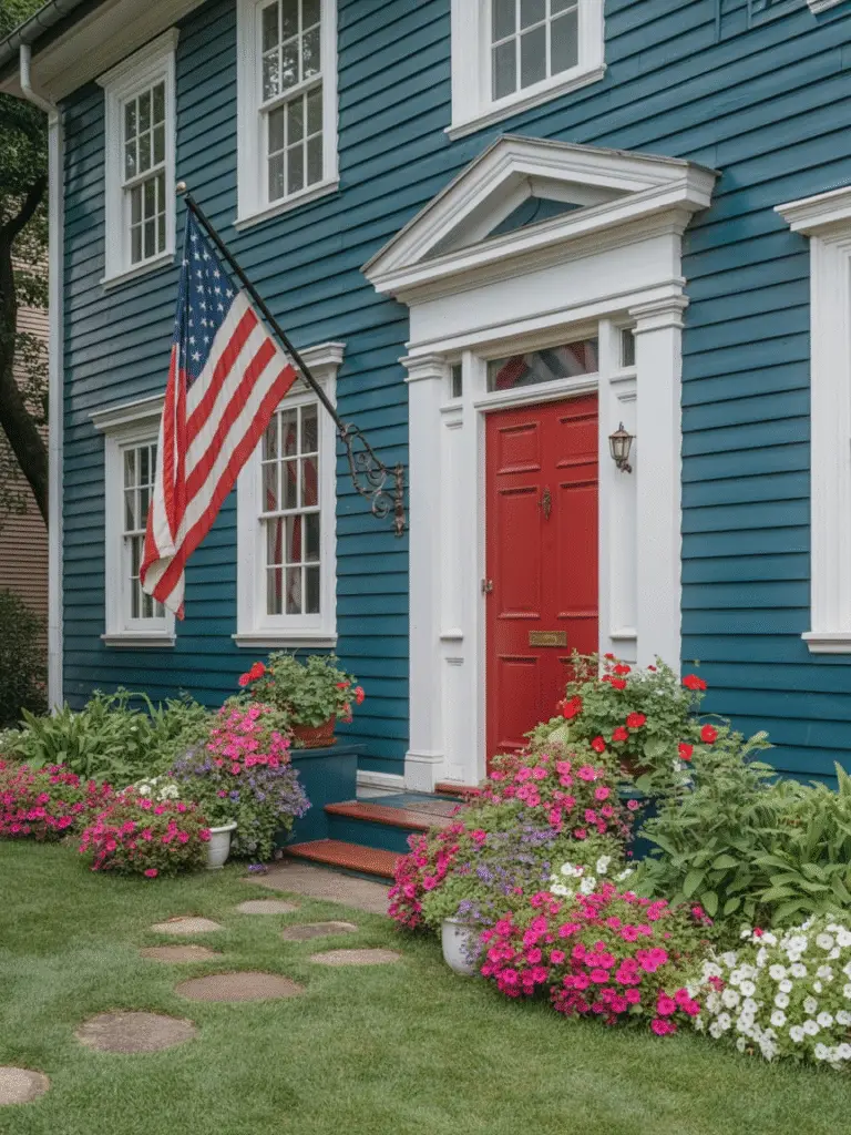
Hale Navy is arguably the most popular navy paint of all time. It’s rich, moody, and timeless. On exteriors, it delivers a bold yet classic statement. Pair it with a red front door for a patriotic pop, or keep it sleek with black and white accents.
Designer Tip: Blue houses shine when accented with wood. Consider cedar shutters, a natural wood front door, or even a wood garage door to warm up the look.
10. Timeless Grays That Never Fail
Grays are the ultimate go-to for homeowners who want sophistication without committing to bold colors. From soft silvery tones to rich charcoals, gray exteriors always look elegant and modern.
Behr – Silver Bullet (N520-2)
Silver Bullet is a light-to-medium gray that feels airy and approachable. It’s a safe bet for anyone who wants their home to look updated without being too dramatic. Works well on modern colonials and suburban homes alike.
Sherwin Williams – Repose Gray (SW 7015)
Repose Gray is a crowd-pleaser because of its balance—it’s not too warm, not too cool. It adapts beautifully to natural light, making it perfect for exteriors. With white trim, it looks soft and classic; with black trim, it leans modern and edgy.
Benjamin Moore – Kendall Charcoal (HC-166)
If you’re looking for a deeper, more dramatic gray, Kendall Charcoal is the one. This bold shade pairs perfectly with stonework and wood details, creating a high-end, architectural feel.
Designer Tip: Grays are highly influenced by lighting. Always test a large sample on your home’s exterior before committing—it can look lighter or darker depending on sun exposure.
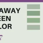
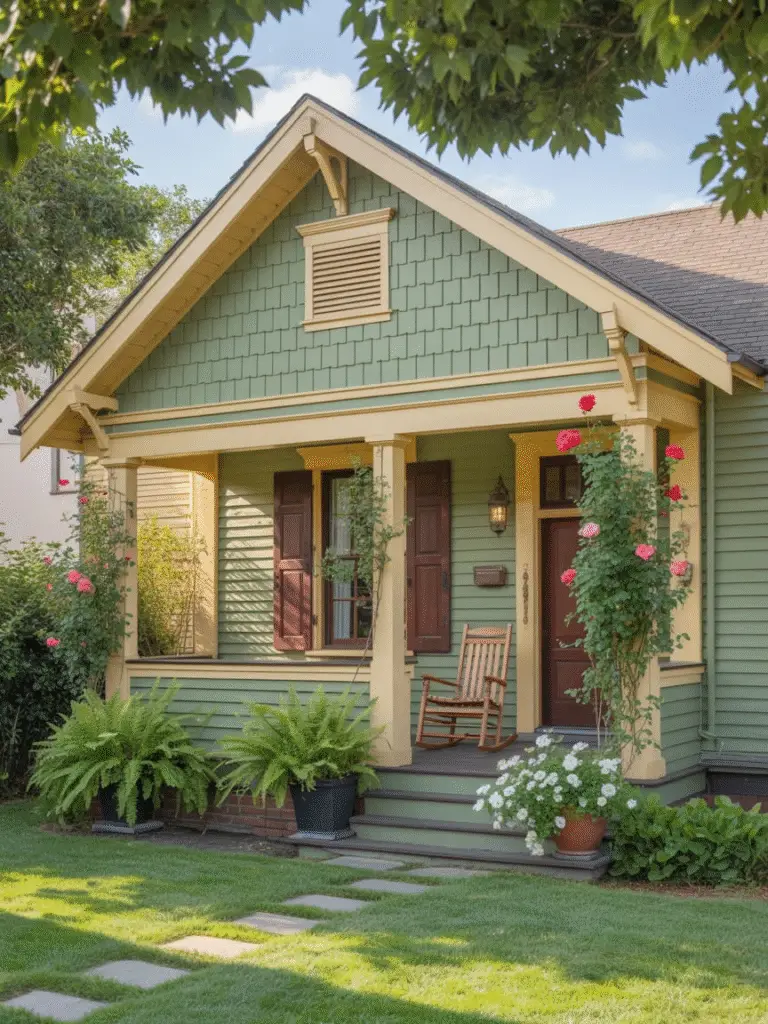
11. Earthy Greens That Blend With Nature
Green is having a major comeback in exterior design. It’s earthy, grounding, and blends seamlessly with natural surroundings. Whether you live in a wooded lot or want a fresh pop of color in the suburbs, green exteriors are timeless.
Behr – Back to Nature (S340-4)
This warm, soft green feels organic and welcoming. It’s the kind of shade that makes a home look like it belongs to the landscape. Works especially well on cottage-style homes with stone foundations.
Sherwin Williams – Evergreen Fog (SW 9130)
Chosen as Sherwin Williams’ Color of the Year in 2022, Evergreen Fog is a muted sage green that’s modern yet classic. It looks incredible with both warm wood accents and sleek black trim.
Benjamin Moore – Saybrook Sage (HC-114)
Saybrook Sage is a soft, historic green that works beautifully on farmhouses and Cape Cod-style homes. It’s understated but still gives plenty of personality.
Designer Tip: Greens pair well with earthy trim colors like cream, taupe, or warm gray. For a bold statement, try black shutters—it’s unexpected but striking.
12. Rustic Reds & Terra Cottas for Bold Personality
If you want your home to stand out in a neighborhood of neutrals, red is a fearless choice. From deep barn reds to warm terra cottas, these hues make a big statement while still feeling timeless.
Behr – Red Pepper (PPU2-02)
A rich, fiery red that instantly draws the eye. Perfect for farmhouses, barns, and country-style homes. Pair it with crisp white trim for that classic Americana look.
Sherwin Williams – Cavern Clay (SW 7701)
Cavern Clay, Sherwin Williams’ 2019 Color of the Year, is a warm terracotta inspired by desert landscapes. It’s earthy, inviting, and looks stunning in sunny climates.
Benjamin Moore – Caliente (AF-290)
Caliente is a bold, energetic red that packs personality. It’s not for the faint of heart—but if you’re looking to make your home the star of the block, this is the shade.
Designer Tip: Bold reds look best when balanced with natural textures—think wood beams, stone foundations, or neutral trim colors.
13. Unexpected Accent Colors That Work
Neutrals may dominate, but sometimes it’s the unexpected pops of color that make an exterior unforgettable. Accent colors can be applied to doors, shutters, or even garage doors for a stylish contrast.
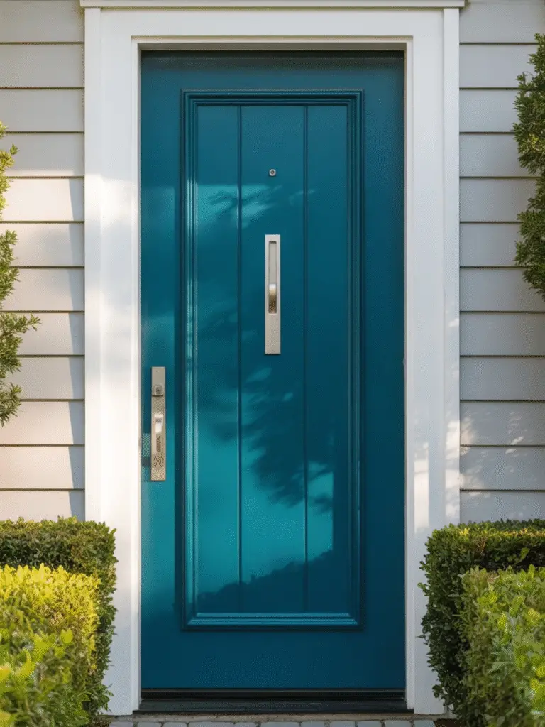
Behr – Deep Breath (MQ6-56)
A moody teal-blue that works beautifully as a front door color against gray, white, or beige siding. It gives just the right amount of personality without overwhelming.
Sherwin Williams – Coral Reef (SW 6606)
Playful, warm, and cheerful—Coral Reef makes a front door feel like a welcome hug. Pair it with crisp white exteriors for a tropical, vacation-home vibe.
Benjamin Moore – Hale Navy (HC-154)
Hale Navy is one of the most versatile navy blues on the market. As an accent, it looks sharp against white, beige, or even pale yellow siding. Think nautical, timeless, and elegant.
Designer Tip: Don’t limit yourself to doors. Garage doors, shutters, and even window boxes are all places where a bold accent shade can shine.
14. The Role of Trim and Accent Colors
It’s easy to get caught up in choosing the main exterior color, but trim and accents make or break the look. A beautiful siding color can fall flat without the right trim pairing.
- White Trim: Works almost universally. Clean, crisp, and classic.
- Black Trim: Dramatic and modern. Perfect for white, gray, or muted green houses.
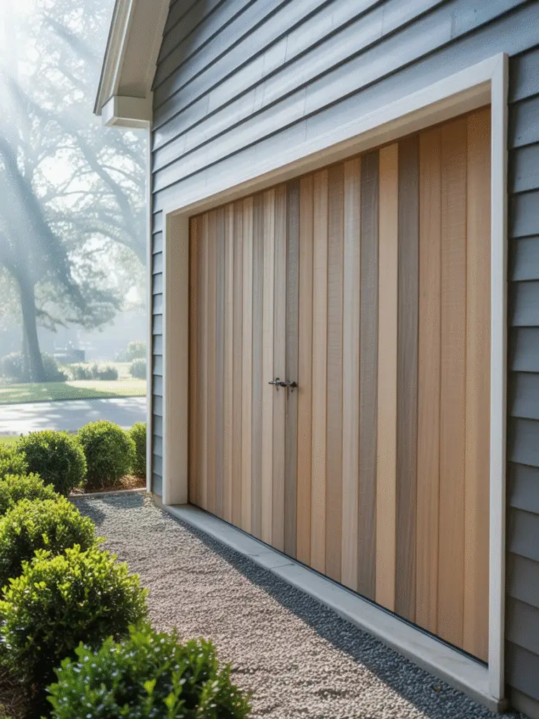
- Wood Accents: Natural cedar or stained finishes add warmth to cool-toned exteriors.
- Neutral Trim: Cream, taupe, or gray offers subtle contrast and softness.
Best Trim Color Picks from Each Brand
- Behr – Ultra Pure White (1850): Crisp and sharp, great for modern farmhouse or traditional homes.
- Sherwin Williams – Tricorn Black (SW 6258): A deep, true black for bold window frames or shutters.
- Benjamin Moore – White Dove (OC-17): A soft, warm white trim that flatters earthy tones and historic homes.
Pro Tip: Always test trim colors against your siding in natural daylight. The wrong undertone can throw off your whole scheme.
15. How to Choose the Right Exterior Color for Your Style of Home
Every home has an architectural personality, and the right paint color highlights it beautifully. Here’s how to match color with style:
Colonial Homes
Classic, symmetrical, and traditional.
- Best colors: White, navy, soft gray, or muted greens.
- Try: Benjamin Moore White Dove with black shutters.
Craftsman Bungalows
Warm, earthy, and rich in detail.
- Best colors: Sage greens, browns, terra cotta, and muted blues.
- Try: Sherwin Williams Pewter Green with cream trim.
Modern Farmhouse
Clean lines with rustic warmth.
- Best colors: Crisp whites, charcoal blacks, and wood accents.
- Try: Behr Ultra Pure White with Tricorn Black trim.
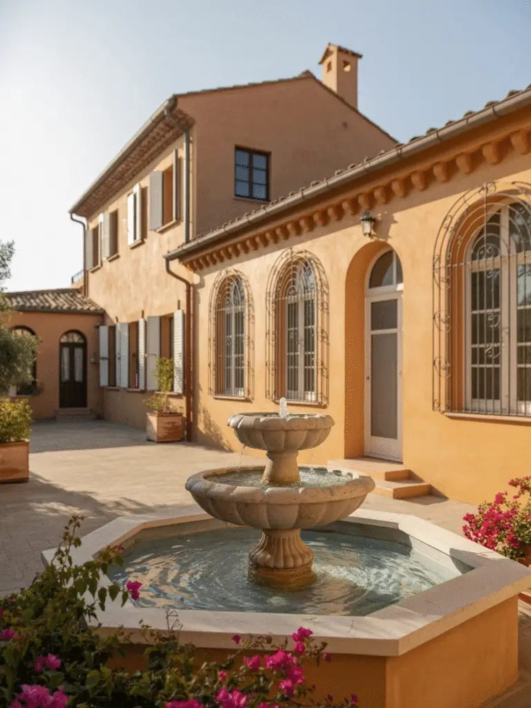
Mediterranean Villas
Stucco walls, clay roofs, and sun-soaked charm.
- Best colors: Warm beiges, creams, and soft terracotta.
- Try: Behr Swiss Coffee or Benjamin Moore Manchester Tan.
Mid-Century Modern
Angular lines, large windows, and retro vibes.
- Best colors: Deep charcoals, navies, and pops of bold accent shades.
- Try: Sherwin Williams Iron Ore with a Coral Reef front door.
Pro Tip: Drive through your neighborhood and notice what colors repeat. Your home should stand out—but not clash with the overall vibe.
16. Regional & Climate Considerations
Where you live plays a huge role in how paint colors look and last.
Hot, Sunny Climates
- Sunlight intensifies color.
- Light colors keep homes cooler and fade less.
- Try: Whites, creams, soft blues, and light grays.
Cold, Snowy Climates
- Bold and warm tones add contrast against snow.
- Dark colors absorb heat, which can help in winter.
- Try: Deep navy, charcoal, or rich reds.
Coastal Homes
- Salty air and moisture demand durable finishes.
- Breezy blues, whites, and sandy tones fit naturally.
- Try: Sherwin Williams Sea Salt or Behr Deep Breath.
Urban Environments
- Bold, modern hues look stylish against brick and concrete.
- Charcoal, black, and navy feel sophisticated.
- Try: Benjamin Moore Kendall Charcoal or Hale Navy.
Rural Settings
- Earthy, natural tones blend with the landscape.
- Greens, taupes, and warm browns feel right at home.
- Try: Sherwin Williams Pewter Green or Behr Granite Boulder.
Pro Tip: Always check how your chosen color reacts to your local light conditions—colors can look two shades lighter in bright sun and two shades darker in shade.
17. Tips for Sampling and Testing Colors
Even the most beautiful paint chip can look completely different on your home’s exterior. Sampling is the key to success, and it’s easier than you think.
1. Buy Small Sample Pots
Purchase 8 oz or quart-sized samples of your top 2–3 colors. Painting a few large swatches on different walls gives a real-life preview.
2. Test in Multiple Locations
Exterior lighting varies throughout the day. Paint swatches on a north-facing wall, a south-facing wall, and even near shaded areas to see how the color shifts.
3. Observe at Different Times of Day
Sunlight in the morning, harsh midday sun, and evening shadows all change the appearance of paint. Take notes and photos.
4. Compare Against Trim and Roof
Bring samples next to your existing trim, doors, and roof tiles. You don’t want a mismatch in undertones that throws off the look.
5. Consider Texture and Material
Siding type—wood, vinyl, stucco, or brick—affects how paint looks. Rough surfaces can make light colors look darker, while smooth surfaces reflect more light.
Pro Tip: Always let samples dry completely before making a final decision. Wet paint can mislead your eyes.
18. Common Mistakes to Avoid
Choosing exterior paint is exciting, but a few common mistakes can ruin the outcome.
1. Choosing Without Testing
Relying solely on color chips is risky. What looks perfect on paper can be shocking in sunlight.
2. Ignoring Undertones
Gray can lean blue, green, or taupe. Beige can lean yellow or pink. Matching undertones with existing elements prevents visual clashes.
3. Forgetting the Neighborhood Context
Going neon green in a neighborhood of muted earth tones? Probably not a good idea. Your house should complement its surroundings.
4. Overlooking Trim and Accents
Your main siding color is only part of the story. Trim, shutters, doors, and even gutters play a huge role in the final look.
5. Picking Trends Over Timelessness
Trendy colors are fun, but trends change fast. If you want long-term curb appeal and resale value, blend trend with classic choices.
6. Ignoring Climate & Sunlight Effects
Exterior light can drastically shift the way a paint color appears. A warm beige may look pink in full sun, and a gray might look blue in the shade.
Pro Tip: Take your time. Exterior paint is a long-term investment, and careful planning pays off big in curb appeal.
19. Best Combinations for Trim, Doors, and Shutters
The magic of a well-styled exterior often lies in contrast and complementary colors. While your main siding sets the stage, trim, doors, and shutters provide the finishing touches that make your home pop.
Classic White Trim
- Works beautifully with almost any siding color.
- Example: Gray siding + White trim + Black shutters = timeless elegance.
Bold Black Trim
- Perfect for modern homes or dramatic statements.
- Example: White house + Black windows/trim + Natural wood door = magazine-worthy look.
Natural Wood Accents
- Cedar, mahogany, or stained wood adds warmth.
- Works best on earthy greens, taupes, and soft grays.
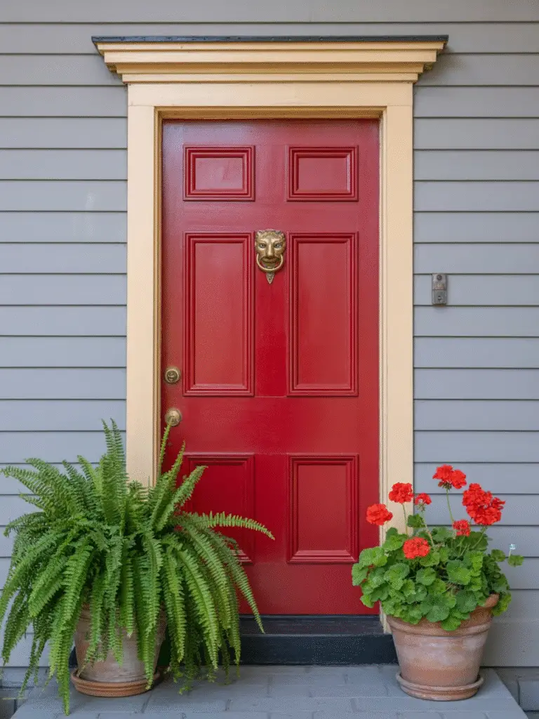
Pop of Color on the Front Door
- Bright red, navy, or teal doors create a welcoming focal point.
- Example: Soft beige siding + Navy door + White trim = balanced and sophisticated.
Coordinating Shutters
- Shutters can match doors or provide subtle contrast.
- Example: Green siding + Cream shutters + Dark brown door = harmonious and cozy.
Pro Tip: Step back 20–30 feet when testing color combinations. What looks good close up might feel too busy or flat from the curb.
20. Exterior Colors That Increase Curb Appeal and Resale Value
Choosing the right color isn’t just about personal taste—it can impact resale value. Neutral, versatile colors generally attract the most buyers.
Top Choices for Curb Appeal
- Soft Gray: Modern yet neutral. Works with many trims and accents.
- Warm Beige & Greige: Timeless, welcoming, and universally appealing.
- Classic White: Clean, crisp, and brightens the exterior.
- Deep Navy & Charcoal: Dramatic without being overpowering, especially with white trim.
- Earthy Greens: Blend with landscaping for a natural, grounded feel.
Colors to Avoid for Resale
- Neon, overly bright, or highly unusual colors may deter buyers.
- Extremely dark exteriors without proper contrast can feel heavy.
Pro Tip: Even if you love bold colors, consider using them as accents (doors, shutters) rather than full siding for long-term value.
21. Painting Techniques for a Professional Finish
Even the most beautiful color can look amateurish if the application isn’t right. These tips help your exterior paint look smooth, polished, and long-lasting.
1. Prep is Everything
- Clean the siding thoroughly to remove dirt, mildew, and peeling paint.
- Repair cracks, holes, or damaged trim before painting.
- Sand rough areas to ensure a smooth surface.
2. Use Quality Brushes and Rollers
- High-quality brushes prevent streaks and bristles in the paint.
- Rollers with the right nap length help cover textured siding evenly.
3. Prime When Necessary
- Primer is essential for new wood, repairs, or drastic color changes.
- It ensures better adhesion and a more even finish.
4. Paint in Proper Conditions
- Avoid painting in extreme heat or humidity.
- Early morning or late afternoon is ideal to prevent uneven drying.
5. Apply Multiple Thin Coats
- Two thin coats are always better than one thick coat.
- This approach avoids drips, streaks, and uneven color.
6. Don’t Forget the Details
- Cut in edges carefully around windows, doors, and trim.
- Use painter’s tape to protect surfaces and create sharp lines.
Pro Tip: Step back frequently to check for missed spots and uneven areas. Your eyes catch details that a ladder or close-up view can miss.
22. Maintenance Tips for Exterior Paint
Exterior paint endures weather, sun, and dirt, so proper maintenance ensures your home stays beautiful for years.
1. Regular Cleaning
- Wash siding once or twice a year with a gentle solution of soap and water.
- Pressure washing can be effective, but use low pressure on delicate surfaces.
2. Inspect for Damage
- Check for peeling, cracking, or bubbling paint after harsh weather.
- Address small issues promptly to avoid larger repairs.
3. Touch-Up Wisely
- Keep leftover paint for touch-ups.
- Blend carefully to match existing paint—sunlight can fade color slightly over time.
4. Protect Trim and Accents
- Wooden trim may need sealant or stain every few years.
- Metal or iron accents benefit from anti-rust paint to maintain appearance.
5. Repaint When Necessary
- Exterior paint typically lasts 7–15 years depending on quality, climate, and surface.
- Don’t wait until it’s completely worn—proactive repainting keeps your home looking fresh.
Pro Tip: Good maintenance not only preserves beauty but also protects your home’s structure from water damage and decay.
23. Popular Trends in Exterior Paint 2025
The world of exterior paint is always evolving. While timeless neutrals dominate, 2025 is all about balancing bold statements with classic charm.
1. Moody Darks
Charcoals, deep navies, and blacks are trending for their drama and modern appeal. They pair beautifully with crisp white trim and natural wood accents.
2. Soft Organic Greens & Earthy Browns
Homeowners want colors that feel connected to nature. Muted greens, taupes, and clay-inspired browns dominate suburban and rural landscapes.
3. Return of Bright Whites
White is making a strong comeback, often paired with black or dark gray trim for striking contrast. It works perfectly for modern farmhouses and coastal homes.
4. Accent Colors That Pop
Doors and shutters are becoming canvases for bold color—bright reds, deep teals, and even warm corals are gaining popularity.
5. Greige and Warm Neutrals
These flexible colors continue to dominate for their versatility and long-term resale value.
Pro Tip: Even trendy colors should be used in moderation. Balance bold shades with timeless neutrals for longevity and curb appeal.
24. How to Mix Classic and Trendy Colors
Pairing a timeless base with a trendy accent is the best way to stay current without sacrificing long-term value.
1. Start with a Neutral Base
- Gray, beige, or white is always a safe choice.
- Example: Soft gray siding sets the stage for bolder accents.
2. Add Trendy Accent Colors
- Doors, shutters, and trim are the perfect place for contemporary shades.
- Example: Beige siding + Coral Reef front door + White trim = Modern, inviting look.
3. Use Natural Elements to Balance
- Wood, stone, and brick add warmth and texture.
- Example: Dark charcoal siding + natural wood garage door + black trim = Elegant contrast.
4. Test Before Committing
- Paint swatches on multiple walls, check in natural light, and see how trending accents complement your timeless base.
Pro Tip: Mixing classic and trendy is all about proportion—let timeless colors dominate while trends accent. This ensures your home looks stylish now and appealing for years to come.
25. How to Coordinate Landscaping with Exterior Paint
Your home’s exterior paint doesn’t exist in isolation—landscaping is a key player in how colors are perceived. Well-planned greenery, flowers, and hardscaping can elevate your color choices and create harmony.
1. Complementary Color Palettes
- Green plants pop against beige, white, and gray siding.
- Red and pink flowers stand out beautifully against navy, charcoal, or olive tones.
2. Seasonal Interest
- Consider how your yard changes throughout the year.
- Evergreens provide consistent contrast, while seasonal blooms offer pops of color in spring and summer.
3. Hardscaping Harmony
- Stone pathways, brick walls, and wooden fences should complement your home’s palette.
- Example: Warm taupe siding + reddish brick walkway + lush green shrubs = cohesive look.
4. Plan for Focal Points
- Use landscaping to draw the eye to the best parts of your home.
- Example: Bright flowers near the front door highlight a colorful accent entry.
Pro Tip: Step back and view your house from the street after planting or updating landscaping. The full effect often looks different up close.
26. Lighting Tips to Enhance Exterior Colors
Lighting can transform the way your paint looks at different times of day. Both natural and artificial lighting play a huge role in curb appeal.
1. Natural Sunlight
- South-facing walls receive the most sunlight—colors will appear brighter here.
- North-facing walls stay cooler and shaded—colors appear darker.
2. Exterior Lighting
- Spotlights and lanterns can make darker colors more dramatic at night.
- Warm-toned lights enhance earthy colors, while cool-toned lights complement grays and blues.
3. Highlight Architectural Features
- Use lighting to emphasize columns, trim, or stonework.
- Example: Illuminate the front porch to make a bold door color stand out after sunset.
4. Seasonal Adjustments
- Outdoor lighting may need seasonal tweaks—longer nights in winter can make exteriors appear different.
- LED lights are versatile and energy-efficient for year-round adjustments.
Pro Tip: Take note of your home’s lighting at sunrise, midday, and sunset. This helps ensure your chosen paint color looks great all day and night.
27. Budgeting for Exterior Painting Projects
Painting your home’s exterior is a big investment, but careful planning can help you stay on budget without compromising quality.
1. Estimate Paint Costs
- High-quality paints last longer and provide better coverage.
- Behr, Sherwin Williams, and Benjamin Moore all offer premium lines—expect to pay more upfront for better longevity.
2. Factor in Supplies
- Brushes, rollers, ladders, drop cloths, and painter’s tape add up.
- Don’t forget primer, caulking, and any wood or siding repairs.
3. Consider Prep Work
- Cleaning, sanding, and repairs can take time and money.
- DIY prep saves labor costs but requires effort.
4. Labor Costs (if Hiring)
- Professional painters often charge per square foot or per hour.
- Prices vary by region, home size, and complexity (trim, multiple stories, textured siding).
5. Contingency Budget
- Always set aside 10–15% for unexpected issues, like rotten wood or additional coats.
Pro Tip: Quality paint and proper prep reduce maintenance costs long-term, making your investment worthwhile.
28. Hiring Professionals vs. DIY
Deciding whether to hire painters or tackle the project yourself depends on your skills, time, and budget.
DIY Painting
Pros:
- Cost savings on labor
- Control over timing and techniques
- Personal satisfaction
Cons:
- Time-consuming
- Requires skill for a flawless finish
- Safety risks with ladders or multi-story homes
Hiring Professionals
Pros:
- Expertise and efficiency
- High-quality, long-lasting results
- Less stress for homeowners
Cons:
- Higher upfront cost
- Scheduling constraints
- Less hands-on control
Pro Tip: Even if you hire professionals, testing and selecting colors yourself ensures the final result matches your vision.
29. Eco-Friendly Paint Options
As homeowners become more environmentally conscious, low-VOC and eco-friendly paints are gaining popularity. They’re better for your health, the environment, and can even improve indoor air quality when painting enclosed spaces.
1. Benefits of Eco-Friendly Paints
- Reduced harmful fumes
- Less environmental impact
- Safe for children, pets, and sensitive homeowners
2. Popular Options from Major Brands
- Behr Premium Plus Ultra: Low-VOC and high-performance exterior paint.
- Sherwin Williams Emerald: Durable, weather-resistant, and low-VOC.
- Benjamin Moore Natura: Zero-VOC formula for a safer, eco-conscious choice.
3. Performance Matters
- Eco-friendly paints can perform just as well as traditional paints when applied correctly.
- Don’t compromise durability—look for products rated for exterior conditions and UV protection.
Pro Tip: Even eco-friendly paints benefit from proper prep and multiple thin coats to ensure longevity and weather resistance.
30. Final Tips for Choosing Your Perfect Exterior Color
Choosing an exterior paint color is a mix of science, intuition, and personal style. Here’s a checklist to make the process easier:
1. Test Multiple Samples
- Paint large swatches and observe in different lighting throughout the day.
2. Consider Your Neighborhood
- Ensure your color complements surrounding homes without clashing.
3. Think Long-Term
- Bold choices are fun, but neutral bases with accent pops offer longevity and higher resale value.
4. Account for Trim, Doors, and Landscaping
- Always visualize the full exterior with all elements included.
5. Factor in Maintenance
- Lighter colors may show dirt more, while darker shades may fade faster in direct sun.
6. Balance Classic and Trendy
- Combine timeless neutrals with modern accent colors for a look that stays current without feeling dated.
Pro Tip: Step back, take photos, and live with your samples for a few days before committing. Exterior paint is a long-term investment, and a thoughtful choice pays off in beauty and curb appeal.
31. Conclusion & Key Takeaways
Styling your home’s exterior with the right paint color is both an art and a science. From bold, dramatic shades to timeless neutrals, your choices define your home’s personality, curb appeal, and even resale value. Here’s a quick recap of what we’ve learned:
Key Takeaways:
- Start with Your Home’s Style
- Colonial, Craftsman, Farmhouse, Mediterranean—your architecture should guide your palette.
- Consider the Environment
- Sunlight, climate, and regional trends impact how colors appear and age over time.
- Test Before You Commit
- Large swatches, multiple walls, and different times of day ensure you pick the right hue.
- Mix Classic and Trendy
- Neutral bases with bold accents give your home a timeless yet modern look.
- Use Trim, Doors, and Shutters Wisely
- Contrast and complementary colors highlight architectural features and make your home pop.
- Think About Maintenance and Durability
- High-quality paint, proper prep, and eco-friendly options extend the life of your exterior.
- Curb Appeal Matters
- The right color combination, paired with landscaping and lighting, makes your home inviting and increases resale potential.
- Don’t Rush
- Exterior paint is a long-term investment. Take your time, experiment, and make sure you love the result before committing.
Final Thoughts
Choosing exterior paint colors doesn’t have to feel overwhelming. With careful planning, testing, and a balance of creativity and classic principles, any homeowner can achieve a stunning, Pinterest-worthy look. Remember, your home’s exterior is the first impression—it’s worth investing the time and thought to get it just right.
Whether you prefer soft whites, moody charcoals, earthy greens, or bold reds, there’s a perfect color combination waiting for your home. By following this guide, you can confidently select colors that enhance your home’s beauty, stand the test of time, and make every passerby stop and admire your curb appeal.