Neutral colors are versatile, timeless shades that provide the perfect backdrop for any home interior. While they may seem simple, neutral tones have subtle undertones that can drastically impact the look and feel of a space. Common neutral colors include beige, greige, taupe, cream, and white.

Why Neutral Paint Colors Are a Timeless Choice
Neutral shades have remained a favorite for decades, and for a good reason. They create a balanced and sophisticated aesthetic, work with any decor style, and make spaces feel larger and more inviting. Whether you’re decorating a modern, rustic, or traditional home, neutrals provide a seamless canvas.
PRO TIP: Neutrals pair well with both warm and cool accents. Consider your lighting and furniture before selecting a shade.
Understanding Undertones in Neutral Paint Colors
Every neutral paint color has an undertone that can influence how it looks in different lighting. Undertones include:
- Warm Undertones: Yellow, orange, or red hints that create a cozy feel.
- Cool Undertones: Blue, green, or purple hints that create a crisp, airy effect.
- Balanced Undertones: A mix of warm and cool, creating a versatile hue.
The Best Neutral Paint Colors for Every Room
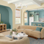
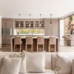
1. Best Neutral Colors for Living Rooms
The living room is the heart of the home. A soft, warm neutral like Sherwin Williams’ Agreeable Gray or Benjamin Moore’s Revere Pewter can make the space feel cozy and inviting. These shades pair beautifully with natural wood tones, warm lighting, and soft textiles.
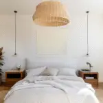
2. Neutral Paint Colors for Bedrooms
A neutral bedroom should feel tranquil and soothing. Consider Sherwin Williams’ Anew Gray for a relaxed ambiance or Benjamin Moore’s Classic Gray for a subtle, airy atmosphere. These shades work well with soft bedding and natural textures.

Pro Grade Paint Roller Kit, Brush & Roller for Professionals & Homeowners
Perfect for smooth finishes on your interior walls. Ideal for home improvement enthusiasts!
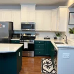
Buy Now on Amazon3. Kitchen Neutral Paint Colors That Work Wonders
Neutral shades in the kitchen create a clean and elegant feel. Sherwin Williams’ Dovetail is a deep, rich greige that adds warmth to white cabinetry, while Benjamin Moore’s Swiss Coffee offers a soft and creamy white that feels fresh and inviting.
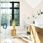
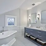
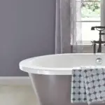
4. Bathroom Neutral Paint Colors for a Spa-Like Feel
For a spa-like bathroom, opt for neutrals with cool undertones. Sherwin Williams’ Drift of Mist or Benjamin Moore’s Balboa Mist provide a relaxing backdrop that complements marble countertops and chrome fixtures beautifully.
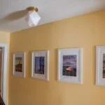
5. Entryway & Hallway Neutrals That Set the Tone
The entryway sets the tone for your home. A neutral like Sherwin Williams’ Shoji White or Benjamin Moore’s Edgecomb Gray creates an inviting first impression and pairs well with wooden doors and statement lighting.
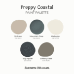
Sherwin Williams’ Best Neutral Paint Colors
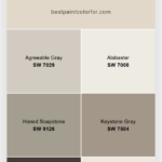
6. Agreeable Gray – The Perfect Balance of Warm and Cool
Agreeable Gray is a soft greige that blends warm and cool undertones, making it one of the most versatile neutrals. It works well in open floor plans and complements both modern and traditional decor styles.

Rust-Oleum 367605 Home Interior Floor Coating Kit, Semi-Gloss Black
Ideal for updating outdated flooring at a fraction of the cost of replacement and adheres without stripping, sanding or priming.
Buy Now on Amazon7. Dovetail – A Bold Yet Neutral Gray
Dovetail is a warm, deep gray with slight taupe undertones. It’s ideal for creating contrast against white trim or cabinetry, adding depth to any space.
8. Anew Gray – A Sophisticated Neutral with Depth
Anew Gray is a warm, medium-toned greige that pairs beautifully with blues and warm wood accents. It’s an excellent choice for both contemporary and rustic homes.
Benjamin Moore’s Best Neutral Paint Colors
9. Revere Pewter – The Ultimate Warm Greige
Revere Pewter is a classic warm greige with subtle beige undertones. It’s perfect for creating a soft, welcoming space that still feels elegant and refined.
10. Classic Gray – A Light, Airy Neutral
Classic Gray is a soft, off-white neutral with a hint of warmth, making it ideal for rooms that need a fresh, uplifting feel.
11. Balboa Mist – The Perfect Cool Greige
Balboa Mist is a light greige with cool undertones, making it a great option for bathrooms, kitchens, and airy living spaces.
How Lighting Affects Neutral Paint Colors
12. South-Facing Rooms & Warm Neutrals
Rooms with ample natural light bring out the warmth in neutrals. Colors like Sherwin Williams’ Accessible Beige work beautifully in south-facing rooms.
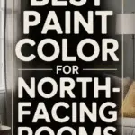
13. North-Facing Rooms & Cool Neutrals
North-facing rooms tend to have cooler light, which can make warm neutrals appear less yellow. Opt for Benjamin Moore’s Stonington Gray for a balanced, cool look.
Coordinating Colors with Neutrals
14. Best Accent Colors for Warm Neutrals
Warm neutrals pair well with soft blues, deep greens, and rich browns. Try pairing Sherwin Williams’ Accessible Beige with SW Naval for a stunning contrast.
15. Cool Neutrals & Their Best Complementary Shades
Cool neutrals shine when paired with crisp whites, blacks, and muted pastels. Benjamin Moore’s Balboa Mist looks gorgeous next to navy blue or blush pink.
16. How to Choose the Right White Trim Color
White trim should complement your neutral walls. Sherwin Williams’ Pure White is a soft white that pairs well with warm tones, while Benjamin Moore’s Chantilly Lace is a crisp white that works with cool hues.
Sampling Neutral Paint Colors the Right Way
17. Why Peel-and-Stick Paint Samples Are a Game-Changer
Instead of buying multiple sample cans, use Samplize peel-and-stick samples. They’re mess-free and let you see how the color looks in different lighting conditions.
Pro Tips for Painting with Neutral Colors
18. How to Avoid the Wrong Undertone
Always test a sample in different lighting before committing. What looks like a soft beige in-store may appear pink or green in your home.
19. Using Neutrals to Make Small Spaces Look Bigger
Light neutrals like Benjamin Moore’s Classic Gray reflect light, making small spaces feel more open and airy.
20. Mixing Textures to Enhance Neutral Walls
Neutrals don’t have to be boring! Add interest by incorporating wood, metal, and textiles to create depth and dimension.
FAQs About Neutral Paint Colors
Q: Can neutral colors work in modern homes?
A: Absolutely! Neutral shades like Sherwin Williams’ Dovetail add depth and sophistication to modern spaces.
Q: How do I make sure my neutral doesn’t look too dull?
A: Layer textures and use contrasting accent colors to keep the space visually interesting.
Q: What’s the best way to sample neutral paint colors?
A: Use peel-and-stick samples like Samplize to see how the color changes throughout the day.