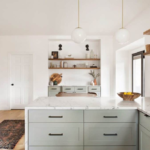
The Kitchen Glow-Up You Didn’t Know You Needed
Here’s the thing… white cabinets are everywhere—and for good reason. They’re clean, timeless, and make your space feel bigger. But if you’ve ever stood in your kitchen thinking, “Why does this still feel… flat?” — you’re not alone.
White cabinets are only half the story.
The color you pair with them? That’s what brings the magic.
And let’s be real… choosing the wrong color can make your kitchen feel cold, boring, or even outdated. I’ve seen this go wrong so many times. But when you get it right? It’s the kind of transformation that makes people say, “Wait… did you remodel?”
You didn’t. You just chose better colors.

Pro Grade Paint Roller Kit, Brush & Roller for Professionals & Homeowners
Perfect for smooth finishes on your interior walls. Ideal for home improvement enthusiasts!
Buy Now on AmazonSo if you’re ready to make your white cabinets actually shine, let’s dive into the colors that are dominating 2026—and how to use them like a pro.
Why White Cabinets Are Still Winning in 2026
Before we jump into colors, let’s talk about why white cabinets haven’t gone anywhere.
They’re basically the “little black dress” of kitchens.
- They reflect light (hello, brighter space)
- They match almost anything
- They work in modern, farmhouse, classic, and even bold designs
But here’s the catch…

Rust-Oleum 367605 Home Interior Floor Coating Kit, Semi-Gloss Black
Ideal for updating outdated flooring at a fraction of the cost of replacement and adheres without stripping, sanding or priming.
Buy Now on AmazonWhite cabinets amplify everything around them.
Which means:
- The right color = stunning contrast
- The wrong color = awkward, washed-out vibes
That’s why picking the right pairing color matters more than you think.

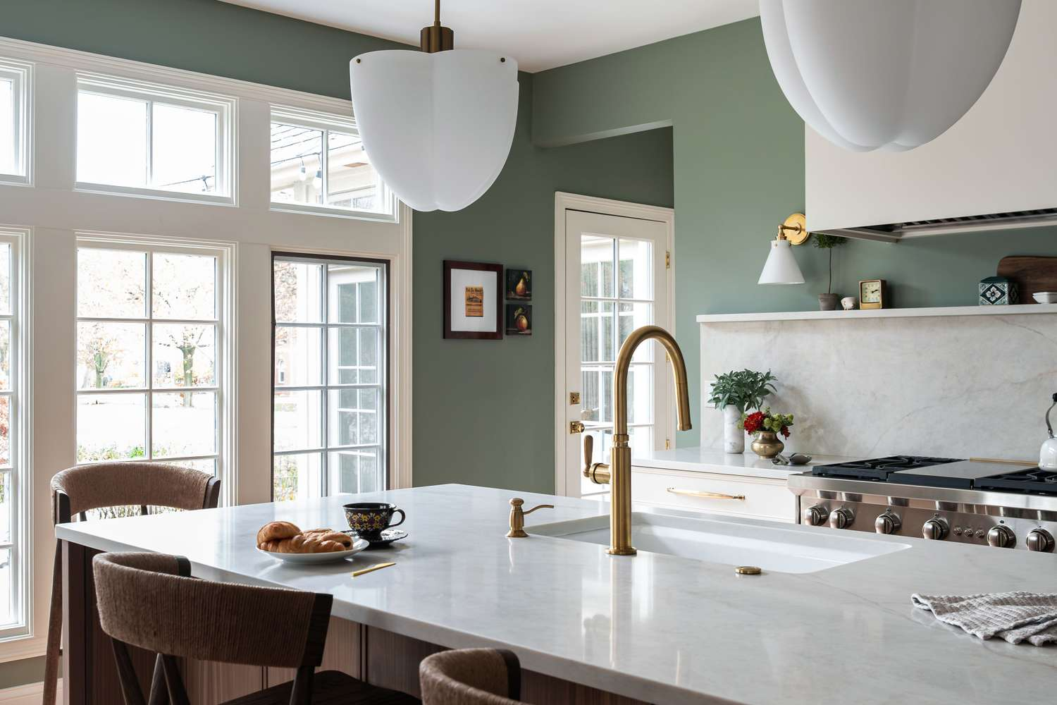
This Color Changes Everything: Warm Greige
If you only try one color from this list… make it greige.
Greige (a mix of gray + beige) is blowing up right now—and honestly, it’s easy to see why.
Why it works:
- Softens the starkness of white cabinets
- Adds warmth without going too yellow
- Feels modern but cozy
Popular picks:
- Sherwin-Williams Accessible Beige
- Behr Wheat Bread
What it feels like:
Calm. Relaxed. Like a Pinterest kitchen that actually feels livable.
Pro Tip:
If your cabinets are a cool white, choose a greige with slightly cool undertones. If they’re creamy white, go warmer.
The Mistake Everyone Makes: Cool Gray Overload
Let’s talk about the elephant in the room… gray.
A few years ago, everyone paired white cabinets with icy gray walls. And now?
It’s starting to feel a little… sterile.
Here’s the problem:
- Cool gray + white = flat and cold
- No contrast = no personality
One of the easiest ways to fix this:
Swap harsh gray for a warm gray or greige.
Trust me… it makes your kitchen feel like a home instead of a showroom.
Why This Shade Is Blowing Up Right Now: Soft Sage Green
You’ll love this one.
Sage green is everywhere in 2026—and it pairs beautifully with white cabinets.
Why it works:
- Adds a natural, calming vibe
- Feels fresh but not overpowering
- Works in both modern and farmhouse kitchens
Best for:
- Walls
- Backsplashes
- Kitchen islands
What it feels like:
Like bringing a breath of fresh air into your home.
“If your kitchen feels boring, sage green is the quickest way to wake it up.”
Deep Navy: The Bold Move That Always Works
If you want drama… this is it.
Navy blue with white cabinets is a classic combo that’s not going anywhere.
Why it works:
- High contrast = instant sophistication
- Grounds the brightness of white
- Looks expensive (even if it’s not)
Where to use it:
- Kitchen island
- Lower cabinets
- Accent wall
Pro Tip:
Pair navy with warm metals (like brass or gold) to avoid a cold look.
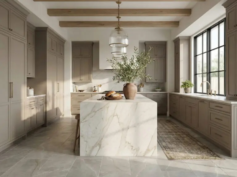
Warm Taupe: The Underrated Hero
Most people don’t even consider taupe—and that’s a mistake.
Taupe sits right between gray and brown, and it’s incredibly versatile.
Why it works:
- Adds depth without overpowering
- Works with both warm and cool whites
- Feels cozy but still elegant
Perfect for:
- Open-concept spaces
- Kitchens that flow into living rooms
Earthy Terracotta: The Cozy Comeback
Let’s be real… all-white kitchens can feel a little… lifeless.
Enter terracotta.
Why it works:
- Adds warmth instantly
- Brings a Mediterranean, earthy feel
- Makes white cabinets pop
How to use it:
- Accent wall
- Decor (pots, rugs, backsplash tiles)
What it feels like:
Warm. Inviting. Like a space you actually want to sit in.
Crisp Black Accents: The Modern Edge
White + black = timeless.
But here’s the trick: don’t overdo it.
Use black for:
- Hardware
- Light fixtures
- Window frames
Why it works:
- Creates contrast
- Defines the space
- Adds a modern touch
“A little black goes a long way—too much, and it takes over.”
Soft Blue: Calm and Coastal
If you’ve ever wanted that breezy, beach-house vibe… this is your color.
Why it works:
- Lightens the mood
- Pairs beautifully with white
- Feels airy and relaxed
Best shades:
- Dusty blue
- Powder blue
- Blue-gray
Perfect for:
- Walls
- Backsplashes
Moody Charcoal: For a Dramatic Look
This one’s for the bold.
Charcoal gray can completely transform white cabinets into something high-end.
Why it works:
- Strong contrast
- Adds depth and drama
- Feels modern and sleek
Pro Tip:
Make sure you have good lighting—charcoal can feel heavy in dark spaces.
Creamy Off-White: The Subtle Upgrade
Wait… another white?
Yes—but hear me out.
If your cabinets are a bright white, pairing them with a soft off-white wall can create a layered, designer look.
Why it works:
- Adds dimension without contrast
- Feels soft and elegant
- Avoids the “too white” problem
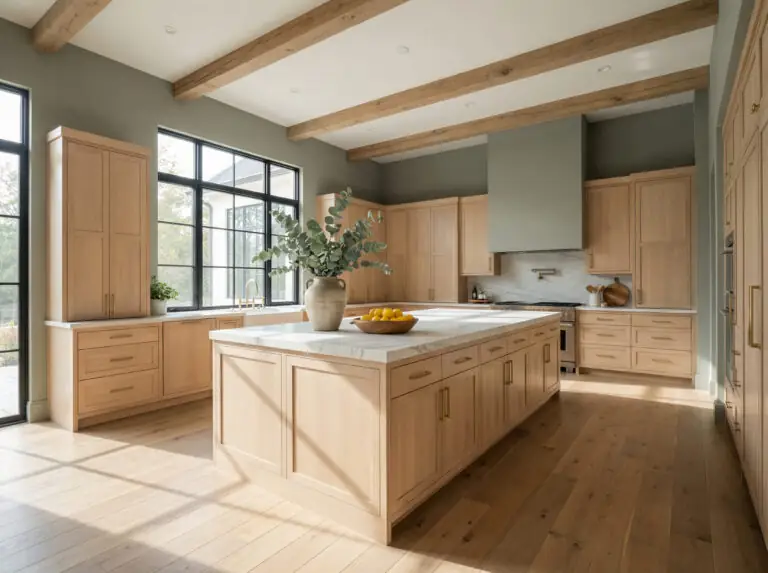
Natural Wood Tones: The Warm Balance
Here’s something most people don’t realize…
White cabinets NEED warmth.
And wood tones are the easiest way to add it.
Use wood in:
- Flooring
- Open shelving
- Countertops
Why it works:
- Breaks up the white
- Adds texture
- Feels grounded and natural
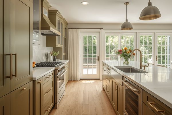
Olive Green: The Rich Alternative to Sage
If sage feels too light, go deeper.
Olive green is richer, moodier, and incredibly stylish.
Why it works:
- Adds depth
- Pairs beautifully with white and wood
- Feels upscale
Blush Pink: The Unexpected Twist
Okay, hear me out…
Blush pink with white cabinets? Stunning.
Why it works:
- Soft and warm
- Adds personality without being loud
- Perfect for modern or feminine spaces
What it feels like:
Fresh, stylish, and a little bit unexpected.
Beige Is Back (Yes, Really)
Beige is having a major comeback—and it’s not the boring beige you remember.
Modern beige = warm, soft, and slightly creamy.
Why it works:
- Warms up white cabinets
- Feels cozy and timeless
- Works in almost any home style
The Lighting Factor (Most People Ignore This)
If you’ve ever painted a wall and thought, “This looked different in the store…” — lighting is why.
Here’s what to know:
- North-facing rooms = cooler light → colors look bluer
- South-facing rooms = warmer light → colors look softer
- Artificial light can shift undertones completely
Pro Tip:
Always test paint samples at different times of day.
Trust me… this step saves you from regret.
Undertones: The Secret Nobody Talks About
This is where most people mess up.
Every color has an undertone:
- Yellow
- Blue
- Pink
- Green
If your white cabinets have a warm undertone, pairing them with a cool wall color can feel off.
Quick rule:
- Warm white → warm colors
- Cool white → cool colors
Best Color Combos (Quick Ideas You Can Steal)
If you’re feeling overwhelmed, here are some foolproof combos:
- White cabinets + sage green walls + brass hardware
- White cabinets + navy island + gold accents
- White cabinets + greige walls + wood floors
- White cabinets + soft blue backsplash + black fixtures
Pro Tips Designers Swear By
1. Add Contrast at Different Levels
Don’t rely on just wall color.
Mix:
- Light (cabinets)
- Medium (walls)
- Dark (accents)
2. Use Texture
Flat colors can feel boring.
Add:
- Tile
- Wood
- Metal finishes
3. Don’t Forget the Ceiling
A slightly warmer ceiling color can soften the entire room.
Before & After Vibes (What Actually Changes)
Let’s paint a picture…
Before:
- White cabinets
- Cool gray walls
- No contrast
- Feels cold and flat
After:
- White cabinets
- Warm greige walls
- Wood accents
- Brass hardware
Suddenly:
- The space feels warmer
- More inviting
- More “put together”
Same cabinets. Totally different vibe.
The Biggest Mistakes to Avoid
Let’s save you some regret…
- ❌ Choosing colors without testing samples
- ❌ Ignoring undertones
- ❌ Going too cold with gray
- ❌ Forgetting about lighting
- ❌ Playing it too safe (your space ends up boring)
How to Choose the Right Color (Simple Method)
Feeling stuck? Do this:
- Look at your cabinet undertone
- Check your lighting
- Pick 2–3 sample colors
- Test them on your wall
- Live with them for 2–3 days
That’s it.
No guesswork. No regrets.
Final Thoughts: Your Kitchen, Your Style
Here’s the truth…
There’s no single “perfect” color for white cabinets.
But there is a perfect color for your space.
Whether you go bold with navy, soft with sage, or cozy with greige—what matters most is how it feels when you walk into the room.
“The best kitchens aren’t just beautiful—they feel like home.”
So take your time. Test your colors. Trust your gut.
And hey… don’t be afraid to try something a little different.
So… Which One Are You Trying First?
Are you team sage green, greige, or ready to go bold with navy?
Save this guide before you paint—you’ll thank yourself later. Export Message as PDF