When it comes to choosing a paint color, warm whites can be incredibly inviting. They create a cozy, elegant feel and bring a touch of softness and sophistication to any room. Two of Sherwin Williams’ most popular warm white shades, Creamy and Alabaster, are often at the top of the list for homeowners looking to achieve a light and bright look without feeling stark or clinical.
In this guide, we’ll delve deep into the details of these two popular colors, exploring their similarities and differences, as well as tips for how to decide which is best suited to your home.

- Why Choose a Creamy White Paint?
- The Appeal of Sherwin Williams Creamy and Alabaster
- Sherwin Williams Creamy (SW 7012)
- Sherwin Williams Alabaster (SW 7008)
- Comparing LRV and Brightness
- The Undertone Difference: Beige vs. Gray-Infused Beige
- Practical Tips for Choosing Between Creamy and Alabaster
- Using Samples to Make Your Final Decision
- Final Thoughts: Which is Better for You?
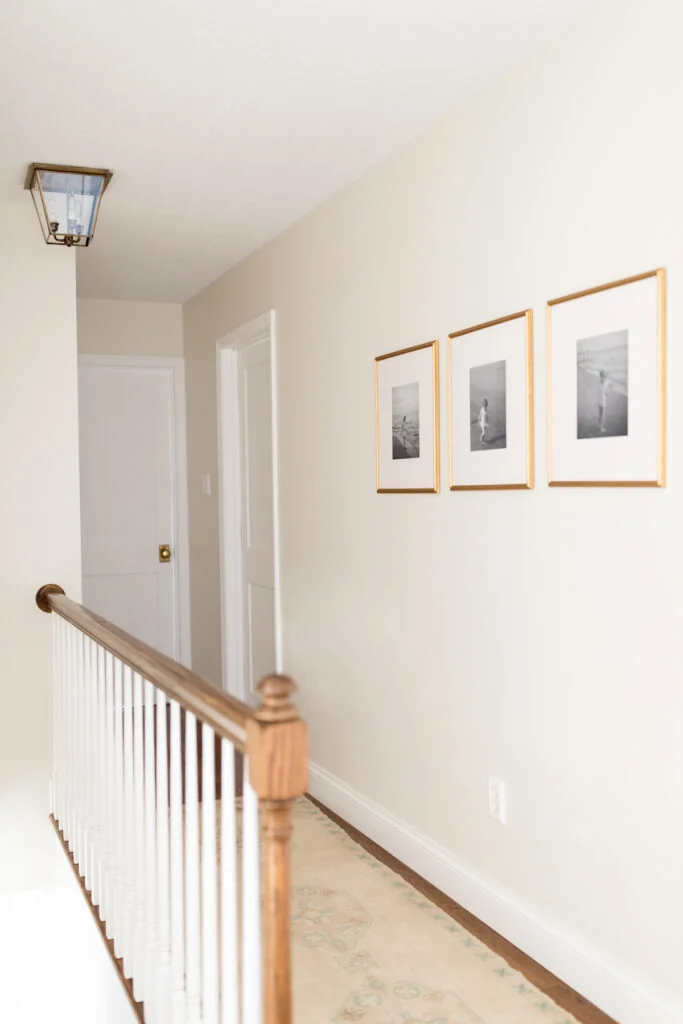
Why Choose a Creamy White Paint?
Warm whites like Creamy and Alabaster bring a unique versatility. They fit well in nearly every room style, from traditional to modern, and add a classic touch that stands the test of time. They’re often considered “neutral,” but these colors still add plenty of personality to a space.
Warm white shades create a soothing atmosphere and feel cozy without being overpowering. Unlike stark whites, which can sometimes feel cold, these creamy tones strike the perfect balance, creating a welcoming environment. So, if you’re looking for a color that’s light, bright, and adaptable, warm whites like Creamy and Alabaster may be just what you need.
The Appeal of Sherwin Williams Creamy and Alabaster
Among the wide variety of white and cream shades, Sherwin Williams Creamy (SW 7012) and Alabaster (SW 7008) are particularly popular choices. These two shades are widely celebrated by interior designers and homeowners alike for their warmth and subtle elegance. While they may look similar at first glance, the nuances in their undertones and brightness levels become more apparent when you examine them closely.

Pro Grade Paint Roller Kit, Brush & Roller for Professionals & Homeowners
Perfect for smooth finishes on your interior walls. Ideal for home improvement enthusiasts!
Buy Now on AmazonTo get a clearer sense of each color, let’s look at these shades in more depth.
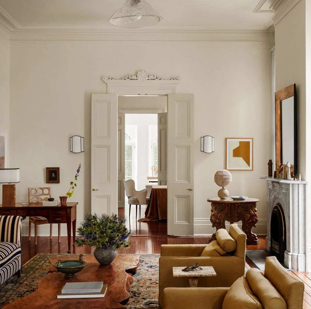
Sherwin Williams Creamy (SW 7012)
Key Characteristics of Creamy
Creamy is a warm-toned off-white color that leans slightly toward a light beige. It has an inviting and soft look, which brings a sense of calmness and relaxation to a space. Creamy has a Light Reflectance Value (LRV) of 81, meaning it reflects a high amount of light without being overly bright. This shade is ideal if you want a warm, rich tone that’s still close to white.
Undertones of Creamy: Creamy has a subtle beige undertone, which adds to its warmth. While it doesn’t contain any gray, this undertone gives it a creamy quality, making it softer than stark whites but brighter than more saturated creams or beiges.
Best Rooms for Creamy
Creamy works well in rooms where you want to maximize light but still retain a cozy feel. Living rooms, bedrooms, and hallways are ideal spaces for this color. Since Creamy reflects plenty of light, it can open up smaller rooms, making them feel more spacious and inviting.
Rust-Oleum 367605 Home Interior Floor Coating Kit, Semi-Gloss Black
Ideal for updating outdated flooring at a fraction of the cost of replacement and adheres without stripping, sanding or priming.
Buy Now on AmazonLighting Considerations
Lighting plays a significant role in how Creamy will appear in your space. If your room has bright, south-facing windows, Creamy’s warm beige tones may come through more prominently, giving it a subtle yellowish hue. In north-facing rooms, where natural light is cooler, Creamy maintains its warmth without feeling too intense, helping create a balanced look.
Sherwin Williams Alabaster (SW 7008)
Key Characteristics of Alabaster
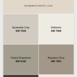
Alabaster is another warm off-white, but it is slightly lighter than Creamy, with an LRV of 82. This means it’s just a touch brighter, making it perfect if you’re looking for a light color that still maintains warmth. Alabaster has a calming quality and pairs well with various styles, whether modern or traditional.
Undertones of Alabaster: Alabaster has both beige and a touch of gray in its undertones, which gives it a unique, balanced warmth. This slight gray tint makes it feel a bit cooler than Creamy in certain lighting, giving it a more neutral look without losing the inviting quality of a warm white.
Best Rooms for Alabaster
Alabaster is perfect for creating that airy, bright look that many homeowners love. It works exceptionally well in open-concept spaces, kitchens, bathrooms, and living rooms. If you’re looking to achieve a clean and soft look, Alabaster’s subtlety allows it to complement almost any decor style, from farmhouse to coastal.

Lighting Considerations
Like Creamy, Alabaster’s appearance will change depending on the light in your room. In south-facing rooms, it may appear warmer, but the gray undertone helps it maintain a subtle, creamy quality without leaning too yellow. In north-facing rooms or areas with cool, artificial light, Alabaster may appear slightly gray, adding a modern and sophisticated touch.
Comparing LRV and Brightness
What is LRV?
The Light Reflectance Value (LRV) measures the amount of light a color reflects. Pure white has an LRV of 100, while pure black has an LRV of 0. Both Creamy and Alabaster have LRVs in the low 80s (Creamy: 81, Alabaster: 82), meaning they are both bright colors but not stark whites.
Creamy vs. Alabaster in Brightness
While Creamy and Alabaster are close in LRV, Alabaster is slightly brighter. This small difference may not be noticeable on a color swatch, but it can be more apparent on large wall surfaces, especially in rooms with abundant natural light. If you’re looking for the brightest option, Alabaster may give you a bit more of that open, airy feeling.
The Undertone Difference: Beige vs. Gray-Infused Beige
Creamy’s undertone is strictly beige, which gives it a straightforward warmth without any gray to cool it down. This makes Creamy feel slightly more traditional and cozy.
Alabaster’s undertone is a mix of beige and gray, giving it a more balanced warmth. This subtle gray undertone keeps Alabaster from feeling too yellow in warm lighting, making it an excellent choice for those who want a versatile warm white that adapts to different lighting conditions.
Practical Tips for Choosing Between Creamy and Alabaster
Selecting the right shade for your home goes beyond just liking a color; it requires considering how it will interact with your room’s unique lighting and decor. Here are some factors to think about:
1. Assess Your Natural Lighting
- South-Facing Rooms: Rooms with warm natural light will amplify any warm undertones in your paint color. Creamy may appear slightly yellower, while Alabaster will look warm but more muted.
- North-Facing Rooms: In rooms with cooler light, Creamy maintains a warm feel, while Alabaster may take on a very light gray cast.
2. Consider the Decor Style and Other Colors
- Traditional Styles: Creamy’s beige undertones make it a wonderful choice for traditional or rustic decor. Its warmth pairs beautifully with wooden furniture and classic accents.
- Modern and Minimalist Styles: Alabaster’s gray undertone gives it a slight edge in modern settings. It has just enough softness to feel inviting while staying neutral.
3. Think About the Room’s Function
- Living Rooms and Bedrooms: Creamy is an excellent choice for spaces where you want warmth and comfort. It’s inviting without being too stark and works well with cozy, soft furnishings.
- Kitchens and Bathrooms: If you’re aiming for a clean, airy feel, Alabaster might be your best bet. Its slight gray undertone can add a touch of sophistication, creating a fresh look that works well with marble, granite, or stainless-steel accents.
Using Samples to Make Your Final Decision
Before committing to a full wall of paint, it’s worth trying out peel-and-stick samples of both Creamy and Alabaster. These samples allow you to move the colors around the room and see how they look at different times of day and under different lighting conditions.
You can also observe how each color looks next to your existing decor. Place the samples next to your furniture, cabinets, and flooring to ensure you’re happy with how the color interacts with everything else in the room.
Final Thoughts: Which is Better for You?
Choosing between Sherwin Williams Creamy and Alabaster ultimately depends on the atmosphere you want to create in your home. Here’s a quick summary:
- Choose Creamy if you want a classic warm white with a beige undertone that will create a cozy, inviting feel. It’s perfect for traditional decor styles and spaces where warmth is a priority.
- Choose Alabaster if you want a versatile warm white with a hint of gray that works well in both modern and traditional spaces. Its balanced tone makes it adaptable to a range of lighting conditions and decor styles.
Whether you go with Creamy or Alabaster, both of these colors offer a timeless elegance that can enhance any room in your home. Warm whites like these two colors create a sense of peace and sophistication that will make your space feel both comfortable and stylish.


