Color is more than just decoration; it’s an expression of personality, mood, and style. The right color combination can make a space feel warm and inviting, sophisticated and elegant, or bold and energetic. In home interiors, the living room sets the stage for the entire house, making color selection a crucial step in home design.
Why the Living Room Sets the Tone for Your Home
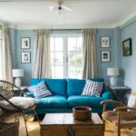
Your living room is where you entertain guests, spend quality time with family, and relax after a long day. It should reflect your taste and create an atmosphere that suits your lifestyle. Whether you’re drawn to calming neutrals, striking contrasts, or vibrant palettes, the colors you choose will define the overall feel of your home.
Choosing the Right Color Palette
Understanding Color Psychology in Home Interiors
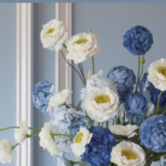
Different colors evoke different emotions. Soft blues and greens promote relaxation, while warm yellows and reds create an energetic and welcoming vibe. Knowing how colors affect mood can help you make informed decisions when selecting shades for your living space.
The Rule of 5-7 Colors for a Balanced Look
A well-designed living room should have a cohesive color scheme consisting of 5-7 colors. This includes:
- A dominant color (used in walls or large furniture pieces)
- Two to three complementary shades
- One or two accent colors for pops of interest
- A grounding neutral to tie everything together
How to Identify Existing Colors in Your Space
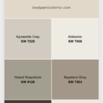
Before choosing new colors, take note of what’s already in your space. Consider your flooring, furniture, and décor items, and select a palette that complements these elements rather than clashing with them.

Pro Grade Paint Roller Kit, Brush & Roller for Professionals & Homeowners
Perfect for smooth finishes on your interior walls. Ideal for home improvement enthusiasts!
Buy Now on Amazon
Popular Living Room Color Schemes
Minimalist Nordic Style: Simplicity Meets Elegance
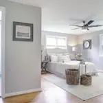
Minimalist interiors thrive on neutral colors like white, gray, beige, and black. The key to making this style work is texture—layer different fabrics and materials to keep the look from feeling too stark. Add subtle pops of color with artwork, throw pillows, or greenery to maintain a fresh and modern aesthetic.
Bright and Loud Bohemian Palettes: A Splash of Personality
Bohemian design embraces color, patterns, and eclectic decor. While classic boho homes use rich jewel tones like deep blues, purples, and reds, modern bohemian spaces often favor muted neutrals with bold pattern accents. Limit your palette to 5-7 colors to avoid overwhelming the space.
Traditional Living Room Colors: Timeless and Sophisticated
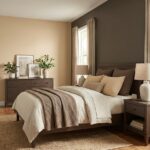
Traditional design favors warm, classic tones like beige, taupe, and cream, paired with dark wood finishes. To add character, incorporate deep shades like burgundy, forest green, or navy blue. These colors create a rich, elegant look that complements ornate furniture and vintage decor.
Rustic and Country Style: Bringing Nature Indoors
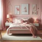
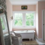
Rustic interiors are all about simplicity and natural materials. Earthy tones like soft browns, muted greens, and warm whites set the foundation, while accents in dusty pink or butter yellow add a cozy charm. Using reclaimed wood and organic textures enhances the country-inspired appeal.

Rust-Oleum 367605 Home Interior Floor Coating Kit, Semi-Gloss Black
Ideal for updating outdated flooring at a fraction of the cost of replacement and adheres without stripping, sanding or priming.
Buy Now on AmazonContemporary Color Schemes: The Trendy and Chic Approach
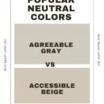
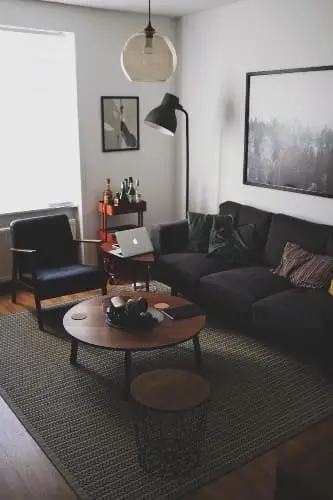
Contemporary interiors change with trends, but neutral bases remain key. Shades like charcoal gray, crisp white, and soft beige allow for flexible styling. Bright accent colors such as burnt orange or Persian blue inject vibrancy without overpowering the space.
How to Use Color in Interior Styling
Accent Walls: A Game-Changer in Interior Design
An accent wall can transform a space by adding depth and personality. Whether you choose a bold color or textured wallpaper, make sure it complements the rest of your palette.
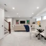
Playing with Neutrals and Monochromes for Depth
Neutral colors don’t have to be boring. Layering different shades of beige, gray, or white adds dimension. Incorporate wooden elements, cozy textiles, and metallic accents to create a visually interesting space.
Mixing Textures to Avoid a Flat Look
To prevent a monochromatic space from looking dull, use various textures—think linen curtains, velvet cushions, and woven rugs. Texture plays a crucial role in making neutral palettes feel dynamic.
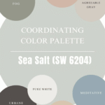
Coordinating Colors Like a Pro
How to Match Walls, Furniture, and Accessories
When selecting colors, consider all elements of the room. Your wall color should harmonize with your furniture and decor. A foolproof method is using a base neutral with two to three complementary shades.
The Role of Undertones in Creating Harmony
Undertones can make or break a color scheme. Warm undertones (yellow, orange, red) create a cozy feel, while cool undertones (blue, green, violet) evoke a fresh and airy ambiance. Make sure your primary and accent colors share a common undertone for a seamless look.
Finding the Perfect Contrast Without Overdoing It
Contrast is essential, but too much can feel chaotic. Balance dark and light tones while keeping the 60-30-10 rule in mind—60% dominant color, 30% secondary color, and 10% accent color.
Pro Tips and Bonus Insights
Unexpected Color Combos That Work Beautifully
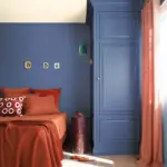
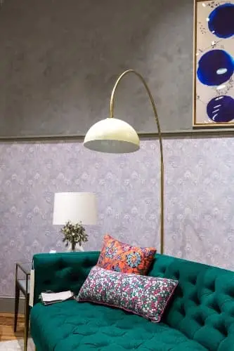
- Navy blue and blush pink: Elegant and soft
- Olive green and mustard yellow: Warm and earthy
- Charcoal gray and burnt orange: Modern yet cozy
Using Patterns and Prints Without Clashing
Stick to one dominant pattern and use solids to balance it out. If using multiple patterns, ensure they share at least one common color for cohesion.
The Secret to Making Small Spaces Feel Bigger with Color
Lighter colors make a space feel open and airy. Use mirrors and strategic lighting to enhance this effect.
Final Touches: The Ultimate Color Guide
How Lighting Affects Paint Colors
Natural light changes how colors appear throughout the day. Test samples on your walls before committing to a shade.
Choosing the Right Finish: Matte, Satin, or Gloss?
- Matte: Great for walls, hides imperfections
- Satin: Slight sheen, easy to clean
- Gloss: High shine, best for trims and accents
Testing Colors Before Committing: Swatches and Samples
Always try paint samples in different lighting conditions to see how they interact with your space.
FAQs
What’s the Best Living Room Color for Small Spaces?
Light neutrals and soft pastels help create an illusion of a larger space.
How Do I Make My Living Room Look More Expensive with Color?
Use deep, rich hues like navy or emerald green, paired with metallic accents and luxurious textiles.
Should I Stick to One Style or Mix Multiple Styles?
You can mix styles, but ensure there’s a unifying color scheme for harmony.
This comprehensive guide ensures your living room reflects your style while maintaining balance and harmony. Whether you’re aiming for a modern, traditional, or rustic look, the right color combinations will bring your vision to life!