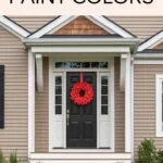
If you’ve been searching for that perfect neutral — not too gray, not too beige, not too cold, not too warm — there’s a good chance you’ve come across Crushed Ice.
And if you’re anything like most homeowners I talk to, you’re probably wondering:
- Is it really neutral?
- Does it turn blue?
- Will it look beige in my living room?
- Is it just another Agreeable Gray situation?
Let’s break it all down — in plain English — so you can decide if Crushed Ice is right for your home.
Grab a coffee. We’re going deep.
First Things First: What Color Is Crushed Ice?
Crushed Ice is a light gray with balanced undertones. But here’s the part that makes it interesting: it sits right on that delicate line between gray and greige.

Pro Grade Paint Roller Kit, Brush & Roller for Professionals & Homeowners
Perfect for smooth finishes on your interior walls. Ideal for home improvement enthusiasts!
Buy Now on AmazonIt’s not a flat cement gray.
It’s not a creamy beige.
It’s not icy blue.
It’s… balanced.
And that balance is exactly why so many people love it.
The Technical Details (Without Getting Boring)
- LRV: 66
(That means it reflects a good amount of light. It’s not dark. It’s not white. It’s comfortably bright.) - Color Family: Light neutral gray
In a bright room, it reads lighter and fresher.
In a warm-lit space, it softens and leans slightly warm.

Rust-Oleum 367605 Home Interior Floor Coating Kit, Semi-Gloss Black
Ideal for updating outdated flooring at a fraction of the cost of replacement and adheres without stripping, sanding or priming.
Buy Now on AmazonIt’s subtle — and that subtlety is its superpower.
Let’s Talk Undertones (Because This Is Where Things Get Real)
Undertones are what make or break a paint color.
Crushed Ice has:
- A soft gray base
- The faintest hint of warmth (almost taupe-like)
- No strong blue
- No heavy purple
- No obvious green
Now, here’s what that means in real life:
It adapts.
In north-facing rooms (cool light), it leans slightly cooler gray.
In south or west-facing rooms (warm light), it feels softer and warmer.
It doesn’t scream one direction. It listens to the room.
That’s rare.
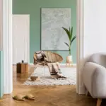
How Crushed Ice Looks in Different Rooms
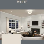
Living Room
In a living room with decent natural light? It looks airy and clean.
It won’t compete with:
- Warm wood floors
- White trim
- Beige sofas
- Charcoal accents
It just sits quietly in the background and lets your furniture shine.
If your living room gets strong sunlight, it will look lighter and slightly cooler during the day — then warmer in the evening.
Bedroom
This is where Crushed Ice really shines.
It’s calm.
It’s peaceful.
It doesn’t feel cold.
Pair it with:
- Cream bedding
- Light oak furniture
- Soft gray throws
- Warm bedside lamps
It creates that relaxed, “Pinterest-worthy but still cozy” look.
Kitchen
If you’re considering it for walls with white cabinets — yes, it works beautifully.
With crisp white cabinets, it feels clean.
With slightly warm white cabinets, it feels balanced.
It also pairs well with:
- Marble countertops
- Light quartz
- Brushed nickel hardware
- Matte black fixtures
Bathroom
In bathrooms with lots of tile and bright lighting, Crushed Ice keeps things fresh without feeling sterile.
It’s softer than a stark white but still light enough to feel spa-like.
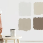
Let’s Compare It to Other Popular Neutrals
You can’t talk about Crushed Ice without comparing it to the heavy hitters.
Crushed Ice vs Agreeable Gray
Agreeable Gray is warmer and more beige.
Crushed Ice is lighter and more balanced.
If Agreeable Gray feels a little too tan for you, Crushed Ice might be your answer.
Crushed Ice vs Repose Gray
Repose Gray is slightly darker and can show more warmth.
Crushed Ice feels a touch cleaner and brighter.
If you want less depth and more light reflection, go with Crushed Ice.
Crushed Ice vs Snowbound
Snowbound is much lighter and closer to an off-white.
Crushed Ice has more gray body and presence.
If you want a true light gray rather than a white-with-a-hint-of-gray, Crushed Ice wins.
The Best Trim Colors for Crushed Ice
Trim matters more than people think.
Here are my top recommendations:
1. Pure White
Crisp but not harsh.
This is my favorite pairing.
2. Extra White
Brighter and cooler.
Great for modern homes.
3. High Reflective White
If you want maximum contrast and brightness.
What I wouldn’t recommend? Super creamy, yellow-based whites. They can make Crushed Ice look slightly dingy.
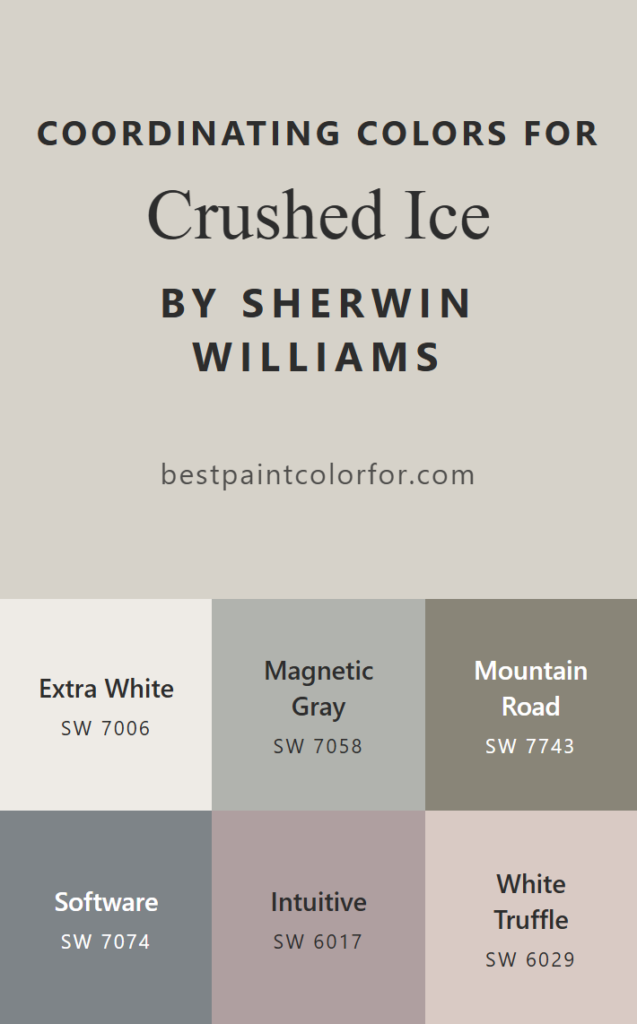
Coordinating Colors That Work Beautifully
Now the fun part — building a full-home palette.
Soft & Neutral Palette
- Crushed Ice (main walls)
- Alabaster (adjacent room or cabinets)
- Repose Gray (deeper accent)
This creates a layered neutral look that feels designer-approved but safe.
Warm & Cozy Palette
- Crushed Ice
- Accessible Beige
- Sea Salt
This combination gives you subtle warmth with a hint of color interest.
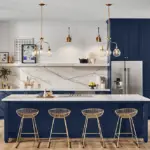
Bold & Dramatic Contrast
If you want to go bold:
- Crushed Ice (walls)
- Naval (accent wall or cabinets)
- Iron Ore (doors or built-ins)
This combo feels elevated and modern without being trendy.
The Pros (Because There Are Many)
✔ Extremely versatile
✔ Works with warm and cool décor
✔ Brightens spaces without feeling white
✔ Plays nicely with wood tones
✔ Doesn’t go obviously blue or purple
The Cons (Because No Color Is Perfect)
✖ Can shift slightly depending on lighting
✖ Might feel flat in very dark rooms
✖ If you want a strong greige, this may feel too neutral
When You Should Choose Crushed Ice
You want:
- A safe but not boring neutral
- Something brighter than mid-tone gray
- A color that works throughout the home
- Flexibility for future décor changes
It’s especially good if you’re selling your home or designing for broad appeal.
When You Might Skip It
If you:
- Love strong warmth
- Want a true cool gray
- Prefer dramatic depth
Then you might lean toward something darker or more clearly warm/cool.
My Honest Verdict
Crushed Ice is one of those colors that quietly does its job.
It won’t dominate the room.
It won’t fight your furniture.
It won’t suddenly turn baby blue.
It adapts. It balances. It supports.
And that’s why designers keep coming back to it.
If you’re standing in the paint aisle feeling overwhelmed by 50 shades of gray, Crushed Ice is a smart, sophisticated middle ground.
Just make sure you:
- Test it on large sample boards
- View it morning and night
- Pair it with the right trim
Do that, and you’ll likely end up with a space that feels light, calm, and timeless.