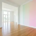
If you’ve been searching for the perfect white paint but everything feels either too stark or too yellow, you’re not alone. Choosing the right white is surprisingly tricky—and that’s exactly where Sherwin Williams Divine White steps in.
It’s soft, warm, and incredibly livable. Not a harsh builder-grade white, not a heavy beige… but something beautifully in between.
Let’s break down everything you need to know about Sherwin Williams Divine White—so you can confidently decide if it’s right for your home.
What Is Sherwin Williams Divine White?
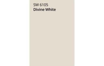
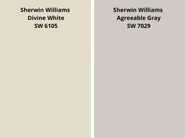
Sherwin Williams Divine White (SW 6105) is a warm off-white with creamy beige undertones. It’s often described as a “barely-there beige” that still reads light and bright on walls.
Key Details:
- Color family: Warm off-white
- LRV: 72 (light and reflective)
- Undertones: Beige + subtle orange/peach
- Hex code: #E6DCCD
It sits right on the edge of white and light beige—making it one of the most versatile neutral paint colors out there.

Pro Grade Paint Roller Kit, Brush & Roller for Professionals & Homeowners
Perfect for smooth finishes on your interior walls. Ideal for home improvement enthusiasts!
Buy Now on Amazon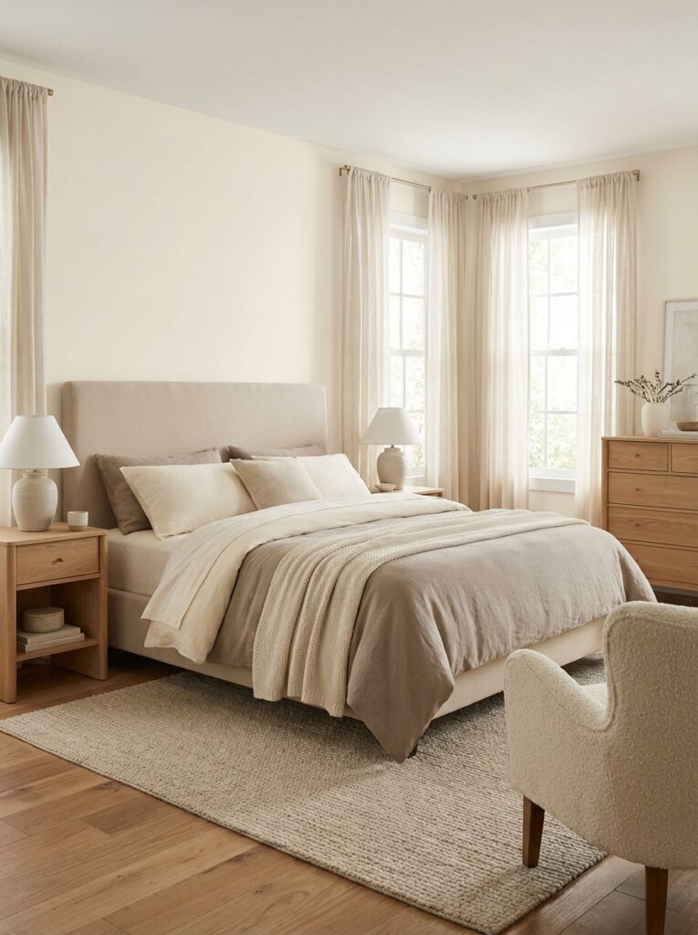
Why Sherwin Williams Divine White Is So Popular
1. It Feels Warm Without Looking Yellow
A lot of warm whites lean too yellow or golden. That’s where people get nervous.
But Divine White has a soft beige/orange undertone that keeps it warm without looking outdated.
It feels:
- Cozy
- Clean
- Modern
2. It’s Bright—but Not Harsh
With an LRV of 72, it reflects a good amount of light while still having depth.

Rust-Oleum 367605 Home Interior Floor Coating Kit, Semi-Gloss Black
Ideal for updating outdated flooring at a fraction of the cost of replacement and adheres without stripping, sanding or priming.
Buy Now on AmazonThat means:
- Rooms feel brighter
- Walls don’t look flat or washed out
- It hides imperfections better than pure white
3. It Works in Almost Any Style
Whether your home is:
- Modern
- Farmhouse
- Traditional
- Transitional
This color blends in effortlessly.
It’s one of those rare neutrals that doesn’t fight your decor—it supports it.

Understanding the Undertones (This Is Important)
Undertones are where most people get surprised—so let’s keep it simple.
Beige + Orange + Slight Pink
Sherwin Williams Divine White has:
- A warm beige base
- A soft orange undertone
- Sometimes a hint of pink/peach in certain lighting
Don’t worry—it doesn’t look pink on the wall. But in strong light, you might notice a slight warmth shift.
How Lighting Affects Divine White
Lighting changes everything.
- South-facing rooms: warmer, creamy glow
- North-facing rooms: slightly muted, hint of greige
- Artificial warm lighting: richer and cozier
Even in darker spaces, it keeps its softness instead of turning dull or dingy.
Best Rooms to Use Sherwin Williams Divine White
This is where this color really shines.
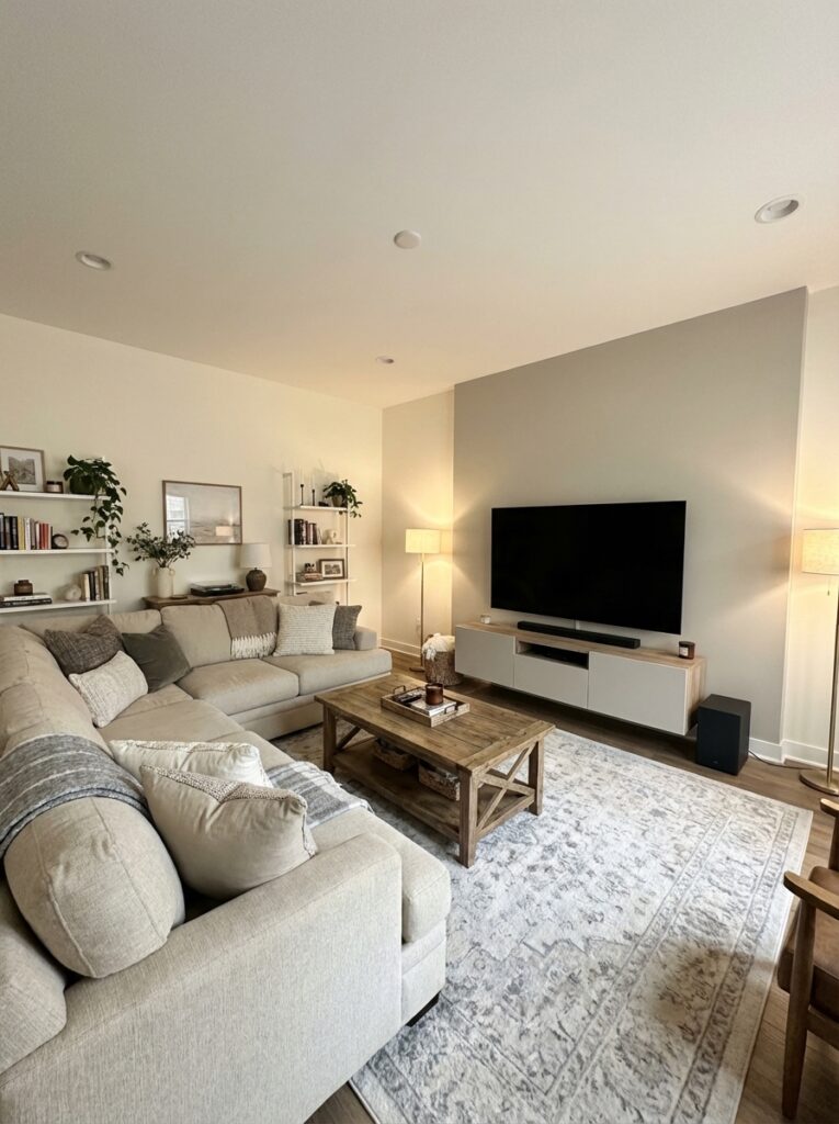
Living Room: Warm and Welcoming
If your living room feels cold or too gray, this color instantly warms it up.
Pair it with:
- Beige or cream furniture
- Wood accents
- Textured rugs
You’ll get that cozy, inviting vibe everyone loves.
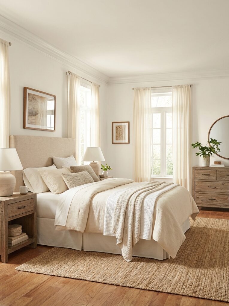
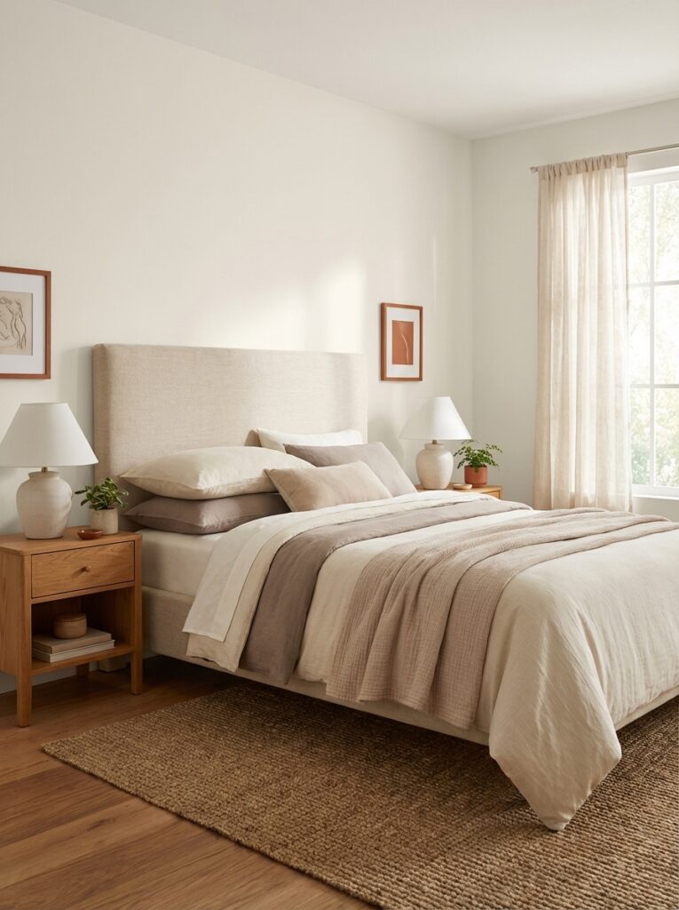
Bedroom: Soft and Relaxing
This is a great alternative to stark white bedrooms.
It creates:
- A calm atmosphere
- A slightly luxurious feel
- A cozy, hotel-like vibe
Kitchen: Clean but Not Clinical
White kitchens can sometimes feel too sterile.
Divine White softens that look beautifully.
Use it on:
- Walls with white cabinets
- Cabinets for a creamy finish
Bathroom: Warm Spa Feel
Instead of cold gray or bright white, this adds warmth while still feeling fresh.
Whole House Color: Yes, It Works
Because it’s so balanced, you can use it throughout your entire home for a cohesive look.
Designers love it for exactly this reason.
Best Color Pairings for Divine White
This color is flexible—but pairing it right makes all the difference.
1. Crisp Whites (for trim)
Try:
- Pure White
- Cotton White
These create contrast without clashing.
2. Warm Neutrals
- Beige
- Taupe
- Soft browns
These enhance the warmth.
3. Deep Blues & Navy
Adds contrast and sophistication.
4. Greens (Sage or Olive)
Perfect for a natural, earthy look.
5. Charcoal & Black Accents
For a modern edge.
Real-Life Examples (Relatable Scenarios)
Scenario 1: Builder-Grade White Upgrade
Your home has flat, boring white walls.
Switching to Divine White:
- Adds warmth instantly
- Makes the space feel custom
- Still keeps it neutral
Scenario 2: Open Concept Home
You want one color for living, kitchen, and hallway.
Divine White:
- Creates flow
- Works in different lighting conditions
- Doesn’t clash with furniture
Scenario 3: Cozy Rental Makeover
You need a safe, appealing color.
This one:
- Looks good with almost anything
- Appeals to most people
- Feels upgraded but neutral
Common Mistakes to Avoid
1. Pairing with the Wrong White
Some whites are too yellow and can clash.
Stick with balanced, slightly warm whites.
2. Skipping Paint Samples
This color shifts depending on lighting.
Always test:
- Daytime
- Nighttime
- Different walls
3. Using Too Many Warm Colors
Too much warmth can feel heavy.
Balance with:
- Cool accents
- Neutral decor
4. Expecting a Crisp White Look
This is NOT a bright white.
If you want crisp and modern, this might feel too creamy.
Expert Tips (Interior Designer Secrets)
1. Use It for Layered Neutrals
Combine it with:
- Slightly darker greiges
- Soft whites
- Natural textures
This creates depth without bold colors.
2. Add Texture for Interest
Because it’s subtle, texture matters:
- Linen curtains
- Wood furniture
- Woven baskets
3. Use It on Cabinets or Furniture
It’s a great alternative to plain white cabinets.
4. Keep Lighting Warm
Warm bulbs enhance its cozy undertones.
5. Let It Breathe
Avoid over-decorating—this color works best in clean, open spaces.
How It Compares to Similar Colors
- Alabaster: lighter and brighter
- Creamy: more yellow
- Shoji White: slightly more neutral/greige
Divine White sits right in the middle—soft, balanced, and versatile.
Is Sherwin Williams Divine White Right for You?
Choose this color if you:
- Want a warm, cozy white
- Don’t like cold or stark whites
- Prefer timeless over trendy
- Love soft, neutral interiors
Avoid it if you:
- Want a crisp, modern white
- Prefer cool gray undertones
Final Thoughts: Why Divine White Is a Designer Favorite
At the end of the day, Sherwin Williams Divine White is one of those colors that just works.
It’s:
- Warm but not yellow
- Light but not flat
- Neutral but not boring
And that’s exactly why it’s been a go-to choice for years.
If you want a paint color that feels comfortable, elegant, and easy to live with—this is a safe and stylish bet.
FAQs About Sherwin Williams Divine White
1. Is Sherwin Williams Divine White warm or cool?
It’s a warm off-white with beige and subtle orange undertones.
2. What is the LRV of Divine White?
The LRV is 72, meaning it reflects a good amount of light while still having depth.
3. Does Divine White look yellow?
No, it leans more beige/cream than yellow, making it feel modern and soft.
4. Can I use Divine White in small rooms?
Yes! Its brightness helps make small rooms feel more open and inviting.
5. What colors go best with Divine White?
It pairs well with warm neutrals, blues, greens, and soft whites for trim.