Choosing the right paint color can completely transform the atmosphere of your home. Some shades make a room feel brighter and bigger, while others create a calm, cozy environment that instantly feels welcoming. If you’re searching for a sophisticated neutral that brings both warmth and subtle depth, Sherwin-Williams Ethereal Mood SW 7639 is a color worth exploring.
Ethereal Mood is one of those versatile paint colors that sits beautifully between warm greige and soft sage. It has a grounded, earthy character that feels modern yet timeless, making it a favorite for homeowners and designers who want a neutral with personality.
In this complete color review, we’ll look at Ethereal Mood’s undertones, lighting behavior, best uses in the home, and the most beautiful coordinating colors to create a cohesive palette.
What Color Is Sherwin-Williams Ethereal Mood?
Sherwin-Williams Ethereal Mood SW 7639 is a soft, earthy neutral that blends gray, beige, and subtle green undertones. It belongs to the greige family but leans slightly organic due to its gentle green influence.
Color Details
- Color Code: SW 7639
- Color Family: Greige / Soft Green Neutral
- LRV (Light Reflectance Value): 43
- Color Depth: Medium tone
With an LRV of 43, Ethereal Mood sits comfortably in the middle of the light-to-dark scale. It reflects enough light to keep rooms from feeling heavy but still has enough depth to feel cozy and grounded.

Pro Grade Paint Roller Kit, Brush & Roller for Professionals & Homeowners
Perfect for smooth finishes on your interior walls. Ideal for home improvement enthusiasts!
Buy Now on AmazonBecause of this balance, Ethereal Mood works well in many spaces—from living rooms and bedrooms to kitchens and entryways.
Undertones of Ethereal Mood
The secret behind Ethereal Mood’s charm lies in its complex undertones.
Primary Undertones
Ethereal Mood contains:
- soft gray
- warm beige
- muted green
These undertones work together to create a balanced color that feels natural rather than overly warm or cool.

Rust-Oleum 367605 Home Interior Floor Coating Kit, Semi-Gloss Black
Ideal for updating outdated flooring at a fraction of the cost of replacement and adheres without stripping, sanding or priming.
Buy Now on AmazonThe subtle green undertone is what gives this paint color its earthy and slightly organic look. However, the gray base keeps the green from appearing too strong, making the color look refined and neutral.
How Ethereal Mood Looks in Different Lighting
Lighting has a major impact on how this color appears in your home.
In Natural Daylight
In rooms with lots of natural light, Ethereal Mood often reveals its soft green undertone, creating a calm and refreshing atmosphere.
In Warm Artificial Lighting
Under warm bulbs, the color leans more warm greige, giving spaces a cozy and inviting feeling.
In Low Light Rooms
In darker rooms or north-facing spaces, Ethereal Mood can appear slightly deeper and more taupe.
This chameleon-like quality is one of the reasons many designers love this color—it adapts beautifully throughout the day.
Is Ethereal Mood Warm or Cool?
Ethereal Mood is generally considered a warm neutral.
Although it contains gray and green notes, its subtle beige warmth prevents it from feeling cold or stark. This makes it an excellent choice for homeowners who want a neutral paint color that still feels welcoming and comfortable.
Why Designers Love Ethereal Mood
There are several reasons why Ethereal Mood has become a popular paint color in modern homes.
1. A Greige with Character
Many greige colors can feel flat, but Ethereal Mood adds dimension through its earthy undertones.
2. Nature-Inspired Look
The gentle green undertone gives rooms a calming, organic vibe that pairs beautifully with natural materials.
3. Works in Many Interior Styles
Ethereal Mood adapts well to a variety of design styles, including:
- modern organic
- farmhouse
- transitional
- Scandinavian
- contemporary
4. Ideal for Whole-Home Color
Because it is balanced and neutral, Ethereal Mood can easily flow from one room to another without feeling repetitive.
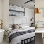
Best Rooms to Use Ethereal Mood
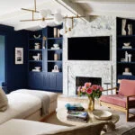
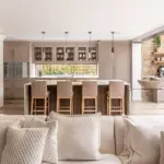
Living Rooms
Ethereal Mood creates a relaxed and comfortable atmosphere in living spaces. It pairs beautifully with wood furniture, linen fabrics, and soft textures.
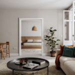
Bedrooms
The soft earthy tone promotes a peaceful environment, making it ideal for restful bedrooms.
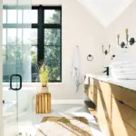
Kitchens
In kitchens, Ethereal Mood works especially well with white cabinets, stone countertops, and natural wood accents.
Dining Rooms
This color adds elegance to dining areas without feeling overly formal or dark.
Hallways and Entryways
Because it’s neutral and versatile, Ethereal Mood makes a great backdrop for artwork and décor in transitional spaces.
Best Coordinating Colors for Ethereal Mood
Choosing the right coordinating colors helps create a cohesive and designer-approved palette.
Below are some beautiful pairings from Sherwin-Williams.
Soft White Coordinating Colors
Sherwin-Williams Alabaster SW 7008
Alabaster is one of the most popular warm whites. It pairs beautifully with Ethereal Mood by adding brightness without making the walls feel too cool.
Best used for:
- trim
- ceilings
- cabinets
Sherwin-Williams Shoji White SW 7042
Shoji White is a creamy neutral that blends seamlessly with Ethereal Mood. It works especially well in open-concept homes.
Use it for:
- trim
- nearby rooms
- cabinetry
Sherwin-Williams Pure White SW 7005
Pure White offers a cleaner contrast while still remaining soft enough to complement Ethereal Mood’s warmth.
Neutral Coordinating Colors
Sherwin-Williams Repose Gray SW 7015
Repose Gray is a light gray that provides subtle contrast without overpowering Ethereal Mood.
It works well in:
- adjacent rooms
- open floor plans
- hallways
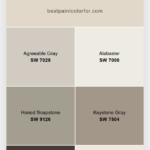
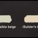
Sherwin-Williams Accessible Beige SW 7036
Accessible Beige leans warmer and beige-heavy, making it a perfect complement for creating a cozy neutral palette.
Dark Accent Colors
Sherwin-Williams Web Gray SW 7075
Web Gray is a deep charcoal gray that creates dramatic contrast with Ethereal Mood.
Best for:
- accent walls
- doors
- built-ins
Sherwin-Williams Acacia Haze SW 9132
Acacia Haze is a smoky green-gray that enhances Ethereal Mood’s earthy undertones.
Great for:
- cabinetry
- accent walls
- offices
Nature-Inspired Coordinating Colors
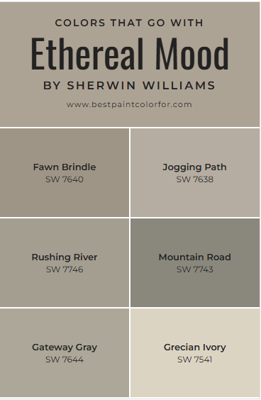
Sherwin-Williams Rushing River SW 7746
Rushing River is a rich green that pairs beautifully with Ethereal Mood to create a calming, nature-inspired palette.
Sherwin-Williams Fawn Brindle SW 7640
Fawn Brindle is a warm brown-gray that adds depth and grounding to the overall color scheme.
Best Trim Colors for Ethereal Mood
The right trim color can elevate the entire look of a room.
Great trim options include:
- Sherwin-Williams Alabaster SW 7008
- Sherwin-Williams Pure White SW 7005
- Sherwin-Williams Shoji White SW 7042
These whites provide the right amount of contrast while maintaining a soft and cohesive appearance.
Ethereal Mood Compared to Similar Colors
Many homeowners compare Ethereal Mood with other popular neutrals.
Here’s how it differs:
| Color | How It Differs |
|---|---|
| Sherwin-Williams Accessible Beige SW 7036 | Warmer and more beige |
| Sherwin-Williams Repose Gray SW 7015 | Cooler gray |
| Sherwin-Williams Drift of Mist SW 9166 | Much lighter |
| Sherwin-Williams Evergreen Fog SW 9130 | Noticeably greener |
Ethereal Mood sits right in the middle, making it a balanced and flexible neutral.
Pros and Cons of Ethereal Mood
Pros
✔ Soft and sophisticated neutral
✔ Works with warm and cool palettes
✔ Earthy undertone adds character
✔ Versatile for many interior styles
Cons
✖ Can appear slightly green in some lighting
✖ May feel darker in rooms with little natural light
Final Thoughts
If you’re looking for a neutral paint color that feels warm, natural, and elegant, Sherwin-Williams Ethereal Mood SW 7639 is an excellent option.
Its balanced blend of gray, beige, and subtle green undertones gives it a unique personality that works beautifully in many interiors. Whether you’re designing a modern organic living room, a cozy bedroom, or a sophisticated dining space, Ethereal Mood offers the perfect foundation for a calm and stylish home.
Pair it with soft whites, earthy greens, or deep charcoals to create a palette that feels both timeless and modern.