Let’s talk about one of those paint colors that doesn’t scream for attention… but somehow makes every room feel better the minute it’s on the wall.
I’m talking about Neutral Ground.
If you’ve been searching for a neutral that isn’t cold gray, isn’t yellow-beige, and definitely isn’t builder-basic tan, Neutral Ground might be exactly what you’re looking for.
And today, I’m going to break it down in real-life terms — no confusing jargon, no overcomplicating it. Just honest, practical advice like I’d give a friend standing in the paint aisle feeling overwhelmed.
So… What Color Is Neutral Ground, Really?
Neutral Ground is a light, warm beige with soft greige undertones.

Pro Grade Paint Roller Kit, Brush & Roller for Professionals & Homeowners
Perfect for smooth finishes on your interior walls. Ideal for home improvement enthusiasts!
Buy Now on AmazonNot yellow.
Not pink.
Not muddy.
Not gray-gray.
It sits comfortably in that sweet spot between cream and greige. It’s warm enough to feel inviting, but neutral enough that it doesn’t take over the room.
If your goal is to make your home feel:
- Cozy but not dark
- Bright but not stark
- Warm but not dated
You’re in the right neighborhood.

Rust-Oleum 367605 Home Interior Floor Coating Kit, Semi-Gloss Black
Ideal for updating outdated flooring at a fraction of the cost of replacement and adheres without stripping, sanding or priming.
Buy Now on AmazonThe Technical Stuff (But I’ll Keep It Simple)
- LRV: Around 70
(That means it reflects a lot of light. It’s bright, but not white.)
Because it has a higher LRV, Neutral Ground helps bounce light around your space. That makes it especially nice for open floor plans or rooms that need a little lift.
It won’t feel heavy.
It won’t close in your space.
It keeps things airy.
Let’s Talk Undertones (Because This Is Where People Get Nervous)
Every neutral has undertones — and this is where Neutral Ground wins people over.
Here’s what you’ll see:
- Soft beige warmth
- Subtle greige depth
- No strong yellow
- No obvious green
- No pink
In most lighting, it reads as a calm, creamy neutral.
In bright southern light, it looks a touch warmer and creamier.
In cooler north light, it may lean slightly greige.
Under warm bulbs, it feels cozy and inviting.
But here’s the key: it doesn’t swing wildly. It stays steady.
That’s a big deal when you’re painting an entire home.
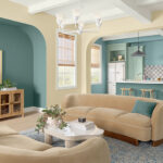
How Neutral Ground Looks in Real Rooms
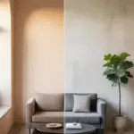
Living Room
This is where Neutral Ground shines.
If you have:
- Wood floors
- Beige or linen furniture
- Woven textures
- Warm metals like brass or bronze
This color pulls everything together beautifully.
It creates a warm, comfortable backdrop without feeling like “tan walls from 2005.”
It’s modern warmth — not outdated warmth.
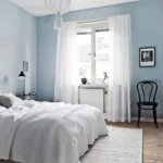
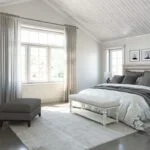
Bedroom
If you want your bedroom to feel like a calm retreat, this is a strong contender.
It pairs beautifully with:
- Cream bedding
- Soft taupe throws
- Light oak or walnut furniture
- Warm table lamps
At night, it glows softly instead of turning gray or dull.
That’s huge in a bedroom.
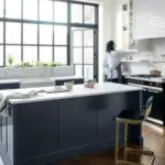
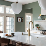
Kitchen
Neutral Ground works really well with:
- White cabinets
- Off-white cabinets
- Warm wood cabinetry
- Marble or quartz countertops
If your kitchen has warm finishes, this color will feel cohesive instead of clashing.
And if you’re worried about it looking “too beige,” don’t be. It’s lighter and fresher than traditional beige.
Bathroom
In bathrooms, Neutral Ground feels soft and spa-like.
It pairs beautifully with:
- White tile
- Stone floors
- Matte black fixtures
- Brushed brass hardware
It warms up all those hard surfaces just enough.
Let’s Compare It to Other Popular Sherwin-Williams Neutrals
Context helps, so let’s see how it stacks up.
Neutral Ground vs Agreeable Gray
Agreeable Gray leans more gray with beige undertones.
Neutral Ground leans more creamy beige with subtle greige.
If Agreeable Gray feels too cool in your home, Neutral Ground might be your warmer alternative.
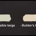
Neutral Ground vs Accessible Beige
Accessible Beige is deeper and richer.
Neutral Ground is lighter and airier.
If you want something that brightens your space more, Neutral Ground wins.
Neutral Ground vs Alabaster
Alabaster is lighter and closer to an off-white.
Neutral Ground has more body and warmth.
If Alabaster feels too pale for your taste, Neutral Ground gives you more presence.
The Best Trim Colors for Neutral Ground
Trim is where a lot of people accidentally go wrong.
Here’s what works beautifully:
1. Pure White
Crisp but not harsh. This is my top pick.
2. Extra White
A brighter, cleaner contrast — great for modern homes.
3. Alabaster
If you want a softer, more blended look.
What I’d avoid? Super creamy, yellow-based whites. They can make the whole room feel too warm.
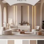
Coordinating Colors That Pair Beautifully
Here’s where you can have fun.
Soft & Natural Palette
- Neutral Ground (main walls)
- Sea Salt (soft accent)
- Repose Gray (cooler contrast)
- Pure White (trim)
This feels calm, layered, and fresh.
Warm & Earthy Palette
- Neutral Ground
- Dried Thyme
- Oyster Bay
- Extra White trim
Perfect if you love organic, nature-inspired interiors.
Bold & Modern Contrast
- Neutral Ground (walls)
- Iron Ore (accent wall or doors)
- Naval (cabinetry or decor accents)
This combination feels sophisticated without losing warmth.
The Pros
✔ Warm but not yellow
✔ Bright without feeling white
✔ Extremely versatile
✔ Works in open floor plans
✔ Pairs well with wood, metal, stone, and neutral fabrics
It’s one of those colors that quietly makes your whole house feel cohesive.
The Cons
✖ If you want a cool gray look, this isn’t it
✖ In very warm lighting, it can lean creamier
✖ Without contrast trim, it may look very soft and subtle
But honestly? For most homes, these aren’t deal breakers.
When Neutral Ground Is the Right Choice
Choose it if you want:
- A light warm neutral for the whole house
- A backdrop that works with changing decor
- Something safe but elevated
- A color that feels welcoming year-round
It’s especially great if you’re selling your home or designing for broad appeal.
When You Might Skip It
Skip it if:
- You love cool-toned modern grays
- You want dramatic depth
- You prefer ultra-crisp white interiors
Neutral Ground is about warmth and comfort — not sharp contrast.
My Honest Opinion
Neutral Ground isn’t flashy.
It doesn’t trend hard.
It doesn’t demand attention.
What it does is make a home feel balanced, warm, and livable.
And sometimes that’s exactly what you want.
If you’re standing there debating between gray and beige, and neither feels right — Neutral Ground might be the calm middle ground you’ve been looking for.
Just make sure you:
- Test large samples on multiple walls
- View it morning and night
- Pair it with clean trim
Do that, and you’ll likely end up with a space that feels intentional, cozy, and timeless.