Pale pink and soft white shades with pink undertones are perfect for creating a subtle, warm, and inviting atmosphere in your home. These colors work beautifully in pantries, bathrooms, and bedrooms, offering a hint of pink without being overwhelmingly “pink pink.” If you’re looking for a gentle, sophisticated touch of pink, this guide will help you choose the perfect Sherwin Williams shade for your space.

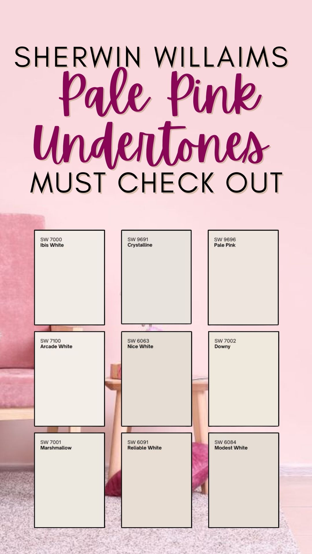
1. SW 7000 Ibis White
Color Information
- Undertones: Soft white with warm, subtle pink undertones
- Finish Options: Eggshell, satin, or matte
- Vibe: Clean, soft, and elegant
Best Uses
✅ Perfect for trim, ceilings, and walls in small spaces
✅ Great for pantries, powder rooms, and bedrooms
✅ Pairs well with blush and taupe accents
Pros & Cons
✔️ Feels warm and inviting without being too pink
✔️ Enhances natural light for a soft, airy feel
❌ Can look slightly peachy in certain lighting
Pro Tips
🔹 Pair with light wood tones for a cozy, natural look
🔹 Works beautifully with soft gray or taupe furniture
2. SW 9691 Crystalline
Color Information
- Undertones: Delicate pink with a soft white base
- Finish Options: Satin or eggshell for a gentle sheen
- Vibe: Feminine, fresh, and sophisticated
Best Uses
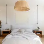
✅ Ideal for bedrooms, dressing rooms, and bathrooms
✅ Works well as an accent wall or an all-over color
✅ Pairs beautifully with gold, brass, or rose gold fixtures

Pro Grade Paint Roller Kit, Brush & Roller for Professionals & Homeowners
Perfect for smooth finishes on your interior walls. Ideal for home improvement enthusiasts!
Buy Now on AmazonPros & Cons
✔️ Adds warmth without feeling overly girly
✔️ Reflects light beautifully, making spaces feel larger
❌ May appear slightly peachy in artificial lighting
Pro Tips
🔹 Pair with white trim and soft beige tones for an elegant contrast
🔹 Use in combination with floral or neutral fabrics for a timeless look
3. SW 9696 Pale Pink
Color Information
- Undertones: True pale pink with warm, creamy undertones
- Finish Options: Matte or satin for a velvety touch
- Vibe: Soft, romantic, and timeless
Best Uses
✅ Perfect for nurseries, cozy bedrooms, and accent walls
✅ Works well in bathrooms with white or marble finishes
✅ Complements light-colored wood furniture and vintage décor
Pros & Cons
✔️ Creates a delicate, airy atmosphere
✔️ Looks stunning with soft whites and warm neutrals
❌ Can appear slightly washed out in very bright rooms

Rust-Oleum 367605 Home Interior Floor Coating Kit, Semi-Gloss Black
Ideal for updating outdated flooring at a fraction of the cost of replacement and adheres without stripping, sanding or priming.
Buy Now on AmazonPro Tips
🔹 Layer with deep burgundy or mauve for a sophisticated touch
🔹 Works beautifully with white linen and plush textiles
4. SW 7100 Arcade White
Color Information
- Undertones: Warm white with a hint of blush
- Finish Options: Semi-gloss for trim, eggshell for walls
- Vibe: Bright, welcoming, and cozy
Best Uses
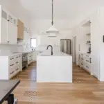
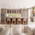
✅ Ideal for kitchens, living rooms, and open spaces
✅ Works beautifully in modern farmhouse or minimalist interiors
✅ Great for brightening up small or dark rooms
Pros & Cons
✔️ Versatile and pairs well with a variety of color schemes
✔️ Feels fresh and inviting without being stark
❌ Might appear more neutral in dim lighting
Pro Tips
🔹 Pair with deeper blush tones for a soft monochromatic look
🔹 Use with warm metals like brass or copper for a stylish touch
5. SW 6063 Nice White
Color Information
- Undertones: A soft white with a beige-pink warmth
- Finish Options: Eggshell or matte for a smooth finish
- Vibe: Understated elegance
Best Uses
✅ Ideal for bedrooms, pantries, and hallways
✅ Works beautifully as a neutral backdrop for artwork
✅ Complements soft, muted pastels and warm neutrals
Pros & Cons
✔️ Brings warmth without overpowering the space
✔️ A subtle, fresh take on traditional white
❌ Can lean too warm in yellow-toned lighting
Pro Tips
🔹 Works great with dark wood floors for contrast
🔹 Use with soft gray and blush décor for a harmonious look
6. SW 7002 Downy
Color Information
- Undertones: A warm, slightly pink-tinged white
- Finish Options: Satin or semi-gloss for added depth
- Vibe: Soft, cozy, and inviting
Best Uses
✅ Ideal for bedrooms, powder rooms, and nursery walls
✅ Works well as an all-over color for a soft, warm look
✅ Pairs beautifully with ivory and taupe tones
Pros & Cons
✔️ Feels cozy and welcoming without being too pink
✔️ A great alternative to stark white
❌ May appear too warm in direct sunlight
Pro Tips
🔹 Combine with dusty rose or blush furniture for a refined touch
🔹 Works well with floral or vintage-style décor
7. SW 7001 Marshmallow
Color Information
- Undertones: White with the faintest pink undertones
- Finish Options: Semi-gloss for trim, eggshell for walls
- Vibe: Airy, bright, and timeless
Best Uses
✅ Perfect for ceilings, trims, and cabinetry
✅ Great for bathrooms and laundry rooms for a fresh look
✅ Complements warm woods and brass accents
Pros & Cons
✔️ Brightens up dark spaces without being stark
✔️ Works well with both warm and cool tones
❌ May look slightly creamy in low lighting
Pro Tips
🔹 Pair with deep rose or mauve for a sophisticated color combo
🔹 Works beautifully with modern or farmhouse-style homes
8. SW 6091 Reliable White
Color Information
- Undertones: Soft white with a hint of peach-pink warmth
- Finish Options: Satin or matte for a soft glow
- Vibe: Subtle, warm, and inviting
Best Uses
✅ Ideal for bedrooms, living spaces, and offices
✅ Works beautifully in traditional and transitional interiors
✅ Pairs well with warm taupe and beige accents
Pros & Cons
✔️ A warm, inviting alternative to stark white
✔️ Works well in both modern and classic interiors
❌ Can look more beige than pink in artificial lighting
Pro Tips
🔹 Use with warm lighting to bring out its undertones
🔹 Pair with dusty pink and rose hues for a sophisticated palette
9. SW 6084 Modest White
Color Information
- Undertones: A creamy white with pinkish warmth
- Finish Options: Satin or eggshell for a gentle sheen
- Vibe: Classic, soft, and elegant
Best Uses
✅ Ideal for bedrooms, hallways, and cozy living spaces
✅ Works well in vintage, French country, and farmhouse interiors
✅ Complements floral prints and soft neutral décor
Pros & Cons
✔️ A timeless and versatile neutral
✔️ Adds warmth without feeling too colorful
❌ Can appear slightly peachy in warm lighting
Pro Tips
🔹 Works great with soft grays and warm woods
🔹 Pair with floral or feminine accents for a charming look
Final Thoughts
Sherwin Williams offers a range of pale pink and soft white shades that are perfect for creating a warm, inviting space without an overpowering pink tone. Whether you’re looking for a romantic blush hue or a subtle white with pink undertones, these colors bring elegance, warmth, and timeless charm to any room.
Which of these shades is your favorite? Let me know! 😊💖