Every year, paint brands release their much-anticipated Color of the Year (COTY), setting trends and inspiring homeowners to refresh their spaces. In 2025, HGTV Home by Sherwin-Williams has crowned Quietude as its Color of the Year. This serene blue-green shade is already making waves in interior design, promising to bring a sense of calm and sophistication into homes.
But what makes Quietude so special? How can you incorporate it into your home? Let’s dive into a detailed color review and explore everything you need to know about this stunning paint color!
What is Sherwin-Williams Quietude?
Quietude is a muted blue-green paint color with a soft and inviting presence. It is slightly darker than Sherwin-Williams Sea Salt, making it a fantastic alternative for those who want a bit more depth while maintaining a tranquil aesthetic.
Key Characteristics:
- Color Family: Blue-Green
- Undertones: Strong green with muted gray tones
- Light Reflectance Value (LRV): 48 (medium-depth color)
- Warm or Cool? Warm, thanks to its green influence
Quietude is part of the Naturally Refined Color Collection, a palette that embodies timeless design and quiet luxury. This collection focuses on simplicity and slower living, perfect for homeowners seeking a soothing, nature-inspired environment.
Where to Buy Quietude Paint?
You can find HGTV Home by Sherwin-Williams paints exclusively at Lowe’s. Unlike standard Sherwin-Williams paints, this line is geared toward DIY homeowners, offering affordable, high-quality options with a one-stop shopping experience.

Pro Grade Paint Roller Kit, Brush & Roller for Professionals & Homeowners
Perfect for smooth finishes on your interior walls. Ideal for home improvement enthusiasts!
Buy Now on AmazonDifference Between HGTV Home by Sherwin-Williams and Sherwin-Williams Paints:
- Availability: HGTV Home paints are sold at Lowe’s, while traditional Sherwin-Williams paints are available at Sherwin-Williams stores.
- Pricing: HGTV Home paints are more budget-friendly, making them a great option for DIYers.
- Color Variations: While many colors overlap, the formulations differ slightly, meaning a color from Lowe’s may not perfectly match its counterpart from a Sherwin-Williams store.
Best Ways to Test Quietude Before Committing
Lighting conditions can drastically change how a color appears in a space. Before you start painting, it’s essential to test the color to ensure it looks just right in your home.
Testing Methods:
✅ Samplize Peel-and-Stick Paint Samples
- Large 9” x 14” swatches pre-painted with real Sherwin-Williams paint
- Mess-free and easy to apply
- Repositionable, allowing you to see the color in different lighting
✅ Traditional Sample Pots
- Paint large poster boards and move them around your space
- View the color at different times of the day
How to Use Sherwin-Williams Quietude in Your Home
Quietude is a versatile paint color that can be used in various ways throughout your home. Here’s how to incorporate it into different spaces:

Rust-Oleum 367605 Home Interior Floor Coating Kit, Semi-Gloss Black
Ideal for updating outdated flooring at a fraction of the cost of replacement and adheres without stripping, sanding or priming.
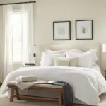
Buy Now on Amazon1. Bedroom Retreat 🛏️
Quietude creates a calming atmosphere, making it ideal for bedrooms. Pair it with warm wood furniture, white bedding, and gold accents for a cozy and stylish space.
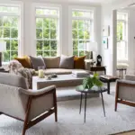
2. Tranquil Living Room 🏡
In a living room, Quietude provides a sophisticated backdrop. Complement it with neutral furniture, soft textures, and natural elements to create a balanced, inviting space.
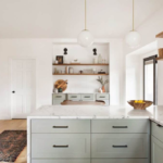
3. Stylish Kitchen Cabinets 🍽️
Consider using Quietude for lower cabinets in a tuxedo kitchen (darker cabinets below, white cabinets above). It pairs beautifully with light countertops and backsplashes, enhancing a coastal-inspired aesthetic.
4. Refreshing Bathroom Vanity 🚿
Painting your vanity with Quietude adds a spa-like feel to a bathroom. Combine it with white subway tiles and brushed gold fixtures for an elegant touch.
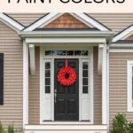
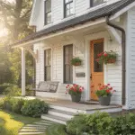
5. Front Door Accent 🚪
For exteriors, Quietude is best suited for front doors. It offers a welcoming look, especially when paired with neutral siding and crisp white trim.
What Are the Best Trim and Ceiling Colors for Quietude?
Pairing Quietude with the right trim and ceiling colors enhances its beauty. Here are some top choices:
- Crisp White: Sherwin-Williams Pure White (SW 7005) or Extra White (SW 7006) for classic contrast.
- Warm White: Sherwin-Williams Greek Villa (SW 7551) for a softer, more inviting look.
- Ceiling Option: Keep ceilings white or a very light neutral to avoid making the space feel heavy.
Complementary Colors for Quietude
To create a harmonious color palette, consider pairing Quietude with the following shades:
Neutral Pairings:
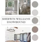
✅ Alabaster (SW 7008) – Soft, warm white ✅ Accessible Beige (SW 7036) – Light, warm greige ✅ Snowbound (SW 7004) – Crisp, cool white
Bold Accent Colors:
✅ Nutshell (SW 7708) – Earthy brown with a hint of mauve ✅ Iron Ore (SW 7069) – Deep charcoal gray ✅ Naval (SW 6244) – Classic navy blue
Common Questions About Sherwin-Williams Quietude
Is Quietude a Good Whole-House Paint Color?
🔹 Not really. Quietude is best used in selective rooms rather than as an all-over color. It’s rich and colorful, so using it throughout the house might feel overwhelming.
Does Quietude Work Well in North-Facing Rooms?
🔹 Yes, but it will appear cooler and slightly darker. Pairing it with warm white trim can help balance the color.
Can Quietude Be Used for Exteriors?
🔹 Quietude can work for front doors, but it may appear minty or washed out when used on large exterior surfaces. It’s best for sheltered areas like porches.
What Colors Are Similar to Quietude?
🔹 Sea Salt (SW 6204) – A lighter version with softer tones. 🔹 Rainwashed (SW 6211) – More blue, less green. 🔹 Oyster Bay (SW 6206) – A deeper, richer alternative.
Final Thoughts
Sherwin-Williams Quietude is a beautiful, tranquil paint color perfect for creating relaxing and stylish spaces. Whether you use it for a bedroom, bathroom vanity, or kitchen cabinets, this blue-green beauty is sure to add timeless charm to your home.
Looking for more color inspiration? Test out Quietude with Samplize peel-and-stick samples and explore how it looks in your space!
✅ Ready to paint? Head to Lowe’s to grab a can of HGTV Home by Sherwin-Williams Quietude today!