Interior color trends have clearly shifted over the past few years. Cool, flat grays are slowly stepping aside, making room for warmer blue-gray paint colors and earthy green-gray tones that feel more grounded and inviting. While classic gray will always have its place, today’s homes are leaning toward colors with more depth, warmth, and character.
That’s where deep green paint colors truly shine.
One standout shade in this evolving palette is Sherwin Williams Rosemary (SW 6187). This rich, saturated green-gray has been quietly gaining popularity—and for good reason. It strikes a beautiful balance between bold and livable, dramatic yet timeless.
If you’re feeling confident enough to move beyond safe neutrals and want to introduce a sophisticated, nature-inspired color into your home, let’s take a closer look at what Sherwin Williams Rosemary has to offer—and whether it’s the right choice for your space.
What Color Is Sherwin Williams Rosemary?
If you’re considering Sherwin Williams Rosemary, here’s the short answer:
this color was made for accent walls, cabinetry, and architectural details.

Pro Grade Paint Roller Kit, Brush & Roller for Professionals & Homeowners
Perfect for smooth finishes on your interior walls. Ideal for home improvement enthusiasts!
Buy Now on AmazonSW Rosemary is a deep, organic green with strong gray undertones, giving it a moody, grounded presence without feeling overly bold or trendy. It’s dark, but not harsh. Rich, but not overpowering.
Because of its depth, Rosemary works exceptionally well on:
- Shiplap or board-and-batten accent walls
- Built-ins and bookshelves
- Kitchen islands and bathroom vanities
- Interior doors or statement cabinetry
Many homeowners who hesitate to commit to black paint often turn to colors like Rosemary instead. It delivers a similar level of drama and sophistication—without reading stark or heavy on the walls.
This forest-inspired green feels equally at home in traditional interiors, modern spaces, and farmhouse-style homes, making it surprisingly versatile.

Rust-Oleum 367605 Home Interior Floor Coating Kit, Semi-Gloss Black
Ideal for updating outdated flooring at a fraction of the cost of replacement and adheres without stripping, sanding or priming.
Buy Now on Amazon
Sherwin Williams Rosemary Undertones Explained
One of the best things about SW Rosemary is that it’s predictable—there are no sneaky undertone surprises here.
- The dominant undertone is gray, which softens the green
- The green itself feels earthy and natural, not bright or jewel-toned
- There are no noticeable blue or yellow flashes
That gray base is what keeps Rosemary from feeling too vibrant or too dark. Even though it’s a deep color, it does not read black on the walls the way some near-black greens can (such as SW Greenblack).
If you want a green that feels calm, grounded, and sophisticated rather than bold or trendy, Rosemary fits the bill beautifully.
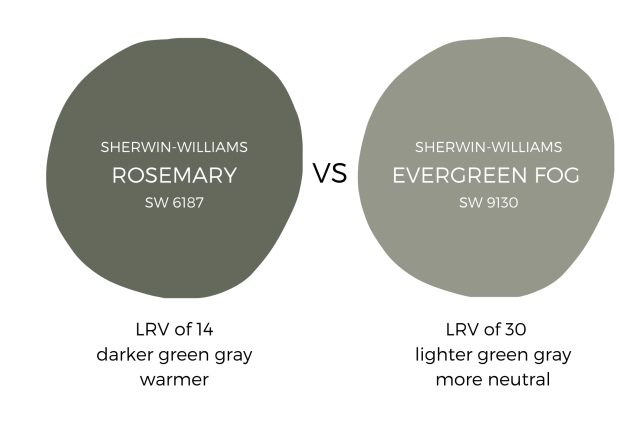
Sherwin Williams Rosemary LRV (Light Reflectance Value)
Sherwin Williams Rosemary has an LRV of 14, which places it firmly in the medium-dark range.
What does that mean for your space?
- Rosemary absorbs more light than it reflects
- It will look deeper and moodier in low-light rooms
- In bright spaces, the green and gray balance becomes more noticeable

For reference, Sherwin Williams Tricorn Black has an LRV of 3, so while Rosemary is dark, it’s nowhere near black.
Because lighting plays such a huge role in how dark colors behave, it’s essential to test Rosemary in your own home. Natural light, artificial lighting, and even surrounding finishes will all influence how it reads on the wall.
👉 Peel-and-stick paint samples are highly recommended for this color so you can see it throughout the day without committing to a full gallon.
Sherwin Williams Rosemary Color Palette Ideas
Seeing a paint color in real spaces is often the best way to understand its potential. Here are some of the most effective ways Sherwin Williams Rosemary is being used in homes today.
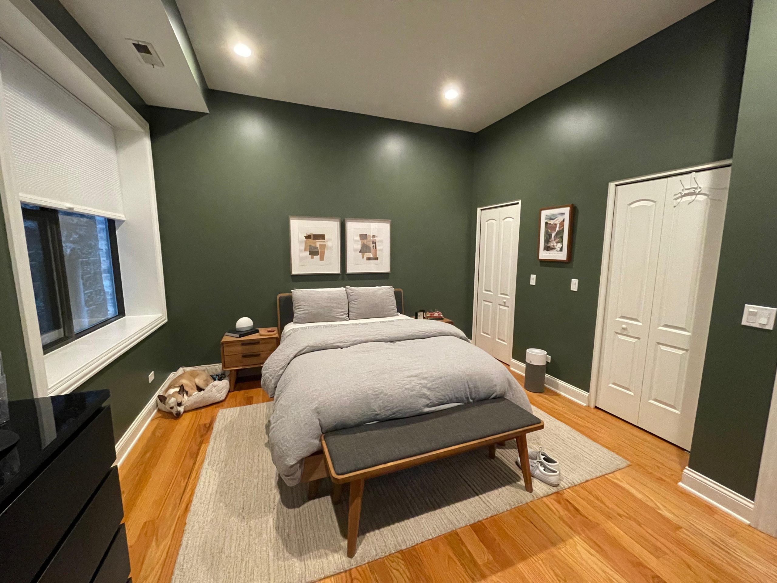
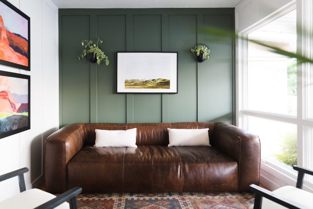
Sherwin Williams Rosemary Accent Walls
If you want instant impact without overwhelming a room, Rosemary makes a stunning accent wall color.
Designers often lighten SW Rosemary by 25% or 50% for:
- Bedrooms
- Kids’ rooms
- Smaller spaces that need softness
Lightening a color keeps it in the same family while making it more adaptable for everyday living.
Rosemary looks especially striking on board-and-batten or paneled walls, where the shadows and texture enhance its depth.
Sherwin Williams Rosemary Cabinets & Built-Ins
This is where Rosemary truly shines.
On cabinetry and shelving, its moody green-gray tone:
- Creates a strong focal point
- Adds richness to neutral rooms
- Makes white decor, books, and plants stand out
In kitchens, a Rosemary green island paired with white perimeter cabinets feels both fresh and timeless. It brings in color without committing to a fully green kitchen.
In living rooms or offices, Rosemary built-ins elevate the space instantly, making it feel custom and intentional.
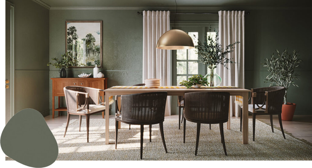
Sherwin Williams Rosemary on Walls
Using Rosemary on full walls can be incredibly beautiful—but balance is key.
To keep the room from feeling heavy:
- Pair it with crisp whites
- Use light countertops or tile
- Incorporate warm wood tones
Bathrooms, laundry rooms, and powder rooms are excellent candidates for darker greens like Rosemary because the contrast feels clean, cozy, and elevated rather than overwhelming.
Sherwin Williams Rosemary vs Other Green-Gray Paint Colors
Rosemary vs Evergreen Fog (SW 9130)
Evergreen Fog is noticeably lighter and softer than Rosemary. If your space lacks natural light or you want a more relaxed, airy feel, Evergreen Fog may be the safer option.
That said, these two colors work beautifully together in a monochromatic palette, with Rosemary as the anchor and Evergreen Fog as a supporting shade.
Rosemary vs Ripe Olive (SW 6209)
Ripe Olive is significantly darker, with an LRV of just 6, placing it close to black. Depending on lighting, Ripe Olive can appear nearly black on the walls.
Rosemary, by comparison:
- Looks greener
- Has more gray to soften it
- Never reads black
If you want drama without going ultra-dark, Rosemary is the more approachable choice.
Rosemary vs Pewter Green (SW 6208)
Pewter Green leans much heavier into the gray side, giving it a cooler, more metallic feel.
- Choose Pewter Green if you want less green
- Choose Rosemary if you want warmth and earthiness
Both are deep and dramatic, best used on accent walls or focal areas rather than throughout an entire home.
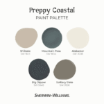
Sherwin Williams Rosemary Coordinating Colors
If your home is filled with whites and greige neutrals and you’re craving something richer, Rosemary layers in beautifully without requiring a full repaint.
Best Coordinating Colors for SW Rosemary
Whites & Neutrals
- SW Snowbound
- SW Alabaster
- SW Neutral Ground
- SW Conservative Gray
Deep Contrasts
- SW Deep Forest Brown
- SW Status Bronze
Rosemary also pairs exceptionally well with:
- Natural wood tones
- Brown leather furniture
- Brass and bronze finishes
These combinations enhance its warmth and give the space a high-end, designer feel.
Final Thoughts on Sherwin Williams Rosemary
Sherwin Williams Rosemary is a confident, sophisticated green-gray paint color that feels grounded, timeless, and deeply inviting. It’s bold without being trendy, dark without feeling heavy, and versatile enough to work across many design styles.
If you’re ready to move beyond basic neutrals and bring depth and warmth into your home—without the risk of going too dark—Rosemary is absolutely worth considering.
Test it, live with it, and let it transform your space in the most beautifully understated way.