Every once in a while, a paint color comes along that quietly steals the show. It doesn’t shout for attention. It doesn’t demand the spotlight. Instead, it works its magic in the background—calming, refreshing, and making every room look effortlessly put together.
For 2025, Sherwin Williams has crowned Sea Salt SW 6204 as its Whole House Color of the Year. If you’ve been anywhere near Pinterest boards, Instagram home accounts, or design blogs lately, you’ve probably seen it in action: a muted, airy shade that shifts between green, blue, and gray like the sea on a cloudy morning.
Why is it so beloved? Because Sea Salt is a color that looks just as beautiful in a beach cottage as it does in a modern farmhouse, city condo, or suburban family home. It’s sophisticated without being stuffy. Soothing without being boring.
And the best part? It’s not just a “trend” color—it’s a classic that has been around for over a decade, proving its staying power. Let’s dive deep into why the Sherwin Williams Sea Salt palette is the ultimate choice for your whole home in 2025.

The Story Behind Sherwin Williams Sea Salt
When Sea Salt First Entered the Design World
Sea Salt made its quiet debut years ago, initially catching the eye of coastal decorators. It quickly became a go-to for beach-inspired interiors because of its soft, watery vibe. Picture a light breeze coming through open windows, sheer curtains swaying, and a faint scent of salt in the air—that’s the feeling this color evokes.

Pro Grade Paint Roller Kit, Brush & Roller for Professionals & Homeowners
Perfect for smooth finishes on your interior walls. Ideal for home improvement enthusiasts!
Buy Now on Amazon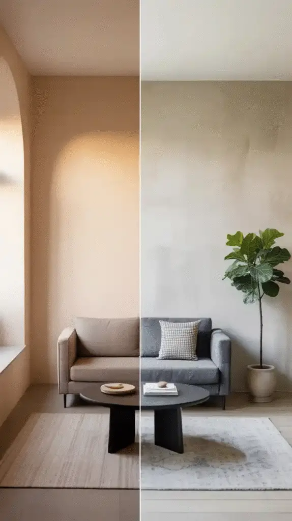
How It Evolved Into a Timeless Favorite
Over time, Sea Salt escaped the “beach house only” label. Designers began using it in farmhouses, contemporary apartments, and even traditional suburban homes. Why? Because it strikes the perfect balance between color and neutrality. It’s lively enough to feel fresh but muted enough to act as a backdrop for almost any style.
Why It Resonates With Homeowners in 2025
In 2025, we’re seeing a big movement toward nature-inspired design. People are craving connection to the outdoors, organic textures, and calming color schemes. Sea Salt’s green undertones tie directly to nature, while its subtle gray keeps it modern and versatile.
Understanding the Sea Salt Color Profile
The Undertones – Green, Blue, and Gray
Sea Salt is what designers call a chameleon color. It has three distinct undertones—green, blue, and gray—that shift depending on the lighting and the colors around it.
- In bright daylight, the green undertone shines the most, giving rooms a fresh, natural vibe.
- In cooler, artificial light, blue undertones emerge, making the color feel cooler and more spa-like.
- In shadow or low light, the gray undertone dominates, giving the space a soft, muted elegance.
This shifting personality is what makes Sea Salt so intriguing—and also why you should always test it before painting an entire room.

Rust-Oleum 367605 Home Interior Floor Coating Kit, Semi-Gloss Black
Ideal for updating outdated flooring at a fraction of the cost of replacement and adheres without stripping, sanding or priming.
Buy Now on Amazon
How Lighting Transforms Sea Salt Throughout the Day
- Morning light: Appears crisp and fresh, leaning green-blue.
- Midday light: Softens toward gray, especially in south-facing rooms.
- Evening light: Can feel moodier, with more blue-gray tones.
Comparing Sea Salt to Similar Colors
If you love Sea Salt but want to explore variations:
- Rainwashed SW 6211: Slightly deeper with more obvious green-blue tones.
- Comfort Gray SW 6205: A bit darker and more gray—great for a richer feel.
- Oyster Bay SW 6206: More saturated and greener—ideal for accent walls.

Sea Salt as a Whole House Color
What Makes It Versatile for Every Room
The secret to a great whole house paint color is flexibility. It needs to work in bright rooms and dim hallways, large open spaces, and small cozy nooks. Sea Salt checks all those boxes.
It’s soft enough to flow seamlessly from one room to another without feeling overwhelming, yet it has enough character to stand on its own.
How It Creates a Cohesive Flow Between Spaces
When used throughout your home, Sea Salt becomes the unifying thread that ties different spaces together. This is especially valuable in open-concept homes, where walls aren’t there to break up colors.
The Psychological Effect – Calm, Airy, and Fresh
Colors influence mood, and Sea Salt is a mood-lifter. Its cool undertones create a calming environment—perfect for reducing stress after a long day.
The 2025 Sherwin Williams Sea Salt Palette
Primary Color – Sea Salt SW 6204
The heart of the palette, Sea Salt can cover main living areas, hallways, bedrooms, and even exterior siding for a cohesive look.
Coordinating Colors for Walls and Trim
For trim and doors:
- Pure White SW 7005 – clean, fresh, and classic
- Extra White SW 7006 – bright and modern
- Alabaster SW 7008 – soft and warm for a cozy vibe

Accent Colors for Bold Pops Without Clashing
Accent walls, pillows, or furniture can pull in:
- Naval SW 6244 – rich navy for drama
- Iron Ore SW 7069 – bold charcoal for depth
- Coral Reef SW 6606 – warm pop for contrast
Updated 2025 Trend Pairings
The Sea Salt palette pairs beautifully with:
- Natural rattan and wicker
- Brushed brass fixtures
- White oak furniture
- Linen and cotton textiles
Pairing Sea Salt with White Trim
Best Sherwin Williams Whites for Trim
- Pure White: Works in any lighting, crisp but not too stark.
- Extra White: Great for modern or contemporary spaces with cool lighting.
- Alabaster: Perfect if you want a softer, warmer feel.
How to Choose the Right White Based on Undertones
If your home gets cooler light, a warmer white can keep the space inviting. If your home gets lots of warm light, a crisp white will help balance the warmth.
Gloss Levels That Work Best
- Trim: Semi-gloss for durability and light reflection.
- Walls: Eggshell or satin for subtle sheen and easy cleaning.
Sea Salt in Different Lighting Conditions
North-Facing Rooms – Cooler and More Muted
In these rooms, Sea Salt leans toward blue-gray. Add warmth through wood tones, soft lighting, and warm textiles.
South-Facing Rooms – Warmer and Softer
Sea Salt’s green undertones will come forward here, creating a fresh, spring-like feel.
Tips for Testing Before Committing
Always paint large test patches and check them at different times of day. Don’t skip this step—lighting can make or break your color choice.
Sea Salt in Different Rooms
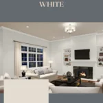
Living Rooms – Airy and Welcoming
Pair with white sofas, light wood coffee tables, and woven baskets for an easy-breezy style.
Bedrooms – The Perfect Restful Retreat
Add plush bedding in crisp white, natural wood side tables, and soft throw blankets for a serene sanctuary.
Bathrooms – Spa-Like Tranquility
Pair with white tile, chrome fixtures, and soft towels for a luxury spa feel at home.
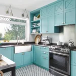
Kitchens – Pairing with Cabinets and Countertops
Sea Salt works with white shaker cabinets, marble or quartz countertops, and brushed brass pulls.
Entryways and Hallways – Light, Bright, and Inviting
Keeps small or narrow spaces from feeling cramped.
Sea Salt for Open Floor Plans
How It Helps Unify Large, Shared Spaces
It’s perfect for avoiding color “clutter” in open layouts while still offering visual interest.
Layering with Rugs, Furniture, and Décor
Add depth with rugs in soft gray or beige, plus artwork in muted blues or greens.
Transitioning to Other Colors Without Breaking the Flow
Consider Repose Gray or Agreeable Gray for adjacent rooms if you want variety without clashing.

Coordinating Colors for the Sea Salt Palette
Neutrals That Work Beautifully
- Agreeable Gray SW 7029
- Repose Gray SW 7015
Deeper Accents for Contrast
- Naval SW 6244
- Iron Ore SW 7069
Warm Accent Tones for Balance
- Accessible Beige SW 7036
- Urbane Bronze SW 7048
Sea Salt and Exterior Applications
Using Sea Salt for Siding – Fresh Coastal Appeal
Great for Cape Cod, coastal, or modern farmhouse exteriors.
Best Trim and Shutter Colors for Exteriors
White trim, charcoal shutters, and natural wood doors make a beautiful combination.
Sea Salt for Front Doors – Subtle Yet Stylish
A lovely alternative to bold red or navy.
The Pros and Cons of Choosing Sea Salt
Pros:
- Timeless and versatile
- Calming atmosphere
- Works in any style of home
Cons:
- Lighting-sensitive
- May appear more muted than expected
Styling Tips for Sea Salt Interiors
Furniture Styles That Complement Sea Salt
Works with coastal, modern farmhouse, Scandinavian, and transitional styles.
Fabric and Textile Colors to Pair
Soft whites, beiges, grays, and muted blues.
Choosing Flooring That Enhances the Palette
Light to medium hardwoods or natural stone tiles are perfect.
Sherwin Williams Sea Salt vs. Other Brands’ Equivalents
Benjamin Moore Healing Aloe
Softer and slightly bluer.
Behr Reflecting Pool
Close match but flatter undertones.
Sea Salt for Resale Value in 2025
Buyers love it because it’s neutral yet stylish, and it photographs beautifully for listings.
How to Test Sea Salt in Your Home
Use peel-and-stick samples or paint large swatches, and view them in different lighting before committing.
Common Mistakes to Avoid with Sea Salt
- Ignoring lighting conditions
- Choosing clashing trim whites
- Overusing competing accent colors
The Future of Sea Salt Beyond 2025
With its decade-long popularity, Sea Salt isn’t going anywhere—it’s likely to become a permanent design classic.
FAQs About Sherwin Williams Sea Salt
Is it more green or blue?
It depends on lighting, but generally leans green.
Does it work with wood tones?
Yes—especially light and medium wood finishes.
Final Thoughts – Is Sea Salt the Right Choice for You?
If you want a home that feels fresh, calm, and timeless, Sea Salt SW 6204 is a fantastic choice. Test it, pair it with the right trim, and enjoy the transformation.
Conclusion and Call to Action
Sherwin Williams Sea Salt truly earns its spot as the 2025 Whole House Color of the Year. If you’ve painted with Sea Salt before—or plan to—share your experiences in the comments. And if you found this helpful, send it to a friend who’s ready for a fresh start in 2025.