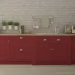
When it comes to creating a welcoming and stylish home, paint colors serve as the foundation. They set the tone for every room, influencing both mood and perception. For 2025, Sherwin-Williams continues to lead with a stunning palette that blends versatility with timeless appeal.
Whether you’re revamping your living room, refreshing a bedroom, or preparing your home for sale, these 25 shades will inspire you.
Why Color Choice Matters
Paint isn’t just about aesthetics—it shapes the ambiance of a space. Studies show that different colors can influence mood, productivity, and even sleep quality.
- Blues & Greens – Promote relaxation, making them ideal for bedrooms.
- Yellows & Reds – Add energy and warmth, perfect for kitchens or dining rooms.
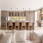
- Neutrals (Grays & Beiges) – Create balance and sophistication for a timeless appeal.
The Sherwin-Williams 2025 color palette embraces these principles, offering hues for every style and function.
Key Color Trends for 2025
This year’s most popular shades align with major design movements:

Pro Grade Paint Roller Kit, Brush & Roller for Professionals & Homeowners
Perfect for smooth finishes on your interior walls. Ideal for home improvement enthusiasts!
Buy Now on Amazon✅ Earthy & Natural Tones – Inspired by nature, soft greens and browns reflect the ongoing trend toward sustainability.
✅ Bold Accents – Deep jewel tones are making a statement in small doses, like on accent walls or cabinetry.
✅ Soft Neutrals – Grays and whites remain classic, offering a clean backdrop for personalized decor.
Top 25 Sherwin-Williams Paint Colors for 2025
1. Alabaster (SW 7008)
A warm, off-white that creates a bright and airy feel.
✔ Best for: Living rooms, kitchens.
✔ Pairs well with: Natural wood tones, black accents.
2. Agreeable Gray (SW 7029)
A versatile greige that balances warm and cool tones.
✔ Best for: Open floor plans.
✔ Pairs well with: Soft blues, whites.
3. Urban Bronze (SW 7084)
A deep, earthy bronze that feels rich and grounding.
✔ Best for: Accent walls, cabinetry.
✔ Pairs well with: Warm whites, muted greens.

Rust-Oleum 367605 Home Interior Floor Coating Kit, Semi-Gloss Black
Ideal for updating outdated flooring at a fraction of the cost of replacement and adheres without stripping, sanding or priming.
Buy Now on Amazon4. Pure White (SW 7005)
A crisp, clean white that complements any decor style.
✔ Best for: Trim, ceilings, minimalist spaces.
✔ Pairs well with: Bold colors like navy or emerald.
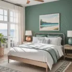
5. Evergreen Fog (SW 9130)
A soft green-gray with a serene vibe.
✔ Best for: Bedrooms, entryways.
✔ Pairs well with: Creamy whites, light woods.
6. Sea Salt (SW 6204)
A soothing green-blue reminiscent of a spa retreat.
✔ Best for: Bathrooms, laundry rooms.
✔ Pairs well with: White trim, brushed nickel.
7. Repose Gray (SW 7015)
A neutral gray with warm undertones.
✔ Best for: Open living spaces.
✔ Pairs well with: Dark wood furniture, bold wall art.
8. Naval (SW 6244)
A sophisticated navy blue that adds elegance.
✔ Best for: Dining rooms, front doors.
✔ Pairs well with: Crisp whites, gold hardware.
9. Dover White (SW 6385)
A creamy white with soft yellow undertones.
✔ Best for: Entryways, kitchens.
✔ Pairs well with: Muted greens, pale grays.
10. Tricorn Black (SW 6258)
A true black that adds drama and contrast.
✔ Best for: Accent walls, trim, doors.
✔ Pairs well with: Light neutrals.
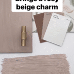
11. Accessible Beige (SW 7036)
A warm beige with gray undertones.
✔ Best for: Living rooms, bedrooms.
✔ Pairs well with: Light blues, greens.
12. Gauntlet Gray (SW 7019)
A deep, warm gray with a refined touch.
✔ Best for: Accent walls, cabinetry.
✔ Pairs well with: Soft whites, muted yellows.
13. Clary Sage (SW 6178)
A gentle sage green inspired by nature.
✔ Best for: Kitchens, mudrooms.
✔ Pairs well with: Light wood tones, brass finishes.
14. Eider White (SW 7014)
A cool, off-white with subtle gray undertones.
✔ Best for: Modern, minimalist spaces.
✔ Pairs well with: Dark grays, blues.
15. Hale Navy (SW 6241)
A deep, muted navy that exudes sophistication.
✔ Best for: Home offices, bedrooms.
✔ Pairs well with: Warm metallics, white trim.
16. Rainwashed (SW 6211)
A refreshing blue-green with a soft touch.
✔ Best for: Bedrooms, bathrooms.
✔ Pairs well with: Light neutrals, sandy beige tones.
17. Shoji White (SW 7042)
A warm off-white with a hint of beige.
✔ Best for: Creating a cohesive look in open spaces.
✔ Pairs well with: Soft greens, grays.
18. Muted Gold (SW 6691)
A rich, golden hue that adds warmth.
✔ Best for: Accent walls, statement furniture.
✔ Pairs well with: Deep blues, dark grays.
19. Greek Villa (SW 7551)
A soft, creamy white that’s incredibly versatile.
✔ Best for: Traditional or modern designs.
✔ Pairs well with: Neutral beiges, bold blacks.
20. Cadet (SW 9143)
A muted blue-gray that feels serene.
✔ Best for: Bathrooms, reading nooks.
✔ Pairs well with: Light woods, off-whites.
21. Black Fox (SW 7020)
A deep brown-black that adds richness.
✔ Best for: Exteriors, trim, furniture.
✔ Pairs well with: Warm whites, muted greens.
22. Rock Candy (SW 6231)
A pale, cool gray with blue undertones.
✔ Best for: Modern kitchens, bathrooms.
✔ Pairs well with: Polished silver, stainless steel.
23. Peach Blossom (SW 6624)
A soft, peachy pink with a cheerful feel.
✔ Best for: Nurseries, accent walls.
✔ Pairs well with: Light grays, whites.
24. Caribbean Coral (SW 6617)
A bold coral full of personality.
✔ Best for: Powder rooms, statement walls.
✔ Pairs well with: Soft creams, muted greens.
25. Caviar (SW 6990)
A luxurious black with a velvety finish.
✔ Best for: Dining rooms, exteriors.
✔ Pairs well with: Whites, jewel tones.
Tips for Choosing the Right Color
🎨 Consider Lighting – Colors change under different lighting conditions. Test samples before committing.
🎨 Pair Wisely – A neutral base with one or two accent shades creates a balanced look.
🎨 Start Small – If unsure, paint a small space like an accent wall first.
🎨 Seek Expert Advice – Sherwin-Williams offers free or low-cost color consultations.
Final Thoughts
Paint is one of the easiest ways to transform a home. Whether you prefer timeless neutrals, calming greens, or bold statement shades, Sherwin-Williams’ 2025 collection has something for every style. Which of these stunning colors will you try first? 🎨✨