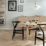
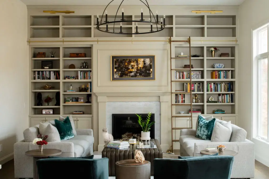
Neutrals are timeless. Whether they fill your wardrobe or define the character of your home, neutral shades never go out of style. In interior design, especially in living rooms, neutrals offer a versatile foundation. Some homeowners prefer to layer different neutral tones to craft a cozy, layered ambiance, while others use neutral walls as a blank canvas for pops of vibrant color.
When you start collecting paint swatches, you quickly realize that choosing the right neutral isn’t as simple as it seems. With countless stunning options available, how do you pick the best neutral paint color for your living room?

Why Neutrals Are the Cornerstone of Interior Design
Neutral colors remain the go-to starting point for most interior designers—and for good reason. Neutrals are incredibly versatile, practical, and eternally stylish. A well-chosen neutral palette can fit seamlessly into any design trend, from minimalist to bohemian, and always looks fresh, welcoming, and contemporary.
Neutral shades don’t overpower a room. Instead, they enhance other design elements: bold artwork, patterned furniture, statement lighting, and textured fabrics all pop against a neutral backdrop. This adaptability makes neutral living rooms easy to update with small seasonal changes or evolving trends without major overhauls.
What Are Neutral Colors in Interior Design?
In the world of color theory, pure neutrals include black, white, brown, and gray. These colors are typically created by mixing two complementary colors. However, in interior design, the definition of a “neutral” is broader and a bit more forgiving.

Pro Grade Paint Roller Kit, Brush & Roller for Professionals & Homeowners
Perfect for smooth finishes on your interior walls. Ideal for home improvement enthusiasts!
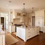
Buy Now on AmazonNeutral colors are often light, subdued hues that appear almost colorless. Think soft ivories, creamy beiges, gentle grays, and sandy tans. Even though these shades appear muted, they can carry subtle undertones—like yellow, blue, green, or pink—which impact how they behave under different lighting conditions.
You might also hear experts refer to near-neutrals, which are created by mixing one of the pure neutrals with a primary color. These paints often have richer undertones, giving them more dimension and warmth. For instance, tan has noticeable yellow undertones, while greige (a mix of gray and beige) blends warm and cool notes together.
The line between neutral colors and pale color shades can be fuzzy. Pale blues, greens, and blush pinks are often treated as neutrals in contemporary design schemes, providing a fresh twist on classic neutrals.
Pro Tip: Always sample neutral paints on your walls and observe them throughout the day. Natural and artificial lighting can dramatically change how a neutral shade looks.

Rust-Oleum 367605 Home Interior Floor Coating Kit, Semi-Gloss Black
Ideal for updating outdated flooring at a fraction of the cost of replacement and adheres without stripping, sanding or priming.
Buy Now on AmazonHow to Use Neutrals in Your Living Room
Choosing a neutral palette for your living room unlocks two main design strategies:
1. Layering Neutrals Tonally
An all-neutral look is the epitome of sophistication and elegance. It creates a cohesive, serene environment that feels polished yet inviting. Here’s how to layer neutrals effectively:
- Choose Consistent Undertones: Stick with either warm or cool neutrals. Mixing a warm beige with a cool gray can feel disjointed.
- Play With Natural Materials: Incorporate wood, brick, stone, and textiles like linen or wool to add organic interest.
- Vary the Depths: Keep the walls lighter than your furniture and accent pieces to create depth and dimension.
- Anchor With a Patterned Rug: A rug that ties together various neutral shades can ground the room beautifully.
- Embrace Texture: Add variety with chunky knitted throws, leather sofas, woven baskets, and soft area rugs to keep the space from feeling flat or clinical.
2. Using Neutrals as a Backdrop
If you love colorful furniture and accessories, neutral walls provide the perfect stage. Here’s what to consider:
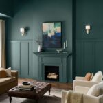
- Do You Want to Brighten or Cozy Up the Space? Light neutrals expand space and make rooms feel airier, while darker neutrals add coziness and drama.
- Will You Use an Accent Wall? A deep taupe or charcoal gray accent wall can offer stunning contrast without overwhelming the space.
- Is Your Color Palette Warm or Cool? Choose neutrals that complement your overall palette to maintain harmony.
Whether you layer neutrals or use them as a backdrop, they offer endless creative freedom while ensuring a timeless and sophisticated living space.
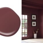
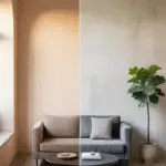
Taupe is perfect for creating a cozy, grounded feeling in your living room without it appearing too cold or stark. Its unique blend of gray and brown with subtle pink or mauve undertones adds complexity and depth, making it extremely versatile.
Taupe pairs wonderfully with both cool and warm accents. For a serene, spa-like atmosphere, pair taupe walls with soft blues and greens. For a more earthy and rustic look, combine taupe with terracotta, olive green, and natural wood tones.
Recommended Taupe Paint Colors:
- Perfect Taupe by Behr
- Smokey Taupe by Benjamin Moore
- Anonymous by Sherwin-Williams
- Ashen Tan by Benjamin Moore
Why Choose Neutrals for the Living Room?
Neutrals are more than just safe choices—they’re foundational elements that allow your living room to evolve over time. Here’s why neutrals remain the top pick for interior designers and homeowners alike:
1. Timeless Appeal
Neutral colors don’t go out of style. While trends may shift from bold hues to softer pastels, neutrals remain a constant, offering a look that is always sophisticated and appropriate.
2. Adaptability
Neutrals provide a flexible backdrop, allowing you to swap out throw pillows, rugs, curtains, and accessories seasonally or whenever you want a fresh look without repainting the walls.
3. Enhancing Space
Light neutrals like ivory, cream, and light gray visually expand a room, making it appear larger and airier—perfect for small living rooms or spaces with limited natural light.
4. Calming Effect
Neutral colors tend to have a soothing, stress-reducing quality, making them ideal for a space like the living room where relaxation and social gatherings happen.
Tips for Decorating with Neutral Paint Colors
Using neutrals doesn’t mean your living room has to feel bland. Here’s how to keep your neutral living room stylish and engaging:
Layer Textures
Introduce a variety of materials such as wool throws, leather sofas, linen curtains, woven baskets, and rustic wooden furniture. The variation in texture will create depth and richness.
Mix Warm and Cool Neutrals (Cautiously)
While it’s best to stick to either warm or cool tones to maintain harmony, skillful decorators can create stunning contrasts by balancing warm woods with cool gray walls, for instance.
Add Accents
Bring life to the room through colorful accessories—bright pillows, bold artwork, or vibrant plants can make your neutral living room pop without overwhelming the space.
Focus on Lighting
Neutrals behave differently depending on natural and artificial lighting. Test paint samples in your actual living room before finalizing. Layer lighting with overhead fixtures, floor lamps, and table lamps to add warmth and prevent the room from looking too flat.
Most Popular Neutral Color Palettes for Living Rooms
If you’re unsure how to combine neutrals, here are some foolproof palette ideas:
1. Soft and Airy
- Walls: Ivory or Light Beige
- Sofa: Light Gray
- Accents: White and Pale Blue
2. Warm and Cozy
- Walls: Cream or Tan
- Sofa: Chocolate Brown
- Accents: Burnt Orange and Olive Green
3. Cool and Modern
- Walls: Pearl Gray
- Sofa: Charcoal
- Accents: Silver, Navy Blue, and White
4. Earthy and Natural
- Walls: Taupe or Greige
- Sofa: Tan Leather
- Accents: Forest Green and Terracotta
How to Choose the Right Neutral for Your Living Room
Picking the perfect neutral requires a thoughtful look at your living room’s conditions and your personal style preferences:
Consider the Room’s Natural Light
- North-facing rooms often have cooler light, so warm neutrals like cream or beige can balance the chill.
- South-facing rooms bathe in warm sunlight, allowing cooler neutrals like gray or silver to feel comfortable.
Understand the Mood You Want
- Bright whites and light grays create a crisp, energetic atmosphere.
- Deeper neutrals like taupe and pewter foster a sense of coziness and intimacy.
Sample Before You Commit
Paint patches on all walls and observe them at different times of the day. A color that looks perfect under store lighting might appear too dark or too bright at home.

Conclusion: Neutrals Offer Endless Possibilities
Incorporating neutrals into your living room design offers the best of both worlds: timeless elegance and complete flexibility. Whether you prefer the bright freshness of pure white, the comforting warmth of beige and tan, or the dramatic depth of charcoal and pewter, neutrals allow your living space to evolve with your tastes.
From soft, light-infused spaces to moody, dramatic havens, there’s a neutral palette waiting to transform your living room into your perfect sanctuary.