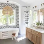
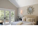
Every year, major paint brands shape the way homes look, feel, and evolve. Their Color of the Year announcements don’t just influence interior design — they guide architecture, décor, furniture, and even lifestyle trends.
As we move into 2026, color trends are shifting in meaningful ways. Homeowners are craving:
- Comfort without boredom
- Depth without heaviness
- Warmth without excess yellow
- Nature-inspired tones that feel modern
The result? A powerful mix of warm neutrals, softened earth tones, deep organic hues, and calm mid-tones designed to work in real homes — not just showrooms.
In this guide, we’ll cover:
- The buzz around national color picks for 2026
- How to understand Color of the Year choices
- Trending palettes from Sherwin-Williams, Behr, and Benjamin Moore
- How to use these colors room by room

The Buzz Around 2026 Color Trends & National Picks
Why 2026 Color Trends Feel Different
Unlike previous years dominated by either stark minimalism or ultra-bold statements, 2026 trends are about balance.
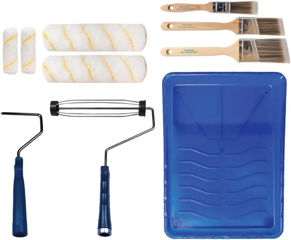
Pro Grade Paint Roller Kit, Brush & Roller for Professionals & Homeowners
Perfect for smooth finishes on your interior walls. Ideal for home improvement enthusiasts!
Buy Now on AmazonKey themes emerging across brands:
- Emotional warmth
- Nature-inspired calm
- Muted saturation
- Livable depth
Instead of extremes, brands are leaning into “soft strength” colors — shades that feel grounded, reassuring, and timeless.
What Drives Color of the Year Decisions?
Major paint brands don’t choose colors randomly. Their selections are influenced by:
- Global design movements
- Lifestyle shifts (work-from-home, wellness spaces)
- Architecture and material trends
- Fashion and art influences
- Consumer psychology
For 2026, the dominant influence is comfort-driven sophistication.
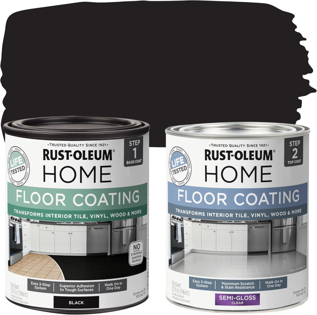
Rust-Oleum 367605 Home Interior Floor Coating Kit, Semi-Gloss Black
Ideal for updating outdated flooring at a fraction of the cost of replacement and adheres without stripping, sanding or priming.
Buy Now on AmazonThe Big 2026 Color Trend Categories
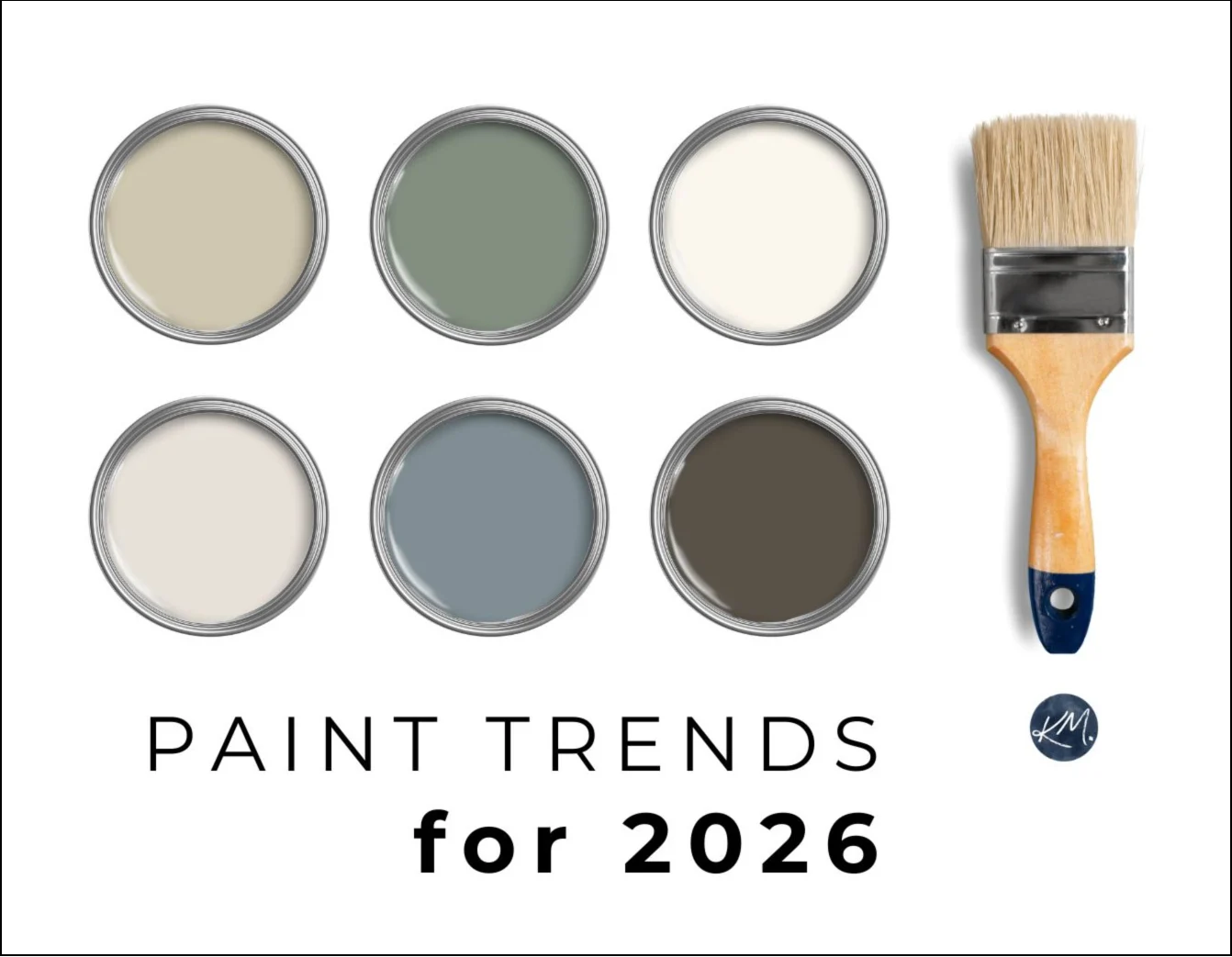
Across Sherwin-Williams, Behr, and Benjamin Moore, colors fall into these major categories:
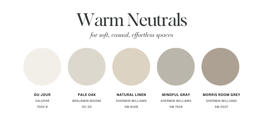
1. Warm Neutrals (But Not Beige as Usual)
- Creamy off-whites
- Soft greiges
- Mushroom and stone tones
These replace cold grays and stark whites.
2. Earthy Mid-Tones
- Clay
- Sand
- Muted terracotta
- Soft browns
They add warmth without overpowering a room.
3. Nature-Based Greens
- Olive
- Moss
- Eucalyptus
- Lichen-inspired hues
Green continues to dominate — but softer, more complex.
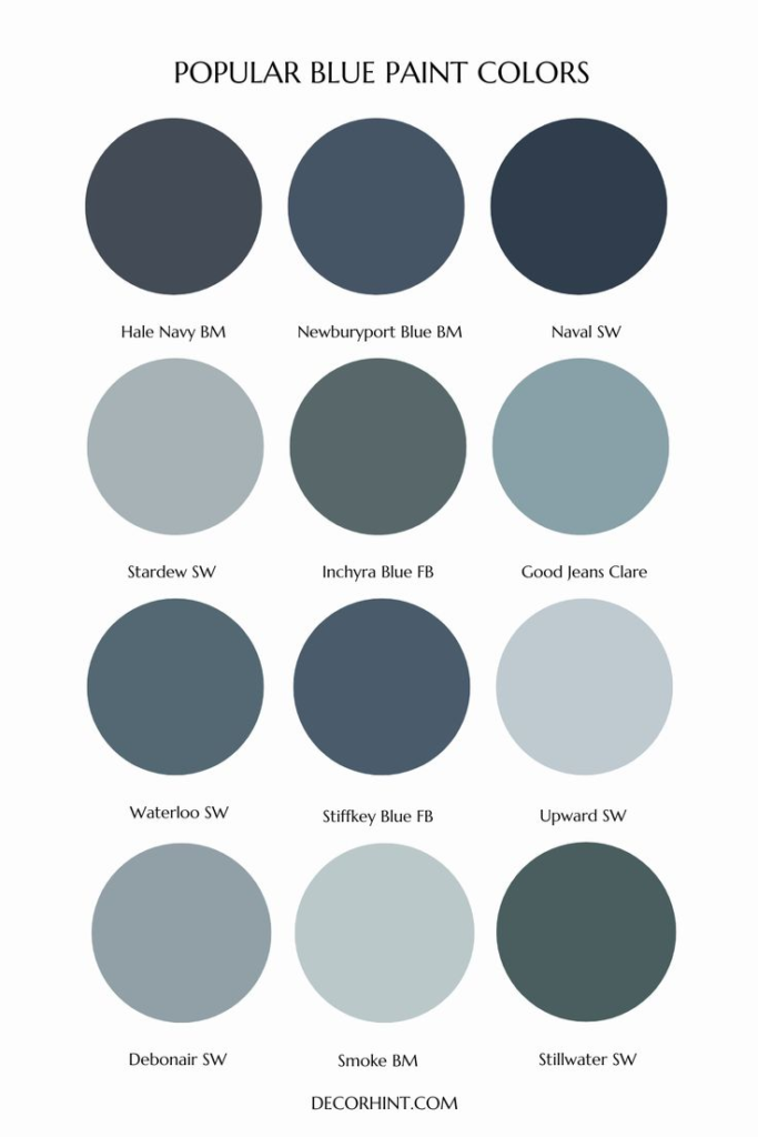
4. Deep Comfort Colors
- Inky blues
- Charcoal grays
- Smoky navy
- Soft blackened shades
These are no longer “dramatic accents” — they’re becoming main-room colors.
Why These Trends Matter for Homeowners
2026 colors are designed to:
- Work in multiple lighting conditions
- Age well over time
- Pair easily with wood, stone, and metals
- Feel cozy in winter and fresh in summer
This makes them ideal for whole-house palettes, not just feature walls.
2026 Color of the Year Breakdowns (By Brand)
🎯 Sherwin-Williams 2026 Trending Colors & Palette Direction
Sherwin-Williams continues its focus on layered, livable palettes rather than a single loud statement color.
Key Characteristics of Sherwin-Williams 2026 Colors
- Warm undertones
- Soft depth
- Subtle complexity
- Excellent performance in low light
Standout Sherwin-Williams 2026 Trend Shades
1. Warm Greige Foundations
These replace traditional gray.
Common undertones:
- Beige
- Taupe
- Mushroom
Best for:
- Open-concept homes
- Living rooms
- Hallways
2. Muted Greens with Gray Influence
Not bright or botanical — more earthy and calm.
Why they’re trending:
- Feel natural indoors
- Pair well with wood floors
- Reduce visual stress
Perfect for:
- Bedrooms
- Dining rooms
- Offices
3. Smoky Blues & Soft Charcoals
Deep but not harsh.
Why they work:
- Cozy under warm lighting
- Elegant without feeling formal
- Excellent accent or full-room colors
Sherwin-Williams 2026 Pairing Ideas
- Warm greige walls + creamy white trim
- Muted green walls + light oak furniture
- Smoky blue accent + warm neutral surrounding walls
🎯 Behr 2026 Color Trends: Approachable, Warm & Versatile
Behr’s 2026 direction focuses heavily on real-life livability.
What Sets Behr Apart in 2026
- Softer saturation
- High versatility
- Strong focus on family spaces
These colors are meant to look good all day, every day.
Behr’s Most-Loved 2026 Color Families
1. Creamy Warm Whites
Replacing stark builder whites.
Why they’re popular:
- Work in any room
- Reflect light softly
- Make small spaces feel inviting
2. Clay-Inspired Neutrals
A blend of beige, brown, and subtle red undertones.
Perfect for:
- Living rooms
- Entryways
- Dining spaces
They feel grounded and welcoming.
3. Deep, Cozy Accent Colors
Used more confidently in 2026.
Includes:
- Deep teal
- Soft charcoal
- Warm navy
These colors add personality without overpowering.
Behr 2026 Room-by-Room Favorites
- Living rooms: warm neutral base + deep accent
- Bedrooms: muted green or clay tones
- Kitchens: warm white cabinets + darker island color
🎯 Benjamin Moore 2026 Trending Palettes: Sophisticated & Timeless
Benjamin Moore leans toward heritage-inspired modernity in 2026.
Benjamin Moore 2026 Color Direction
- Rich but restrained
- Elegant neutrals
- Historical influence with modern undertones
These colors shine in architectural homes and classic interiors.
Trending Benjamin Moore Color Groups
1. Stone & Plaster Neutrals
Inspired by European interiors.
Why they’re trending:
- Soft texture effect
- Excellent depth
- Timeless appeal
2. Deep Heritage Greens & Blues
More saturated, but still warm.
Perfect for:
- Libraries
- Dining rooms
- Statement living rooms
3. Soft Charcoal & Warm Blackened Shades
Replacing pure black.
These work beautifully on:
- Interior doors
- Built-ins
- Accent walls
Benjamin Moore 2026 Pairing Tips
- Stone neutral walls + warm white trim
- Deep green walls + brass accents
- Charcoal features + light wood tones
How to Use 2026 Trending Palettes in Real Homes
Creating a 2026 Whole-House Color Palette
The key to using trend colors successfully is layering, not overusing.
A balanced palette includes:
- One main warm neutral
- One or two mid-tone supporting colors
- One deeper accent shade
This creates flow without monotony.
Best Rooms for Trending Colors in 2026
Living Rooms
- Warm greiges
- Clay neutrals
- Soft greens
These create comfort and versatility.
Bedrooms
- Muted greens
- Soft blues
- Cozy mid-tones
Perfect for rest and relaxation.
Kitchens
- Warm white cabinets
- Deeper island colors
- Soft neutral walls
2026 kitchens feel warm, not sterile.
Bathrooms
- Stone-inspired neutrals
- Soft gray-beige blends
- Subtle contrast trim
Spa-like without feeling cold.
Trim & Finish Trends for 2026
Trim Colors
- Creamy whites
- Soft greiges
- Monochrome trim (same as wall color)
Bright white trim is fading in popularity.
Paint Finishes
- Eggshell and satin for walls
- Soft semi-gloss for trim
- Matte accents for depth
Finish choice matters as much as color.
Mistakes to Avoid with Trend Colors
❌ Using cool gray undertones
❌ Overusing dark colors without balance
❌ Pairing warm walls with stark white trim
❌ Ignoring lighting conditions
Trends work best when adapted to your home, not copied blindly.
Final Thoughts: 2026 Colors Are Designed for Real Life
The biggest takeaway from 2026 trending colors is this:
These colors are meant to be lived in, not just admired.
Across Sherwin-Williams, Behr, and Benjamin Moore, the focus is on:
- Warmth
- Depth
- Comfort
- Longevity
Whether you’re repainting one room or planning a whole-house refresh, the 2026 palettes offer flexibility, elegance, and emotional warmth that will stay relevant for years.

