(And what to do instead if you want your space to look expensive, cozy, and Pinterest-worthy)
🎯 Let’s Start With the Truth No One Tells You…
Here’s the thing…
You can have the nicest couch, the trendiest coffee table, and the cutest decor from your latest Target run—but if your paint color is off, the whole room just feels… wrong.
Flat. Awkward. Cheap, even.
And if you’ve ever painted a living room, stepped back, and thought “Wait… why does this look nothing like the inspo pic?” — you’re not alone.

Pro Grade Paint Roller Kit, Brush & Roller for Professionals & Homeowners
Perfect for smooth finishes on your interior walls. Ideal for home improvement enthusiasts!
Buy Now on Amazon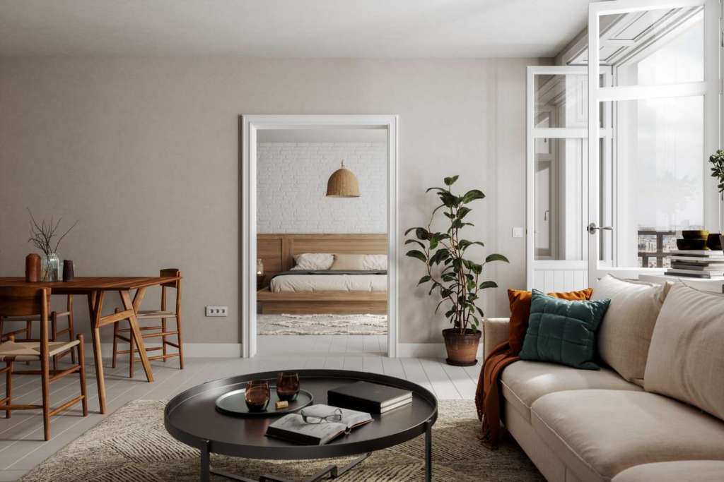
Designers see the same paint mistakes over and over again. And honestly? Most of them are super easy to avoid once you know what to look for.
So before you grab that paint roller, let’s talk about the 7 living room paint mistakes designers absolutely hate—and how to fix them like a pro.

❌ 1. Choosing Paint Before Anything Else
“This is the mistake that ruins everything.”
Let’s be real…
Paint feels like the starting point. It’s exciting. It’s transformative. It’s cheap-ish compared to furniture.

Rust-Oleum 367605 Home Interior Floor Coating Kit, Semi-Gloss Black
Ideal for updating outdated flooring at a fraction of the cost of replacement and adheres without stripping, sanding or priming.
Buy Now on AmazonBut here’s the reality:
Paint should be the LAST thing you choose—not the first.
Why?
Because it’s way easier to match paint to your furniture than the other way around.
What Goes Wrong:
- Your sofa clashes with your walls
- Your rug looks “off” but you can’t figure out why
- Nothing feels cohesive
What To Do Instead:
Pick your key pieces first:
- Sofa
- Rug
- Curtains
- Artwork
Then choose a paint color that ties everything together.
💬 “Paint is the background, not the star of the show.”
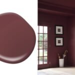
❌ 2. Ignoring Undertones (This One Sneaks Up on You)
“Why does my beige look pink?!”
Most people don’t realize this, but…
Every paint color has an undertone. And if you ignore it, things can go very wrong.
Common Undertones:
- Warm (yellow, red, orange)
- Cool (blue, green, purple)
- Neutral (balanced, but still slightly leaning)
Real-Life Disaster:
You pick a “perfect” gray…
Then at night, it suddenly looks purple or blue 😬
Why It Happens:
Lighting + surrounding colors = undertone chaos
What To Do Instead:
- Compare paint swatches side by side
- Look at them morning, afternoon, and night
- Place them next to your furniture
🎨 Popular safe neutrals:
- “Accessible Beige” (warm greige vibe)
- “Repose Gray” (soft, balanced gray)
💬 “It’s not the color you see—it’s the undertone you don’t.”
❌ 3. Testing Paint the Wrong Way
“Tiny swatches lie. Big time.”
If you’ve ever painted a little square on your wall and thought, “Yep, that’s it!”…
Trust me… that sample probably betrayed you.
Why Small Samples Don’t Work:
- They don’t reflect full-room lighting
- Your eye can’t fully process the color
- Surrounding wall color interferes
The Better Way:
Go BIG.
- Paint at least a 2×2 ft section
- Test on multiple walls
- Or use peel-and-stick samples
Watch how it changes throughout the day.
💬 “A paint color isn’t a color—it’s a mood that shifts with light.”
❌ 4. Going Too White (Yes, It’s a Thing)
“White isn’t always safe.”
You’ll love this…
White walls can look stunning—but only if you pick the right one.
Because not all whites are created equal.
What Goes Wrong:
- Stark white = cold, sterile, hospital vibes
- Wrong undertone = yellow or blue cast
Common Mistake:
Choosing a bright white thinking it’ll make the room feel bigger…
…but it ends up feeling harsh and empty.
What To Do Instead:
Look for soft whites with warmth:
- Creamy whites
- Off-whites
- Warm whites with subtle beige undertones
💬 “The right white feels like a hug. The wrong one feels like a spotlight.”
❌ 5. Ignoring Lighting (This Changes EVERYTHING)
“Same paint. Totally different room.”
Here’s something designers obsess over…
Lighting. Changes. Everything.
The same color can look:
- Bright and airy in one room
- Dark and muddy in another
Why?
Because light direction matters:
- North-facing rooms → cooler, darker
- South-facing rooms → warm and bright
- Artificial light → can shift undertones
What To Do:
Test your paint in:
- Morning light
- Afternoon sun
- Night with lamps on
💡 Pro Tip:
If your living room lacks natural light, avoid super cool tones—they can feel dull.
💬 “Paint doesn’t exist without light. Ever.”
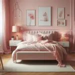
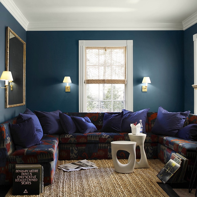
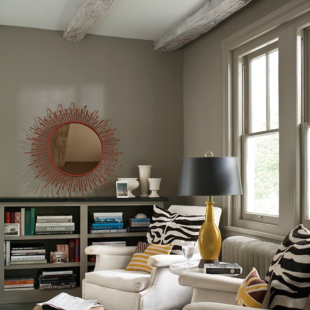
❌ 6. Playing It Too Safe (And Ending Up Boring)
“Beige overload is real.”
Let’s be honest…
A lot of living rooms look the same.
Safe beige walls. Safe gray couch. Safe everything.
And while “safe” sounds good… it can make your space feel forgettable.
What Designers Wish You’d Do:
Take a tiny risk.
You don’t need to go bold red or neon green—but you can:
- Try a deeper neutral
- Add a moody accent wall
- Use earthy tones like olive, clay, or navy
Trending Shades Right Now:
- Warm greige
- Soft sage green
- Dusty blue
- Muted terracotta
💬 “Safe is fine. Memorable is better.”
❌ 7. Forgetting the Whole Room Flow
“Your living room doesn’t live alone.”
If you’ve ever walked through a house and felt like each room was from a different universe…
Yeah. That’s a paint flow problem.
What Happens:
- Living room = cool gray
- Kitchen = warm beige
- Hallway = random white
Result? Visual chaos.
What To Do:
Create a color story across your home.
- Stick to similar undertones
- Use complementary shades
- Repeat colors subtly in decor
💬 “Your home should feel like one story—not seven different chapters.”
🎨 Bonus Section: Paint Choices That Always Look Expensive
Let’s flip things for a second…
Instead of mistakes, here are designer-approved choices that almost always work:
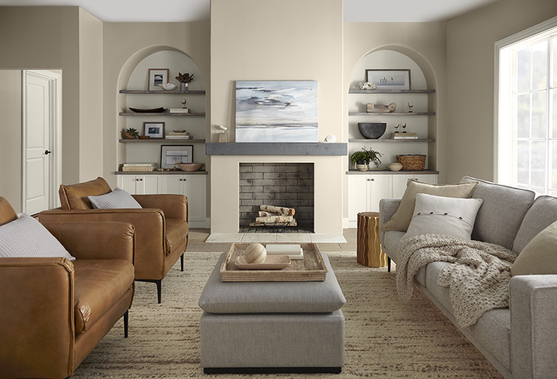
✨ Go-To Living Room Colors:
- Warm greige (cozy + modern)
- Soft taupe (elevated neutral)
- Muted green (calm and organic)
- Dusty blue (subtle and classy)
✨ Foolproof Combos:
- Greige walls + white trim + wood accents
- Sage green + brass + cream textiles
- Soft gray + black accents + warm lighting
💡 Pro Tips Designers Swear By
✔ Use Sheen Strategically
- Matte → hides imperfections
- Eggshell → best for living rooms
- Satin → more durable, slight shine
✔ Don’t Forget the Ceiling
Most people paint it flat white and call it a day…
But you can:
- Go slightly warmer than your walls
- Try a soft tint for a cozy feel
✔ Sample More Than One Color
Never fall in love with just one option.
Compare at least 3–5 shades side by side.
✔ Trust Your Gut (But Test First)
If you keep coming back to a color…
There’s a reason.
Just test it properly before committing.
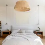
🛋️ What a “Perfect” Living Room Paint Feels Like
You walk in…
The light hits just right.
The walls feel soft—not loud, not dull.
Everything flows effortlessly.
It’s not just pretty—it feels right.
That’s what good paint does.
💬 “The best paint color is the one you don’t notice… but you feel.”
🎯 Final Thoughts: Don’t Just Pick a Color—Create a Feeling
Here’s the takeaway…
Most living room paint mistakes aren’t about bad taste.
They’re about:
- Rushing the process
- Ignoring undertones
- Not testing enough
- Playing it too safe
And the good news?
Every single one of these is fixable.
So take your time. Test your colors. Trust your eye.
And remember…
💬 “A $50 gallon of paint can either upgrade your entire home… or quietly ruin it.”
💬 Your Turn
Which mistake have you made before?
Or which paint color are you thinking about trying?
Save this before you paint—you’ll thank yourself later 😉