Are you searching for the ideal off-white paint color that combines warmth, neutrality, and versatility? Let me introduce you to Benjamin Moore Seapearl. This beautiful shade is more than just an off-white; it’s a balanced and refined color that can transform your home into a serene, welcoming space. Whether you want a clean, polished look for your interiors or a subtle, elegant finish for your exteriors, Seapearl might just be the perfect fit.

Why Off-White Paint Colors Are Timeless
Off-white paint colors have been a favorite for years, and for good reason. They are light, bright, and versatile, making them the go-to choice for homeowners and designers alike. Off-whites like Seapearl provide a fresh and neutral backdrop that pairs well with almost any décor style. Whether your home is modern, traditional, or somewhere in between, off-white paint colors can adapt seamlessly to your vision.
I’ve always appreciated off-whites for their ability to bring brightness into a room without feeling stark or overwhelming. Unlike pure whites that can sometimes feel too sterile, off-whites like Seapearl strike a balance between clean and cozy. This makes them an excellent choice for both formal and casual spaces.
What Makes Seapearl Stand Out
Seapearl is not your average off-white. What sets it apart is its ability to balance warm and cool undertones in a way that feels effortless. It’s a shade that adapts to its surroundings, creating a dynamic effect depending on the lighting in the room.
For example, in rooms with abundant natural light—like south-facing spaces—Seapearl takes on a soft, creamy tone that feels inviting and warm. On the other hand, in rooms with less natural light—like north-facing spaces—it shifts toward its cooler gray undertones, giving it a fresh, modern vibe. This ability to adapt makes it a versatile choice for both traditional and contemporary homes.

Pro Grade Paint Roller Kit, Brush & Roller for Professionals & Homeowners
Perfect for smooth finishes on your interior walls. Ideal for home improvement enthusiasts!
Buy Now on AmazonIf you’re like me and love a paint color that can create different moods in different spaces, you’ll appreciate Seapearl’s versatility. It’s the kind of color that works just as beautifully in a bright, open kitchen as it does in a cozy, dimly lit bedroom.
How Seapearl Interacts with Light
One of the most fascinating aspects of Seapearl is how it interacts with light. The way a paint color looks on your walls can change dramatically depending on the type and amount of light it receives. This is especially true for off-whites like Seapearl, which have subtle undertones that can shift based on their environment.
In bright, sunny rooms, Seapearl leans warm and creamy. The natural light enhances its yellow undertones, giving the room a soft, inviting glow. This makes it an excellent choice for spaces where you want to create a cozy and welcoming atmosphere.
In contrast, in rooms with cooler, dimmer lighting, Seapearl takes on a more subdued, grayish tone. This cooler side of Seapearl adds a touch of sophistication and modernity, making it a great option for minimalist spaces or rooms with a contemporary design aesthetic.

Rust-Oleum 367605 Home Interior Floor Coating Kit, Semi-Gloss Black
Ideal for updating outdated flooring at a fraction of the cost of replacement and adheres without stripping, sanding or priming.
Buy Now on AmazonIf you’re unsure how Seapearl will look in your space, I highly recommend testing it with a sample. Paint swatches can give you a clearer idea of how the color will behave under your specific lighting conditions.

Where to Use Seapearl in Your Home
Seapearl’s adaptability makes it suitable for virtually any room in your home. It’s one of those rare paint colors that can work as both a statement color and a neutral backdrop. Here are some ideas for how to incorporate Seapearl into your home:
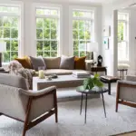
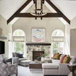
Living Rooms
In living rooms, Seapearl creates a clean, polished look that pairs beautifully with both modern and traditional furniture. Its warm undertones make the space feel inviting, while its subtle gray hues add a touch of sophistication.
Bedrooms
For bedrooms, Seapearl is an excellent choice for creating a serene and restful atmosphere. Its soft, neutral tones are calming and versatile, allowing you to pair it with a wide range of bedding and décor styles.
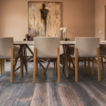
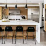
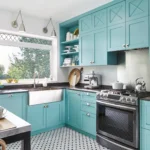
Kitchens
Seapearl works wonderfully in kitchens, especially when paired with white cabinetry or natural wood finishes. It provides a light and airy feel that makes the space look larger and more open.
Bathrooms
In bathrooms, Seapearl’s balance of warm and cool tones creates a spa-like ambiance. Pair it with crisp white trim and fixtures for a clean, elegant look.
Home Exteriors
Seapearl isn’t just for interiors—it’s also a fantastic option for home exteriors. Its soft, neutral tones complement a variety of architectural styles, from modern to farmhouse to colonial.
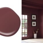
Pairing Seapearl with Other Colors
One of the reasons Seapearl is so versatile is its ability to pair well with other colors. Whether you prefer bold, dramatic accents or soft, understated tones, Seapearl provides the perfect neutral backdrop.
Coordinating Colors
Seapearl pairs beautifully with a range of colors, including:
- Soft blues and greens for a calming, coastal vibe.
- Warm neutrals like beige and taupe for a cozy, earthy feel.
- Bold accents like navy blue or charcoal gray for a modern, dramatic look.
Trim Colors
For trim, you can opt for a crisp white to create contrast, or use Seapearl itself in a semi-gloss finish for a seamless, tone-on-tone look. Some popular trim colors to pair with Seapearl include:
- Benjamin Moore Simply White
- Sherwin Williams Extra White
- Behr Ultra Pure White
Comparing Seapearl to Similar Colors
When it comes to off-whites, there are many options to choose from. Here’s how Seapearl compares to some popular alternatives:
Seapearl vs. Classic Gray
While both are part of Benjamin Moore’s off-white collection, Seapearl leans warmer, whereas Classic Gray has cooler, more neutral undertones.
Seapearl vs. Dove Wing
Dove Wing is slightly warmer and lighter than Seapearl, making it a better choice for spaces with very little natural light.
Seapearl vs. Swiss Coffee
Swiss Coffee is a brighter, creamier off-white, while Seapearl has more depth and a slightly cooler tone.
Why Seapearl Is Worth Considering
Choosing the right paint color can be overwhelming, but Benjamin Moore Seapearl makes the decision easier. Its ability to adapt to different lighting conditions and pair well with a variety of colors makes it a versatile and reliable choice for any home.
Whether you’re updating a single room or giving your entire home a fresh new look, Seapearl offers the perfect balance of warmth and neutrality. It’s a timeless shade that will make your home feel polished, cozy, and inviting for years to come.
So, why not give Seapearl a try? With its subtle beauty and endless versatility, it just might be the off-white you’ve been searching for.