Choosing the right neutral paint color can be surprisingly difficult. Many homeowners want a color that feels bright but not stark, warm but not yellow, and versatile enough to work in multiple rooms. That’s exactly why Sherwin-Williams Natural Choice SW 7011 has become one of the most loved warm off-whites among designers and homeowners.
Natural Choice sits in that perfect middle ground between creamy white and light beige. It has a gentle warmth that makes a room feel inviting without overpowering the space. Whether you’re designing a cozy living room, a calm bedroom, or a welcoming kitchen, this color can serve as a beautiful foundation.
But what truly makes Natural Choice special is how well it pairs with other colors. When combined with the right coordinating shades, it can create palettes that feel modern, elegant, and timeless.
In this complete guide, we’ll explore everything you need to know about Sherwin-Williams Natural Choice, including its undertones, lighting behavior, best uses in the home, and the best coordinating colors to pair with it.
What Color Is Sherwin-Williams Natural Choice?
Sherwin-Williams Natural Choice SW 7011 is a soft warm off-white with gentle beige undertones. It belongs to the warm neutral family and sits comfortably between true white and light greige.

Pro Grade Paint Roller Kit, Brush & Roller for Professionals & Homeowners
Perfect for smooth finishes on your interior walls. Ideal for home improvement enthusiasts!
Buy Now on AmazonUnlike stark whites that can feel cold or clinical, Natural Choice has a subtle warmth that helps rooms feel comfortable and welcoming.
Key characteristics
Color family: Warm off-white
Undertones: Beige with slight greige influence
LRV (Light Reflectance Value): 73
Depth: Light
The high LRV means Natural Choice reflects a large amount of light, which helps brighten rooms and make spaces feel larger.
This makes it an excellent option for homes that want a light neutral without the sharpness of bright white paint.

Rust-Oleum 367605 Home Interior Floor Coating Kit, Semi-Gloss Black
Ideal for updating outdated flooring at a fraction of the cost of replacement and adheres without stripping, sanding or priming.
Buy Now on AmazonUndertones of Natural Choice
Understanding undertones is essential when choosing coordinating colors.
Natural Choice contains soft beige undertones with a touch of greige. These undertones give it a creamy softness while still feeling modern and balanced.
Depending on lighting conditions, you might notice slight variations:
- In warm lighting, the beige undertones become more noticeable.
- In cooler lighting, it can appear closer to a soft greige.
- In bright natural light, it reads as a warm creamy white.
This adaptability makes Natural Choice extremely versatile across different interior styles.
How Lighting Affects Natural Choice
Lighting plays a huge role in how any paint color appears, and Natural Choice is no exception.
North-facing rooms
North-facing spaces tend to have cooler light. In these rooms, Natural Choice may appear slightly more gray or muted.
South-facing rooms
South-facing spaces receive warm sunlight, which enhances the creamy warmth of Natural Choice and makes the color feel cozy and inviting.
East-facing rooms
Morning sunlight will brighten the color, while afternoon shadows may make it appear softer.
West-facing rooms
Afternoon sunlight will warm the color significantly, bringing out the beige undertones.
Because Natural Choice reflects light well, it works especially well in rooms that need brightness without harsh white walls.
Why Designers Love Natural Choice
Interior designers often recommend Natural Choice because it solves a common design problem: finding a white that feels warm but not yellow.
Many popular whites either lean too cool or too creamy. Natural Choice sits right in the middle, creating a neutral backdrop that works with many materials and colors.
Reasons designers choose it
• Soft warmth without yellow tones
• Works with wood tones and natural materials
• Brightens rooms while remaining cozy
• Versatile enough for many design styles
This balance makes Natural Choice suitable for modern farmhouse, transitional, traditional, coastal, and contemporary homes.
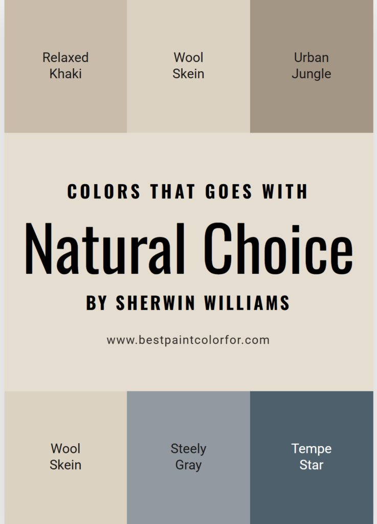
Best Colors That Pair With Sherwin-Williams Natural Choice
While Natural Choice works beautifully on its own, pairing it with complementary colors can elevate your entire interior palette.
Below are some of the best coordinating colors.
1. Greek Villa – A Soft and Elegant White
Greek Villa is another warm white that pairs beautifully with Natural Choice.
This color is slightly brighter and cleaner, which makes it perfect for trim and ceilings.
Why it works
Greek Villa maintains the warmth of Natural Choice while providing just enough contrast to define architectural details.
Best uses
• Trim and baseboards
• Interior doors
• Ceilings
• Cabinets
Using Natural Choice on walls with Greek Villa trim creates a soft, elegant designer palette.
2. Accessible Beige – A Classic Neutral Pairing
Accessible Beige is one of Sherwin-Williams’ most popular greige colors, and it pairs beautifully with Natural Choice.
This mid-tone neutral adds depth while maintaining the warm undertones of the palette.
Why it works
The two colors share warm undertones, which allows them to transition smoothly from room to room.
Best uses
• Living rooms
• Hallways
• Adjacent spaces
• Open floor plans
Accessible Beige works especially well if you want slightly darker neutral rooms connected to Natural Choice spaces.
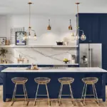
3. Urbane Bronze – A Bold and Sophisticated Accent
If you want contrast, Urbane Bronze is an excellent companion color.
This deep brown-gray creates a dramatic contrast with the light warmth of Natural Choice.
Where to use Urbane Bronze
• Kitchen islands
• Accent walls
• Fireplace surrounds
• Interior doors
Together, these two colors create a modern, sophisticated palette that feels both warm and contemporary.
4. Sea Salt – A Soft Coastal Green
For a calming and natural look, Sea Salt pairs beautifully with Natural Choice.
Sea Salt is a muted green-blue that brings a peaceful, airy feeling to interiors.
Why it works
The soft coolness of Sea Salt balances the warmth of Natural Choice, creating a harmonious color palette.
Best rooms for this combination
• Bedrooms
• Bathrooms
• Coastal-style living rooms
This palette creates a light, relaxing atmosphere.
5. Smoky Blue – A Subtle Cool Accent
Smoky Blue is another beautiful coordinating color for Natural Choice.
This muted blue-gray introduces a soft cool tone that balances the warmth of Natural Choice.
Best uses
• Accent walls
• Home offices
• Bedrooms
• Decorative furniture pieces
It adds just enough color without overwhelming the neutral palette.
6. Analytical Gray – A Perfect Transitional Neutral
Analytical Gray is a warm gray with subtle green undertones.
It sits deeper than Natural Choice but still feels soft and neutral.
Why it works
Both colors share similar undertones, allowing them to transition smoothly between rooms.
Ideal uses
• Dining rooms
• Entryways
• Hallways
• Living spaces
This pairing works well in homes that want layered neutrals.
Creating a Designer Color Palette With Natural Choice
Here is an example palette that works beautifully in many homes.
Walls
Natural Choice SW 7011
Trim and ceilings
Greek Villa SW 7551
Secondary neutral
Accessible Beige SW 7036
Accent color
Smoky Blue SW 7604
Bold contrast
Urbane Bronze SW 7048
This palette combines warm neutrals, cool accents, and dramatic depth.
Best Rooms to Use Sherwin-Williams Natural Choice
Natural Choice works well in nearly every room of the house.
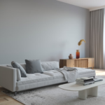
Living Rooms
In living rooms, Natural Choice creates a welcoming backdrop for furniture, art, and décor.
It pairs especially well with:
• Warm wood furniture
• Linen fabrics
• Neutral rugs
• Brass lighting
The result is a cozy yet sophisticated space.
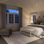
Bedrooms
Natural Choice is perfect for bedrooms because of its calming warmth.
The color feels soft and relaxing without being dull.
Pair it with:
• Soft gray bedding
• Light wood furniture
• Muted blue accents
This combination creates a peaceful retreat.
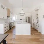
Kitchens
Natural Choice is also an excellent kitchen color.
It works beautifully with both white and darker cabinetry.
Popular kitchen combinations
Natural Choice walls
White cabinets
Urbane Bronze island
This combination creates a clean yet warm kitchen design.
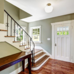
Hallways and Entryways
Because of its high LRV, Natural Choice helps brighten narrow hallways and entry spaces.
It reflects light beautifully and prevents small areas from feeling dark.
Natural Choice in Open Floor Plans
Many modern homes feature open floor plans where multiple rooms connect visually.
Natural Choice works extremely well in these layouts because it coordinates easily with many colors.
You can use it as a main wall color and transition into deeper neutrals or accent colors in adjoining spaces.
This creates flow without making the entire home feel identical.
Materials That Pair Beautifully With Natural Choice
Natural Choice looks especially beautiful when paired with natural textures.
Great materials include:
• Light oak flooring
• Walnut furniture
• Marble countertops
• Linen fabrics
• Woven baskets
• Brass or bronze hardware
These materials enhance the warmth and elegance of the color.
Common Mistakes to Avoid
While Natural Choice is versatile, there are a few design mistakes to avoid.
Pairing with very cool whites
Cool whites can clash with the warm undertones of Natural Choice.
Using it in very dark rooms without contrast
Because it’s a soft color, pairing it with darker accents can help maintain depth.
Ignoring lighting conditions
Always test the paint in your space before committing.
Paint swatches can look very different depending on lighting.
Is Natural Choice a Good Whole-House Color?
Yes, Natural Choice can absolutely work as a whole-house color.
Because it sits between white and beige, it connects rooms beautifully without overwhelming the design.
It works especially well in homes that want:
• Warm neutral walls
• Soft transitions between rooms
• A timeless color palette
Many designers use it as a main neutral foundation throughout an entire home.
Natural Choice vs Similar Sherwin-Williams Colors
Homeowners often compare Natural Choice with other popular warm whites.
Natural Choice vs Alabaster
Alabaster is slightly brighter and cleaner, while Natural Choice has more beige warmth.
Natural Choice vs Shoji White
Shoji White leans more greige and slightly darker.
Natural Choice vs Greek Villa
Greek Villa is brighter and creamier, making it great for trim.
Understanding these differences can help you choose the best color for your space.
Final Thoughts
Sherwin-Williams Natural Choice SW 7011 is one of the most versatile warm off-white paint colors available today.
Its subtle beige undertones give it a softness that many stark whites lack, while its brightness helps spaces feel open and airy.
When paired with the right coordinating colors—such as Accessible Beige, Greek Villa, Urbane Bronze, Sea Salt, and Smoky Blue—it creates palettes that feel elegant, balanced, and timeless.
Whether you’re painting a single room or designing an entire home color scheme, Natural Choice provides a beautiful foundation that works with many styles and materials.
If you’re looking for a warm neutral that feels both classic and modern, Natural Choice may be the perfect paint color for your home.