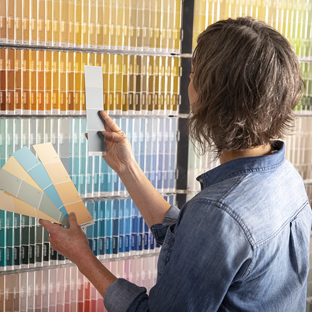
Let’s be real… choosing a paint color should be the fun part of decorating your home. But somehow, it turns into one of the most stressful decisions ever.
You stand in the paint aisle staring at what feels like 400 versions of “white”… and suddenly your confidence disappears.
Is it too warm? Too cold? Too gray? Too… beige?
Here’s the thing…
Paint can either make your home look like a magazine… or like something just feels “off” and you can’t explain why.

Pro Grade Paint Roller Kit, Brush & Roller for Professionals & Homeowners
Perfect for smooth finishes on your interior walls. Ideal for home improvement enthusiasts!
Buy Now on AmazonAnd trust me—I’ve seen this go wrong so many times.
So before you open that paint can, grab a coffee and read this guide. It’s going to save you time, money, and probably a minor meltdown.
This One Decision Changes Everything
If you remember nothing else from this guide, remember this:
“Paint isn’t just a color. It’s a feeling.”

Rust-Oleum 367605 Home Interior Floor Coating Kit, Semi-Gloss Black
Ideal for updating outdated flooring at a fraction of the cost of replacement and adheres without stripping, sanding or priming.
Buy Now on Amazon
The same gray can feel:
- Cozy in one home
- Cold in another
- Elegant in one room
- Completely dull in the next
Why? Because paint doesn’t exist alone. It reacts to:
- Lighting
- Furniture
- Flooring
- Even the direction your windows face
So choosing paint without considering these? That’s where most people go wrong.
The Undertone Secret Nobody Talks About
Let’s talk about the sneaky thing ruining your paint choices: undertones.
If you’ve ever painted a wall gray and it suddenly looked purple… yep, that’s undertones messing with you.
Here’s a simple breakdown:
- Warm undertones → yellow, red, beige
- Cool undertones → blue, green, violet
- Neutral/greige → a mix of both
Here’s the problem…
Most people choose a color based on how it looks on the swatch, not how it behaves on their wall.
“A color can look perfect in the store… and completely wrong at home.”
The Lighting Trick That Changes Everything
Lighting is everything. Seriously.
If you’ve ever felt like your wall color looks different in the morning vs evening—you’re not imagining it.
Natural Light:
- North-facing rooms → cooler, darker
- South-facing rooms → warm, bright
- East-facing → soft morning light
- West-facing → warm evening glow
Artificial Light:
- Warm bulbs → make colors look cozier
- Cool bulbs → make colors look sharper (sometimes harsh)
Pro Tip:
Paint a sample on multiple walls and check it at different times of day.
You’ll love this—because it prevents that “why does this look green at night?” moment.
The Mistake Everyone Makes
Let me guess…
You picked a color based on:
- A Pinterest photo
- A friend’s house
- A tiny paint chip
Yeah… don’t do that.
Here’s why:
“Colors don’t copy-paste well between homes.”
Your flooring, lighting, and furniture are completely different.
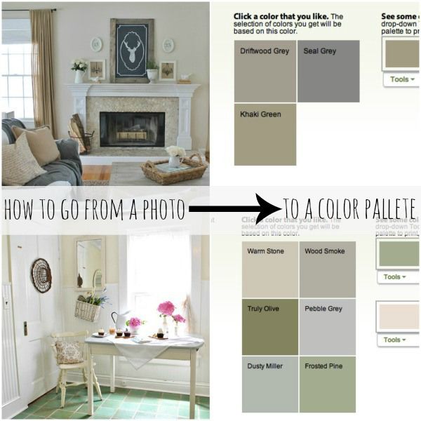
One of the easiest ways to fix this?
Start with what you already have.
Look at your:
- Couch
- Rugs
- Cabinets
- Countertops
Then choose paint that works with them, not against them.
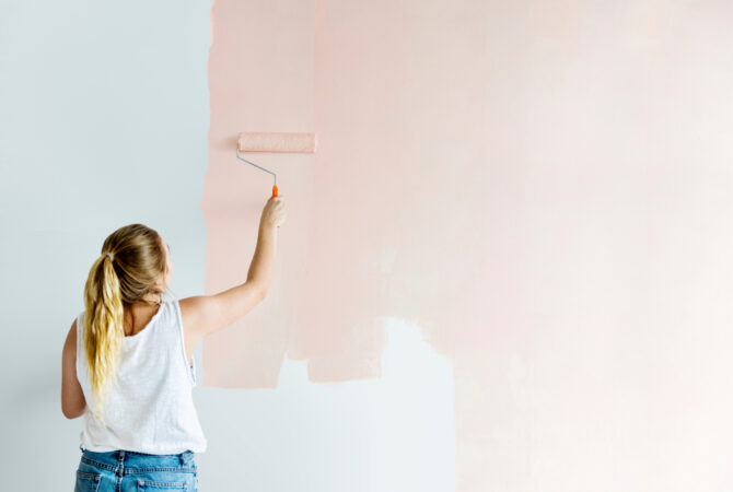
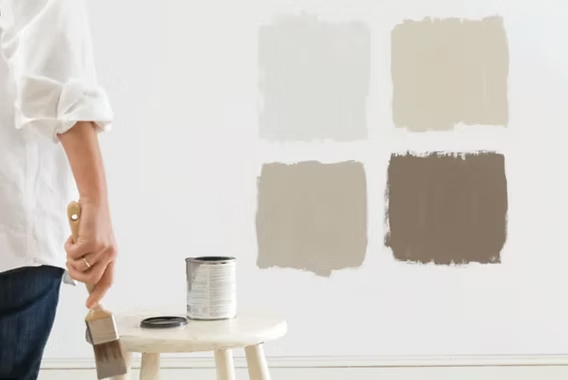
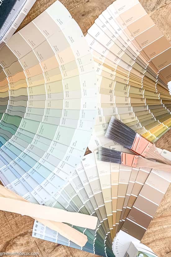
Why Sample Paints Are Non-Negotiable
If you skip this step… you will regret it.
Small paint chips lie. Big time.
Instead:
- Buy sample sizes
- Paint large swatches (at least 2×2 ft)
- Move around your room
“The bigger the sample, the more honest the color.”
Trust me—this step alone can save you from repainting an entire room.
This Color Is Blowing Up Right Now
Let’s talk trends—but in a smart way.
Right now, warm neutrals and soft greiges are everywhere.
Think:
- Creamy whites
- Warm taupes
- Soft beige-grays
Why?
Because they feel:
- Cozy
- Timeless
- Not sterile like cool grays
Paint brands like Sherwin-Williams and Behr are leaning heavily into these tones—and honestly, for good reason.
“Cool gray had its moment… warm neutrals are taking over.”

White Paint Isn’t Just White
If you’ve ever tried choosing white paint… you already know the struggle.
There are:
- Warm whites
- Cool whites
- Creamy whites
- Bright whites
And yes—they all look different on your wall.
Quick Cheat Sheet:
- Want cozy? → go warm white
- Want modern/crisp? → go cool white
- Want safe? → go neutral white
Most people don’t realize this, but…
“The wrong white can make your home feel sterile instead of stylish.”
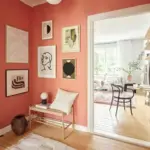
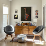
The Living Room Rule You Should Never Break
Your living room is where everything comes together.
So here’s the rule:
Don’t go too dark or too bold unless you’re 100% sure.
Why?
Because this space:
- Gets the most use
- Needs flexibility
- Sets the tone for your whole home
Safe (but beautiful) options:
- Greige
- Warm beige
- Soft muted green
These colors feel elevated without overwhelming the space.
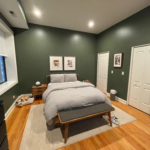
Bedrooms Should Feel Like a Hug
Let’s be honest… your bedroom should feel like a retreat.
Not a showroom. Not a statement piece. A vibe.
Think:
- Soft blues
- Warm neutrals
- Dusty pinks
- Muted greens
“If your bedroom color doesn’t make you exhale… it’s not the right one.”
Avoid:
- Harsh whites
- Neon tones
- Overly dark shades (unless done intentionally)
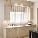
Kitchens Need a Different Strategy
Kitchens are tricky.
Why? Because they already have:
- Cabinets
- Countertops
- Backsplashes
So your paint needs to fit into the puzzle.
Easy Wins:
- White or off-white → always works
- Light greige → modern but safe
- Soft sage → adds personality without chaos
Pro Tip:
Match your undertones with your cabinets.
Warm cabinets? Choose warm paint.
Cool cabinets? Stick with cool tones.
The Bold Accent Wall Debate
Accent walls… yes or no?
Here’s the truth:
They can look amazing—or very 2015.
If you’re going bold, do it right:
- Choose a meaningful wall (like behind a bed or sofa)
- Keep other walls neutral
- Use rich, deep tones
Great accent colors:
- Navy
- Charcoal
- Forest green
“A good accent wall feels intentional. A bad one feels random.”
Why Your Paint Looks “Dirty”
Ever painted a wall and thought…
“Why does this look kind of… muddy?”
That’s usually because:
- The undertone clashes with your flooring
- The lighting dulls the color
- The shade is too muted for the space
One of the easiest fixes?
Go slightly lighter or cleaner than your first choice.
Gloss Level Matters More Than You Think
Color gets all the attention—but finish matters too.
Here’s a quick breakdown:
- Flat → soft, hides imperfections
- Eggshell → subtle shine, great for living rooms
- Satin → durable, good for kitchens
- Semi-gloss → best for trim and doors
“The same color can look totally different depending on the finish.”
The Exterior Color Trap
Choosing exterior paint? That’s a whole different game.
Because now you’re dealing with:
- Sunlight
- Landscaping
- Roof color
- Neighboring homes
Colors look way brighter outside.
So here’s the rule:
Go slightly darker than what you think you want.
Small Rooms Need This Trick
If you’ve ever felt like a room is too small…
Paint can fix that.
Try this:
- Use light, airy colors
- Paint walls + trim the same shade
- Avoid harsh contrasts
“The less visual interruption, the bigger the room feels.”
Dark Colors: Risky But Worth It
Let’s be real—dark paint can be intimidating.
But when done right?
It looks incredible.
Think:
- Moody bedrooms
- Dramatic dining rooms
- Cozy offices
Pro Tip:
Balance dark walls with:
- Light furniture
- Mirrors
- Good lighting
The Ceiling Trick Designers Love
Most people paint ceilings white and call it a day.
But here’s a little secret:
“Painting your ceiling a soft tint can completely transform a room.”
Ideas:
- Pale blue ceiling in a bedroom
- Warm white ceiling in a cozy space
- Slightly darker tone than walls for depth
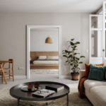
Paint First or Decor First?
This question comes up all the time.
And the answer is simple:
Decor first. Paint second.
Why?
Because it’s much easier to match paint to your furniture than the other way around.
The 3-Color Rule for a Cohesive Home
Want your home to feel put together?
Stick to this:
- 1 main neutral
- 1 secondary tone
- 1 accent color
Repeat these throughout your home.
“Consistency is what makes a home feel expensive.”
Budget-Friendly Paint Hacks
You don’t need a huge budget to get amazing results.
Try this:
- Use one color in multiple rooms
- Focus on high-impact areas first
- Refresh trim and doors for a clean look
Sometimes, a simple repaint makes your whole home feel brand new.
The Final Test Before You Commit
Before you paint the entire room, ask yourself:
- Do I like this color in the morning AND evening?
- Does it work with my furniture?
- Does it feel like the mood I want?
If the answer isn’t a confident yes… wait.
Final Thoughts: Don’t Rush This
Here’s the thing…
Paint is one of the easiest ways to transform your home—but also one of the easiest ways to get wrong.
Take your time. Test your colors. Trust your instincts.
“The right paint color doesn’t just look good… it feels right.”
And once you find it?
Everything else just falls into place.
So tell me…
Which color are you thinking about trying?
Or better yet—save this guide before you pick up that paintbrush. 🎨