If you’ve ever walked into a home and instantly felt your shoulders drop… like the world just got quieter… chances are you were standing inside a beautifully layered cottage-inspired space.
There’s something about soft whites, warm neutrals, and nature-inspired hues that feels timeless and grounding. And when it comes to curating that look, few brands do it better than Sherwin-Williams.
Today, we’re diving deep into the Sherwin-Williams Paint Palette for Modern Cottage and Farmhouse Cottage interiors—and not just listing colors, but walking through how to use them throughout your whole house. Think of this as us sitting down with coffee, flipping through paint swatches together, and designing your dream home one room at a time.
Let’s get into it.

What Is Modern Cottage Style?
Before we start choosing colors, let’s define the vibe.

Pro Grade Paint Roller Kit, Brush & Roller for Professionals & Homeowners
Perfect for smooth finishes on your interior walls. Ideal for home improvement enthusiasts!
Buy Now on AmazonModern Cottage blends:
- Classic cottage warmth
- Clean, updated lines
- Soft, natural color palettes
- A mix of old and new
It’s cozy—but not cluttered.
Relaxed—but not rustic-heavy.
Refined—but still approachable.
Farmhouse Cottage leans a little more rustic, with deeper contrasts, vintage touches, and traditional warmth. Modern Cottage feels lighter and slightly more minimal.
And the paint palette? That’s what sets the tone.

Rust-Oleum 367605 Home Interior Floor Coating Kit, Semi-Gloss Black
Ideal for updating outdated flooring at a fraction of the cost of replacement and adheres without stripping, sanding or priming.
Buy Now on AmazonThe Foundation: Soft Whites That Feel Like Home
Every great cottage palette begins with the right white. Not stark. Not sterile. But soft and livable.
1. Alabaster (SW 7008)
Alabaster
If there were an official color of Modern Cottage, this might be it.
Alabaster is:
- Creamy but not yellow
- Soft but not beige
- Clean without feeling cold
It works beautifully on:
- Entire walls
- Trim
- Cabinets
- Open concept spaces
In natural light, it glows. In artificial light, it feels warm and inviting.
Whole-house tip: Use Alabaster on walls with slightly brighter trim like Pure White for subtle contrast.
2. Pure White (SW 7005)
Pure White
This is your perfect trim and cabinet white.
It’s:
- Neutral (not blue, not yellow)
- Crisp without being harsh
- Extremely versatile
If your walls are warmer (like Accessible Beige or Agreeable Gray), Pure White creates just enough contrast to keep things fresh.
Warm Neutrals That Create Cottage Comfort
Now let’s layer in those cozy undertones.
3. Accessible Beige (SW 7036)
Accessible Beige
Don’t let the word “beige” scare you. This isn’t 1990s beige.
Accessible Beige is:
- Greige (a mix of gray and beige)
- Warm but modern
- Perfect for open layouts
It works beautifully in:
- Living rooms
- Hallways
- Entire homes
Farmhouse Cottage tip: Pair with black hardware and wood beams for contrast.
4. Agreeable Gray (SW 7029)
Agreeable Gray
This color has been wildly popular for a reason.
Agreeable Gray:
- Feels balanced
- Works in almost every lighting situation
- Is soft and calming
If you want one safe, whole-house neutral? This is it.
It transitions beautifully from room to room without visual disruption.
The Soft Green Cottage Dream
If cottage style had a signature accent family, it would be muted greens.
Nature-inspired, soothing, and timeless.
5. Clary Sage (SW 6178)
Clary Sage
This is the Modern Cottage green.
It’s:
- Muted
- Slightly gray
- Soft and earthy
Perfect for:
- Kitchen cabinets
- Bathrooms
- Accent walls
- Mudrooms
Pair it with brass hardware and warm woods and it becomes magic.
6. Evergreen Fog (SW 9130)
Evergreen Fog
This one feels deeper and more moody.
Evergreen Fog has:
- Green-gray undertones
- A velvety softness
- A cozy, enveloping feel
It works beautifully in:
- Dining rooms
- Offices
- Primary bedrooms
Modern Cottage loves this color when paired with creamy whites.
Soft Blues That Whisper, Not Shout
Cottage style doesn’t use loud blues. It leans into dusty, heritage-inspired shades.
7. Rainwashed (SW 6211)
Rainwashed
This color is like sea glass.
It has:
- Blue-green undertones
- A spa-like softness
- A calming presence
Use it in:
- Bathrooms
- Bedrooms
- Guest rooms
It pairs beautifully with Alabaster and woven textures.
8. Misty (SW 6232)
Misty
A soft gray-blue that feels clean and airy.
Perfect for:
- Smaller rooms
- Coastal cottage homes
- Laundry spaces
It’s light enough to stay bright but interesting enough to avoid looking plain.
Earthy Accent Colors for Depth
Modern Cottage isn’t all pale. It needs grounding tones too.
9. Urbane Bronze (SW 7048)
Urbane Bronze
Deep. Rich. Sophisticated.
This works beautifully on:
- Kitchen islands
- Built-ins
- Interior doors
- Fireplace surrounds
It brings farmhouse depth without going fully black.
10. Iron Ore (SW 7069)
Iron Ore
If you love contrast, this is your go-to.
Use it for:
- Exterior accents
- Interior doors
- Statement walls
- Window frames
Pair with Alabaster for a crisp farmhouse look.
Designing a Whole-House Cottage Palette
Now let’s bring it all together.
The key to whole-house cohesion is:
- Choose 1–2 main neutrals
- Choose 1 soft color family (green or blue)
- Add 1 grounding dark
- Repeat elements consistently
Here’s a sample Modern Cottage whole-house palette:
- Walls: Alabaster
- Trim: Pure White
- Kitchen cabinets: Clary Sage
- Island: Urbane Bronze
- Bedrooms: Agreeable Gray
- Bathroom: Rainwashed
- Interior doors: Iron Ore
See how everything flows? No room feels disconnected.
Room-by-Room Modern Cottage Ideas
Let’s walk through your house together.
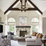
Living Room
Best wall choices:
- Alabaster
- Accessible Beige
- Agreeable Gray
Layer in:
- Linen sofas
- Warm woods
- Textured throws
- Matte black lighting
Keep the palette calm and let texture shine.
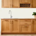
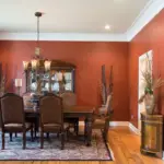
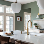
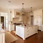
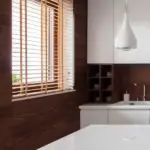
Kitchen
Two main directions:
Light & Airy:
- Walls: Alabaster
- Cabinets: Pure White
- Island: Clary Sage
Moody Cottage:
- Walls: Agreeable Gray
- Cabinets: Evergreen Fog
- Island: Urbane Bronze
Add brass or matte black hardware for farmhouse charm.
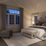
Primary Bedroom
Think soft and serene.
Top picks:
- Rainwashed
- Misty
- Evergreen Fog
Use layered bedding, natural fiber rugs, and warm lamps.
The goal? Cozy retreat energy.
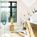
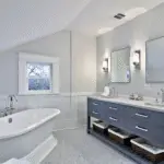
Bathroom
Cottage bathrooms are spa-inspired.
Try:
- Rainwashed
- Clary Sage
- Alabaster with dark vanity
Add:
- Vintage mirrors
- Brass fixtures
- Woven baskets
Home Office
Want calm focus?
Use:
- Evergreen Fog
- Agreeable Gray
- Iron Ore accent wall
Cottage offices feel grounded, not corporate.
Modern Cottage vs Farmhouse Cottage
Let’s clarify the subtle difference.
Modern Cottage:
- Lighter
- More muted
- Cleaner lines
- Softer contrast
Farmhouse Cottage:
- Stronger contrast
- More black accents
- Warmer woods
- Slightly more rustic
Both use similar base colors—but styling makes the difference.
Lighting Matters (A Lot)
Here’s something most people forget.
Paint changes drastically based on lighting.
North-facing rooms:
- Feel cooler
- Work well with warm whites
South-facing rooms:
- Feel brighter
- Can handle grays and deeper greens
Always sample first.
The Emotional Impact of Cottage Colors
Let’s be honest.
We don’t just pick paint colors for looks.
We pick them for how they make us feel.
Soft whites = peace
Warm greige = comfort
Muted greens = grounding
Dusty blues = calm
Deep bronze = security
Cottage palettes aren’t trendy. They’re emotional.
And that’s why they last.
Common Mistakes to Avoid
- Going too stark white
- Mixing warm and cool undertones incorrectly
- Using too many accent colors
- Forgetting about trim color
- Skipping sample testing
Keep it simple. Cottage style thrives on restraint.
If You Want a Foolproof Palette…
Here’s a no-fail Modern Cottage setup:
Walls: Alabaster
Trim: Pure White
Accent: Clary Sage
Depth: Urbane Bronze
You honestly can’t go wrong.
Final Thoughts: Creating a Home That Feels Like a Hug
Modern Cottage and Farmhouse Cottage interiors aren’t about perfection.
They’re about:
- Comfort
- Warmth
- Natural beauty
- Livable elegance
And the right Sherwin-Williams paint palette makes that effortless.
Start with a soft white.
Layer in warm neutrals.
Add a whisper of green or blue.
Ground it with a deep accent.
And suddenly… your home doesn’t just look beautiful.
It feels like you.