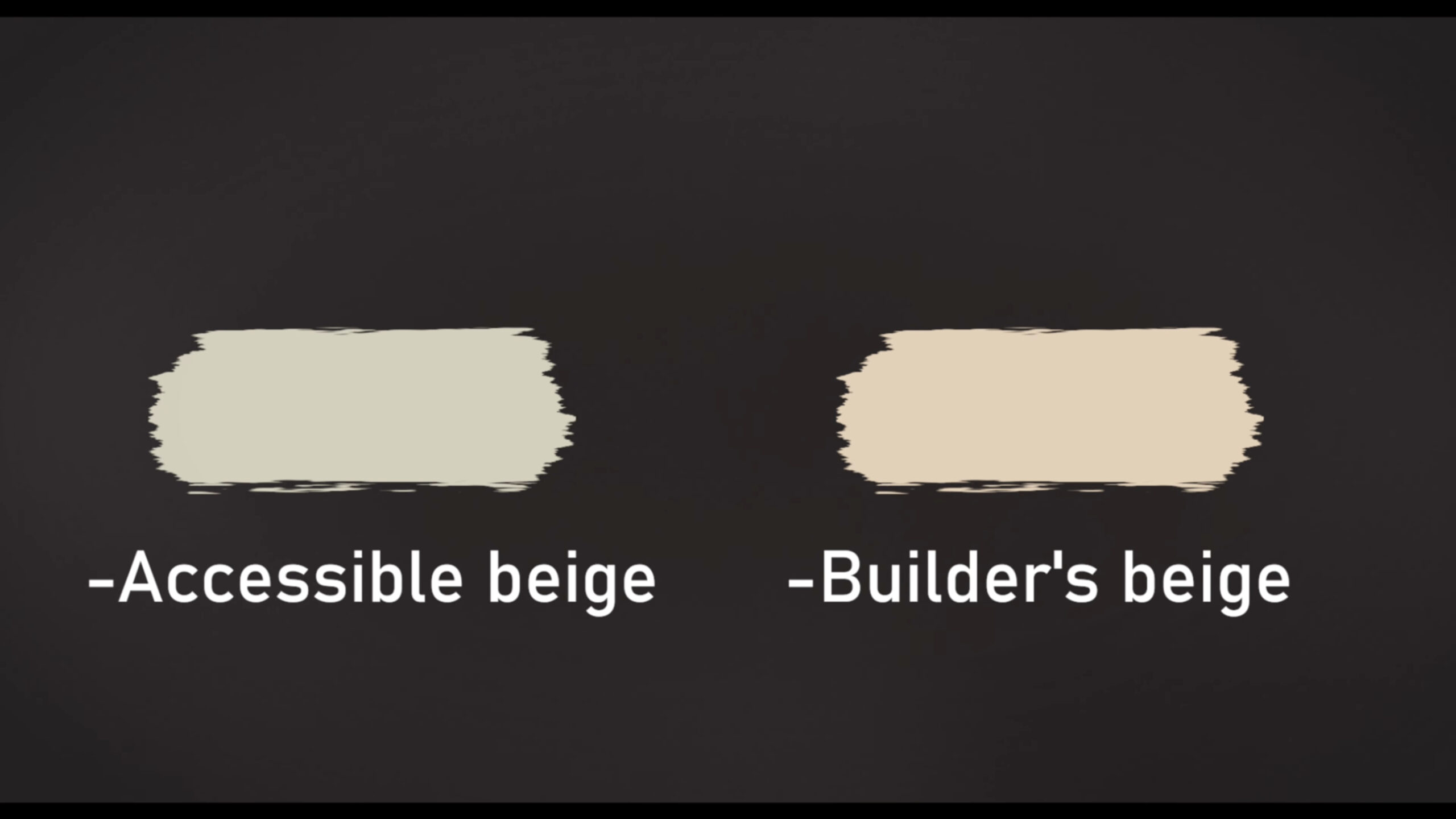
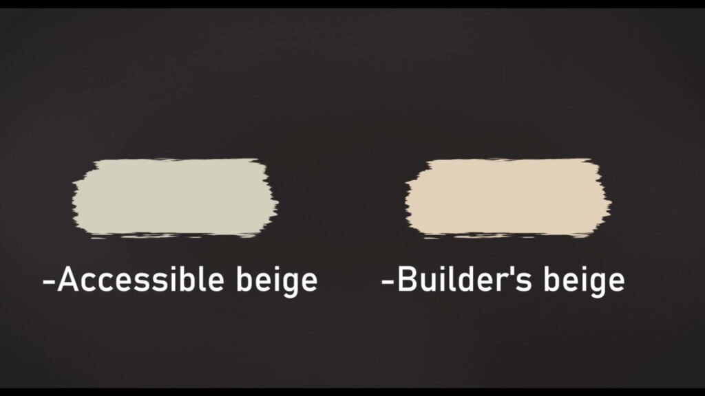
Remember when beige was the safe choice — and also the dullest?
Back in the early 2000s, every wall seemed to wear that yellowy, builder-grade beige that made your living room feel like it came free with the house. Well… beige is back. But not that beige. No, this is the smarter, sleeker, far-more-chic cousin you wish had shown up to the party years ago.
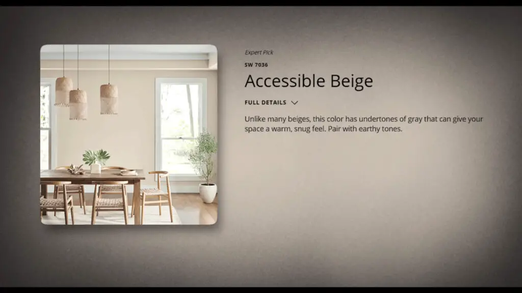
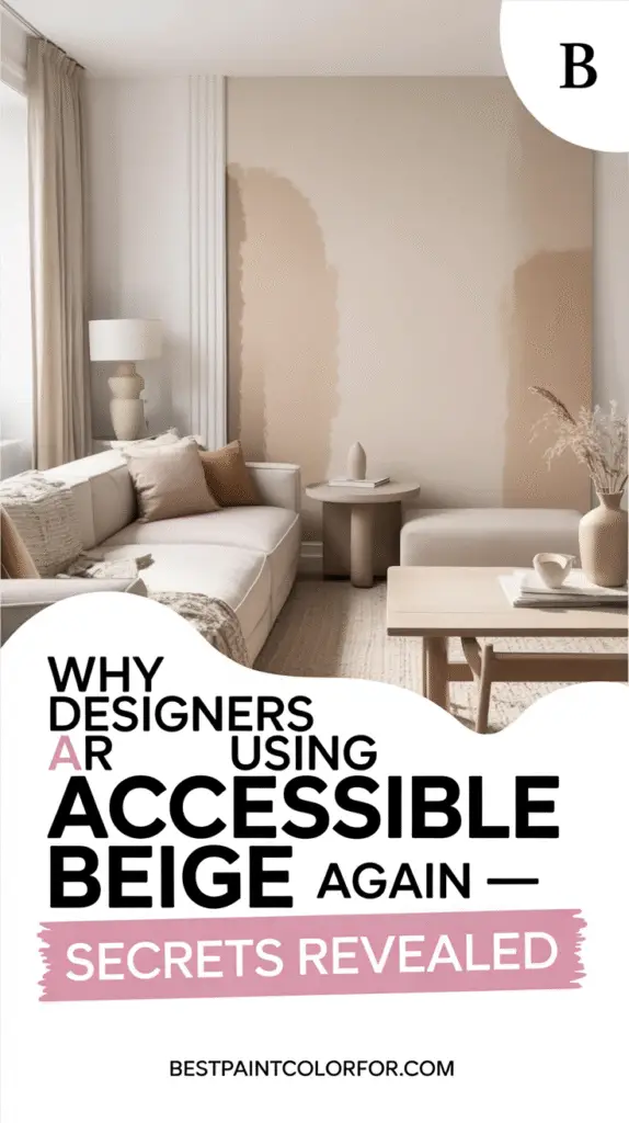
Meet Accessible Beige by Sherwin Williams — the warm neutral that’s quietly taking over 2025 design boards, Pinterest mood boards, and yes, your favorite designers’ Instagram feeds.
Beige, But Make It 2025
Design trends have been on a wild ride lately. For years, we leaned into white-on-white minimalism, cool Scandinavian grays, and even bold, saturated moments that screamed for attention. But now? We’re craving warmth again — that feeling of home, texture, and softness that a good neutral can bring.
Here’s the problem: not all beiges are created equal.
The wrong beige? Dusty. Dated. A one-way ticket to “Why does this room feel so flat?”
The right beige? Calm. Timeless. Deep enough to be interesting, but still versatile enough to work with the rest of your home.
Accessible Beige hits that sweet spot.

Pro Grade Paint Roller Kit, Brush & Roller for Professionals & Homeowners
Perfect for smooth finishes on your interior walls. Ideal for home improvement enthusiasts!
Buy Now on Amazon
What Makes Accessible Beige Different?
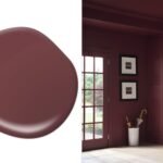
At first glance, you might call it beige — but technically, it leans more greige (that magical blend of gray and beige). It has a touch of taupe that keeps it feeling contemporary instead of stuck in a 2005 time capsule.
- Warm, not yellow: No weird golden undertones that clash with modern finishes.
- Chameleon-like in light: Soft and airy in bright rooms, richer and cozier in dim light.
- LRV of about 58: This means it reflects a good amount of light without feeling washed out — a whisper, not a yell.
It’s a shade that stands on its own but also plays beautifully with warm woods, muted pastels, and textured neutrals.

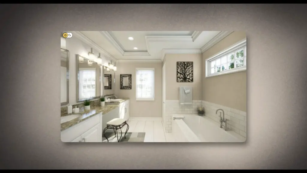
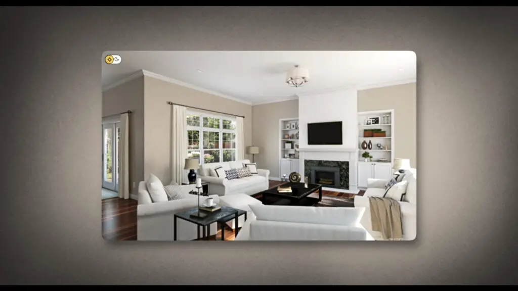
Where It Works Best (And Where It Doesn’t)
If you want a color that can quietly tie your home together, Accessible Beige is a designer’s dream.
Top spots to try it:

Rust-Oleum 367605 Home Interior Floor Coating Kit, Semi-Gloss Black
Ideal for updating outdated flooring at a fraction of the cost of replacement and adheres without stripping, sanding or priming.
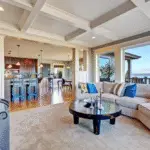
Buy Now on Amazon- Living rooms & open-concept spaces – It’s a great “unifier” that connects spaces without overwhelming them.
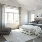
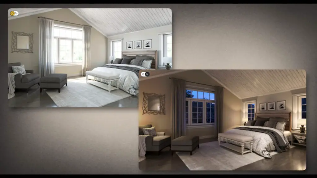
- Bedrooms – Morning sun brings out its softness, evening light reveals its taupey richness.
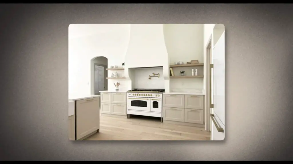
- Cabinetry – Yes, beige cabinets are trending again. Pair Accessible Beige with white oak, brass, or even matte black hardware for a sophisticated update.
- Exteriors – It reads as a warm, neutral backdrop that works beautifully with stone, wood, and dark trims like Sherwin Williams Iron Ore.
A few watch-outs:
- In north-facing rooms, it can look a touch muddy — solve that with warmer bulbs or brighter trim.
- If your home is filled with cool grays and icy blues, Accessible Beige might feel “dirty” next to them. It loves warm tones and creamy whites.
- Don’t pair it with early-2000s golden beige — that’s like wearing a vintage suit with Crocs. Just… no.
How to Test Before You Commit
Lighting changes everything. What looks like the perfect beige in a paint chip might turn into “meh” on your actual walls.
That’s why pro designers (and smart homeowners) always test first.
One easy method? Use peel-and-stick paint samples like Samplize. They’re painted with the real Sherwin Williams formula (not just printed color swatches), and you can move them around to see how the color shifts in different lighting.
1. Why Accessible Beige Is More Than Just Beige
A Reinvented Neutral for Modern Living
Accessible Beige has shed its “bland beige” reputation. It’s become a nuanced, nature-inspired neutral that blends sophistication with soft versatility — a designer favorite for its quiet yet impactful aesthetic.
LRV Magic (Light Reflectance Value = 58)
Its LRV of 58 makes it light enough to illuminate but deep enough to anchor a space — the sweet spot between bland and bold. This optimal depth provides warmth without washing out, giving walls a grounded yet breathable quality.
The Undertone Story: Taupe, Gray, Green
Accessible Beige is a complex chameleon:
- Warm, but not golden — it sidesteps the dated yellow undertones of 2000s beiges
- Muted green undertones flash subtle neutrality in certain lights
- Taupe and gray hints add contemporary depth and richness
This layered undertone profile helps it pair beautifully with both warm and cool palettes.
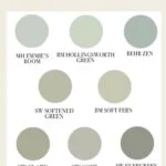
Designer-Approved Alternatives
If Accessible Beige feels close but not quite right, you’ve got options:
- Edgecomb Gray (Benjamin Moore) – A touch cooler and more greige.
- Balanced Beige (Sherwin Williams) – A richer, slightly deeper version.
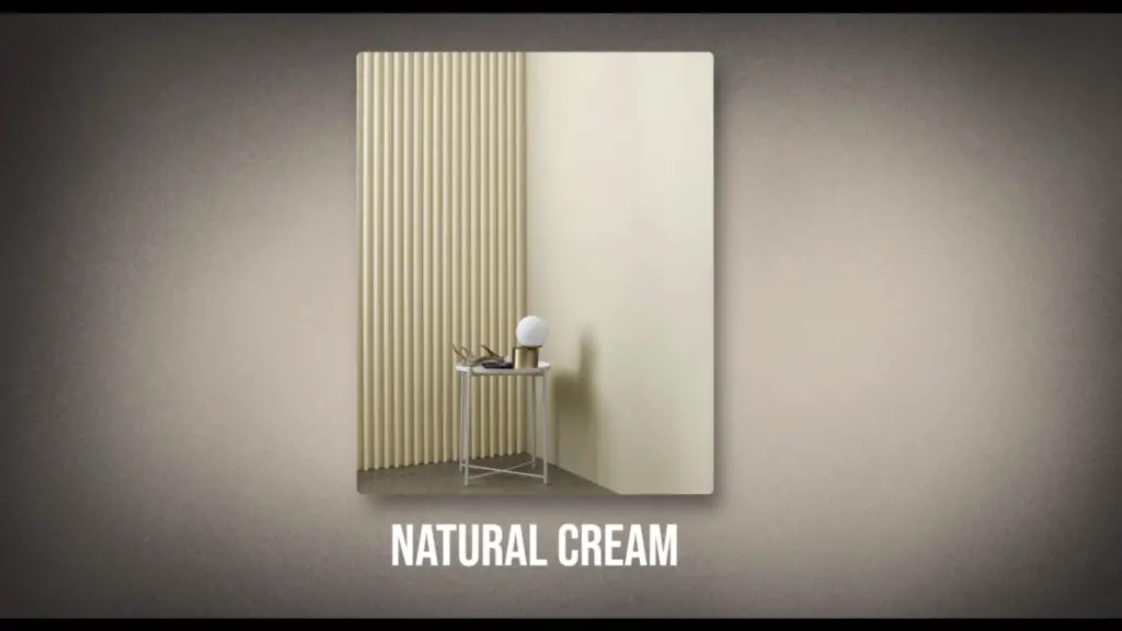
- Natural Cream (Benjamin Moore) – Airier and more relaxed, perfect for a breezy, casual vibe.
Why Beige Isn’t Boring Anymore
In 2025, beige isn’t a compromise color — it’s a statement. Accessible Beige gives you that sense of warmth and sophistication without boxing you into one style. It works in modern homes, traditional spaces, and everything in between.
Trend Context: Where Accessible Beige Fits in 2025 Design
A Reaction Against Cold Minimalism
Interior design has moved away from stark gray-and-white minimalism, shifting toward warmer, more emotionally resonant neutrals. Accessible Beige captures this movement perfectly — offering cozy sophistication while keeping a fresh, modern edge.
Beige’s Stylish Revival
Today’s beige is a far cry from the flat, one-note tones of the past. Accessible Beige is softer, more refined, and incredibly versatile. It pairs beautifully with natural textures, limewash finishes, and works equally well in minimal or richly layered interiors.
Warm Neutrals Take Center Stage
Looking ahead, paint color forecasts highlight sandy beiges and earthy neutrals as core elements of home design. Accessible Beige fits right into this palette, proving that warm tones aren’t just trending — they’re becoming the foundation of modern spaces.
Room-by-Room Strategy Guide
Living Areas & Open Concepts
As a unifying neutral, Accessible Beige is perfect for open layouts. It creates a sense of cozy continuity without overwhelming the space, grounding modern builds or softening overly sterile designs.
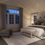
Bedrooms & Relaxation Zones
This color transforms beautifully throughout the day. In the morning, sunlight gives it a gentle, airy glow. At night, under lamplight, it deepens into a rich, taupey cocoon — making bedrooms feel intimate and inviting.
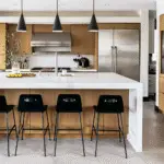
Kitchen & Cabinetry Applications
Beige cabinetry is making a comeback, and Accessible Beige is leading the charge. Pair it with warm wood, matte brass, or black hardware for a modern yet timeless kitchen look that feels intentional and stylish.
Exterior Applications
On exteriors, Accessible Beige reads as a creamy, sophisticated neutral. It complements natural materials like stone and wood, and looks striking when paired with deep, contrasting trims such as Sherwin-Williams Iron Ore.
Matchmaker’s Guide: Pairing Colors & Finishes
- Warm Whites: Swiss Coffee or Alabaster create a soft, harmonious pairing.
- Contrast Pop: Dark accents like Iron Ore or matte black hardware give it definition without overpowering.
- Muted Greens: Earthy greens such as Evergreen Fog highlight its subtle undertones and enhance its natural feel.
Testing Smart: Sample Before You Commit
Because lighting can dramatically change the way Accessible Beige appears, always test it in your own space. Peel-and-stick real paint samples are a quick, mess-free way to see exactly how the shade looks at different times of day and under various lighting conditions.
Alternatives for Fine-Tuning Shade and Mood
- Edgecomb Gray (Benjamin Moore): A cooler, more greige-leaning alternative.
- Balanced Beige (Sherwin-Williams): Slightly deeper and richer than Accessible Beige.
- Natural Cream (Benjamin Moore): Lighter and more relaxed for an airy feel.
- Other Options: Agreeable Gray, Natural Tan, and Revere Pewter offer similar versatility with subtle shifts in tone.
Final Insights: Why Accessible Beige Deserves the Title
- Understated elegance: A layered, dynamic color that changes beautifully with context and light.
- Emotional resonance: Warm neutrals like this provide comfort, calm, and a sense of home in a busy world.
- Trend-savvy and timeless: Accessible Beige balances current design preferences with long-term appeal, making it a safe yet stylish choice for years to come.
If you’re looking to refresh your home without repainting every time the trend cycle turns, this is a safe yet stylish bet. Think of it as the perfect backdrop for whatever you love today — and whatever you’ll love five years from now.
So yes, beige is back. And this time, it’s here to stay.