Choosing the perfect paint color for your living room can feel overwhelming. It’s more than just picking a shade — it’s about setting the mood, reflecting your personality, and creating a backdrop where memories are made. Whether you crave a cozy, warm atmosphere or a bright, airy vibe, the colors you choose for your walls, trim, and ceilings will shape how your living room feels every day.
In this comprehensive guide, we’ll explore 35 stunning living room paint colors, from timeless whites and grays to bold blues and greens, and everything in between. Along the way, you’ll discover expert tips, real-life examples, and inspiration to help you find the color that speaks to you.

Why Paint Color Matters in the Living Room
The living room is the heart of your home — where you gather with family, entertain guests, relax after a long day, or enjoy your favorite book. The paint color plays a huge role in how inviting, spacious, and comfortable the space feels.
Key factors paint influences:
- Mood and Atmosphere: Light colors can make a room feel calm and open, while darker tones add drama and coziness.
- Room Size Perception: Pale colors tend to enlarge a space visually, while deep hues can make it feel more intimate.
- Coordination with Decor: Your paint should complement your furniture, rugs, artwork, and lighting fixtures.
- Architectural Features: Colors on trim, ceilings, and fireplace surrounds can highlight beautiful design elements.
Before we dive into the palette, here’s a quick tip from design experts:

Pro Grade Paint Roller Kit, Brush & Roller for Professionals & Homeowners
Perfect for smooth finishes on your interior walls. Ideal for home improvement enthusiasts!
Buy Now on Amazon“While there’s no one-size-fits-all approach for choosing the perfect living room color, you can’t go wrong with a design-worthy neutral,” advises Anna Logan, Senior Homes & Style Editor at Country Living. Her personal favorite? A greenish-teal called Mill Springs Blue by Benjamin Moore — a color that blends calm and personality.
1. Pearly White — Classic and Airy
A fresh, pearly white sets a luminous and timeless backdrop, perfect for rooms with a mix of textures like wood-plank laminate floors, leather furniture, and natural fiber rugs. This color breathes life into hardworking living spaces without overwhelming them.
- Example Color: Seapearl by Benjamin Moore
- Why It Works: The subtle sheen adds warmth without feeling stark, brightening the room and balancing rustic or robust furnishings.
2. Chocolate Brown — Rich and Cozy
Don’t shy away from embracing deep, chocolatey brown walls to create a snug, enveloping space — especially in smaller rooms or cottages. Pair with textured patterns and eclectic artwork for a look that feels collected and lived-in.
- Example Color: Dark Chocolate by Benjamin Moore
- Tips: Balance the dark walls with lighter furniture accents or metallic details to keep the space from feeling too heavy.
3. Blue and White — Vibrant Contrast
Painting trim or millwork in a vivid blue against white walls channels historic charm and cheerful energy. This combination references classic architectural styles and can energize your living room.

Rust-Oleum 367605 Home Interior Floor Coating Kit, Semi-Gloss Black
Ideal for updating outdated flooring at a fraction of the cost of replacement and adheres without stripping, sanding or priming.
Buy Now on Amazon- Example Color: Vardo by Farrow & Ball (for millwork)
- Style Note: Incorporate natural wood beams or plaster walls to enhance the classic, fresh farmhouse feel.
4. All Gray — Moody and Spacious
Using the same gray-brown color on walls, ceiling, and built-in bookcases can create a dramatic yet cohesive room. This approach expands the space visually while enveloping it in a cozy, moody vibe.
- Example Color: Mouse’s Back by Farrow & Ball
- Design Tip: Layer with warm lighting and leather furniture to soften the depth of the color.
5. Linen-Colored Neutrals — Historic Warmth
Inspired by Early American homes, soft white walls paired with slightly darker wainscoting and trim add depth and a sense of history. This tone-on-tone scheme provides a gentle, layered foundation for both antiques and modern furnishings.
- Example Colors: White Dove and Natural Cream by Benjamin Moore
- Why It’s Timeless: The contrast draws attention to architectural details and evokes a cozy, well-loved home.
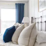
6. Rich Blue — Bold and Inviting
Floor-to-ceiling rich blue walls and shelves transform a living room into a sophisticated library-like retreat. Brass lighting and custom touches add warmth and style.
- Example Colors: Endless Sea (walls and trim), Oyster White (ceiling) by Sherwin-Williams
- Fun Fact: Bold blue tones have a calming effect, perfect for reading or unwinding.
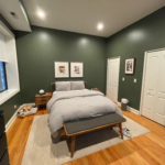
7. Grassy Green — Earthy and Soothing
A grounding grassy green walls provide a natural backdrop that complements both feminine accents and vintage furnishings. This shade connects the indoors with the outdoors.
- Example Color: Shamrock by Sherwin-Williams
- Styling Tip: Balance green walls with warm neutrals and soft pink accents for a fresh, inviting space.
8. Latte-Colored Neutrals — Soft and Cozy
Transforming dark, heavy brick or wood surfaces with a creamy latte shade can breathe new life into an uninspired living room. This warm neutral keeps the space inviting without feeling cold or dull.
- Example Color: Shaded White by Farrow & Ball
- Pro Tip: Leave select rustic elements exposed for contrast and character.
9. Dusty Pink — Soft with Personality
For a subtle but distinct color choice, dusty pink offers warmth and softness without overwhelming the space. Combine with patterned and velvet furniture for balance.
- Example Color: Setting Plaster by Farrow & Ball
- Design Advice: Keep saturation varied so no single color dominates, creating a harmonious look.
10. Creamy White — The Perfect Neutral White
Not too warm, not too cold — creamy whites like Swiss Coffee create an ideal blank canvas. They bring brightness and a welcoming glow that suits various decorating styles.
- Example Color: Swiss Coffee by Benjamin Moore
- Why It Works: It’s versatile, timeless, and allows art and furnishings to take center stage.
11. Spring Green — Fresh and Relaxing
A light, spring-inspired green sets a calming tone reminiscent of English country homes. It pairs beautifully with blue and white furniture.
- Example Color: Vert de Terre by Farrow & Ball
- Style Note: Add floral fabrics or classic pottery to complete the countryside vibe.
12. Wheat-Colored Cream — Warm and Inviting
Warm cream walls can set a cozy scene when paired with natural textures like brick pavers and leather furniture. It’s an approachable color that feels like a welcoming hug.
- Example Color: Dorset Cream by Farrow & Ball
- Great For: Rooms aiming for an understated elegance with lots of texture.
13. Rustic White — Bright and Textured
Using white paint with a single coat lets wood grain and knot holes show through, brightening rooms while preserving rustic charm.
- Example Color: Simply White by Benjamin Moore
- Ideal For: Coastal cabins, country homes, or anyone wanting a bright yet textured backdrop.
14. Warm Gray — Versatile and Neutral
Warm grays offer a sophisticated neutral base that adapts to many styles. Annie Sloan’s French Linen is a go-to for layering with different textures and colors.
- Example Color: French Linen by Annie Sloan
- Tip: Warm gray walls pair well with both vibrant accents and muted furnishings.
15. Cream and Tan — Layered and Lived-In
Combining light walls with slightly darker trim creates subtle architectural interest. Mix fabrics and muted colors for a relaxed, collected look.
- Example Colors: Wimborne White (walls) and Joa’s White (trim) by Farrow & Ball
- Design Insight: Layering different textures and eras adds warmth and personality effortlessly.
16. Bright White — Open and Airy
Bright whites maximize the sense of space in small living rooms. Paired with a neutral sofa and art collections, the result is fresh and inviting.
- Example Color: Super White by Benjamin Moore
- Why Choose Bright White: It reflects light beautifully, making rooms feel larger and more open.
17. Moody Blue — Dramatic and Cozy
Deep blues on walls, ceilings, and trim create enveloping, cozy rooms perfect for relaxing. This works especially well with vintage and coastal decor.
- Example Color: Midnight Blue by Benjamin Moore
- Pro Tip: Paint ceilings the same color as walls to add intimacy.
18. Black and White — Bold and Graphic
Charcoal or black walls paired with white chair rails and trim make architectural details pop and add depth to the room.
- Example Color: Muted Ebony by Valspar
- Style Hint: Use this palette for a high-contrast, modern-classic living room.
19. Fresh White — Clean and Inviting
Fresh white walls give a clean slate for decorating, allowing furniture and collectibles to shine.
- Example Color: Delicate White by Porter Paints
- Great For: Farmhouse styles, eclectic collections, and those who love airy spaces.
20. Watery Blue and Wood — Cool and Rustic
Blue fireplace paint paired with rustic wood paneling brings harmony to rooms with a vintage vibe.
- Example Color: Philipsburg Blue by Benjamin Moore
- Design Note: Painted brick can unify a space that has mismatched materials.
21. Airy White — Warm and Welcoming
Soft whites with warm undertones create inviting rooms that feel open without being cold.
- Example Color: Quail Egg by Valspar
- Style Tip: Combine with antiques and floral fabrics for a lived-in, cozy feeling.
22. Limewash and Warm Gray — Simple and Elegant
White limewash walls with gray trim give a subtle textured effect and sophistication to smaller rooms.
- Example Colors: White Limewash (walls) and Tyler Gray (trim) by Benjamin Moore
- Perfect For: Rooms with rustic furniture or vintage finds.
23. Forest Green — Rich and Luxurious
Deep forest green walls and matching trim create a dramatic, high-end look all year round.
- Example Color: Lafayette Green by Benjamin Moore
- Seasonal Bonus: This color looks fantastic during holidays but is versatile beyond.
24. All White — Breezy and Bright
All-white walls, ceilings, and trim evoke a coastal cottage’s easy, breezy vibe, highlighting colorful accents and meaningful decor.
- Example Color: All White by Farrow & Ball
- Why It’s Popular: Perfect for creating a clean backdrop in beach or cottage styles.
25. Gray and Black — Strong and Sophisticated
Rich gray walls paired with high-gloss black ceilings and trim make a bold, elegant statement in foyers or living rooms.
- Example Colors: Roycroft Pewter (walls) and Tricorn Black (trim) by Sherwin-Williams
- How to Style: Balance with natural fibers like jute rugs and antique accessories.
26. White and Wood — Classic and Cozy
Soft white walls with exposed wood beams blend tradition and comfort beautifully, highlighting architectural features.
- Example Color: Vanilla Milkshake by Benjamin Moore
- Tip: Wood accents warm up white walls for a balanced look.
27. Grounding Gray — Timeless and Textured
Warm gray walls with distressed plaster bring a timeless quality, pairing wonderfully with antique furniture and natural materials.
- Example Color: Mole’s Breath by Farrow & Ball
- Great For: Creating rooms that feel historic yet comfortable.
28. Limewashed Walls — Warm and Textured
A limewashed finish adds depth and softness, allowing rustic architectural details to shine.
- Example Color: Coconut Milk Interno Lime Wash by Sydney Harbour
- Styling Idea: Perfect for rooms with salvaged wood beams and vintage pieces.
29. Crisp White Pine-Paneled — Clean and Airy
Painting exposed pine paneling in crisp white revitalizes old architecture and brightens tight spaces.
- Example Color: Pure White by Sherwin-Williams
- Design Note: Combine with neutral furnishings to avoid overwhelming the senses.
30. Barely Blue — Cool and Balanced
A subtle white with blue undertones balances warm furnishings like orange velvet sofas, creating an autumn-inspired look.
- Example Color: Patriotic White by Benjamin Moore
- Style Tip: Use to ground vibrant colors without clashing.
31. French Gray — Soft and Calm
Mid-tone neutral grays create a soothing atmosphere and highlight natural wood floors and textured furnishings.
- Example Color: Cornforth White by Farrow & Ball
- Perfect For: French farmhouse or rustic chic interiors.
32. Black Trimmed — Dramatic and Defined
Bold black trim against white walls frames views and architectural details like artwork or large windows.
- Example Colors: Snowbound (walls) and Black Fox (trim) by Sherwin-Williams
- Pro Tip: Use matte finishes on walls and gloss on trim for contrast.
33. Wood and White — Rustic and Refined
Soft white walls with green undertones contrast beautifully with reclaimed wood walls, creating a relaxed yet elegant atmosphere.
- Example Color: Fleur de Sel by Sherwin-Williams
- Design Idea: Pair with natural stone fireplaces and neutral furnishings.
34. Foggy Gray Fireplace — Subtle and Stylish
Painting small architectural elements like hearths or mantels in soft gray draws subtle attention and adds sophistication.
- Example Color: Morning Fog by Sherwin-Williams
- Tip: Use paired with bright white walls to create depth.
35. Snow White — Tranquil and Antique-Filled
Snow-white walls open up a room and provide a calm setting for collections of antiques and vintage furniture.
- Example Color: Snow White by Sherwin-Williams
- Why It Works: Creates a serene environment perfect for relaxing and showcasing treasured pieces.
Final Thoughts: Choosing Your Perfect Living Room Paint Color
With so many gorgeous paint colors to choose from, the key is finding the one that resonates with your style, space, and how you want to feel in your living room. Here are some quick tips to help you decide:
- Test Samples: Always try paint samples on your walls and observe how the light changes the color throughout the day.
- Consider Lighting: Natural light and artificial lighting will greatly affect how colors look.
- Think About Mood: Do you want your living room to feel calm and soothing or lively and energetic?
- Coordinate With Existing Elements: Consider your furniture, flooring, and artwork.
- Don’t Be Afraid of Contrast: Combining light walls with darker trims or vice versa can add dimension and interest.
Ready to refresh your living room? Pick a color that excites you, embrace your style, and watch how a new paint shade can transform your home’s heart.
Which living room paint color caught your eye? Are you drawn to bold blues, cozy browns, or crisp whites? Share your thoughts or ask for personalized advice — your perfect living room color is just a brushstroke away!